Image source: artvee.com
Introduction
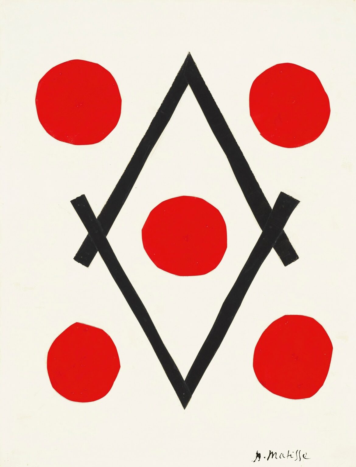
Henri Matisse’s “Diamond” (1947) is a late, radical reduction: a white sheet carries a tall black lozenge built from two broad strips, inside of which a single red disk glows; four more red disks sit just outside the lozenge, roughly at the cardinal diagonals. The elements are few, the contrasts extreme, and the result instantly legible from across a room. Yet this brevity delivers a surprising depth of associations—playing cards and dice, targets and constellations, mandalas and heraldry, architecture and dance. What looks like a childlike emblem turns out to be a precise demonstration of how Matisse’s late language of color-and-shape works: clarity is not simplification for its own sake but a distillation of rhythm, balance, and touch.
1947 and the Cut-Out Turn
The year 1947 marks the public debut of Matisse’s cut-paper method. Convalescent and unable to work long at an easel, he began painting sheets of paper with opaque gouache and cutting shapes directly with scissors—“drawing with scissors,” as he called it. Assistants pinned the cut pieces to the studio wall, where he could shuffle and edit them at full scale until the composition “rang true.” Many of these wall collages were later translated into hand-stenciled pochoir prints to preserve their sharp edges and matte color. “Diamond” belongs to this new vocabulary: pure, flat color; decisive, handmade edges; and a structure built entirely from the relations of a few shapes on an uncluttered ground.
Geometry Made by Hand
At first glance the central figure is a perfect diamond. Look longer and you see something more interesting: two thick, black bands generate the lozenge; they meet at the top and bottom points and overlap slightly at left and right, where short, squared stubs reveal how the shape is assembled. The black is not mechanically straight—its edges swell and narrow as the scissors (or brush) turned. That human irregularity is crucial. It prevents the geometry from becoming cold and gives the lozenge the springy life of a drawn line writ large. Matisse wants the clarity of geometry and the pulse of the hand, and here he gets both.
The Quincunx: Five Reds, One Center
Five red disks punctuate the field in a classic quincunx—the pattern you see on the five side of a die or in Renaissance gardens: one at the center, four at the corners. The outer disks sit just beyond each side of the diamond so that the black frame seems to calibrate, even magnetize, their positions. The disks are not perfect circles. They wobble a touch, like coins turned in a pocket, and that wobble keeps them lively against the hard black. The central disk, encased by the lozenge, reads as a heart, a core, a seed, an eye—choose your metaphor—and it anchors the picture’s rhythm.
Color as Structure: Black, Red, White
The palette is a fierce triad. Black provides architecture—weight, edge, and containment. White is not blankness but active space, a luminous field that measures the intervals between forms. Red is the pulse. Because the pigments are flat and unmodulated, all sensation comes from adjacency and proportion. The red disks near white glow; the central red against black intensifies, taking on a gemlike density. This is how Matisse composes in his late period: color is not a coating; it is the scaffold itself.
Rhythm, Interval, and the Eye’s Path
The composition reads in an instant and then reveals its timing. The eye lands on the central red, travels up the black rails to the acute apex, slides down the opposite side to the lower point, and then ricochets outward to the four satellites. Those outer disks are set at unequal distances from the lozenge, a tiny asymmetry that prevents the picture from freezing. You feel a beat: center—top—center—bottom—left—right—left—right. The quincunx sets the tempo; the irregularities give it jazz.
Negative Space That Does Positive Work
Between the lozenge and each outside disk is a wedge of white that does as much work as the colored shapes. These wedges keep the black from swallowing the field and prevent the red from crowding the frame. They also generate a shallow sense of depth: the central disk seems nearer because it has the least white around it; the corner disks, surrounded by white and pushing against the paper’s edge, float slightly forward like planets in a clear sky. Matisse had spent a lifetime turning background into active participant; “Diamond” shows the principle in its most concentrated form.
Games, Signs, and Sacred Diagrams
Because the elements are so archetypal, they call up different worlds without locking into any single narrative. The pattern is the five-pip on a die, suggesting play and chance. The title conjures playing cards and the diamond suit’s red lozenge. Through another lens, the black figure is a mandorla or portal, the central red a heart or ember. Seen in architectural terms, the black is a truss or frame; in celestial terms, the red disks are stars arranged around a bright core. Matisse’s late signs work precisely because they are not illustrations; they are poised at the level of symbol and relation, where many meanings can coexist.
Tension Between Frame and Freedom
The black lozenge acts like a rule. It stakes out a territory and sets clear boundaries. The red disks answer with freedom: they can sit inside or outside, close or far, alike yet individual. The picture’s drama is the conversation between those two impulses. Matisse had long balanced structure (grids, windows, shutters) with the freer rhythms of plants, fabrics, and figures. Here the balance is compressed to its barest form—two impulses, five dots, one field—and still it carries the old theme: harmony is not the absence of difference but the tuning of differences.
Touch and Precision
Even in such reduction, the touch matters. The black strips show minute variations where the scissors hesitated and bit in; the red disks have edges that thicken where pigment pooled near the cut. These traces of making are the late work’s signature. They keep the graphic clarity from turning into sterile perfection and let the viewer feel time in the object—the moment when a curve rounded, a strip crossed, a disk was placed just so and then moved half a finger’s width to ring.
Scale and Bodily Recognition
The forms in “Diamond” are scaled to the body. The lozenge could be traced by the sweep of two arms; each disk sits comfortably within the span of a hand. That human scale helps explain the image’s immediate warmth. You can imagine performing its construction with your own body: cutting two long strips, crossing them, dropping five rounds of red, stepping back to judge the spaces between. The work becomes a choreography of simple actions executed with care.
Balance Without Symmetry
The composition is nearly symmetrical, but not quite. The lower outside disks sit a whisper nearer the lozenge than the upper pair; one side stub on the lozenge projects a touch farther than the other; the central disk is fractionally lower than the midway point. These deviations are the difference between a living order and a diagram. Matisse distrusted mechanical symmetry; he preferred balances that you feel rather than measure. “Diamond” is a textbook of that preference.
Dialogues With the Rest of the Late Work
Place this page beside the 1947 portfolio Jazz and the large cut-outs that follow and you see a family resemblance: a reliance on flat, saturated color; clarity at distance; and edges that bear the memory of scissors. The red disks echo the starbursts and hearts in other plates; the lozenge reads like a cousin of the black bands that anchor compositions such as Icarus. What distinguishes “Diamond” is its ascetic restraint. Where other late works swarm with foliage, acrobats, or swimmers, this one trusts five circles, two bands, and a field to do the whole job.
The Ethics of Economy
Matisse’s late economy is not a matter of minimalism for its own sake; it is an ethic of sufficiency. How little is needed to make a complete, resonant picture? “Diamond” answers: very little, if each part is placed with conviction. The success of the page depends on proportional relationships you can feel but not easily codify—the proportion of disk to field, of lozenge height to page height, of distance between shapes to the width of the strips. This is why the image, simple as it is, resists trivial imitation; its rightness lies in those tuned ratios.
The Viewer’s Role
Because the picture is so open, it enlist the viewer as co-composer. Some will read a face of a die and think of chance; others will see a target and think of focus; others will see a gem set in a mount and think of value. None of these readings cancels the others. The work is not a puzzle to be solved but a clear structure within which different sentiments can arise. That openness is a final gift of the late Matisse: the decorative, properly understood, is not superficial; it is a framework for shared pleasure and thought.
How to Look
A productive way to encounter “Diamond” is to run through three distances. From far away, it is a sign: red pulses around a black frame on white. At mid-range, the intervals start to count and you feel the rhythm of the quincunx, the press of white wedges, the steadying vertical reach of the lozenge. Close up, the edges reveal their handmade logic—the squared stubs at the crossings, the tiny crenellations in the reds, the paper’s slight tooth under the matte paint. Moving through these distances, you experience the work as both emblem and event.
Why It Still Feels New
Decades later, “Diamond” looks perfectly contemporary: flat color, stark contrasts, instantaneous legibility. It anticipates the visual language of logos and wayfinding but refuses their impersonality. The hand remains present, the relationships felt rather than plotted. That combination—graphic punch with human warmth—is why the page continues to move designers and painters alike. It proves that austerity can be generous when it is precise.
Conclusion
“Diamond” is a small manifesto. With two black bands and five red disks on a white field, Matisse composes a space that is at once playful and solemn, structural and breathing. The lozenge frames and protects; the red pulses organize the beat; the white holds everything in luminous suspension. In the end, the picture’s subject is not a diamond at all but a way of seeing: the belief that balance can arise from very few ingredients if they are tuned by eye and hand. In that sense, this late work sums up Matisse’s project—color as architecture, shape as music, clarity as pleasure.