Image source: artvee.com
Introduction
Alphonse Mucha’s Deutsches Schauspiel-Haus Theater Program (1908) represents a pivotal moment in the artist’s mature decorative style and his engagement with theatrical culture beyond his early Parisian success. Commissioned for Hamburg’s prestigious Deutsches Schauspielhaus, Mucha crafted a lithographed poster that transcends mere advertisement to become a sumptuous fusion of allegory, ornament, and typographic innovation. In this work, he combines his characteristic sinuous line, Celtic-inspired borders, and idealized female figures to evoke both the spirit of drama and the Gesamtkunstwerk ideal—where architecture, performance, and graphic art coalesce into a unified artistic experience. This analysis explores the poster’s historical origins, compositional mastery, symbolic depth, technical execution, and enduring influence.
Historical Context
By 1908 Mucha had returned to his native Prague after a decade of flourishing in Paris. His reputation as the leading exponent of Art Nouveau had already been established through iconic posters for theater star Sarah Bernhardt and luxury brands like Moët & Chandon. Meanwhile, Germany’s vibrant theatrical scene, centered in cities such as Berlin and Hamburg, sought to modernize its visual culture. The Deutsches Schauspielhaus, inaugurated in 1901, became one of Europe’s foremost stages for dramatic innovation. In commissioning Mucha to design a theater program poster, the Schauspielhaus acknowledged both the need for contemporary visual identity and Mucha’s ability to translate theatrical dynamism into graphic form. The 1908 poster thus emerged at a confluence of national cultural ambition and Art Nouveau’s international reach.
Commission and Purpose
The Deutsches Schauspielhaus commissioned Mucha to produce not only posters but also programs, tickets, and interior decorations, signaling a holistic approach to theater branding. The program poster served multiple functions: to announce upcoming seasons, to adorn walls and foyers, and to confer prestige upon the institution. Mucha’s design needed to convey the gravitas of classical drama and the excitement of modern repertory, while also fitting seamlessly into the theater’s aesthetic environment. The resulting image would greet patrons as they entered the building, establishing an anticipatory mood and reinforcing the notion that attending the theater was a cultivated, even ritualistic, act.
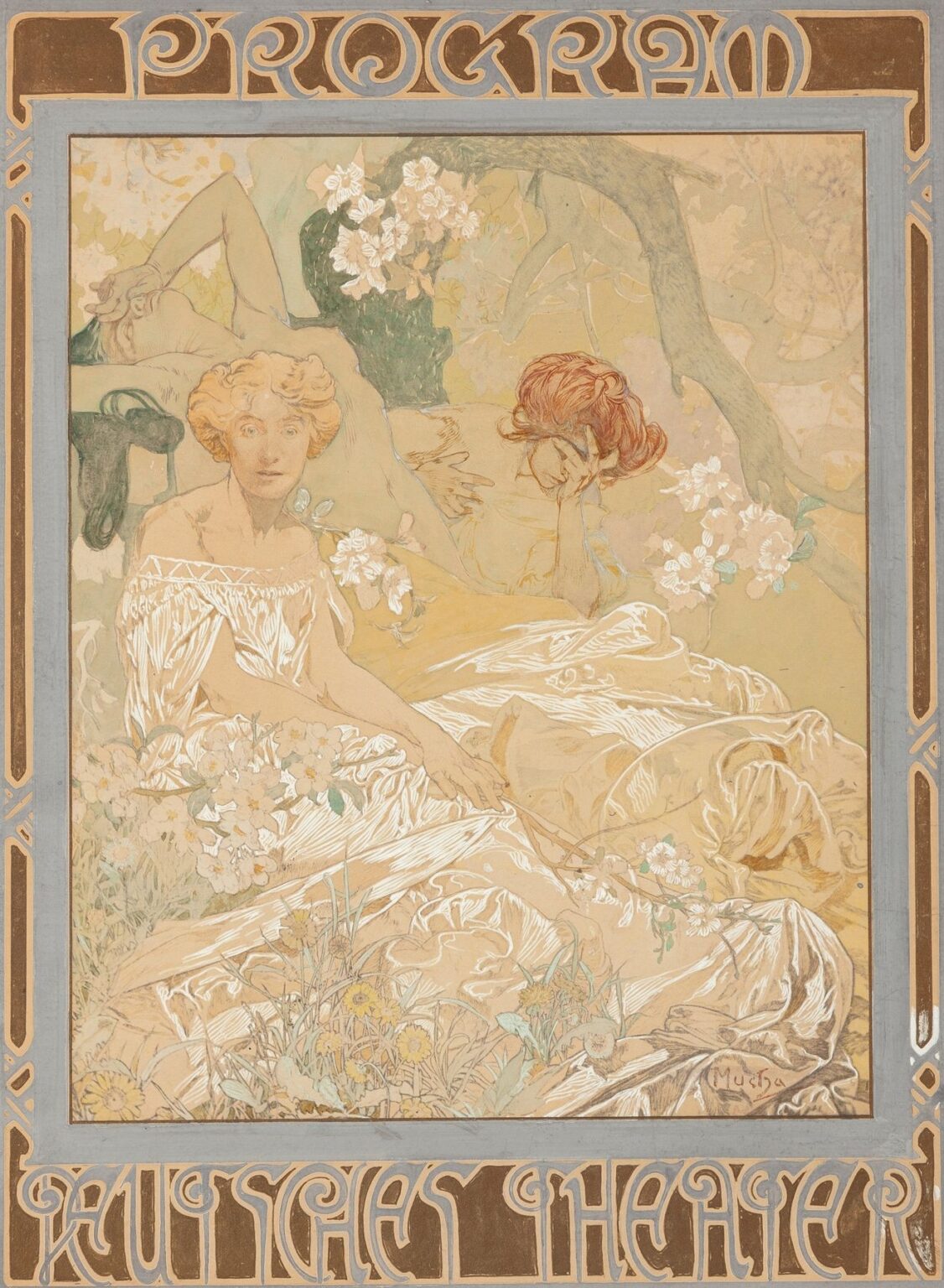
Composition and Spatial Dynamics
At first glance, the poster’s composition is anchored by a central female figure, poised within a broad rectangular frame ornamented with intricate knotwork. She stands in three-quarters profile, her body curving gracefully as her draped robe billows around her. Behind and above her looms a second, partially obscured figure, lending depth and a sense of theatrical layering—much like actors emerging from the wings. The background features a subtle suggestion of stage scenery: the silhouette of a proscenium arch and trailing vines that echo theater curtains. The border itself—rendered in metallic gold and muted pastel tones—forms an outer frame that encloses the narrative space, guiding the viewer from the title at the top (“Programm”) through the central tableau and down to the theater name at the bottom (“Deutsches Schauspiel-Haus”). Mucha’s balancing of positive and negative space ensures legibility while offering a richly detailed visual journey.
Line and Ornamental Language
Line constitutes the structural backbone of Mucha’s aesthetic, and in this poster it operates with both precision and freedom. The contours of the figures and drapery are traced in confident strokes that vary in weight to suggest volume and movement. Secondary lines weave through the border’s Celtic knot motifs, forming loops and interlacing patterns that evoke medieval manuscript illumination. Mucha’s landmark “whiplash” curves—the signature S-shapes of Art Nouveau—appear in the cascading folds of the robe and the undulating tendrils of ornamental vines. The result is a rhythmic interplay between the human form and decorative abstraction, each line reinforcing the viewer’s sense of organic unity while also fulfilling the poster’s functional need to frame type and image.
Color Palette and Illumination
Mucha’s choice of color in the Deutsches Schauspiel-Haus poster marks a subtle evolution from his earlier, more vibrant Parisian prints. Here, he employs a restrained palette of warm ochres, soft greens, pale blues, and metallic golds, leveraging the natural tone of the paper as a midtone. This muted harmony reflects the dignified seriousness of classical theater and resonates with the interior color schemes of early twentieth-century theater lobbies, often adorned in gold-leaf and dark wood. Highlights on the robes and the women’s hair blossoms are rendered with white gouache overprint, creating a shimmering effect reminiscent of stage lighting. The metallic inks used for the knotwork border catch ambient light, reinforcing the poster’s presence in low-lit foyers and lending a tactile luxury to the printed surface.
Symbolism and Theatrical Allegory
Beneath its decorative veneer, Mucha’s poster teems with symbolic undertones that resonate with theatrical tradition. The primary female figure, poised as if addressing an unseen audience, embodies the muse of drama—an allegorical representation of tragedy, comedy, or the dramatic impulse itself. Her drapery, reminiscent of classical Greek garb, situates the theater within the lineage of ancient drama. The secondary figure whispering behind her suggests the collaborative nature of performance: the director’s guidance, the counsel of fellow actors, or the secrets of character motivation. The interlaced knotwork border, drawing on Celtic and medieval motifs, implies the timeless nature of storytelling, linking past and present through visual continuity. Collectively, these symbols affirm the theater’s role as a living repository of cultural memory and communal expression.
Typography and Visual Hierarchy
Mucha approached the text elements of the poster with the same care he applied to his imagery. The title “Programm” appears across the top in a stylized typeface of Mucha’s own invention—its letters inflected with decorative curls that reflect the motif of the border. The letterforms blend calligraphy and geometric precision, balancing readability with ornamental unity. At the bottom, “Deutsches Schauspiel-Haus” adopts a more restrained but complementary font, its weight ensuring prominence without overwhelming the central scene. Mucha’s typographic decisions create a clear visual hierarchy: the viewer first identifies the poster’s function, then engages with the allegorical imagery, and finally registers the theater’s name. This seamless integration of text and image underscores Mucha’s conviction that typography can be both functional and expressive.
Technical Execution in Lithography
As with Mucha’s finest works, the Deutsches Schauspiel-Haus poster was produced as a color lithograph, requiring multiple stones or plates—one for each major hue. Stone 1 laid down the black outlines and fine hatching, Stone 2 provided the ochre robe and background gradients, Stones 3 and 4 added greens and blues, while a separate plate applied metallic gold for the knotwork. The print shop used high-quality Rag paper to maintain archival stability and ensure crisp ink adhesion. Because the design called for white highlights—such as on the figure’s skin and gown—Mucha specified the use of opaque white overprint, a more costly but visually striking technique. The registration tolerances were exacting: even minor misalignments would fragment the intricate knotwork and disrupt the seamless flow of lines between image and border. The final prints, distributed to theaters and collectors, retained the painterly subtlety of Mucha’s hand-drawn drafts while achieving the reproducibility needed for promotional purposes.
Reception and Immediate Impact
Upon its debut in Hamburg, the Deutsches Schauspiel-Haus program poster was met with acclaim from both theatergoers and critics. Local newspapers praised its refined elegance and the synergy it created between modern graphic design and venerable theatrical tradition. Theater management reported an uptick in ticket sales and audience engagement, attributing part of the increased excitement to the poster’s alluring visuals. Collectors of Art Nouveau ephemera eagerly acquired limited-edition prints, and the poster circulated briefly as a decorative object beyond its immediate advertising function. Mucha’s reputation in Germany, initially established through exhibitions of his Parisian posters, was further enhanced by this collaboration—leading to subsequent commissions for programs, invitations, and interior murals.
Influence on Theatrical Graphic Design
Mucha’s work for the Deutsches Schauspielhaus set a precedent for theater branding across Europe. His approach demonstrated that promotional materials could transcend mere information delivery to become integral components of the theatrical experience. In the years that followed, theaters from Vienna to Moscow adopted similar strategies, commissioning artists to devise unified visual campaigns that encompassed posters, programs, tickets, and lobby ornament. Mucha’s insistence on integrating allegorical imagery, custom typography, and archival printing techniques helped legitimize graphic design as a critical element of performance art and cultural diplomacy. The concept of a “season identity,” now commonplace in performing arts marketing, can trace part of its lineage to innovations like the 1908 Mucha poster.
Legacy and Contemporary Relevance
More than a century after its creation, Alphonse Mucha’s Deutsches Schauspiel-Haus Theater Program remains a touchstone for designers, historians, and theater practitioners. Original lithographs are treasured in museum collections—from Hamburg’s own theater archives to the Musée d’Orsay in Paris. Scholars study the poster as an exemplar of late Art Nouveau typographic innovation and cross-cultural artistic exchange. Contemporary theater companies and cultural institutions continue to draw inspiration from Mucha’s holistic approach to visual identity, commissioning bespoke artwork that echoes his principles: allegorical resonance, ornamental unity, and technical excellence. In an era of digital blurbs and transient social media posts, the enduring allure of Mucha’s lithograph underscores the power of finely crafted, tangible graphic art to define and elevate the communal experience of live performance.
Conclusion
Alphonse Mucha’s Deutsches Schauspiel-Haus Theater Program (1908) represents the artist at the height of his powers, merging theatrical allegory, ornamental mastery, and typographic innovation into a single lithographic tour de force. Through its thoughtful composition, rhythmic line work, harmonious palette, layered symbolism, and impeccable technical execution, the poster not only announced a season of drama at Hamburg’s premier stage but also redefined the role of graphic design in the performing arts. Its immediate impact on theater branding and its lasting influence on designers worldwide attest to Mucha’s vision of decorative art as an immersive, culturally resonant force—an ideal that continues to inspire creators over a century later.