Image source: artvee.com
Introduction
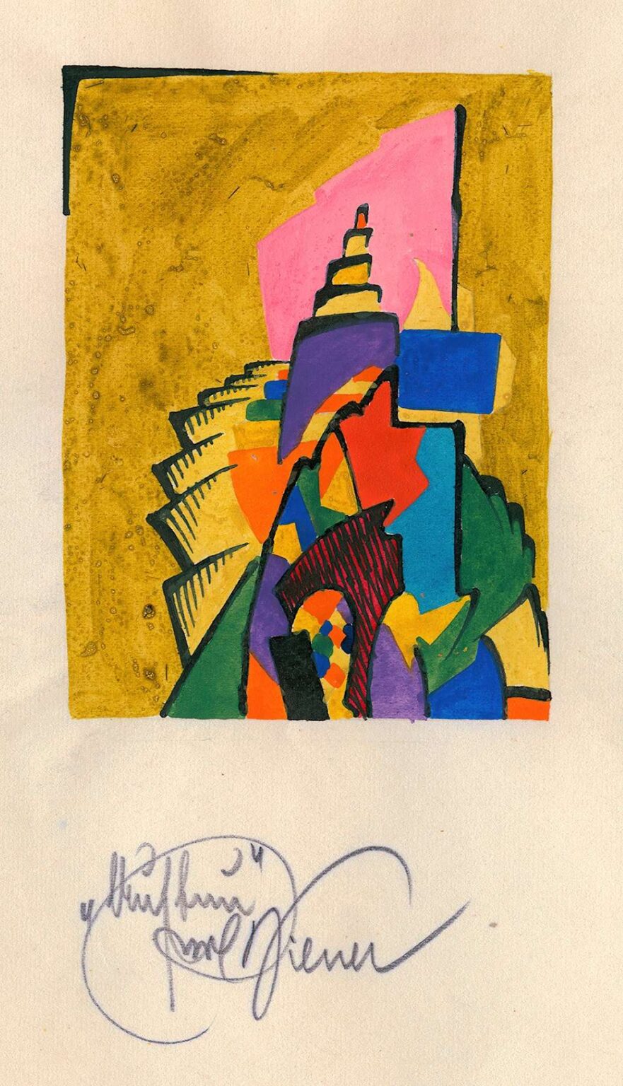
Karl Wiener’s 1923 composition Construction offers a vivid glimpse into the artist’s experimental engagement with form, color, and spatial dynamics. At first glance, the piece appears as a crystalline tower of interlocking shapes rising against a richly textured golden backdrop. Against a roughly drawn rectangular frame, an assembly of colored planes—pinks, purples, blues, greens, oranges, and blacks—cascade upward in a spiraling sequence of geometric motifs. Each form overlaps and interpenetrates its neighbor, creating a sense of both solidity and fluid motion. Though the work remains firmly abstract, its title directs us to consider notions of building, scaffolding, and architectural aspiration. In this analysis, we will examine the historical context in which Construction emerged, trace Wiener’s artistic influences, unpack the formal strategies that animate the work, and explore its symbolic resonances as a meditation on creation, progress, and the interplay between order and improvisation.
Historical Context
The early 1920s constituted a period of profound reinvention in European art, driven by the upheavals of World War I and the rapid transformations of postwar society. Vienna, once the cultural capital of the Habsburg Empire, found itself redefining its identity amid political collapse and economic uncertainty. Artists who had once leaned toward decorative secessionism now gravitated toward abstraction, seeking universal visual languages that could bridge fragments of a fractured world. Wiener, working within this charged atmosphere, absorbed currents from the Bauhaus in neighboring Germany, the geometric innovations of De Stijl in the Netherlands, and the constructivist fervor emanating from Russia. Construction emerges as a testament to this cosmopolitan dialogue. Rather than depicting a literal building site, Wiener distills the essence of construction into a sequence of forms that evoke foundational pillars, rising scaffolds, and layered facades. His work reflects an era when the very act of creation—social, technological, and aesthetic—was being reimagined from first principles.
Artistic Influences
Though Karl Wiener’s name may not carry the renown of Kandinsky or Mondrian, his work reveals clear affinities with several avant‑garde tendencies. The emphasis on geometric assembly recalls Piet Mondrian’s neoplastic compositions, where simple rectangles and lines coalesce into harmonious wholeness. However, Wiener diverges by embracing diagonal thrusts and irregular overlays that Mondrian consciously avoided. The spiraling sequence of shapes in Construction resonates with the Cubist practice of fracturing space, as pioneered by Picasso and Braque, yet Wiener applies this fragmentation more fluidly, allowing shapes to overlap like shifting plans in an architect’s drawing. Meanwhile, the sense of upward momentum and industrial energy aligns with the Italian Futurists’ celebration of speed and mechanization. Finally, the layering of colored pencil over inked outlines recalls Russian Constructivism, where artists like El Lissitzky experimented with graphic elements as tools for social engineering. In Construction, Wiener synthesizes these influences into a personal idiom that foregrounds the tactile immediacy of drawing and the structural logic of form.
Composition and Structure
At the heart of Construction lies a dynamic axis that propels the composition skyward. Beginning at the lower right corner, a series of angular planes—triangles, trapezoids, and semi‑rectangles—stack and rotate in a spiraling ascent. Each successive layer varies slightly in orientation and color, akin to floors of a multilevel structure under continuous development. The shapes interlock without gaps, implying a careful fit that echoes an engineer’s blueprint. Yet the edges remain visibly hand‑drawn, with slight irregularities that humanize the geometry. The roughly drawn rectangular border functions as both frame and scaffold, its inked lines partially concealed by the colored forms, underscoring the tension between containment and emergence. The overall effect is that of a tower in flux: a structure not yet complete, alive with creative possibility and the latent energy of construction.
Color and Texture
Wiener’s color palette in Construction is at once bold and nuanced. Vivid hues of pink and purple announce themselves at the tower’s apex, suggesting dawn light or fresh material awaiting placement. Deeper blues and greens anchor the midsection, imparting a sense of stability and grounding. Brilliant oranges and reds flash at select junctions, sparking visual interest and evoking industrial machinery. The golden wash that fills the surrounding field provides a warm, luminous contrast, its subtle variations in tone hinting at a weathered patina or the glow of sunlight. The artist’s technique—likely colored pencil combined with gouache or watercolor wash—yields a rich textural interplay. In some areas, the pencil grain remains visible, lending a tactile quality; in others, the wash pools and dries unevenly, creating organic patterns that animate the background. Through these textural and chromatic strategies, Wiener balances the precision of geometry with the spontaneity of material interaction.
Line and Gesture
Although color captures immediate attention, Construction is underpinned by agile, expressive line work. Black ink outlines define the major planes, their varying thicknesses lending weight to certain forms and lightness to others. In contrast, delicate hatchings—applied with pencil—articulate interior volumes, suggest shadow, and guide the eye across surfaces. These hatching lines shift direction to follow each shape’s orientation, reinforcing the sense of three‑dimensional form. In some segments, quick, angular strokes sprout from the edges like bracing struts or metal connectors, implying the functional hardware that binds a construction site together. This interplay of disciplined outlines and energetic gestures captures the dual nature of building: the interplay between rigorous planning and on‑the‑spot adaptation.
Spatial Dynamics
Although Construction offers no literal perspective, it achieves a convincing sense of depth through scale, overlap, and tonal variation. Shapes at the apex of the tower appear smaller and more contracted, as though receding into space, while broader forms at the base loom larger, asserting their proximity. Overlapping planes create an optical layering: a violet wedge might float above a red block, which itself overlaps a green segment. The golden wash behind the structure remains unbroken, pushing the tower into a shallow yet palpable foreground. These spatial cues guide the viewer’s gaze upward along the spiraling axis, reinforcing the work’s implied narrative of ascent and development. The sense of vertical progression, unencumbered by linear perspective, reflects abstraction’s capacity to evoke spatial experience without slavish adherence to descriptive conventions.
Symbolism and Interpretation
While Construction remains primarily abstract, its title and formal cues evoke rich symbolic associations. The ascending forms suggest the act of building—a process of creating, reinforcing, and expanding. This can be interpreted metaphorically as a reflection on human aspiration: the desire to reach new heights, to elevate mind and spirit through creative endeavor. The structural interplay of shapes may also allude to social constructs, the layered hierarchies that uphold cultural institutions. The choice of bright, contrasting colors could symbolize the diversity of elements—ideas, individuals, technologies—that must coalesce for any project, literal or conceptual, to succeed. The golden backdrop, meanwhile, might evoke the promise of a radiant future or the glow of communal achievement. Through Construction, Wiener thus offers more than a formal exercise: he presents an allegory of collective progress, anchored in the interplay of individual parts.
Technique and Medium
Karl Wiener’s decision to work predominantly in colored pencil and ink on paper reflects both practical considerations and artistic intentions. Colored pencil permits both rich, saturated areas of pigment and delicate tonal transitions; combined with engraved‑like hatchings, it yields a painterly yet graphic surface. The wash of yellow—likely gouache or watercolor—provides a unified background that contrasts with the sharper pencil marks. Its application appears loose, with slight variations in density and occasional pooling, lending the work an organic vitality. The visible texture of the paper’s tooth anchors the composition in material reality, reminding viewers that the abstract forms are products of hand and tool. Wiener’s brushwork—if used for the wash—is careful yet unforced, the edges occasionally bleeding into the paper to soften the boundary between structure and field. This mixed‑media approach underscores the drawing’s hybrid nature: at once architectural sketch, color study, and autonomous artwork.
Emotional Resonance
Encountering Construction, viewers often experience a blend of exhilaration and contemplation. The vibrant color contrasts ignite visual excitement, while the disciplined geometry imparts a sense of order and purpose. The spiraling ascent evokes feelings of ambition and forward momentum, as though one stands at the base of a grand edifice and feels compelled to join its upward climb. Yet the irregular edges and visible hand‑made qualities temper this exhilaration with intimacy, reminding us that every grand project begins with modest tools and human determination. The juxtaposition of bold, impersonal forms and personal, tactile strokes elicits a nuanced emotional response: pride in human creativity tempered by awareness of perseverance and imperfection. Through Construction, Wiener taps into universal experiences of building—whether brick, idea, or community—and celebrates the exhilaration inherent in transformative acts.
Legacy and Impact
Although Karl Wiener did not achieve mainstream fame, Construction stands as a compelling testament to the vitality of interwar abstraction beyond the canonical avant‑garde figures. The work anticipates later twentieth‑century explorations of architectural form in painting, where artists like Richard Diebenkorn and Philip Guston would translate structural motifs into lyrical compositions. Wiener’s mixed‑media technique—combining colored pencil, wash, and ink—foreshadows later process‑oriented practices in minimalism and post‑minimalism, where artists emphasized material presence and visible gestures. In recent years, curators have begun to reassess peripheral figures of the period, recognizing works like Construction for their inventive formal strategies and nuanced materiality. As part of this broader reevaluation, Wiener’s drawing contributes to a richer understanding of how regional artists synthesized international currents into singular modes of expression.
Conclusion
In Construction, Karl Wiener masterfully intertwines geometry, color, and gesture to create an evocative meditation on building—both literal and metaphorical. Through the spiraling assembly of colored planes, the dynamic interplay of line and wash, and the bold chromatic contrasts, he crafts a composition that speaks to human aspiration, collective effort, and the creative spirit. Situated within the fertile cross‑currents of post‑World War I abstraction, the drawing transcends its historical moment to offer enduring insights into the processes by which new structures—physical, social, and conceptual—emerge. Nearly a century after its creation, Construction continues to captivate viewers, reminding us that the act of building, in all its forms, remains a profoundly human endeavor.