Image source: artvee.com
Introduction
Alphonse Mucha’s “Cocorico” Magazine Title Illustration (1898) stands as a landmark achievement in the fusion of graphic design and fine art at the dawn of the Art Nouveau era. Conceived to grace the masthead of the avant-garde publication Cocorico, this dynamic composition moves far beyond mere typographic ornamentation. It inaugurates a new visual vocabulary—melding sinuous line, allegorical figuration, and expressive letterforms—to celebrate a spirit of artistic renewal. In this analysis, we will explore the historical backdrop that shaped Mucha’s breakthrough, unpack the formal strategies that underpin the design’s enduring power, examine its rich symbolism, and trace its influence on the trajectory of graphic arts and publishing at the turn of the twentieth century.
Historical Context
The late 1890s in Paris were marked by a fervent search for new artistic languages. Traditional academic painting and the prevailing Beaux-Arts establishment were increasingly challenged by emerging currents: Symbolism in literature and the decorative arts, Impressionism’s focus on modern life, and Japonisme’s embrace of asymmetry and pattern. Meanwhile, the printed press was undergoing a renaissance. Advances in lithographic printing allowed for mass reproduction of vivid color and intricate line work, empowering magazines, journals, and posters to become vehicles for high art. Cocorico, founded in 1898 by journalist and critic André de Fouquières, aimed to showcase cutting-edge illustration alongside experimental literature and commentary on art and society. Mucha’s title illustration for Cocorico thus arrived at a moment when print media and avant-garde aesthetics were converging, and he seized the opportunity to redefine what a magazine header could be.
Art Nouveau and Mucha’s Evolution
Art Nouveau—literally “new art”—spread rapidly across Europe in the 1890s, championing organic forms, whiplash curves, mineral and vegetal motifs, and the unity of fine and applied arts. Mucha, a Czech émigré who had settled in Paris in 1887, first gained notice in 1894 with his poster for actress Sarah Bernhardt in Gismonda. Thereafter, he became synonymous with female personifications framed by elaborate floral halos and undulating arabesques. By 1898, he had refined his style into a mature balance of naturalistic detail and decorative abstraction. The Cocorico title illustration emerges from this period of artistic crystallization. Unlike his large colored posters, it is rendered in black line against an ivory ground, yet it retains the flowing energy and rich ornamentation that define Mucha’s contribution to Art Nouveau.
Commission and Purpose
André de Fouquières commissioned Mucha to create a distinctive masthead for his new cultural and literary review. The brief called for a design that would capture the magazine’s spirit of irreverence and innovation while providing a bold, eye-catching visual identity. Fouquières and his editors sought to distance Cocorico from the staid periodicals of the day, positioning it as a haven for modernist writers, caricaturists, and printers. Mucha responded with a title illustration that functioned as both logo and emblematic tableau. It would appear at the top of each issue, establishing an immediate visual link between the magazine’s content and its commitment to artistic experimentation.
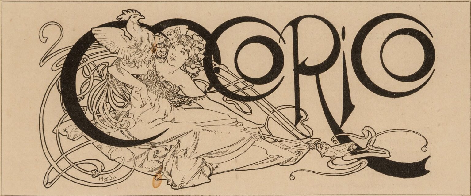
Composition and Layout
At first glance, the Cocorico masthead balances the monumental sweep of its title letters with the dynamic flourish of figural ornament. Spanning the page almost edge-to-edge, the word “COCORICO” is composed in a custom letterform where each character flows into the next via subtle arcs and tapering strokes. The letters themselves act as both negative and positive space: the “C” and “O” shapes create windows through which the viewer glimpses the sinuous outline of a reclining female figure positioned behind the text. Above her, a stylized rooster—France’s national emblem—perches atop the first “C,” crowing into the letter’s curve. The entire composition relies on a sweeping ostinato of curved lines that curve under the figure’s flowing drapery and then loop back to reinforce the letterforms, creating a cohesive visual circuit.
The Figure and Allegory
Central to Mucha’s design is the reclining female allegory, a hybrid of seductive dancer, pastoral muse, and national icon. Her pose, drawn from classical sources, suggests both ease and poise: one arm extends toward the rooster, her fingers grazing its talons, while the other lifts her gown to reveal a hint of leg. Her hair, ornamented with flowers and ribbons, cascades in parallel curves that echo the ribbon-like extensions of the letters. Through this figure, Mucha weaves multiple layers of meaning: she embodies the creative spirit that Cocorico aspired to cultivate, the pastoral heritage of France’s rural traditions, and the innovative energy of modern art. The rooster, poised at the crest of the design, amplifies these associations, signaling both a national awakening and a dawn of new artistic forms.
Line Quality and Ornamental Rhythm
In the Cocorico masthead, line serves as the vehicle for both structure and decoration. Mucha modulates line weight to articulate form: the letters are rendered with thick strokes that ensure visibility, while the figure’s contours are defined by thinner lines that capture the subtleties of drapery folds and musculature. The swirling loops and curlicues that emanate from the letters are drawn with a calligraphic elegance, their arcs varying in tension and direction to create dynamic movement. These ornamental ribbons interlace under and around the figure, linking her to the typography and preventing any sense of disjunction. The rhythmic repetition of curves fosters visual harmony, leading the viewer’s eye in a continuous, uninterrupted journey across the masthead.
Custom Typography and Visual Identity
Every letter in “COCORICO” is a bespoke creation, infused with Mucha’s decorative ethos. The curves of the “C” shapes are exaggerated into near-elliptical loops that cradle the figure’s shoulders and legs, while the narrower letters—such as the “I” and “R”—feature elongated terminals that groove into the surrounding ornament. This custom lettering serves not only to spell the magazine’s name but also to reinforce its identity as a locus of artistic invention. The interplay between thick and thin elements within each glyph echoes the chiaroscuro effect of Mucha’s graphic design, creating a sense of depth and dimensionality even in the absence of color. This masthead thus functions as an early example of unified branding, where text and image coalesce to forge a memorable visual signature.
Symbolism and Cultural Resonance
Beyond its decorative impact, Mucha’s Cocorico illustration brims with symbolic resonance. The rooster, or coq, is an emblem of France—at once proud and vigilant. In this role, it presides over the creative imagination represented by the female figure, suggesting that national identity and artistic innovation are intertwined. The figure’s floral headdress recalls traditional garlands of harvest and festival, aligning Cocorico with a celebratory spirit. At the same time, her modern, revealing attire signals liberation from strict moral conventions, reflecting the magazine’s avant-garde leanings. Through this layered symbolism, Mucha transforms a mere title illustration into an ideological manifesto: a call to cultural renewal rooted in national heritage yet unbound by outdated strictures.
Use of Negative Space and Silhouette
A hallmark of Mucha’s design is his deft use of negative space. In the Cocorico masthead, the interior of the large “O” letters is left entirely uninked, allowing the ivory paper ground to frame the female figure’s head and torso. This silhouette effect—where the white of the paper shapes the figure just as much as the printed lines—enhances legibility while showcasing the drawing’s delicate line work. Negative space also separates the sweeping loops of the letters from the complex ornamental details, providing the eye with visual rests amid the profusion of curves. Mucha understood that effective design depended as much on what was left blank as on what was filled, and this masthead exemplifies his mastery of that principle.
Technical Execution and Printmaking
Produced in black line lithography, the Cocorico masthead required meticulous planning and collaboration with skilled lithographers. Mucha prepared precise full-scale drawings, indicating tonal separations and line weights. The printer would then transfer these drawings onto lithographic stones or plates, carving and etching each layer by hand. The uncolored rendition demanded absolute clarity: every line had to register crisply against the paper, and every loop and swirl needed precise alignment to maintain continuity. The success of the printed masthead—its evenly inked, uniform black lines and clean white grounds—attests to Mucha’s exacting standards and his ability to translate ornamental finesse into reproducible print.
Integration with Layout and Content
In the pages of Cocorico, Mucha’s masthead operated as the visual cornerstone around which other elements were organized. Editorial columns, illustrations, and advertisements were placed beneath or beside the masthead, benefitting from the momentum generated by its curves. The masthead’s dynamic energy set the tone for the magazine’s content, suggesting movement from one article to the next. Indeed, early issues of Cocorico often featured Mucha’s masthead spanning the top of the folio, with subsequent pages carrying section headers and page numbers in complementary letterforms drawn from the same calligraphic system. This holistic approach to magazine design—where theme, typography, and illustration form a unified ensemble—anticipated later practices in modern editorial design.
Reception and Influence
Upon its debut, the Cocorico masthead drew immediate attention from both art critics and the reading public. Its seamless marriage of fine art techniques and commercial application underscored Mucha’s role as a pioneer in graphic art. The masthead influenced subsequent magazine title pages and journal covers across Europe, as editors and designers sought similarly integrated visuals. Even in other contexts—book jackets, sheet music covers, and exhibition invitations—Mucha’s blend of flowing typography and allegorical illustration became a model to emulate. The Cocorico masthead thus not only defined a publication but also helped establish the parameters of Art Nouveau design in print.
Legacy in Graphic Design
More than a century later, Alphonse Mucha’s Cocorico masthead continues to resonate in the fields of typography and illustration. Contemporary designers cite it as a foundational example of how to harmonize logotype and imagery. Its techniques—custom letterforms that interact with drawing, assertive use of negative space, and rhythmic line modulation—remain relevant in branding, editorial design, and packaging. The masthead’s historical significance also lies in its demonstration that a magazine’s title could itself be conceived as a work of art, a principle that underpins the ethos of modern design studios and creative agencies worldwide.
Conclusion
Alphonse Mucha’s “Cocorico” Magazine Title Illustration of 1898 exemplifies the transformative potential of Art Nouveau in the realm of printed media. Through its bold custom typography, sinuous allegorical figure, layered symbolism, and masterful line work, it redefined what a magazine masthead could achieve—elevating it from functional label to emblematic artwork. In doing so, Mucha charted a path for generations of graphic designers, illustrating how typography and illustration might fuse seamlessly to convey identity, ideology, and aesthetic pleasure. The Cocorico masthead remains a testament to the enduring power of visual innovation at the intersection of art and commerce.