Image source: artvee.com
Introduction
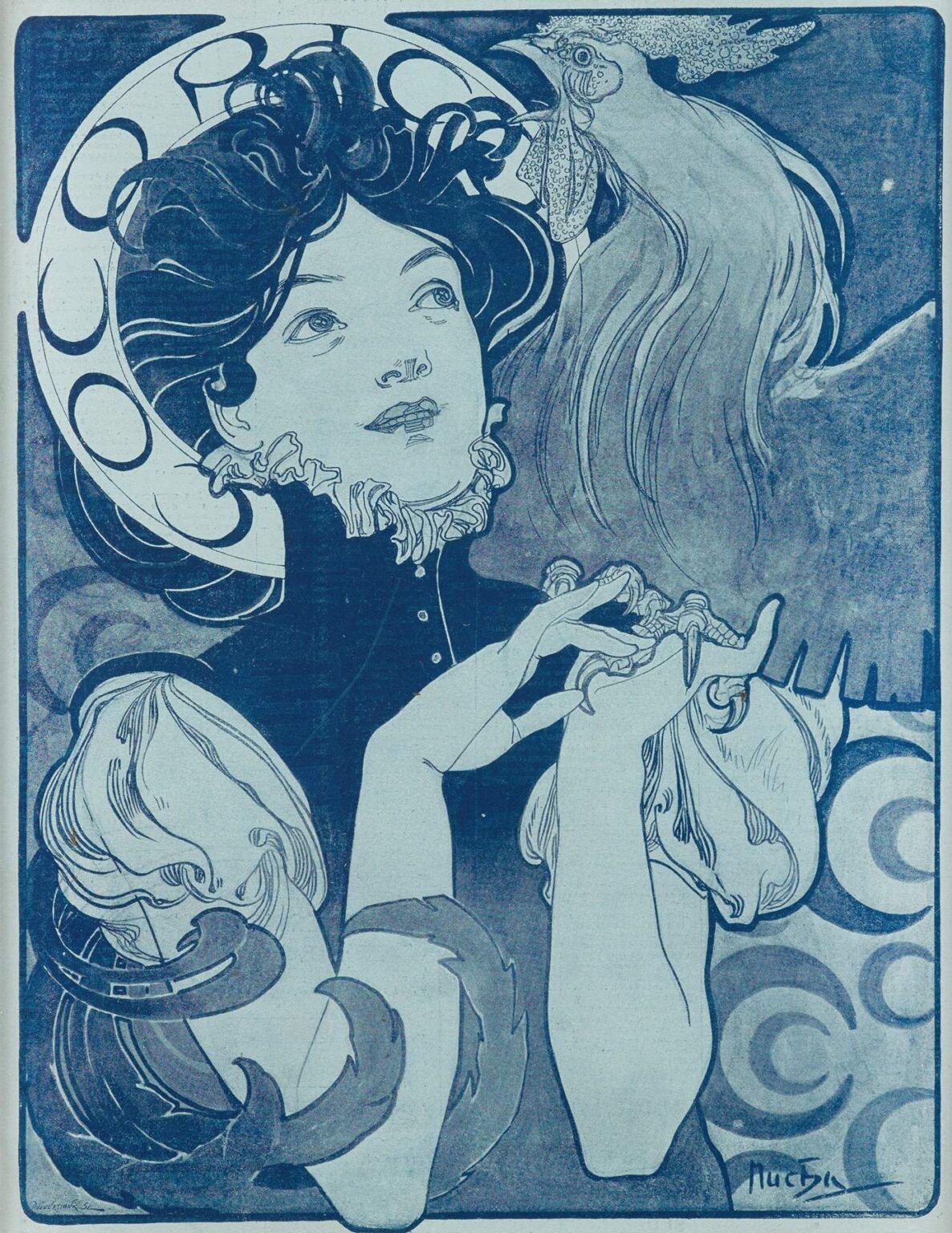
“Cocorico” by Alphonse Mucha, created in 1898, epitomizes the flamboyant elegance of the Art Nouveau movement and stands as one of Mucha’s most daring typographic and pictorial experiments. Commissioned as a promotional poster for the Parisian satirical and avant-garde periodical Cocorico, the work abandons the lush polychromatic palettes and ornate botanical borders typical of Mucha’s theatrical posters in favor of a restricted, high-contrast color scheme and a more abstracted composition. Rendered primarily in two shades of blue, the poster features a captivating female figure engaging in a stylized dialogue with a fantastical bird, while circular motifs echo across the background. Through its bold simplicity of hue, dynamic interplay of positive and negative space, and inventive treatment of line and form, Cocorico announces a new phase in Mucha’s graphic vocabulary—one that anticipates modernist concerns with economy of means and symbolic gesture.
Historical and Cultural Context
By the late 1890s, Alphonse Mucha had achieved international fame for his lithographic masterpieces promoting Sarah Bernhardt’s theatrical seasons and a host of luxury products. Yet he remained restless creatively, eager to push beyond the decorative opulence of his poster repertoire. Cocorico, the periodical for which this poster served as flagship advertising, was founded in 1898 by Georges Goursat (“Sem”) and Edmond de Goncourt’s protégé, poet and critic Maurice Pauliac. It championed irreverent satire, Symbolist poetry, and artistic innovation. In accepting the commission, Mucha aligned himself with Paris’s literary-bohemian avant-garde, seeking to expand his audience among progressive readers. The Cocorico poster thus occupies a liminal place—bridging the ornate Art Nouveau for which Mucha was celebrated and the emerging graphic minimalism that would define 20th-century design.
Purpose and Function
Unlike his earlier posters, where the primary aim was to announce a theatrical engagement or commercial product, the Cocorico design functions simultaneously as magazine promotion and aesthetic manifesto. Its restrained palette and spare composition signal that the publication within eschews mere popular entertainment in favor of artistic and intellectual provocation. The poster’s boldness in reducing color to two tones—light cyan and deep ultramarine—demonstrates that visual impact need not depend on lavish chromatic layering. Instead, Mucha turns to contrasts of light and dark, positive and negative space, to command attention on Parisian boulevards. As a call to readers, Cocorico both invites curiosity and asserts its membership in the avant-garde.
Composition and Spatial Organization
Mucha divides the composition into three horizontal bands of varying proportions. The top portion features abstracted circular motifs—half-moon arcs and floating rings—in deep ultramarine, setting a rhythmic punctuation against a light ground. The middle and largest section houses the central figure and bird, their forms overlapping and interpenetrating within a tight, nearly square space. The woman’s upturned face and the bird’s outstretched wing create a diagonal axis that cuts across the poster, imparting dynamic tension. Finally, the lower band contains the magazine’s title, “COCORICO,” in bold, blocky letterforms that mirror the circular motifs above. Thin, flat borders frame the entire image, anchoring the design while allowing the central forms to breathe. Mucha’s careful calibration of spatial zones balances visual weight and ensures that eye movement flows naturally from title to figure to motifs.
Mastery of Line and Silhouette
In Cocorico, Mucha’s mastery of line takes on a more austere character. Gone are the delicate taperings and ornate flourishes of his decorative posters; instead, the contour lines here are confidently stripped to essentials. The woman’s coiffure, rendered in thick, curving strokes, echoes the bird’s feathered plumes, forging a kinship between human and avian. The ruffed collar around her neck, with its scalloped edges, recalls both lace and the bird’s wing textures. Mucha employs silhouette to maximum effect: large swaths of ultramarine define the figure’s bodice, hair, and bird’s body, while the light cyan reveals negative-space details. This interplay of filled and empty areas creates a striking visual dichotomy that foreshadows early 20th-century expressionist woodcuts.
Color Palette and Printing Technique
The palette of Cocorico is remarkably restrained for a Mucha lithograph: two inks, light cyan and deep ultramarine, printed on pale off-white paper. Such a duotone approach required precise alignment and careful control of ink consistency to maintain crisp edges between tones. Some areas—such as the subtle texturing in the bird’s plumage and the gentle halftone shading behind the figure—suggest the use of graded lithographic washes, demonstrating that even with limited colors, nuance could be preserved. The choice of blue hues aligns with the magazine’s avant-garde sensibility—blue evoking both the intellectual coolness of satire and the nocturnal realm of dreams and imagination.
Symbolism and Allegorical Resonance
While Mucha rarely infused his commercial work with overt allegory, Cocorico hints at layers of symbolic meaning. The bird—a hybrid creature with both feathered wing and curving, almost aquatic tail—perches at the threshold of human speech, mouth open as if in conversation or song. It may represent the muse of artistic inspiration or the spirit of satire, whispering ideas into the woman’s ear. Her upward gaze suggests receptivity or wonder, as though she awaits that next creative impulse. The concentric circles above allude to echoes of laughter or the cyclical nature of ideas. In this reading, Cocorico becomes a visual allegory of the collaborative dance between writer, artist, and critic—the very conversation that the magazine fostered.
Representation of the Feminine Form
Mucha’s depiction of the female figure here diverges from his more voluptuous and decorative muses. The woman in Cocorico is rendered with angular restraint: her shoulders squared, her silhouette framed by the dark bodice, her face nearly profile. Yet her expression conveys both independence and intrigue, aligning with the period’s growing interest in the New Woman—cultured, intellectually engaged, and unafraid of public sphere. The absence of elaborate drapery, replaced by a stiffer garment and ruff, further underscores her role as active interlocutor rather than passive ornament. Through her, Mucha signals that the magazine’s intended readership comprises informed, discerning individuals seeking intellectual exchange.
Typography and Text Integration
The lettering of “COCORICO” reflects Mucha’s understanding of type as image. Each capital form carries subtle irregularities—slightly widened bowls, uneven serifs—that echo the circular motifs above. The spacing between letters is generous, allowing the word to breathe within its band, while the vertical strokes recall the arcs in the poster’s framing bands. By placing the title in a lighter cyan against an ultramarine ground, Mucha ensures maximum legibility without sacrificing harmony. The word itself—an onomatopoeic French equivalent of the rooster’s crow—plays into themes of awakening, loud proclamation, and satirical call-outs, further binding text and image in thematic unity.
The Art Nouveau Aesthetic Evolved
While Cocorico retains core Art Nouveau traits—organic curves, stylized forms, decorative economy—it also demonstrates Mucha’s evolution toward a modernist sensibility. The limited palette, abstraction of motifs, and flattening of space anticipate graphic trends that would flourish in the coming decades, from expressionist posters to Constructivist graphics. Yet the work remains unmistakably Mucha: the sinuous hairlines, the tactile textures of the ruff and feathers, and the rhythmic interplay of positive and negative areas all bear his signature touch. In this, Cocorico bridges the ornamental exuberance of the 1890s and the minimalist ethos of the 20th century.
Influence on Poster Art and Design
By pushing his own boundaries with Cocorico, Mucha encouraged fellow designers to embrace experimental typography and limited color schemes. The poster’s success proved that visual impact need not rely on elaborate ornamentation or full-color palettes; instead, strong silhouettes and inventive composition could command attention just as effectively. Designers in Europe and North America took note, leading to a wave of duotone and monotone posters in the early 1900s. Mucha’s willingness to adapt his style—tempering decorative richness for austere modernity—demonstrated the flexibility of the poster medium and inspired later modernist movements to view graphic art as a laboratory of visual ideas.
Technical Collaboration and Workshop Practices
The production of Cocorico depended on close collaboration between Mucha and the skilled craftsmen at the Imprimerie Champenois. Mucha provided full-scale drawings and color keys indicating areas of ultramarine and cyan. The workshop then prepared two lithographic stones per color—one for linework and one for wash—resulting in four stones inked in sequence. Precise registration marks carved into the stones ensured perfect alignment. Varnish mediums facilitated the smooth tonal transitions in the background, while careful wiping of excess ink maintained the stark contrast in the figure and motifs. This labor-intensive process underscores the high value placed on print quality, even for a seemingly minimalist design.
Reception and Legacy
Upon its release, Cocorico generated immediate buzz in Paris’s artistic circles. Its avant-garde aesthetic resonated with readers of the magazine and fellow graphic artists alike. Collectors prized early impressions for their striking economy of means, and the poster remains one of Mucha’s most sought-after rarities. Over the 20th century, Cocorico found new admirers among modernist designers who saw in it a precursor to abstraction and typography-centric graphics. Today, museums and private collections displaying the poster highlight its significance as both a capstone of Art Nouveau and a harbinger of modern graphic design.
Conclusion
Alphonse Mucha’s Cocorico stands as a remarkable testament to his creative restlessness and willingness to explore new graphic frontiers. Through its bold duotone palette, dynamic composition, and inventive interplay of figure and symbol, the poster transcends its role as mere magazine advertisement to become a milestone in the evolution of poster art. Far more than an echo of Mucha’s earlier decorative triumphs, Cocorico points forward to the modernist embrace of minimalism and typographic expression. It remains, more than a century later, a powerful example of how simplicity of means can yield maximum visual poetry.