Image source: artvee.com
Introduction to Cinzano Vermouth Torino
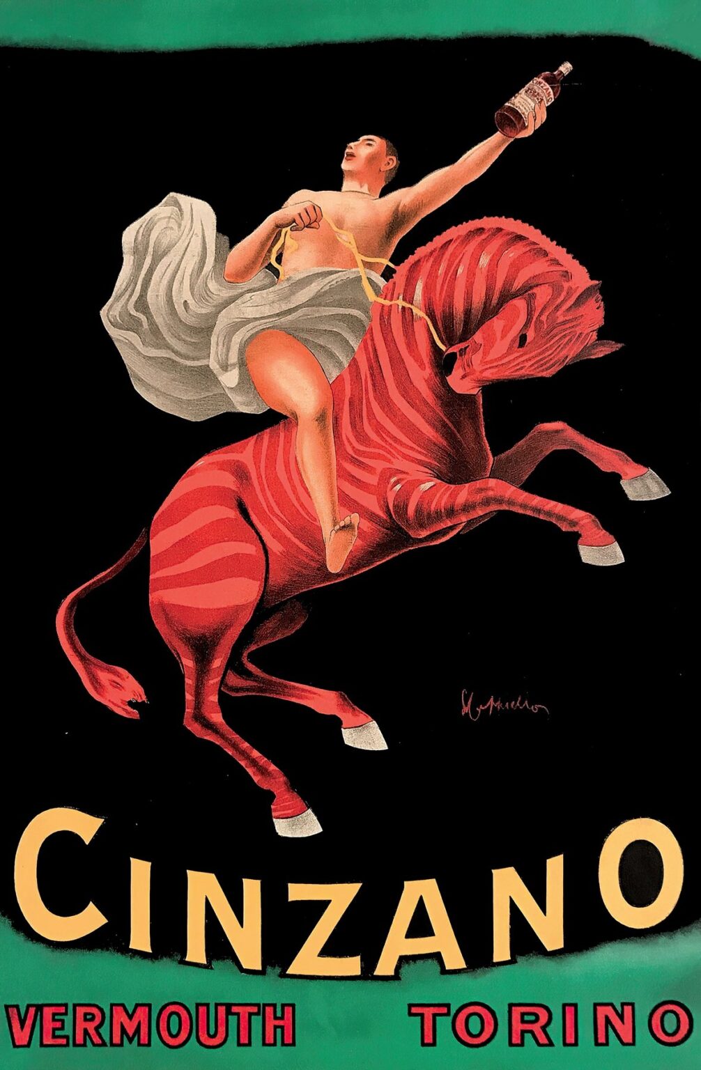
In 1910, Leonetto Cappiello created one of his most iconic posters for Cinzano Vermouth Torino. This advertisement captures the spirit of early twentieth-century graphic design: a bold, simplified composition that communicates both product identity and emotional appeal at a glance. Cappiello’s poster features a dynamic figure astride a vibrant red horse, set against a deep black field framed by bands of green. With minimal text—only the brand name “CINZANO” in mustard yellow and “VERMOUTH TORINO” in contrasting red—the design relies on its dramatic imagery to etch itself into viewers’ memories. By isolating the central motif against flat color backgrounds, Cappiello not only introduced a new visual shorthand for advertising but also elevated a simple vermouth label into a symbol of sophistication, energy, and modernity.
Historical Context of Vermouth Advertising
At the turn of the century, vermouth occupied a privileged place in European social life. Originating in Italy and France, this fortified, aromatized wine quickly became a staple of apéritifs and cocktails, enjoyed in cafés, salons, and private gatherings. Brands competed fiercely for market share, using posters to stand out on city walls and in railway stations. Before Cappiello’s intervention, many vermouth advertisements leaned on ornate typography and intricate illustrations of vineyards or parlors. Cappiello’s 1910 poster for Cinzano represented a turning point: it employed stark silhouettes, flat planes of color, and a single, unforgettable figure to convey product virtues. In doing so, it anticipated the rise of modernist design principles that would dominate visual culture in the decades to follow.
Leonetto Cappiello and the Poster Revolution
Born in 1875, Leonetto Cappiello built his reputation as the “father of modern advertising” by rejecting the elaborate, text-heavy posters of the nineteenth century in favor of a minimalist approach. His background as a painter and caricaturist allowed him to fuse artistic flair with commercial imperatives. By the early 1900s, Cappiello had developed a signature style: one bold image against a monochrome backdrop, minimal copy, and vibrant contrast. His Cinzano Vermouth Torino poster exemplifies this methodology. The design dispenses with clutter, trusting that an arresting visual will not only capture attention but also embed the brand name in the viewer’s mind. This strategy revolutionized poster art, setting a template for future generations of graphic designers and advertisers.
The Cinzano Brand and Its Legacy
Founded in Turin in 1757, the Cinzano firm had long been synonymous with high-quality vermouth. Its signature product combined locally grown wines with secret blends of botanicals, yielding a distinctive flavor profile prized across Europe. By 1910, Cinzano faced competition from emerging Italian and French brands eager to capitalize on the apéritif craze. Commissioning Cappiello represented a strategic effort to reinforce brand prestige and widen Cinzano’s appeal beyond traditional markets. The bold red horse and energetic rider embody the sensations—vitality, elegance, a touch of daring—that the company sought to associate with its vermouth. Over a century later, Cinzano remains a recognized name, its visual identity indelibly linked to Cappiello’s pioneering poster.
Composition and Spatial Dynamics
The heart of the poster resides in its dynamic diagonal composition. A nearly nude rider, draped in a flowing white cloth, leans forward as he grips stylized reins in one hand and holds aloft a bottle of Cinzano in the other. His posture suggests movement and upward momentum, mirrored by the red horse’s leaping pose. The curve of the horse’s back and the rider’s outstretched arm form a sweeping arc, drawing the viewer’s eye from the lower right corner up toward the bottle and then back down to the brand name. Negative space—a vast swath of black—surrounds the duo, amplifying their presence and ensuring that the eye never strays from the central action. Two horizontal bands of green at top and bottom serve as visual bookends, framing the composition and reinforcing the poster’s architectonic balance.
Color Palette and Emotional Resonance
Cappiello’s choice of color is at once daring and economical. The deep black field creates an almost theatrical stage, allowing the red of the horse and the yellow of the brand name to register with maximum intensity. Red, long associated with passion and vitality, energizes the scene, while the mustard yellow of the “CINZANO” lettering conveys warmth and optimism. The green bands—echoing the verdant hues of vermouth’s botanicals—provide a natural counterpoint to the composition’s more aggressive tones. This restrained palette leverages complementary contrasts to captivate the viewer, forging an immediate emotional connection that transcends linguistic or cultural barriers.
Symbolism of the Rider and the Horse
The rider on horseback is a potent symbol of mastery and exhilaration. In allegorical tradition, the horse often represents untamed energy, while the rider signifies human control and refinement. By depicting his protagonist in the act of guiding a red horse through a dramatic rearing pose, Cappiello suggests that Cinzano vermouth offers its drinker a measure of this exhilarating mastery—an elevated experience that balances wildness and sophistication. The rider’s near-nudity, modestly draped by white cloth, recalls classical imagery of heroes and gods, further associating the product with notions of timeless elegance and mythic power.
Typography and Brand Messaging
Cappiello’s typographic choices are as calibrated as his imagery. The brand name “CINZANO” spans the width of the poster in capital letters, each rendered in a bold, slightly condensed serif. The mustard yellow hue ensures instant legibility against the black background. Below, “VERMOUTH TORINO” appears in red capitals, smaller but still commanding attention, set against the lower green band. The contrast between the two type treatments establishes a clear hierarchy: the brand name first, the product category and origin second. The absence of slogans or explanatory copy reflects Cappiello’s confidence that the viewer, once drawn in by the image, will understand the poster’s message without further elaboration.
Technical Execution and Chromolithography
Produced via chromolithography by the renowned Devambez printing house in Paris, the Cinzano poster benefits from the era’s most advanced reproduction techniques. Each of the four primary colors—black, red, yellow, and green—was applied through a separate lithographic stone, demanding precise registration to align text, figure, and background seamlessly. The uniform density of the black field and the vibrancy of the red horse attest to Devambez’s mastery of ink formulation and plate preparation. Fine gradients of shading on the rider’s drapery and the horse’s musculature derive from expert use of stippling and hatching techniques, lending depth to an otherwise flat-color design.
Cultural Reception in Early 20th-Century Europe
Upon its release, the Cinzano Vermouth Torino poster quickly became a fixture of urban streetscapes in Paris, Turin, and beyond. Passersby were struck by its vivid contrasts and evocative symbolism, a welcome departure from more literal advertisements of the period. Café proprietors and wine merchants reported an increase in inquiries about Cinzano, attributing part of the brand’s post-1910 resurgence to the poster’s memorable imagery. Contemporary critics praised Cappiello for his economy of means and his ability to imbue commercial art with a sense of drama and narrative. The poster’s success reinforced the growing view that graphic design could be both an art form and a potent marketing tool.
Influence on Advertising and Design Movements
The Cinzano poster exemplifies principles that would come to define modern graphic design: the power of a single dominant image, the strategic use of color contrast, and the elimination of extraneous detail. Artists affiliated with movements such as Art Deco and Futurism found inspiration in Cappiello’s bold forms and dynamic compositions. In the decades that followed, corporations turned to similarly streamlined logos and brand marks, recognizing that a clear, visually arresting emblem could serve as the cornerstone of a global identity. Cappiello’s influence extends into contemporary branding practices, where minimalism and strong visual hierarchies remain central to effective communication.
Preservation and Modern Appreciation
Original prints of the Cinzano Vermouth Torino poster are prized by museums, collectors, and design historians worldwide. Conservation efforts focus on preserving the integrity of the black background, which can fade or yellow if exposed to improper lighting. The chromolithographic stones and archival records maintained by Devambez provide valuable insight into early twentieth-century printing methods. Retrospectives on poster art frequently include Cappiello’s work as a landmark in the transition from illustrative to modernist advertising. Contemporary designers study this poster in classrooms and studios, analyzing its composition and technique to inform their own practice.
Conclusion
Leonetto Cappiello’s 1910 poster for Cinzano Vermouth Torino remains a touchstone in the history of graphic design and advertising. Through his masterful use of bold color contrasts, minimalist typography, and a dynamic central motif, Cappiello crafted an image that transcends its commercial origins to become a work of art. The rider and his red steed leap from the black void, capturing the viewer’s imagination and promising an elevated experience—one that Cinzano vermouth continues to deliver more than a century later. As both a cultural artifact and a design exemplar, the Cinzano Vermouth Torino poster stands as a testament to the enduring power of simplicity, drama, and visual storytelling.