Image source: artvee.com
Overview of the Composition
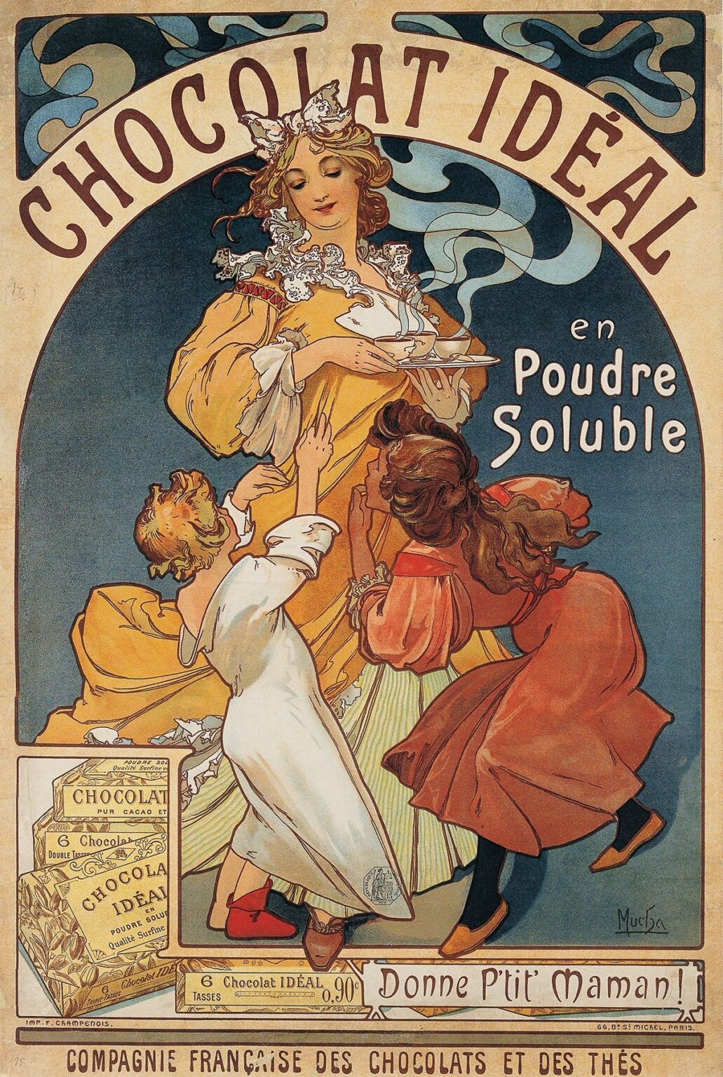
“Chocolat Idéal” (c. 1896) by Alphonse Mucha is a quintessential example of Belle Époque poster art. The vertical format features a nurturing mother figure at the center, her graceful form draped in flowing golden robes. She holds a tray bearing steaming cups of the soluble powdered chocolate product. Two eager children, one in a white nightgown and the other clad in vibrant autumnal tones, reach upward toward the offering. The composition is framed by a large, semi‑circular arch that carries the product name “CHOCOLAT IDÉAL” in bold, rounded letters. Decorative corner panels of swirling steam clouds reinforce the product’s warmth and comforting qualities.
Historical and Commercial Context
At the turn of the twentieth century, Europe was in the thrall of mass‑produced luxury goods presented as objects of refined taste. Chocolatiers and tea merchants commissioned leading artists to create lithographic posters that would stand out on crowded city walls and department store windows. The Compagnie Française des Chocolats et des Thés leveraged Mucha’s rising fame—established by his theater posters for Sarah Bernhardt—to market its new soluble chocolate powder. The phrase “Donne P’tit Maman!” at the poster’s base translates to “Give it, mommy!” signaling the product’s appeal to families and its use in domestic settings.
The Role of Alphonse Mucha in Art Nouveau
By 1896, Alphonse Mucha had emerged as the preeminent poster artist of the Art Nouveau movement. His breakthrough “Gismonda” poster the previous year had introduced his signature aesthetic: sinuous lines, idealized female figures, harmonious palettes, and integrated typography. Mucha’s workshop in Paris produced dozens of commissions for theater, perfume, and food brands, each poster reinforcing the notion that advertising could achieve both mass appeal and fine‑art status. “Chocolat Idéal” exemplifies his mature style, merging narrative warmth with decorative intricacy to create a persuasive, collectible image.
Central Figures and Gesture
At the heart of the poster is the mother figure, whose gentle smile and relaxed posture imbue the scene with a sense of domestic bliss. She tilts her head slightly downward, guiding her children’s eager reach. The children’s bodies create a dynamic diagonal, from the young girl in white on the left to the boy in russet clothing on the right. Their extended arms and uplifted faces convey anticipation and delight. Mucha renders their gestures with naturalism—soft elbows, bent knees, and open hands—enhancing the viewer’s empathy and inviting them to imagine their own family moments.
Symbolism of Motherhood and Nurture
Through these figures, Mucha taps into universal themes of care and comfort. The mother is not merely a dispenser of chocolate; she represents nurturing, warmth, and familial love. By associating the product with maternal affection, the poster positions “Chocolat Idéal” as a means of strengthening family bonds. The children’s contrasting clothing—one in white, the other in rich autumnal hues—suggests the product’s broad appeal across age and temperament. The mother’s golden robe echoes the luxury of the product while also functioning as a halo‑like emblem of care.
Decorative Arch and Typography
The semi‑circular arch that frames the upper composition carries the product name in custom lettering. Mucha’s letters feature soft curves and slight tapering, harmonizing with the gently curling steam motifs in the corner panels. Each letter’s outline is meticulously balanced against the arch’s negative space, ensuring legibility from a distance. Beneath and alongside the main title, the words “en Poudre Soluble” clarify the product’s form. Mucha integrates text organically, treating typography as visual ornament rather than mere information.
Steam and Sensory Allusion
Mucha’s inclusion of stylized steam clouds, rendered in undulating ribbons of pale blue and ivory, serves as more than decoration. The steam motif visually bridges the mother’s golden robes and the sky background, creating a unifying rhythm. It evokes tactile sensations of warmth, softness, and aroma. This sensory suggestion heightens viewer desire, promising a comforting, enveloping experience with each cup of soluble chocolate. The repetition of these cloud motifs in the corners frames the central scene and reinforces the product’s signature attribute: its instantly warming steam.
Color Palette and Emotional Tone
“Chocolat Idéal” employs a restrained, harmonious palette. Warm ochres and golds in the mother’s garment and the chocolate boxes at lower left evoke richness and luxury. Cooler greens and soft blues in the background and children’s attire provide contrast, ensuring the golden tones stand out. Accents of red in the children’s shoes and the duo of cocoa boxes add visual pop and direct attention to key details. Mucha’s skillful layering of translucent inks in the lithographic process creates luminous tiles of color, lending the poster a jewel‑like quality that attracts the eye.
Lower‑Left Product Display
In the lower‑left corner, Mucha includes a device frequently found in his commercial posters: a vignette of the actual product packaging. Here, neatly stacked boxes of “Chocolat Idéal” reinforce brand recognition and provide essential purchase information. The boxes are illustrated with fine detailing—ornamental borders and stylized cacao pods—evoking quality craftsmanship. By coupling the idealized narrative scene with realistic product images, Mucha ensures viewers remember both the emotional appeal and the practical details needed to buy the soluble chocolate.
Bottom Band and Call‑To‑Action
The poster’s base contains the final call to action and corporate attribution. A slender scroll bears the slogan “Donne P’tit Maman !” in an informal, hand‑lettered script that echoes everyday speech. This colloquial phrase serves as a mnemonic, encouraging children to ask their mothers for “Chocolat Idéal.” Beneath that, the full corporate name—“Compagnie Française des Chocolats et des Thés”—is set in a dignified serif typeface, lending institutional gravitas. By combining playful slogan, familial cue, and corporate credit, Mucha crafts a multi‑layered message that resonates emotionally and logically.
Line, Form, and Visual Rhythm
Line is a fundamental element of Mucha’s design. He employs varying line weights to define volumes and guide the eye: strong, unbroken contours outline the figures, while finer interior lines model facial features, drapery folds, and decorative details. The composition’s forms—arching steam lines, flowing garments, semi‑circular frame—create a rhythmic interplay of curves. Vertical elements—the fountain‑like steam rise and the edges of the product boxes—provide balance. This dance of line and form generates a harmonious visual flow, leading viewers from top to bottom and back again.
Use of Light and Shadow
Although lithographic posters are essentially flat, Mucha suggests three‑dimensional form through subtle tonal modulation. The mother’s robes receive soft gradations of ochre that imply folds and volume. The children’s limbs and faces are modeled with gentle shading to indicate roundness. The boxes in the lower corner employ halftone stippling to suggest texture and depth. Clouds and background sky maintain flat expanses of color, intentionally receding to make the figures and product pop. This strategic use of light and shadow enriches the sensory presence of the scene without disrupting the poster’s graphic clarity.
Decorative Motifs and Ornament
Mucha’s ornamentation extends beyond steam clouds. Intricate lace‑like patterns adorn the mother’s neckline and the girl’s chemise hem, reflecting the precision and refinement behind both the product and its packaging. The children’s garments feature tiny floral motifs that echo the cocoa pods and blossoms on the boxes below. Even the edges of the scroll at the bottom display curling filigree. These decorative flourishes exemplify Mucha’s belief in “complete decoration,” where every detail, however small, contributes to the poster’s cohesive aesthetic.
Emotional Resonance and Audience Engagement
The true power of “Chocolat Idéal” lies in its emotional resonance. Viewers see not just a chocolate advertisement but a tender family moment. The children’s expectant posture and the mother’s gentle offering evoke nostalgia for childhood and the warmth of home. Mucha’s design invites viewers into this intimate tableau, promising that the product will deliver more than taste—it will deliver shared pleasure and comfort. This emotional engagement ensures that the advertisement resonates beyond initial viewing, influencing purchase decisions through personal association.
Placement and Public Reception
Posters in the Belle Époque were plastered on kiosks, shop windows, and railway stations, bringing art to the masses. “Chocolat Idéal” would have appeared alongside other Mucha posters by his contemporaries, creating a vibrant outdoor gallery. Viewers strolling the boulevards or waiting for trains would encounter these images repeatedly, reinforcing brand recognition. Contemporary press accounts praised Mucha’s work for transforming commercial messaging into cultural events. The success of “Chocolat Idéal” contributed to rising sales of soluble chocolate powder, proving the poster’s efficacy as both advertisement and work of art.
Influence on Packaging and Brand Identity
Beyond its initial poster run, Mucha’s design influenced the packaging and corporate identity of the Compagnie Française des Chocolats et des Thés. Elements such as the steam motif, the mother and children scene, and the custom typeface were adapted to tin boxes, product leaflets, and other advertising ephemera. This consistency across media reinforced brand cohesion, establishing “Chocolat Idéal” as synonymous with both quality and artistry. Mucha’s pioneering approach laid the groundwork for modern integrated marketing communications, demonstrating the long‑term value of high‑quality design in branding.
Technical Mastery of Lithography
The production of “Chocolat Idéal” required close collaboration between Mucha and the printers at F. Champenois in Paris. Early color lithography was a complex, multi‑step process: each color demanded its own limestone or metal plate, precise registration marks, and careful inking to ensure vibrant, clean printing. Mucha’s intricate line work and subtle color gradations tested the limits of the medium. His success in achieving painterly effects alongside crisp outlines showcased both his artistic skill and the technical prowess of his printers, making the poster a benchmark in lithographic excellence.
Reception in Design Circles
Design journals and critics of the era hailed Mucha’s commercial work as a fusion of art and industry. “[Mucha’s] posters,” one contemporary writer observed, “shine like stained glass on city walls, elevating shop windows into palaces of beauty.” “Chocolat Idéal” was frequently cited in lectures and design manuals as an exemplar of effective, elegant advertising. Its blend of narrative warmth, decorative sophistication, and corporate messaging became a case study for art schools teaching applied design. The poster’s influence extended into early twentieth‑century American graphic arts, where emulation of Mucha’s style—often termed “Le Style Mucha”—became widespread.
Legacy and Collectibility
Original prints of “Chocolat Idéal” are highly sought by collectors of Belle Époque graphics. Their rarity, combined with the fragility of early lithographic papers and inks, means that well‑preserved examples command high prices at auction. Museums of design and poster art include this work in permanent collections, ensuring that future generations can study Mucha’s techniques firsthand. Its continued reproduction in books, exhibitions, and digital archives testifies to its lasting appeal. The poster’s ability to convey universal emotions through the lens of commercial art secures its place in design history.
Conclusion
“Chocolat Idéal” by Alphonse Mucha embodies the golden age of Art Nouveau poster design. Through harmonious composition, evocative color, and integrated ornament, Mucha elevates a soluble chocolate powder advertisement into a timeless tableau of familial love and sensory delight. The nurturing mother, the eager children, and the curling steam invite viewers into a scene of intimate domestic pleasure, while the custom typography and decorative motifs reinforce brand identity. Over a century later, this poster continues to enchant and persuade, demonstrating the enduring power of artful advertising to move both heart and mind.