Image source: wikiart.org
Introduction
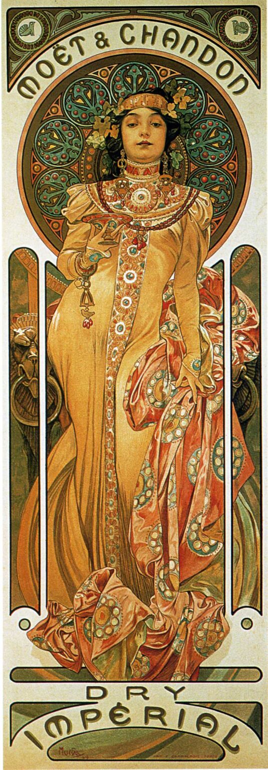
Alphonse Mucha’s “Chandon Cremant Imperial” (1899) transforms a champagne advertisement into an icon of luxury. The composition is a tall, temple-like panel in which a regal woman advances toward the viewer, raising a slender glass as if presiding over a ceremonial toast. Everything around her—halo, robe, jewelry, and letterforms—glows with the soft warmth of gold, amber, and rose. Instead of simply showing a bottle, Mucha constructs a world where effervescence becomes ornament, taste becomes pattern, and brand identity becomes myth. The poster announces Moët & Chandon’s prestige not by telling us so, but by making us feel it.
The Commission and the Culture of Display
By the late 1890s Mucha was Paris’s most celebrated lithographic poet of modern consumer culture. His collaborations with luxury houses demonstrated how advertising could marry fine art with commerce. Champagne, the drink of fêtes and courts, demanded an image that was both public and intimate—public enough to command a boulevard, intimate enough to whisper of refinement. “Chandon Cremant Imperial” meets that brief by presenting a personification rather than a product shot. The brand becomes a character: gracious, composed, sumptuous, and unmistakably cosmopolitan.
A Vertical Stage for a Ritual
The poster’s proportions are intensely vertical, like a door into a gilded chapel. At the top a great arch encloses a circular medallion; below, the figure fills a soaring niche defined by slender columns of negative space. The bottom reserve carries the inscription “Dry Impérial,” whose curved baseline echoes the arch above, completing an architectural frame. This arrangement makes the scene read like a rite. The woman steps forward from a sanctuary of pattern and light, bringing the glass to the very edge of the viewer’s world. Advertising becomes liturgy.
The Personification of Luxury
Mucha’s heroine is no mere hostess. She holds her pose with the authority of a sovereign while retaining the softness of a welcome. Her expression is calm and slightly remote, a choice that shifts the tone from flirtation to ceremony. The hand with the shallow glass is steady; the other gathers the robe’s patterned scarf with practiced elegance. She is the distilled character of the brand—composed, generous, and timeless—conveyed entirely through stance, drapery, and gaze.
Halo, Roundels, and the Metaphor of Effervescence
Behind the figure radiates a circular halo crowded with rosettes and beaded rings. These forms are not decorative excess; they translate champagne’s signature quality—sparkle—into a visual system. Each roundel reads as a bubble held in time; each bead is a point of light. The halo’s layered discs deepen toward teal and bottle green, recalling the color of glass and cool cellars. The circle crowns the figure like a diadem and functions as a giant aureole of effervescence, transforming taste into iconography.
Costume as Architecture
The gown is built from long, weighty falls of ochre silk that behave like columns. A vertical band of jeweled ornament descends from the collar to the hem, acting as a structural pilaster that anchors the entire composition. Over the dress, the patterned scarf in coral and jade tones billows and turns, introducing movement and a secondary melody of circles that rhyme with the halo’s roundels. Mucha’s line declares every fold with the certainty of an engraver; yet the surfaces breathe thanks to transparent color that allows the paper’s warmth to glow through.
Color and the Atmosphere of Taste
The palette is disciplined and delicious. Honey, apricot, and champagne-gold dominate, set against mineral greens and cool grays that prevent the composition from becoming sugary. The color decisions mirror the product’s sensory experience: warmth on the palate, freshness on the finish. In this way the poster operates synesthetically; it lets the eye drink what the mouth will later confirm. Highlights are often simply the untreated paper, which reads as the brightest and most elegant light available to a lithograph.
Jewelry, Grapes, and Quiet Heraldry
Look closely and the jewelry repeats viticulture’s vocabulary with grace. Pendants suggest grape clusters; settings imitate grape leaves; circular stones echo the foam of a freshly poured glass. Even the filigree around the halo bears a botanical cadence, a hint of vines trained on trellises. Rather than plastering the sheet with emblems, Mucha allows the language of grapes to hide in plain sight, discovered by viewers who choose to linger—an apt reward for a drink associated with leisure.
The Gesture of the Toast
The central action is small and decisive: a raised glass held not high above the head, but at the level of the collarbone, close to the body. The gesture reads as intimate and exacting, the toast of a connoisseur rather than a reveler. It says, “I honor you,” and by extension honors the passerby. The brand’s hospitality is not a roar but an invitation to belong to a company of good taste.
Typography as Ornament and Voice
At the top, “Moët & Chandon” curves within the arch, the letters broad and dignified, their rhythm matching the halo’s roundels. At the bottom, “Dry Impérial” unfurls across a bow-shaped cartouche. Mucha’s letterforms are not add-ons; they are integral architecture, chosen for legibility at street scale and for grace at reading distance. Their pale interior and dark outline echo the figure’s treatment, ensuring harmony between language and image. Type speaks in the same voice as drapery and jewelry.
Composition That Guides the Eye
The viewer’s path through the poster is choreographed with musical certainty. From afar the pale oval of the face and the round halo seize attention. As one approaches, the cascade of scarf and vertical jeweled band lead the eye down through the body, while the slender white “columns” of the niche frame and quicken the descent. At the base, the inscription catches and returns the gaze upward along the other side of the robe, back to the glass, and finally to the calm face at center. This loop can repeat without fatigue, the very cycle of glancing that street posters require.
The Influence of Byzantine and Moorish Splendor
Mucha often folded Eastern and medieval motifs into his Art Nouveau grammar. Here the dense, mosaic-like halo and lacy filigree suggest Byzantine opulence; the geometric richness of the ornamental band recalls Moorish tile and Viennese Secession geometry. These references never become literal citations. Rather, they lend the brand a cosmopolitan aura, the sense that Moët & Chandon belongs to a long lineage of courts, palaces, and festivals.
Lithographic Craft and the Glow of Paper
The poster’s tactile richness arises from lithography’s ability to layer transparent inks. A warm keyline defines contours but rarely pounds them; color stones deposit thin veils of hue that leave the paper luminous. The result is a surface that seems to emit light rather than reflect it—ideal for interiors and shopfronts where actual illumination varies. Texture within the halo and drapery comes from crayon on stone, preserving the lively hand of the artist within an otherwise polished design.
Comparisons Within Mucha’s Beverage Portfolio
Compared with Mucha’s earlier beer and liqueur posters—where bacchic swirl and flirtation sometimes take center stage—“Chandon Cremant Imperial” is statelier. The figure is frontal, nearly symmetrical, and hieratic. The palette is more restrained, the typography more monumental. Even the glass is modest in size, emphasizing refinement over excess. This tempering makes sense for champagne, which sells ceremony as much as flavor; the poster’s tone is celebration with decorum.
Gender, Power, and the Marketing of Pleasure
Mucha’s women are often described as muses, but here the figure is decidedly sovereign. Power resides not only in her finery but in her composure. She models a mode of enjoyment that is self-possessed and adult. For a product historically associated with aristocratic rituals and civic fêtes, such authority matters. The poster offers a script to its viewers: to drink champagne is to join a world where pleasure is disciplined, elegant, and confidently public.
The Brand Without the Bottle
One of the design’s masterstrokes is its refusal to rely on a bottle portrait. The wordmark and the mood do the branding. By abstracting the product into symbol, Mucha gives the client something stronger than depiction: recognition through atmosphere. Anyone who has tasted champagne can sense it here; anyone who has not can imagine the experience as belonging to this world of light and textile and tone. The poster thus increases desire not by showing the object, but by staging its meaning.
Ornament as Structure, Not Frill
Although the poster is sumptuous, it never feels overloaded. Every motif carries compositional weight. The halo locks the head in place and balances the vertical thrust. The jeweled band anchors the central axis. The scarf’s curls break the rigidity of the column and move the eye across the width of the sheet. The narrow white openings along the sides keep the figure from suffocating and lend the whole a crisp architectural clarity. Beauty is not pasted on; it is load-bearing.
Lessons for Contemporary Branding
More than a century later, the image still teaches. It shows how a brand can become a character, how typography can speak in the same tone as imagery, how limited color can project richness, and how abstract metaphors—bubbles as roundels, taste as palette—can outperform literal product renderings. In an era saturated with photographs, Mucha’s approach feels astonishingly modern: invent a world so coherent that the viewer wants to step inside it and will remember the name that marks its gate.
Enduring Appeal and Afterlife
“Chandon Cremant Imperial” continues to circulate in reproductions because it achieves a rare balance between the decorative and the monumental. It graces dining rooms, restaurants, hotels, and print collections not as dated ephemera but as an evergreen emblem of celebration. Its woman still raises her glass with the same serenity; its halo still breathes cool cellar air; its surface still glows like a candle through crystal. The poster is proof that the highest form of advertising is not persuasion but enchantment.
Conclusion
Alphonse Mucha’s poster for Moët & Chandon’s Crémant Impérial distills the experience of champagne into line, color, and gesture. A sovereign figure steps forward from a sanctuary of circles and silk; a modest toast becomes a coronation of taste; letters arch like a proscenium while patterns sparkle like bubbles. More than an advertisement, the sheet is a hymn to refinement, image-making at its most persuasive. To see it is to hear a cork’s soft sigh and to feel the first bright touch of effervescence on the tongue.