Image source: wikiart.org
Introduction
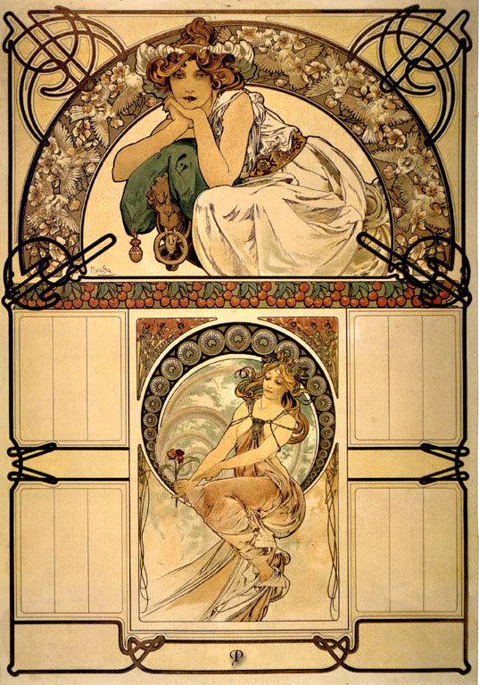
Alphonse Mucha’s “Calendar of Cherry Blossom” (1898) is a radiant demonstration of how the artist could fuse practical design with visionary ornament. Conceived as a wall calendar plate, the sheet orchestrates two allegorical figures within an elegant architecture of arcs, roundels, and ornamental bands. Between these images, Mucha reserves spacious compartments that were intended to receive the printed months and days, yet the composition is so complete that even empty, it reads like a finished work of art. Cherries and blossoms wind through the design as emblems of abundance and renewal, while the flowing “whiplash” line and warm palette give the entire page the soft glow of an interior fresco.
A Calendar that Behaves Like a Jewel
Mucha and his Paris printer F. Champenois perfected a genre that turned everyday ephemera—menus, theater posters, almanacs, and calendars—into collectible artworks. This calendar plate is organized like a precious object. A broad, semicircular lunette crowns the sheet; beneath it, a smaller, framed medallion anchors the center. Four rectangular fields flank the medallion for monthly notations, and a larger panel spans the bottom for the year, notes, or an advertiser’s imprint. The ornamental frame is not mere trim. Its loops and interlaced knots act like a mount for a gemstone, holding the imagery in place and giving the page the tactile presence of wrought iron and filigree.
Two Allegories of Blossom and Time
The upper lunette presents a crouching young woman in classical drapery, her head encircled by a floral wreath. She leans forward, chin on hand, as if contemplating the months to come. The pose is intimate and introspective, a pause before the year begins. The lower medallion turns contemplation into bloom: a second figure—lighter, more airborne—holds a single pink flower between her fingers, her body twisting in a buoyant S-curve. The pairing sets up a rhythm between stillness and motion, potential and unfolding. In a calendar, such pairing is more than decorative. It symbolically brackets the year with mood and gesture, reminding the viewer that time contains both waiting and flowering.
Cherry Iconography and Seasonal Promise
Across the horizontal band that separates the two figures, Mucha strings a garland of cherries and leaves. Their rounded forms echo the curls in hair and scrollwork in the borders, but they also carry clear seasonal meaning. Blossoms promise fruit; fruit implies fulfillment and harvest. By placing cherries between the meditative lunette and the lyrical medallion, Mucha makes the garland a hinge: the year will swing from thought to ripeness, from the quiet of early spring to the richness of summer. The single flower in the lower figure’s hand both answers and anticipates the garland—one blossom against the many fruits—holding the balance between the fleeting and the abundant.
The Architecture of Circles
Mucha’s calendars are lessons in circular architecture. The upper half-circle encloses the reflective figure within a leafy canopy, while the lower circle is ringed with a procession of roundels that resemble carved bosses or ammonite shells. These rings do more than decorate; they measure. The regular repetition suggests the march of days, a visual calendar within the calendar. In the lower medallion, the ring’s patterned weight counterbalances the figure’s airy drapery, keeping the composition grounded while allowing the body to float. In the upper lunette, the curve of the arch echoes the huddled posture and wraps the figure in a sense of shelter.
Line that Conducts the Eye
The sheet is a choreography of line. Mucha’s black keyline traces hair, drapery, and ornament with a consistent pressure that swells and thins like musical phrasing. In the upper scene, the drapery’s long contour descends in a single sweep from shoulder to heel, turning and pooling into a series of folds that rest on the arch’s chord. In the lower medallion, ribbons of cloth spiral around the figure’s legs and trail into the surrounding frame, creating bridges between figure and architecture. The interlaced knots at the corners echo these curves in a more geometric key, ensuring that even the purely ornamental parts of the page participate in the same visual rhythm.
Color as a Climate for the Year
The palette is built from warm creams, olive greens, terracotta reds, and soft grays, with cherries providing concentrated accents of crimson. Mucha avoids icy whites and deep blues, favoring instead the tones of parchment, fruit skin, and aged plaster—colors that are kind to interiors and that allow the page to glow under ambient light. Skin is treated with apricot warmth; garments pick up pale, cool shadows that keep them distinct from the background without disturbing the prevailing harmony. Cherries repeat the deepest note across the sheet so the eye never loses the thread of the theme while moving among the compartments.
The Empty Fields and the Logic of Function
Four rectangular boxes flank the central medallion, and a broader rectangle occupies the base. In finished editions, these panels often received months, saints’ days, and lunar phases; in other impressions they remained blank so that retailers could overprint their own almanac data. Mucha designs for both fates. The boxes are proportioned and bordered so that, even empty, they contribute to the geometry of the page, acting as resting places for the eye and calming the exuberance of the figurative zones. Their spacing respects the reader’s practical need to write notations while preserving the overall poetry of the composition.
Japonisme and the Idea of Blossom
Cherry blossom carries an unmistakable echo of Japanese culture, and Mucha’s generation was steeped in Japonisme. While his treatment of the flower remains European in botany and modeling, the flattened, patterned approach—the garland as band, the roundels as repetitive modules, the swirling background behind the lower figure—owes much to Japanese woodblock prints. The concept of mono no aware, the poignant awareness of transience often associated with cherry bloom, is distilled here into the single blossom lifted by the seated nymph. A calendar is the ideal vehicle for this sensibility: it tracks passing days while celebrating their beauty.
Gesture, Gaze, and the Tone of Address
Mucha’s women do not shout for attention; they confer attention. The upper figure’s gaze is slightly downward and inward, drawing viewers into quietude. The lower figure’s eyes are half-closed, her smile small and private, as if listening to the year’s first breeze. Both gestures make the calendar a contemplative object rather than a commercial shout. It is designed to live with the viewer for twelve months, so its tone is one of sustained companionship. The softness of address also amplifies the theme of blossom: what opens in spring does so without clamor.
Drapery as Time Made Visible
Drapery in Mucha’s hands is not only clothing; it is a visual language for passage and pause. In the upper image, heavier folds pool and sit, matching the figure’s compressed pose and the incubation of early spring. In the lower image, fabric elongates and lifts; points of cloth trail like banners and catch circular currents within the medallion. If you follow the edge of a fold, you experience the difference between waiting and moving, between bud and bloom. This is not narrative illustration; it is abstract time expressed through texture and line.
Ornament that Thinks
The page is busy with motifs—knotwork, roundels, fruit bands, leaf clusters—but none of them is gratuitous. The knotwork near the corners stabilizes the outer frame and mirrors the intertwined logic of a calendar grid. The roundels form a visual abacus around the lower figure. The fruit band measures the threshold between the two halves of the sheet and clarifies hierarchy: the lunette is “above,” the medallion “below,” but the cherries bind them. Even the tiny bell-like pendant under the upper figure’s knee acts as punctuation, a momentary stop at the end of a visual sentence before the eye continues.
Lithographic Craft and the Glow of Paper
Mucha designs for color lithography with remarkable economy. The black keyline holds forms together; transparent inks create painterly passages without heaviness; highlights—on cheeks, flowers, and drapery—are often the paper left bare. That choice allows light to emanate from within the sheet, a quality that gives the calendar a placid luminosity throughout a day. Registration tolerances are handled cleverly: flat color areas in garments and borders forgive slight shifts, while the most delicate passages occur where stones align consistently—around faces and hands. The result is a print that could be produced in quantity without losing the intimacy of an original drawing.
The Calendar as a Roommate
Mucha understood that a calendar is not just consulted but lived with. The open spaces invite handwriting; the imagery offers intervals of rest; the overall balance prevents fatigue. In a café, a studio, or a bourgeois salon, the “Calendar of Cherry Blossom” would have supplied a continuous atmosphere of mild anticipation. Even when months were overprinted, the cherries and blossoms never surrendered their primacy; they made the practical grid feel celebratory. This is the ethics of Mucha’s decorative art: utility ennobled by grace.
The Viewer’s Journey Across the Page
Most observers will enter at the gaze of the upper figure and follow her bent arm to the cherries band. The eye then drops into the central medallion, circles the procession of roundels, catches the flower between the nymph’s fingers, and descends to the blank bottom panel where the year would be read. From there, the border’s looping corners pull attention back up the sides to the four empty compartments, which are scanned in turn before the eye returns to the top. The motion is cyclical, like months repeating. Mucha’s geometry ensures that the viewer’s tour of the page reenacts the calendar’s very purpose.
Cherry Blossom as a Philosophy of Design
Blossoms open briefly and fully; Mucha’s design does the same. Every part of the sheet opens to view without obstruction or muddle. The architecture is clear, the figures legible, the ornament coherent. There is a generosity in the way forms unfurl—hair into scrolls, leaves into patterns, fabric into arcs—that mirrors the botanical subject. The calendar thus becomes a statement of design philosophy: clarity that carries delight, organization that welcomes life.
Dialogue with Mucha’s Broader Calendar Series
Compared with other Mucha almanacs, this sheet is unusually serene. Some calendars lean toward zodiac symbolism or allegorical pageantry; “Calendar of Cherry Blossom” prefers intimacy. The upper figure crouches rather than poses; the lower figure sits rather than strides. The motifs are botanical rather than astrological. Yet the signature elements—the halo-like ring, the black keyline, the integrated compartments—keep it firmly within Mucha’s recognizable system. It is both distinct and of a piece, which is why the plate worked so well in a series while standing alone as a self-sufficient image.
Enduring Appeal and Contemporary Relevance
The image remains resonant because it solves problems that designers still face. It balances information with emotion, structure with ornament, and long-term legibility with daily pleasure. Even in purely digital contexts, the lesson holds: the eye wants places to rest, patterns to trust, and a clear hierarchy that never feels tyrannical. The cherries still read instantly; the figures’ calm still persuades; the compartments still promise order. The calendar has outlived its months by embodying the perennial wish that time might be organized beautifully.
Conclusion
“Calendar of Cherry Blossom” is a quietly spectacular page. A contemplative muse above, a blossoming nymph below, cherries binding them in a garland of promise, and a measured architecture of circles and rectangles ready to welcome the year’s notations—Mucha gathers all of this into a sheet that dignifies the ordinary work of keeping time. It is as usable as it is lyrical, as harmonious as it is practical. The poster demonstrates why Mucha’s decorative art has never faded from favor: it gives daily life a face, and the face is one we are glad to see every day.