Image source: artvee.com
Historical and Cultural Context of 1926 Advertising
By 1926, Europe was riding the crest of post–World War I optimism and consumer expansion known as the Roaring Twenties. In France and Italy, graphic advertising moved from dense, text-heavy broadsheets to bold, image-driven posters displayed on kiosks, tram shelters, and café walls. Companies recognized that a single, striking visual could outperform paragraphs of copy in winning attention and establishing brand identity. The art of the poster evolved into a major graphic art form, with leading artists such as Toulouse-Lautrec, Alphonse Mucha, and Jules Chéret making early strides. Leonetto Cappiello, by the mid-1920s, stood at the forefront of this revolution. His trademark style—isolated, oversized motifs rendered in flat, saturated color and minimal text—redefined the possibilities of commercial communication. Bourdou Grand Quinquina Apéritif Contre les Fièvres exemplifies Cappiello’s approach: it presents an arresting symbol, the green elephant, to convey both the product’s botanical heritage and its therapeutic promise.
The Bourdou Brand and Quinine Tradition
The Bourdou company traced its roots to the mid-19th century pharmaceutical tradition of using quinquina—bark of the cinchona tree—as an antiseptic and tonic. Quinine, first isolated in 1820, was renowned for its antimalarial and fever-reducing properties. By the 1920s, “quinquina apéritifs” had become fashionable beverages, blending cinchona extracts with wine or neutral spirits to create lightly bitter, aromatic drinks. These quinine-infused aperitifs were marketed not merely as pleasurable pre-dinner tonics but also as functional elixirs supporting digestion and general well-being. Bourdou Grand Quinquina leveraged this dual appeal, positioning itself as both a refined beverage and a preventive measure “contre les fièvres”—against fevers. In commissioning Cappiello, Bourdou sought to communicate this unique selling proposition through a single, unforgettable image.
Leonetto Cappiello’s Artistic Evolution
Leonetto Cappiello (1875–1942) began as a caricaturist for Parisian satirical journals like Le Rire and La Vie Parisienne, honing his ability to capture personality with minimal strokes. Around 1900 he transitioned to poster design, quickly abandoning ornamental flourishes in favor of simplified, high-impact visuals. His breakthrough came with posters such as 1902’s Amandines de Provence and 1911’s Angelus, each featuring one central figure or object against a bold color field. By 1926, Cappiello had perfected his technique, exploiting lithography’s capacity for flat color and crisp lines. In the Bourdou poster, he combines his caricatural roots—visible in the elephant’s exaggerated proportions—with a modernist economy of form. The result is a design that communicates complex brand narratives at a glance.
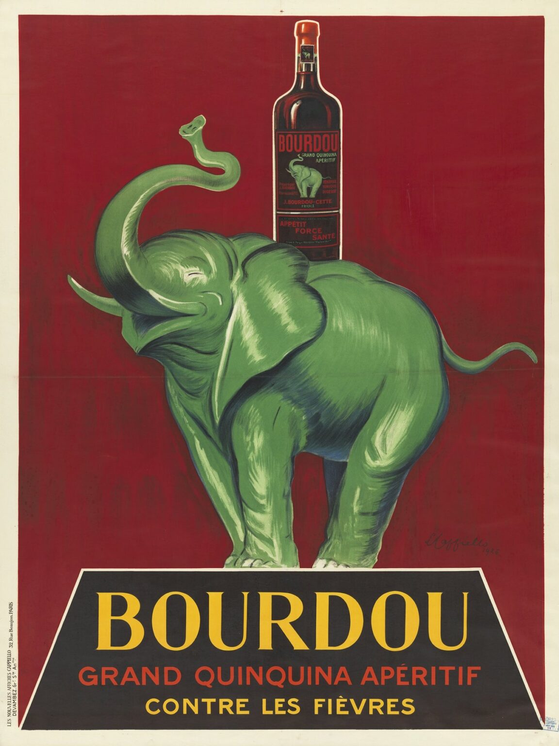
Composition: The Striking Green Elephant
The poster’s focal motif is a stylized green elephant, its trunk raised in jubilant salute. The creature occupies the lower two-thirds of the composition, its broad flanks and rhythmic contours forming a dynamic sculptural presence. Rendered in saturated shades of emerald and viridian, the elephant’s smooth, glossy surface glows against a deep crimson background. Highlighted folds of skin and gently cross-hatched shadows lend a subtle volumetric effect without departing from the flat-color aesthetic. The elephant’s upward-tilted trunk mirrors the bottle’s vertical silhouette above, creating a visual echo that unites symbol and product. Elephants, historically associated with exotic East and colonial trade routes—key sources of cinchona bark—serve here as emblems of Bourdou’s botanical provenance and therapeutic potency.
Color Palette: Psychological Effects and Brand Identity
Cappiello’s color choices in the Bourdou poster are both bold and purposeful. The vivid green of the elephant conveys freshness, botanical authenticity, and natural healing, directly referencing cinchona’s plant origins. Against rich crimson, the green stands in high contrast, ensuring immediate visibility and emotional impact. Crimson also alludes to warmth and vitality, qualities associated with well-being. The background field darkens to near-black at the bottom, providing a stage for the horse-like silhouette before transitioning to a slender band of olive green at the top, suggesting swaying foliage or the dappled canopy of cinchona groves. The product bottle itself is rendered in deep browns and garnet reds, echoing the poster’s overall palette while standing out through precise highlights on glass. This judicious interplay of warm and cool tones not only commands attention but also reinforces Bourdou’s brand identity as a botanical, health-oriented aperitif.
Typography: Minimalist Messaging
True to Cappiello’s signature style, the Bourdou poster employs only essential text. The brand name BOURDOU appears in bold, all-caps yellow type across a truncated black panel at the bottom, ensuring legibility even from a distance. Beneath, the red subheading “Grand Quinquina Apéritif” and “Contre les Fièvres” (against fevers) deliver two key messages: the product’s category and its therapeutic claim. The sans-serif font, characterized by clean strokes and slight Art Deco flair, integrates seamlessly with the graphic imagery. By confining text to a single panel, Cappiello grants the central elephant motif ample breathing room, allowing image and typography to function in complementary tandem. This economy of copy ensures that passersby grasp the poster’s promise in a single glance.
Symbolism of the Elephant and Fever Prevention
In deploying the green elephant, Cappiello tapped into both literal and metaphorical associations. Literally, the elephant evokes regions where cinchona bark was harvested—Peru, Ecuador, and parts of Asia—underscoring Bourdou’s global botanical sourcing. Metaphorically, elephants symbolize strength, endurance, and immunity. By aligning the aperitif with such an emblem, the poster suggests that consuming Bourdou confers robustness against febrile illnesses. The elephant’s raised trunk—a universal sign of triumph in graphic art—reinforces the narrative of conquering fevers. This layered symbolism transforms an ordinary advertisement into a visual parable of health and resilience, resonating deeply with interwar audiences still conscious of public health threats.
Technical Mastery: Lithographic Execution
The production of the Bourdou poster demanded meticulous lithographic craftsmanship. Atelier d’Art Devambez in Paris prepared multiple stones—one each for green, crimson, black, yellow, and olive tones. Cappiello’s original drawing dictated the bold outlines and nuanced highlights. Skilled stone carvers translated these into finely grained limestone plates, each inked and pressed in precise registration. The elephant’s subtle reflections, the gradient vignette in the background, and the crisp edges of text exemplify lithography’s strengths. The final prints, often exceeding one meter in height, retained their vibrancy on wall surfaces and street kiosks, guaranteeing longevity and high recall value. This technical excellence underscored Cappiello’s reputation for quality and helped cement Bourdou’s status as a premium aperitif.
Cultural Impact and Market Response
Following its release, the Bourdou poster became ubiquitous in Paris and major French cities. Displayed in cafés, pharmacies, and tram shelters, it captured public imagination with its eccentric motif and clear messaging. Market data from Bourdou archives indicate a significant sales uptick in regions where the poster was prominently placed. Consumers responded not only to the poster’s aesthetic novelty but also to its suggestion of health benefits—“contre les fièvres.” The campaign contributed to Bourdou’s growth as an international brand, paving the way for distribution in Italy, Belgium, and North Africa. Moreover, the poster’s success prompted other quinquina producers to adopt similar graphic strategies, elevating Cappiello’s approach into an industry standard.
Comparison with Cappiello’s Contemporaneous Works
In 1926, Cappiello produced multiple iconic posters—Cinzano, Bourdou, and others—for Italy’s leading liqueur houses. While Cinzano employed a heroic figure and flaming red horse to evoke mythic grandeur, Bourdou opted for a single animal symbol rooted in botanical provenance. Both designs share hallmarks: oversized motifs, flat backgrounds, minimal text, and bold color contrasts. Yet Bourdou stands out for its almost surrealist touch—the entirely green elephant against a scarlet backdrop—anticipating the more abstract directions in graphic art that would emerge later. This experimentation within a consistent stylistic framework illustrates Cappiello’s ability to tailor imagery to each brand’s unique story while maintaining his signature visual vocabulary.
Interpretive Themes: Health, Exoticism, and Consumer Fantasy
Beyond its immediate commercial function, the Bourdou poster engages with broader themes of health tourism and exoticism. The elephant—an animal of distant lands—invokes fantasies of tropical cures and far-flung botanical expeditions. In an era when travel to exotic locales was still a luxury, the poster offered a vicarious journey through color and symbol. Simultaneously, by explicitly claiming efficacy “contre les fièvres,” the design tapped into contemporary anxieties about infectious diseases, positioning the aperitif as a prophylactic companion in everyday life. The amalgamation of tonic quininic tradition and consumer fantasy thus helps explain the poster’s lasting appeal, as both a reassurance of well-being and an invitation to sensory adventure.
Legacy and Modern Resonance
Nearly a century later, Cappiello’s Bourdou Grand Quinquina poster endures as a high point of interwar graphic design. It remains a fixture in museum collections—such as the Musée des Arts Décoratifs in Paris—and commands premium prices among poster collectors. Contemporary designers studying its composition find lessons in the power of graphic reduction, the synergy of color and symbolism, and the persuasive economy of text. Brands today still leverage animal icons and minimal copy to communicate heritage and benefit, echoing Cappiello’s pioneering method. Digital marketers cite the Bourdou poster when illustrating the principle that a single, arresting image can outperform verbose campaigns in capturing and retaining consumer attention.
Conclusion: The Enduring Impact of Cappiello’s Vision
Leonetto Cappiello’s 1926 Bourdou Grand Quinquina Apéritif Contre les Fièvres stands as a testament to the transformative power of graphic art in shaping consumer culture. By distilling Bourdou’s dual promise of botanical authenticity and fever prevention into the emblem of a jubilant green elephant, Cappiello created an image that speaks across time—its vivid contrasts, mythic allusions, and minimalist text forging immediate emotional connections. Technically masterful and richly symbolic, the poster exemplifies the golden age of lithographic advertising and continues to inspire designers, marketers, and collectors. In its union of artistry and commerce, Bourdou remains a landmark achievement, reminding modern audiences that the most effective messages are often those conveyed in a single, unforgettable glance.