Image source: artvee.com
Introduction
Henri Matisse’s Blue Still Life (1907) represents a pivotal moment in the artist’s early exploration of color, form, and surface decoration. Painted during the aftermath of his Fauvist breakthrough, this canvas reveals Matisse’s evolving relationship with blue as a dominant chromatic force. Although still life as a genre might suggest quiet introspection, Blue Still Life pulses with rhythmic energy: a table draped in a patterned cloth supports a profusion of fruit, flowers, and vessels, all unified by a lush, predominantly blue palette. Through a combination of flattened perspective, harmonious color contrasts, and painterly brushwork, Matisse transforms everyday objects into a vibrant tapestry of shape and hue. In the analysis that follows, we will examine the historical context of 1907 Paris, dissect the painting’s compositional structure, explore its chromatic strategies, analyze spatial construction, consider brushwork techniques, uncover thematic and emotional undercurrents, and situate Blue Still Life within Matisse’s broader artistic trajectory.
Historical Context
In 1907, Paris was the epicenter of radical change in the art world. Fauvism, with Matisse as its leading figure, had challenged conventions of naturalistic color just two years earlier. While the Fauves celebrated raw, unmodulated color to convey emotional intensity, by 1907 Matisse was moving toward a more refined decorative approach—one that would eventually culminate in the cut-outs of his late career. The still-life genre offered an ideal testing ground for these experiments: freed from the demands of portraiture or landscape, he could focus on the interplay of objects, linens, and bowls as vehicles for chromatic exploration. The choice of blue as a dominant—or even total—palette aligned with Symbolist and Post-Impressionist predecessors (notably Van Gogh’s Blue Period and the works of Gauguin) yet remained distinctly Matissean in its decorative flatness and rhythmic vitality. Blue Still Life thus speaks to both art-historical precedents and Matisse’s personal journey toward color as structure.
Compositional Framework
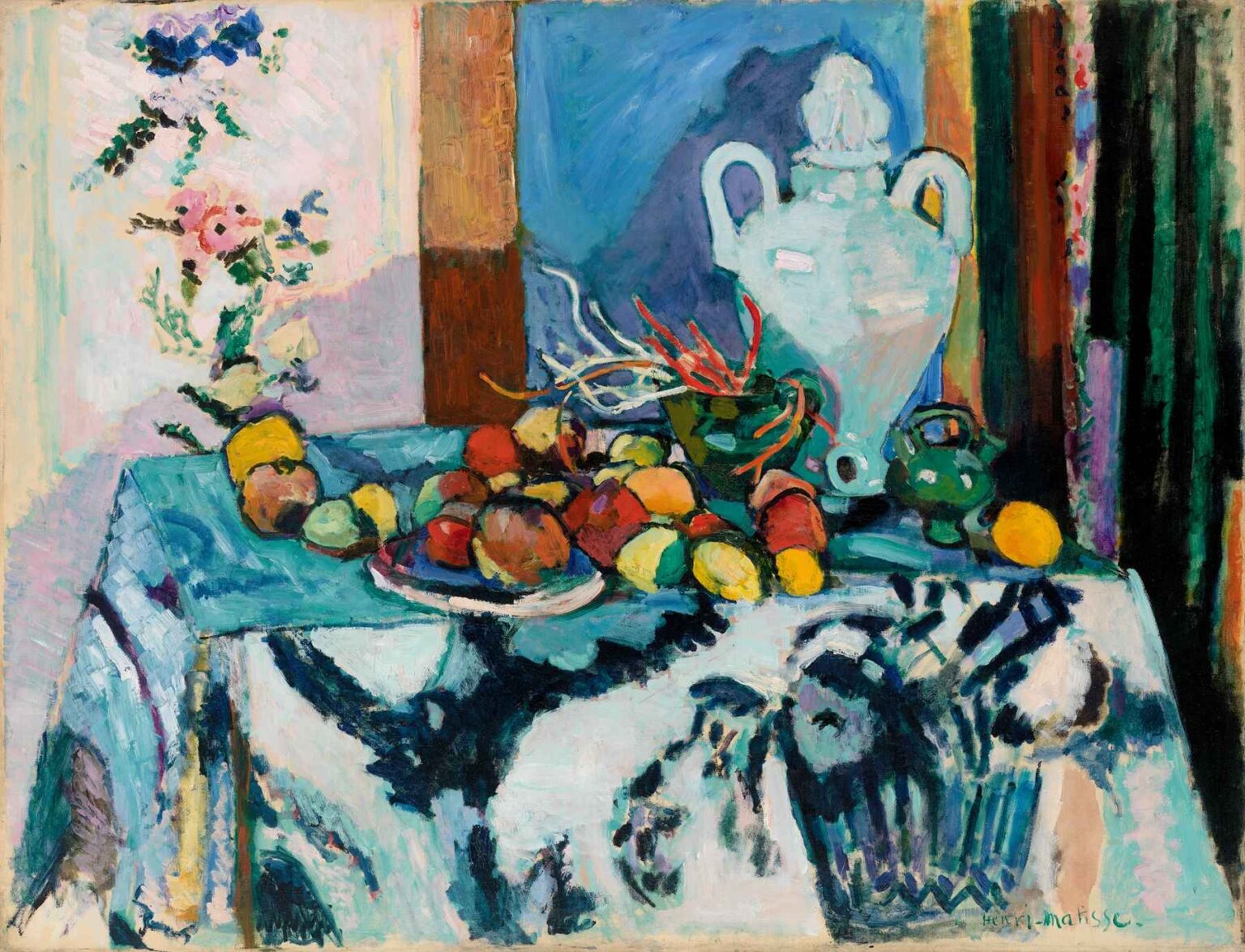
Matisse organizes Blue Still Life around a diagonal axis that runs from lower left to upper right. The tabletop occupies the lower two-thirds of the canvas, its edge almost parallel to the picture plane, inviting the viewer to lean in. A cluster of fruit—apples, lemons, and perhaps small pomegranates—sits at center, spilling slightly over the edge of a shallow dish. Behind them, a green bowl sprouts red-tipped leaves or flower stems, and a pale turquoise urn rises against a cobalt-blue background. The tablecloth, rendered in undulating waves of cerulean, navy, and white, drapes over the table and cascades forward, its pattern echoing the decorative motifs on the wall at left. Vertical elements—the slender backrest of a chair or the edge of a tapestry—interrupt the horizontal sweep of the table, while the rhythmic folds of fabric generate a sense of movement. There is no singular focal point; instead, Matisse invites the eye to travel across planes of color and form, discovering new rhythms in each glance.
Chromatic Strategies
Color in Blue Still Life is both expressive and structural. Matisse employs an almost monochromatic base—shades of blue, from pale sky to deep indigo—but punctuates it with complementary accents:
Red and Orange Details: The flower stems or pepper-like twigs in the green bowl, the small red highlights on the dish of fruit, and subtle orange touches on the fruit skins animate the blue field through visual vibration.
Greens and Turquoises: The bowl and certain leaves introduce a fresh counterpoint, linking the natural forms of fruit and flora to the broader decorative scheme.
White and Cream Highlights: The pale urn, the plate under the fruit, and the white in the tablecloth provide breathing space, preventing the composition from becoming overly dense.
Patterned Backdrop: At left, a pale panel decorated with loose floral motifs in blue and pink suggests a tapestry or wallpaper, reiterating the sense of interior ornamentation.
By restricting—and then carefully diversifying—his palette, Matisse transforms color into an organizing principle. Each hue defines a plane or object while participating in an overall chromatic harmony. Light is implied through shifts in hue rather than through tonal modeling; for example, a lighter ultramarine indicates a plane facing the viewer, while deeper, cooler blues recede.
Spatial Construction
Although Blue Still Life presents a convincing still-life arrangement, Matisse deliberately flattens depth to emphasize surface rhythm. The table tilts upward, collapsing the three-dimensional space of objects into a near two-dimensional tapestry. Overlapping forms—fruit in front of the bowl, bowl in front of urn—signal relative position, yet the lack of cast shadows or strict linear perspective keeps the scene decorative. The patterned textile on the left, with its softly rendered floral sprays, functions as both backdrop and spatial cue; it separates the wall from the tabletop without specifying a corner or vanishing point. Matisse thus invites viewers to appreciate the painting as a unified surface rather than a window onto an illusory room.
Brushwork and Technique
Matisse’s brushwork in Blue Still Life balances broad, expressive strokes with finer, descriptive touches. The tablecloth’s undulating pattern emerges from sweeping arcs of cerulean and navy, applied with confidence and minimal layering. In contrast, the fruit and floral elements receive more textured treatment: short, choppy strokes convey the skin of apples and lemons, while thinner, elongated marks suggest leaves and stems. The pale urn is built through layered washes of turquoise and white, its contours defined by soft, feathered edges rather than sharp outlines. This variation in brush application creates a dynamic surface that feels both tactile and decorative. Importantly, Matisse allows the canvas texture to show through in thinner passages, lending the work an immediacy and sense of process.
Thematic Undercurrents
While a still life ostensibly presents inanimate objects, Blue Still Life resonates with thematic implications:
Abundance and Transience: The fruit, arranged casually yet generously, symbolizes abundance and the pleasures of the senses, even as its impermanence evokes life’s fleeting nature.
Interior Luxury vs. Natural Vitality: The ornate fabric backdrop and sumptuous linens hint at domestic comfort, while the natural forms of fruit and flowers recall the vitality of the external world.
Color as Emotion: By immersing objects in a sea of blue, Matisse suggests moods of serenity, introspection, or even melancholy—qualities traditionally associated with the color’s symbolism.
Decorative Art as High Art: The integration of textile patterns and painterly gesture elevates decorative motifs to the level of fine art, challenging hierarchies between applied and pictorial arts.
Emotional Resonance
Beyond formal experimentation, Blue Still Life exudes a quiet emotional charge. The pervasive blue tonality creates a contemplative mood—cool, yet not austere—while the warm accents provide sparks of vitality. The painting feels at once intimate and expansive: intimate in its focus on personal studio objects, expansive in its decorative reach across the entire pictorial field. Viewers may sense a meditative calm, as if invited to linger over each color shift and texture variation, discovering new delights in repeated viewings.
Place in Matisse’s Oeuvre
Blue Still Life occupies a key transitional moment in Matisse’s development. It follows the explosive Fauvist canvases of 1905–06 yet prefigures the decorative interiors and cut-paper compositions of the 1940s–50s. By 1907, Matisse had begun to temper raw chromatic contrasts in favor of structured harmony and ornamental unity—principles that would define his mature style. This painting thus stands as both culmination of his early chromatic freedom and harbinger of his lifelong exploration of decorative surface and color as form.
Influence and Legacy
The formal strategies of Blue Still Life influenced subsequent generations of artists:
Modern Still Life Painters: Painters across Europe and America drew upon Matisse’s flattening of space and rhythmic color fields to infuse traditional still-life tropes with modernist vitality.
Abstract Expressionists: The emphasis on brushwork gesture and color autonomy resonated with artists seeking to foreground painting as an expressive act.
Decorative Arts and Design: Matisse’s integration of textile patterns into fine art inspired textile designers and decorators, bridging high art and applied design.
Blue Still Life remains a touchstone for those exploring the boundaries between representation, decoration, and abstraction.
Conclusion
In Blue Still Life, Henri Matisse masterfully orchestrates a dialogue between color, form, and surface, transforming a humble arrangement of fruit, flowers, and vessels into a radiant tapestry of blue harmonies. Through his innovative use of flattened perspective, rhythmic brushwork, and limited yet vibrant palette, he elevates the still-life genre to a new level of modernism—one that celebrates both sensory delight and formal invention. Over a century since its creation, Blue Still Life continues to captivate viewers with its serene mood, decorative richness, and testament to the enduring power of color as the very structure of painting.