Image source: artvee.com
Introduction
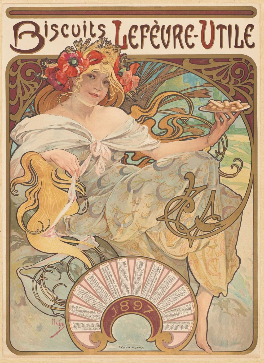
In 1896, Alphonse Mucha designed one of his most celebrated commercial posters for the French biscuit manufacturer Lefèvre-Utile (LU). Titled Biscuits Lefèvre-Utile, this lithograph merges seductive figuration with Art Nouveau ornament to advertise a simple domestic product—sugar-coated butter biscuits—as objects of refined taste and modern elegance. Over 120 centimeters tall and richly printed in multi-stone lithography, the poster presents a floral-crowned maiden who both embodies seasonal abundance and beckons viewers to partake in the brand’s irresistible treats. Through this design, Mucha elevated an ordinary advertising sheet into an icon of Belle Époque graphic art. This analysis explores the poster’s historical context, compositional strategies, color harmonies, ornamental motifs, typographic integration, technical execution, and enduring cultural influence.
Historical and Cultural Context
The late 19th century marked a golden age for advertising in Paris. Advances in lithographic printing and the expansion of railway and tram networks transformed public spaces into vivid galleries of commercial imagery. Businesses like Lefèvre-Utile recognized the power of color posters to capture attention and associate their products with modern sophistication. LU, founded in 1846 by brothers Lefèvre and Utile, had grown into a household name by the 1890s. Seeking to refresh their visual identity, the company enlisted Alphonse Mucha—fresh from his theatrical triumphs with Sarah Bernhardt—to create an image that would align biscuits with the era’s ideals of beauty, health, and leisure. Mucha’s Biscuits Lefèvre-Utile thus emerged at the intersection of consumer culture, technological innovation, and the decorative revolution now known as Art Nouveau.
Alphonse Mucha’s Artistic Evolution
By 1896, Mucha had established his signature style: sinuous lines, idealized feminine figures, botanical wreaths, and integrated typography. His breakthrough came in 1894 with the poster for Gismonda, starring Sarah Bernhardt. Over the next two years, he refined his palette and decorative vocabulary, experimenting with layered glazes and metallic highlights in lithography. While his early theatrical posters focused on celebrity portraiture, Mucha’s commercial commissions required him to adapt his aesthetic to product marketing. Biscuits Lefèvre-Utile represents a mature fusion of portrait and ornament: the central figure gestures toward the biscuits, yet is also allegorical, evoking harvest, abundance, and natural cycles. This work cemented Mucha’s reputation as the premier poster artist of the Belle Époque.
Subject and Iconography
At the heart of the poster stands a young woman in a state of lyrical repose. Draped in a flowing, diaphanous gown patterned with wheat-ear motifs, she embodies the nourishing qualities of the biscuit’s ingredients—wheat, butter, sugar. Her golden tresses cascade across the composition, weaving through the ornamental border like rippling wheat stalks. A crown of poppies and morning glories adorns her head, symbolizing both the product’s freshness and the restorative pleasure of nature. With one hand she holds a small plate piled with rectangular biscuits; with the other, she gently lifts a ribbon that echoes the pastry’s sugary dusting. Mucha thus transforms a simple snack into an emblem of pastoral abundance and feminine grace.
Composition and Spatial Dynamics
Mucha arranges Biscuits Lefèvre-Utile on a vertical format measuring roughly 120 by 80 centimeters. The figure occupies the central two-thirds of the sheet, framed by an arching wreath of vines that delineates a circular midground. Above, the cusped title panel proclaims “Biscuits Lefèvre-Utile” in a flowing, custom typeface. Below, a fan-shaped calendar for 1897 integrates functional information without detracting from the image’s poetic allure. The composition follows a triangular structure: the woman’s head at the apex, her outstretched arm forming one side, and her seated posture the base. This geometric stability offsets the organic curves of the wreath and gown, creating a tension between natural fluidity and structural order. Negative space in the upper corners allows the border’s curling tendrils to breathe, preventing visual overcrowding.
Color Palette and Light
Mucha’s color choices for Biscuits Lefèvre-Utile are both sumptuous and harmonious. A warm ivory-cream ground highlights the figure’s pale skin and the biscuits’ golden hue. Reds and pinks in the floral crown and ribbon infuse the design with vitality, while muted teals and sage greens in the wreath and background suggest foliage and sky. The gown’s pattern of pale gold wheat ears shimmers against the softer ivory, echoing the biscuit’s buttery luster. Metallic inks—especially in the wreath’s veins and the calendar’s gold numerals—lend a subtle iridescence that catches the light. Through careful layering of translucent lithographic inks, Mucha achieved gentle gradations that imbue the scene with a soft, glowing quality, reminiscent of Renaissance frescoes.
Linework and Decorative Flourishes
Central to Mucha’s approach is his mastery of line. In Biscuits Lefèvre-Utile, the heroine’s hair and gown folds are articulated with continuous, undulating strokes that evoke both movement and sensuality. These “whiplash” curves, characteristic of Art Nouveau, guide the viewer’s eye in a continuous circuit around the composition. Surrounding her, the wreath’s vines spiral outward in counter-curves, dotted with blossoms rendered in fine, stylized detail. The border’s scrollwork—echoing Celtic knot patterns and medieval ironwork—anchors the organic forms, providing a visual counterbalance. Mucha’s variation in line weight distinguishes primary forms from background ornament, ensuring that the figure remains central even as decorative patterns swirl around her.
Typography and Graphic Integration
Mucha believed that text should be as carefully designed as imagery. In Biscuits Lefèvre-Utile, the title lettering appears in a tall, slender typeface whose terminals echo the curling tendrils of the wreath. Letterforms are slightly irregular, lending them a hand-crafted warmth that contrasts with rigid industrial fonts of the period. The date calendar at the bottom—an unusual inclusion for a biscuit advertisement—serves both practical and decorative functions. Its fan shape repeats the poster’s overarching circular motif, and its columns of numbers are set in a formal serif that complements the title’s informal script. The printer’s credit—“F. Champenois, Paris”—is tucked into the calendar’s baseline, discreetly acknowledging the printmaker’s role without distracting from the overall design.
Symbolism and Cultural Resonance
Beyond its commercial purpose, Biscuits Lefèvre-Utile resonates with broader cultural themes. The figure’s embodiment of harvest imagery—wheat ears, poppy crowns—harkens back to classical allegories of Ceres and Flora, goddesses of agriculture and flowers. In an industrializing society, such pastoral symbolism evoked nostalgia for an idealized countryside and suggested the biscuit’s natural purity. Moreover, the maiden’s serene expression and timeless attire position her as an archetype rather than a contemporary woman, reinforcing the product’s universal appeal. Mucha thus taps into Romantic yearnings for harmony with nature while simultaneously showcasing modern lithographic innovation.
Technical Execution and Lithographic Process
Creating Biscuits Lefèvre-Utile required rigorous technical coordination. Mucha first produced full-scale watercolor and pencil studies in his studio, defining lines and color breaks. These studies were then transferred onto limestone plates for lithography. Each color—cream, gold, red, green, and black—necessitated a separate stone, with precise registration to ensure alignment. The fine linework was achieved through greasy crayon and tusche washes, while metallic inks were applied in select areas for accent. Printers at Champenois’s workshop mixed pigments by hand, carefully matching Mucha’s swatches. Multiple proofs were struck to calibrate ink density and paper choice—a slightly textured, cream-toned wove paper that enhanced ink saturation and lent the poster a parchment-like quality.
Reception and Commercial Impact
Upon its release in late 1896, Biscuits Lefèvre-Utile quickly gained visibility across Paris, appearing on tram shelters, shop windows, and café walls. Contemporary critics praised Mucha’s ability to infuse a mundane product with poetic charm, noting that the poster elevated biscuit-eating to an aesthetic experience. Sales records from LU outlets indicate a notable uptick in biscuit purchases following the poster’s debut, suggesting its effectiveness in attracting consumers. The design also won acclaim in international exhibitions, contributing to the global diffusion of Art Nouveau. Collectors began seeking copies of the poster as decorative prints, further enhancing Mucha’s reputation and cementing LU’s brand identity.
Influence on Graphic Design and Art Nouveau
Mucha’s Biscuits Lefèvre-Utile became a touchstone for the Art Nouveau movement, demonstrating how commercial art could rival fine art in beauty and sophistication. His integration of allegorical figure, ornamental motif, and custom typography influenced subsequent poster artists across Europe and America. The poster’s success encouraged businesses to view promotional imagery as an investment in brand prestige, leading to widespread commissions for decorative lithographs. Mucha’s holistic approach—where image, lettering, and ornament form an inseparable whole—remains a foundational principle in modern graphic design, echoing in corporate branding, editorial illustration, and digital interface aesthetics.
Legacy and Contemporary Relevance
More than a century after its creation, Biscuits Lefèvre-Utile continues to captivate audiences. Original lithographs reside in major museum collections, including the Musée d’Orsay and the Metropolitan Museum of Art, where they are exhibited as exemplars of turn-of-the-century design. Contemporary designers study the poster’s compositional balance and typographic integration in graphic arts curricula. The image also enjoys popular resurgence in home décor—reproduced on posters, mugs, and textiles—testifying to its timeless appeal. As brands seek to evoke artisanal quality and heritage authenticity, they often turn to Mucha’s decorative strategies, demonstrating the enduring influence of his vision.
Conclusion
Alphonse Mucha’s Biscuits Lefèvre-Utile stands as a masterwork of Art Nouveau and commercial art. Through its graceful portraiture, lush ornament, harmonious color palette, and integrated typography, Mucha transformed the simple advertisement of butter biscuits into an enduring icon of Belle Époque elegance. The poster’s synthesis of classical allegory and modern lithography reshaped public perceptions of advertising, elevating it to the realm of fine art. Over a century later, Biscuits Lefèvre-Utile remains a benchmark for design excellence, illustrating how beauty and commerce can unite to create images of timeless cultural resonance.