Image source: artvee.com
Overview of the Artwork
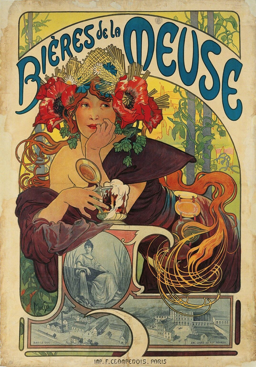
“Bières de la Meuse” (1897) is an iconic Art Nouveau lithograph by Alphonse Mucha, created to advertise a Belgian brewery along the Meuse River. The composition centers on a languid, half‑draped woman who leans on an ornate bar or table, her gaze both playful and contemplative. A tulip‑shaped glass of frothing beer rests before her, while a large poppy wreath crowns her head, interwoven with hop vines and wheat sheaves. Behind her, a stylized arch frames a sunlit grove of vines climbing up slender trellises. Above the arch, the bold lettering “BIÈRES de la MEUSE” curves in harmony with the graphic lines below. Mucha’s synthesis of figure, ornament, and typography transforms a simple commercial announcement into a sensuous emblem of leisure and natural bounty.
Historical and Cultural Context
At the fin de siècle, Europe was enamored with the Belle Époque’s spirit of leisure, travel, and technological innovation. Breweries across the continent turned to celebrated artists to craft posters that would stand out on crowded city walls. In 1897, the tradition of public posters as fine art was in full flower, thanks in large part to Mucha’s earlier successes with Sarah Bernhardt and major brands like Job cigarettes. The “Bières de la Meuse” poster reflects contemporary fascination with exotic botanicals—poppies, hops, and wheat—and the emerging café culture where patrons lingered over a drink. It also signals the brewery’s desire to align its product with refinement, natural purity, and the rising status of decorative graphic design as a hallmark of modern business.
Alphonse Mucha’s Career in 1897
By 1897, Alphonse Mucha had firmly established the visual vocabulary of Art Nouveau. After his 1894 breakthrough with the “Gismonda” poster for Sarah Bernhardt, he produced a string of celebrated images that combined graceful female figures, ornate floral motifs, and bespoke type. His collaboration with printer F. Champenois enabled him to exploit multi‑stone lithography to achieve delicate pastel hues and intricate line work. Mucha’s workshop in Paris became a magnet for clients seeking the decorative power and instant recognition his style provided. The brewery commission for “Bières de la Meuse” was one of several food and beverage posters he undertook during the late 1890s, each demonstrating his ability to blend sensual appeal with commercial clarity.
Composition and Design
Mucha structures “Bières de la Meuse” around a central circular motif that echoes the rising sun or a full moon, symbolizing both nature’s cyclical rhythms and the conviviality of evening gatherings. The reclining woman occupies the foreground, her body angled slightly to the left, creating a gentle diagonal that guides the viewer’s eye from her face down to the glass and back up along the hop vines. The curve of the arch above her is mirrored in the sweeping line of her hair and the foliage climbing the trellis behind. The brewery name arcs above the architectural frame, its bold, rounded letterforms complementing the poster’s soft, organic lines. This balanced interplay of curves, diagonals, and verticals lends the image both dynamism and stability.
Color Palette and Lithographic Technique
Mucha’s palette for this poster is rich and harmonious. Warm ochres and burnt sienna define the woman’s hair and gown, while deep burgundy folds of fabric wrap around her form. The poppies are rendered in vivid crimsons, their petals outlined in fine black line to capture textural detail. Hops and wheat appear in soft chartreuse and gold, linking the earthly ingredients of beer to the feminine figure. The background gradient shifts from pale lemon at the top to mossy green at the bottom, suggesting dawn or dusk through filtered light. Each color required its own lithographic stone and precise registration, a technical feat that Mucha and Champenois mastered. The result is a luminous surface in which broad washes of color coexist with the crispness of black outlines.
Depiction of the Central Figure
The woman in “Bières de la Meuse” embodies both relaxation and subtle allure. Mucha idealizes her form—elongated neck, softly rounded shoulders, and a serene profile—while allowing enough naturalistic shading to suggest flesh and bone. Her left arm supports her weight as she leans forward, her right hand poised pensively against her chin. The draped fabric leaves one breast exposed, a gesture common in Mucha’s work to evoke classical Venusian beauty and to hint at the heady pleasures of beer. Her gaze is both invitation and reverie: she seems lost in the aroma of the brew, yet aware of the viewer’s presence. Through this portrayal, Mucha personifies the sensorial delight of sipping a well‑crafted beer, linking feminine grace to gustatory pleasure.
Symbolism and Iconography
Mucha weaves a tapestry of symbols that amplify the poster’s message. The poppies in the wreath speak of opulence and fleeting beauty, while the hop cones and wheat sheaves crown the figure like a harvest deity, celebrating the natural cycle that yields beer. The tulip‑shaped glass—iconic in Belgian beer culture—serves as both product and prop, its frothy head echoing the white petals of the poppies. The geometric trellis and vines behind hint at a cultivated garden, where nature and human ingenuity collaborate. Even the circular frame can be read as a symbolic wheel of seasons, suggesting that the pleasures of Meuse beer are timeless. Together, these elements present beer as both a natural gift and a refined craft.
Decorative Motifs and Ornamental Frame
Mucha’s ornamentation encloses the scene without stifling it. The arch above the central circle is enlivened by stylized hop vines swirling outward, their sinuous curves complementing the figure’s hair and the folds of her garment. The border is minimal, allowing the composition to breathe, yet the corners feature subtle sprigs of foliage that nod to the wider landscape. The simplicity of the frame ensures that the viewer’s focus remains on the woman and her glass, while still reinforcing the unity of natural motifs throughout the design. This disciplined use of ornament exemplifies Mucha’s belief in “total decoration”—where every motif, no matter how small, serves the overall harmony.
Integration of Text and Image
In Mucha’s hands, typography becomes a visual partner to illustration. The brewery name “BIÈRES de la MEUSE” is drawn in a custom Art Nouveau style: the curved stems of the letters echo the tendrils of the hop vines, and the weight of the strokes balances the poster’s color masses. Smaller text, such as the printer’s credit at the bottom, occupies its own discreet band, maintaining legibility without intruding on the central image. Mucha’s seamless integration of text ensures that reading the poster—identifying the product, the region, and the printer—feels like exploring a unified work of art rather than scanning separate information fields.
Line, Form, and Visual Rhythm
Line is the lifeblood of Mucha’s design. The contour of the woman’s silhouette is drawn with a confident, unbroken stroke, while interior details—hair locks, petal veins, and folds of fabric—are rendered in finer lines that suggest texture and movement. The poster’s visual rhythm emerges from the repetition of curving forms: the circular frame, the arch of the brewery name, the wreath petals, and the girl’s flowing hair all follow sinuous paths that lead the eye in a gentle sweep. Diagonal accents—such as the angle of her arm and the tilt of the glass—introduce dynamic tension, preventing the composition from feeling static. This interplay of curves and angles imbues the poster with a graceful energy.
Light, Shadow, and Texture
While lithography is inherently flat, Mucha achieves the illusion of depth through tonal modulation and textural contrasts. Broad washes of color are overlaid with nuanced shading—delicate hatching in the fabric folds, stippled highlights on the skin, and halftone screens in the background. The froth of the beer is suggested with small clusters of white highlights, giving it a tactile quality. The poppies’ petals display internal veins and shadowed bases, imparting a three‑dimensional effect. These textural details invite the viewer to imagine the softness of petals, the coolness of glass, and the effervescent foam, enriching the poster’s sensorial appeal.
Emotional Resonance and Viewer Engagement
“Bières de la Meuse” captivates by harmonizing aesthetic pleasure with the promise of sensory delight. The woman’s thoughtful demeanor suggests both anticipation and satisfaction, drawing viewers into her moment of repose. Mucha’s lush ornamentation and warm palette evoke the convivial atmosphere of a riverside brasserie at sunset. The poster transcends mere advertisement, offering a visual narrative in which beer becomes a conduit for relaxation, camaraderie, and communion with nature’s bounty. By engaging both the eye and the imagination, Mucha ensures that viewers remember not just the brewery name but the emotional experience it represents.
Influence on Art Nouveau and Poster Art
As an exemplar of Belle Époque poster art, “Bières de la Meuse” shaped the trajectory of graphic design in Europe. Mucha’s integration of fine‑arts principles with commercial messaging demonstrated that advertising could be both persuasive and artistically ambitious. Designers across the continent adopted his approach—bespoke typography, sinuous ornament, and figure‑centric layouts—in contexts ranging from magazine illustration to corporate branding. The poster’s enduring popularity attests to the power of Art Nouveau’s visual language and its ability to transcend cultural and linguistic barriers. Even today, echoes of Mucha’s style appear in craft breweries’ labels and modern design movements that celebrate the union of nature and craftsmanship.
Conservation and Modern Reception
Original lithographs of “Bières de la Meuse” are highly prized by collectors and museums, yet their delicate papers and early color inks require careful preservation. Institutions employ climate‑controlled environments, UV‑filtered lighting, and archival framing to protect against fading and deterioration. Modern digital reproductions and exhibitions of Belle Époque graphics have introduced Mucha’s work to new audiences, inspiring graphic artists, beer aficionados, and art historians alike. Beer festivals and craft labels often reference the poster’s motifs—poppies, hop vines, and tulip glasses—demonstrating its continued impact on visual culture and beer marketing.
Conclusion
“Bières de la Meuse” stands as a testament to Alphonse Mucha’s genius in elevating commercial art to the level of fine art. Through harmonious composition, radiant palette, and masterful integration of text and imagery, Mucha transforms a simple brewery advertisement into an emblem of beauty, leisure, and natural abundance. The poster’s blend of lush ornamentation, sensually depicted figure, and symbolic iconography invites viewers to savor both the aesthetic and gustatory pleasures it offers. More than a relic of the Belle Époque, it continues to enchant and inform modern design, reminding us that the finest posters resonate not only with products but with the human experiences they celebrate.