Image source: artvee.com
Introduction: The Emergence of Modern Advertising in the Belle Époque
At the turn of the 20th century, Paris became the crucible in which advertising evolved from ornate handbills into a bold graphic language. Mounted on kiosks, pavements, and café walls, posters transformed public spaces into open‐air exhibitions. It was the age of Art Nouveau, when flowing lines and natural forms pervaded architecture, interior design, and the decorative arts. Amid this cultural renaissance, Leonetto Cappiello emerged as a seminal figure who redefined poster art. Rejecting dense copy and elaborate ornament, he championed a pared‐down approach: one central motif set against a flat, vibrant background, accompanied by minimal text. His 1907 design for Bière du Fort‐Carré. Saint‐Dizier stands as a testament to this new visual economy. In a single, dramatic tableau, Cappiello managed to convey centuries of brewing heritage, local pride, and festive conviviality, illustrating how a well‐crafted poster could captivate audiences and drive consumption in the burgeoning consumer culture of the Belle Époque.
Leonetto Cappiello’s Journey from Caricature to Poster Pioneer
Leonetto Cappiello’s path to becoming “the father of modern advertising” began in Livorno, Italy, in 1875. He moved to Paris in the 1890s and cut his teeth as a caricaturist for leading journals such as Le Rire, where he learned to distill character and narrative into a few decisive strokes. By 1900, he turned his attention to commercial posters, sensing that urban consumers responded more powerfully to images than to paragraphs of copy. Collaborating with the prestigious Atelier d’Art Devambez, he refined his lithographic technique and developed a radical aesthetic: flat fields of bold color, a single oversized subject, and text reduced to essential brand identifiers. Early successes—among them the 1902 posters for Amandines de Provence and Angelus—confirmed his approach. By 1907, Cappiello had mastered the alchemy of graphic persuasion. His Bière du Fort‐Carré poster showcases the full maturation of his style, marrying caricatural flair with modernist simplicity to create an image both visually arresting and commercially potent.
Historical Context and the Saint-Dizier Brewery Legacy
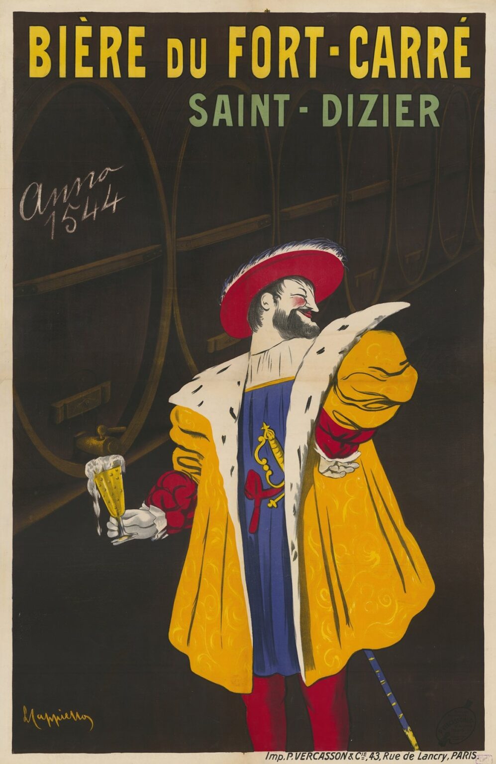
The region of Saint-Dizier in northeastern France possessed a brewing tradition dating back to medieval times, thanks to abundant spring water and grain supply. By the early 20th century, local breweries consolidated under prominent names like Bière du Fort-Carré, so called after the imposing seventeenth-century fortress that still loomed over the town. This star-shaped bastioned stronghold—Fort-Carré—symbolized security, craftsmanship, and civic pride. Patrons of Bière du Fort-Carré could taste not only a well-brewed lager but also a proud legacy claimed to extend back to “Anno 1544,” a date inscribed on Cappiello’s poster to emphasize lineage. In embracing this regional heritage, the brewery balanced tradition with modernity, seeking to reassure an increasingly urban clientele that quality and authenticity were as integral to their pint as brewing science and hop proportions. The 1907 poster encapsulated this dual appeal, offering both a link to the storied past of Saint-Dizier and a bold declaration that Bière du Fort-Carré belonged in the bustling cafes and brasseries of modern France.
Composition and Central Imagery
Cappiello’s composition for Bière du Fort-Carré revolves around one commanding figure: a dashing nobleman in Renaissance garb, rendered at life-size against a field of dark, barrel-lined brewery walls. The man’s right arm extends forward, offering the viewer a flute of frothy beer, while his left hand rests confidently on his hip. His sweeping ermine-trimmed cloak, painted in a rich mustard yellow, billows around him like a banner. Beneath, a deep blue tunic adds visual contrast and harmonizes with the cooler text letterforms above. The brewery vats that recede behind him—a series of ellipses shaded in charcoal and brown—provide context without cluttering the foreground. Above this tableau, the poster’s headline “BIÈRE DU FORT-CARRÉ” in uppercase yellow commands immediate attention, while “SAINT-DIZIER” in sage green situates the brand geographically. Cappiello marries the theatricality of a stage performance with the economy of modern design, ensuring that the viewer’s gaze travels fluidly from nobleman to product name to place of origin.
Color Palette and Emotional Resonance
Cappiello’s chromatic choices in Bière du Fort-Carré harness the emotional power of contrasting hues. The mustard yellow cloak conveys warmth and golden conviviality, instantly evoking the rich malted tones of a finely brewed beer. This warmth is buttressed by deep indigo blue in the tunic and the distant vats, which signal depth and reliability. Charcoal-brown shadows in the barrels lend a subtle sense of aged wood and craftsmanship. Small touches of emerald green in the subheading** “SAINT-DIZIER”** gently introduce a botanical reference—barley fields or hop vines—while the crisp white ermine spots and shirt collar lend a flash of luxury. Emotive color psychology suggests that yellow fosters sociability and appetite, blue communicates trust and stability, and green signals natural origins. By orchestrating these colors in a harmonious yet high-contrast composition, Cappiello created an image that appeals both to the eye and to the palate’s anticipation.
Typography and Brand Messaging
Text in Bière du Fort-Carré is spare yet authoritative. The uppercase “BIÈRE DU FORT-CARRÉ” spans the poster’s width in bold sans-serif characters reminiscent of early Art Deco typography. Painted in a bright yellow with a subtle black outline, the headline is visible from great distances, ensuring high recall. Directly below, “SAINT-DIZIER” identifies the beer’s origin in a pale green that complements the overarching palette without distracting from the primary visual. On the left side, a hand-lettered chalk note reads “Anno 1544”, evoking medieval script and reinforcing the brewery’s claim to centuries-old heritage. Cappiello’s decision to limit text to these few, strategically placed components underscores his conviction that images carry the bulk of persuasive power, with words serving only to clarify brand and provenance.
Symbolism of the Renaissance Nobleman
The central figure in Bière du Fort-Carré is no mere mascot but a synecdoche for the beer’s qualities. By choosing a dashing nobleman in Renaissance finery, Cappiello invokes an era when guilds and craft traditions flourished, suggesting artisanal mastery. The ermine-lined cloak, historically reserved for royalty and high office, elevates the beer to a product worthy of connoisseurs, while the figure’s jaunty feathered hat and confident posture add a touch of conviviality. His direct eye contact and extended invitation—a glass raised as if to toast—create a friendly bond with the viewer. This gesture transforms the act of buying beer from a mere transaction into a shared celebration of history and hospitality. The figure thus embodies both the high standards of Renaissance artistry and the warm camaraderie of modern social drinking.
Spatial Dynamics and Subtle Depth
Although Cappiello’s style often favors flatness, he introduces subtle spatial depth in the Bière du Fort-Carré poster. The brewery vats behind the figure recede slightly, their elliptical shapes diminishing toward the right edge, creating a faint perspective. The gentle tonal gradation on the barrels—from dark at the edges to lighter at their central bands—further suggests rounded forms illuminated by hidden light sources. In contrast, the nobleman and his cloak are rendered with crisp, unmodulated color fields, anchoring him firmly in the foreground. This interplay of shallow relief and flat planes draws the viewer into the scene without distracting from the central interaction. The effect is cinematic: a stage set for the hero of the piece to present his gift to the audience.
Technical Mastery in Lithographic Printing
The 1907 Bière du Fort-Carré poster was produced as a large-format color lithograph by the esteemed Vercasson & Cie in Paris. Each hue—mustard yellow, indigo blue, charcoal brown, sage green, and bright white—required a separate stone and press run. Achieving uniform, lush color fields and razor-sharp registration across these plates demanded exceptional skill from stone carvers and pressmen. Fine details—such as the ermine spots and the text’s black outlines—were engraved with care to avoid misregistration. The poster’s generous scale, often exceeding one meter in height, called for even ink application to prevent mottling. The technical excellence of this process ensured that Cappiello’s vivid design remained bold and legible even after months of display in outdoor kiosks and tram stops.
Cultural Impact and Market Reception
Upon its release, the Bière du Fort-Carré poster quickly dominated the visualscape of cafés, brasseries, and street corners in northeastern France and beyond. Its eye-catching colors and charismatic figure distinguished it from more conventional beer ads, garnering immediate public attention. Brewery sales records from Saint-Dizier indicate a noticeable uptick in both urban and rural markets following the campaign’s rollout. The poster became a symbol of local pride, with patrons proud to order a Fort-Carré draught as a testament to regional heritage. Its success prompted competing breweries to commission similarly daring graphic artists, accelerating the evolution of poster art across Europe. Cappiello’s work thus not only bolstered Bière du Fort-Carré’s commercial fortunes but also reshaped advertising conventions industry-wide.
The Poster’s Place Within Cappiello’s Oeuvre
Although Cappiello produced hundreds of posters over his four-decade career, Bière du Fort-Carré occupies a special place as one of his earliest major beverage campaigns. It bridges his initial forays into Art Nouveau illustration and the later Art Deco flamboyance of works like Cinzano (1926) and Bourdou (1926). In Fort-Carré, one sees the caricatural energy of his journalistic drawings tempered by a more disciplined compositional structure and emerging modernist restraint. The poster’s integration of regional history, theatrical presentation, and graphic reduction foreshadows Cappiello’s mature period, when he would harness mythic imagery and exotic motifs to sell everything from vermouth to mint liqueur. As such, the Fort-Carré design exemplifies the transitional moment when Cappiello’s visionary approach crystallized into a style that would dominate early 20th-century advertising.
Interpretive Themes of Heritage, Hospitality, and Modernity
At its core, Bière du Fort-Carré communicates three interwoven themes. First, heritage: the “Anno 1544” inscription and reference to the local fortress firmly root the product in centuries of tradition. Second, hospitality: the nobleman’s gesture of offering a glass transforms beer-drinking into an act of convivial exchange, inviting viewers into a communal ritual. Third, modernity: the poster’s minimalist design, flat color fields, and sans-serif typography signal the forward momentum of the Belle Époque, reminding consumers that tradition and progress can coexist. By harmonizing these themes in a single image, Cappiello created a narrative that resonated emotionally and intellectually, appealing to both the mind’s sense of history and the heart’s desire for social pleasure.
Legacy and Contemporary Relevance
More than a century after its creation, Leonetto Cappiello’s “Bière du Fort-Carré. Saint-Dizier” remains a touchstone in graphic design history. Original lithographic prints are coveted by museums and private collectors worldwide, and reproductions grace the walls of breweries, bars, and design studios. The poster continues to inform contemporary branding strategies in the craft beer movement, where regional identity and narrative authenticity are prized. Designers studying Cappiello’s work learn valuable lessons in how to distill complex brand stories into single, image-driven statements. In the digital age of fragmented attention, his principle holds true: focus on one unforgettable motif, use color to evoke mood, and keep copy concise. The enduring appeal of the Fort-Carré poster underscores the power of a well-executed design to transcend its commercial origins and become a cultural icon.
Conclusion: Enduring Influence and Artistic Triumph
Leonetto Cappiello’s “Bière du Fort-Carré. Saint-Dizier” remains a landmark achievement at the intersection of art and commerce. Through a masterful blend of theatrical composition, evocative color, and minimalist text, he distilled centuries of brewing heritage and civic pride into a single, compelling image. The poster’s technical brilliance, rooted in expert lithographic production, ensured that its bold vision captivated audiences across France. Its thematic depth—celebrating heritage, fostering hospitality, and embracing modernity—resonates as strongly today as it did in 1907. In crafting this design, Cappiello not only propelled Bière du Fort-Carré to new commercial heights but also laid the groundwork for the modern graphic poster. More than a historical artifact, it remains a source of inspiration for contemporary designers, illustrating how clarity of vision and emotional authenticity can create images of timeless power.