Image source: artvee.com
Overview of the Artwork
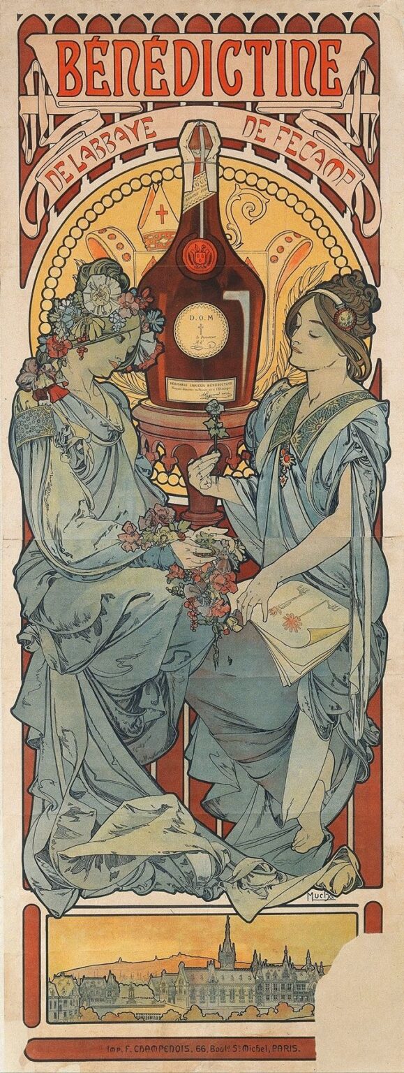
“Bénédictine” (1896) is an arresting Art Nouveau poster by Alphonse Mucha, commissioned to celebrate and promote the famed herbal liqueur produced by the Abbey of Fécamp. Dominating the vertical format are two graceful, allegorical female figures draped in flowing gowns of silvery blue, perched before a monumental bottle of Bénédictine that rises like a sacred relic at the center. Their gestures—one weaving a garland of herbs and the other holding an open book of botanical lore—evoke both the artisanal craft and the monastic heritage behind the liqueur. Above them, the bold red lettering of “BÉNÉDICTINE” arcs across a banner, flanked by stylized architectural motifs suggesting Gothic abbey façades. Below, a panoramic silhouette of Fécamp Abbey at sunrise anchors the design in place and history. Mucha’s fusion of figure, typography, and ornament transforms a commercial advertisement into a symbolic tableau of nature, knowledge, and tradition.
Historical and Cultural Context
At the fin de siècle, France was captivated by the dual currents of medieval revivalism and modern innovation. The Bénédictine liqueur, first produced in 1863 by Alexandre Le Grand in Fécamp, sought to establish its identity through historical legitimacy—claiming a recipe rescued from medieval monks—and contemporary marketing. By 1896, the drink had achieved international renown, and its makers commissioned Mucha, the leading poster designer of the Belle Époque, to craft an image that would embody both monastic tradition and modern elegance. Posters at this time were the primary medium for public art and advertising, plastered across Parisian boulevards and provincial walls alike. Mucha’s design had to resonate with urban sophisticates while retaining an aura of heritage and craftsmanship—a challenge he met by marrying medieval iconography, botanical science, and his signature sinuous ornament.
Alphonse Mucha’s Career in 1896
By 1896, Alphonse Mucha had firmly established the visual language of Art Nouveau. His breakthrough “Gismonda” poster for Sarah Bernhardt in 1895 had vaulted him to celebrity status in Paris. Over the next months, he refined his style—elongated figures, floral halos, bespoke typography, and decorative frames—in a series of high-profile commissions for luxury brands, theatres, and publishers. Mucha’s Paris studio became synonymous with modern elegance, and his posters were lauded as both commerce and high art. The Bénédictine commission arrived at a pivotal moment: Mucha was balancing his commercial success with personal artistic ambitions, including decorative panels and early studies for what would later become his Slav Epic series. In the Bénédictine poster, Mucha synthesizes medieval, botanical, and religious motifs into a cohesive, contemporary design that underlines his mastery of lithographic technique and symbolic narrative.
Composition and Spatial Organization
Mucha’s composition is meticulously structured along a vertical axis. At the top, the large red banner reading “BÉNÉDICTINE” immediately captures attention. Below this, a second ribbon proclaims “DE L’ABBAYE DE FÉCAMP,” linking brand to place. The central zone is dominated by the monumental bottle, flanked symmetrically by the two figures whose drapery and hair echo the curves of the glass container. The bottle stands on a carved stone pedestal, reinforcing its quasi-religious veneration. Behind this arrangement, a large circular aureole of bead‑like ornamentation suggests a halo, encircling the bottle and linking it to sacred imagery. At the very bottom, a narrow register features the silhouette of the Abbey of Fécamp at dawn, providing a geographical and historical foundation. The interplay of these horizontal bands, central vertical thrust, and framing details yields a harmonious unity that guides the viewer from title to landscape.
Color Palette and Lithographic Technique
Mucha’s palette for “Bénédictine” is restrained yet resonant. The dominant silvery blues of the figures’ robes contrast with the warm reds and amber toffee hues of the central bottle and the sunset glow behind the abbey. Delicate greens of botanical wreaths and manuscript ornaments provide accents that underscore the herbal character of the liqueur. Each color was printed from a separate lithographic stone, demanding exacting registration to preserve crisp contour lines. Mucha and his printer, F. Champenois, exploited the lithographic medium’s capacity for delicate tonal transitions: the robe folds are rendered in soft washes, while the glass bottle features subtle gradients that suggest transparency and depth. The background behind the bottle and figures is kept in muted ivory, allowing the jewel‑like colors to stand out. This technical sophistication not only enhances visual appeal but also conveys the liqueur’s premium quality.
The Allegorical Figures: Craft and Knowledge
The two female figures function as personifications of the monastic recipe’s twin pillars: botanical mastery and learned tradition. On the left, a figure weaves a garland of flowers, hops, and herbs—ingredients said to comprise the Benedictine recipe—into a living wreath that adorns her head. Her downcast gaze and delicate touch suggest reverence for nature’s bounty. On the right, a second figure holds an illuminated manuscript or herbal guide, the pages open to reveal schematic drawings of plants. Her serene expression and poised posture evoke scholarly knowledge passed down through monastic scribes. Mucha renders both women with classical poise—elongated necks, softly modeled features, and flowing drapery—evoking Greco‑Roman goddesses yet grounded in medieval tradition. Through these personifications, the poster links Bénédictine’s flavor to the sacred fusion of nature and scholarship.
Symbolism and Iconography
Mucha layers symbolic references throughout the poster. The central bottle stands as a modern relic, its label inscribed with “D.O.M.” (Deo Optimo Maximo) echoing monastic dedications to God. The dais on which it rests resembles an altar, and its aureole‑like halo frames it as an object of veneration. The garland of herbs and floral crown reference the recipe’s secret formula of twenty‑seven botanicals. The illuminated manuscript signifies the art of herbal medicine and the role of monks as healers and scholars. The sunset behind the Fécamp skyline suggests both the daily cycle of religious observance and the dawning of a new era of refined taste. Even the abbey silhouette—complete with spired towers and cloister wings—anchors the design in a specific locale, reinforcing the brand’s authenticity and heritage.
Decorative Motifs and Ornamental Frame
Mucha’s hallmark ornamentation enriches the poster’s narrative without overwhelming it. The double ribbon banners curve and twist in ornamental loops reminiscent of medieval scrollwork. The circular halo behind the bottle is composed of bead‑like motifs and Gothic tracery patterns. The lobed arch framing the central scene features stylized foliage that echoes the botanical illustrations held by the figures. Small fleur‑de‑lis and quatrefoil details appear in the background, alluding to French royal and ecclesiastical symbolism. At the bottom register, the abbey silhouette is encased in a simple rectangular form, its minimal decoration contrasting with the richer ornament above. This disciplined use of ornament exemplifies Mucha’s belief that decoration should serve both aesthetic and narrative functions.
Integration of Text and Image
In Mucha’s expansive vision, typography is as integral as illustration. The main title “BÉNÉDICTINE” is drawn in a custom Art Nouveau script featuring elongated serifs and subtle curves that mirror the drapery folds and botanical lines. The secondary banner “DE L’ABBAYE DE FÉCAMP” curves beneath in a complementary hand, its ribbon‑like flow reinforcing the sense of movement. At the very bottom, the printer’s credit—“Imp. F. Champenois, 66, Boulv. St. Michel, Paris.”—is set in a clear, understated serif that provides necessary information without disrupting the composition. Mucha’s holistic approach ensures that reading the poster—absorbing product name, origin, and printer details—feels akin to engaging with a unified work of decorative art rather than scanning separate informational blocks.
Use of Line and Form
Line is the structural backbone of Mucha’s design. He varies line weight masterfully: bold contours outline the figures and bottle, while delicate interior lines model facial features, drapery folds, and botanical details. The swirling curves of the ribbon banners and the figures’ hair and robes introduce a fluid rhythm that guides the eye in loops around the composition. The circular forms of the halo and bottle echo each other, while the vertical thrust of the figures and bottle contrasts with horizontal registers at top and bottom. This interplay of curves, diagonals, and straight lines creates a dynamic balance, giving the poster both a sense of movement and a harmonious stability.
Light, Shadow, and Texture
Although lithography is an essentially flat medium, Mucha evokes a sense of three‑dimensional form through tonal contrasts and textural treatments. The folds of the figures’ robes display subtle gradations from light to dark, achieved through layered transparent inks and fine hatching. The bottle’s surface catches highlights that suggest glass and liquid depth, while its shadowed side lends it solidity and weight. The halo and background arch are rendered in matte, diffuse tones, allowing the luminous central elements to stand forward. The manuscript and botanical wreath feature careful stippling to imply parchment texture and the roughness of plant forms. These nuanced textural effects heighten the sensory appeal of the poster and underscore Mucha’s technical virtuosity.
Emotional Resonance and Viewer Engagement
“Bénédictine” captivates viewers by blending spiritual reverence, scholarly depth, and natural abundance. The poster’s sacred overtones—bottle on an altar, halo‑like aureole, monastic references—invite an almost devotional admiration for the product. Simultaneously, the gentle beauty of the allegorical figures and the lush botanical details evoke a sense of tranquility and well‑being. Mucha’s design promises that each sip of Bénédictine is not merely a drink but an experience steeped in centuries of tradition, herbal wisdom, and refined craftsmanship. By engaging both intellect and emotion, he transforms a commercial message into a memorable celebration of heritage and taste.
Influence on Art Nouveau and Poster Art
As one of Mucha’s most accomplished commercial posters of the 1890s, “Bénédictine” exemplifies the fusion of decorative art with advertising. Its success demonstrated that a poster could be both a persuasive marketing tool and a collectible artwork. Designers across Europe and North America adopted Mucha’s principles—integrated ornament, bespoke typography, and allegorical figures—in contexts ranging from magazine illustration to brand packaging. The idea that commercial imagery could achieve fine‑art status reshaped the trajectory of graphic design in the twentieth century. Today, echoes of Mucha’s “Bénédictine” poster appear in contemporary branding for artisanal spirits, craft breweries, and luxury goods, attesting to its enduring visual legacy.
Conservation and Legacy
Original prints of “Bénédictine” are highly prized by collectors and museums, yet their fragile paper supports and early color inks require meticulous preservation. Institutions employ climate‑controlled display cases, UV‑filtered lighting, and archival framing to guard against fading and deterioration. Modern high‑resolution scans and reproductions have made Mucha’s work accessible to scholars and enthusiasts worldwide. Retrospectives of Belle Époque art regularly feature “Bénédictine” as a quintessential example of Art Nouveau’s marriage of commerce and decoration. Its continuing influence is evident in design curricula, where it serves as a case study in the power of symbolic narrative and technical mastery.
Conclusion
Alphonse Mucha’s “Bénédictine” (1896) stands as a masterful testament to the artistic potential of commercial advertising. Through harmonious composition, a refined palette, and a rich tapestry of symbols, Mucha elevates a simple liqueur poster into an icon of cultural heritage and aesthetic beauty. The allegorical figures, the monumental bottle, and the medieval saintly references coalesce into a narrative that celebrates nature, scholarship, and monastic tradition. Over a century later, “Bénédictine” continues to enchant viewers and inform designers, reminding us that the finest posters resonate not only with products but with the timeless stories and values they embody.