Image source: wikiart.org
Introduction
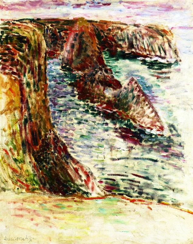
“Belle Île En Mer” captures Henri Matisse in 1897 standing above the Atlantic cliffs and turning rock, water, and air into a vibrating fabric of color. The scene reads at once as a place—the serrated needles and coves of the Breton island—and as a proposition in paint. Comma-like strokes lay down quick notes of viridian, carmine, violet, and cream; warm cliffs push forward against a cold, choppy inlet; a pale band of sky hangs like a lid over the drama. Instead of transcribing geology detail by detail, Matisse builds the experience of weather and surf through patterned touches, warm–cool pivots, and the oblique pull of the headland. The picture belongs to the short run of coastal canvases that reshaped his practice: outdoors he learned to simplify, to let color do structural work, and to trust that a few large relations could carry a whole landscape.
Belle-Île and the Turning Point of the Late 1890s
Belle-Île-en-Mer was more than a destination; it was a workshop where Matisse tested the limits of his training. The island’s Atlantic face offers cliffs that plunge in slate and ochre, coves that bite into the rock, and luminous water that shifts color with every gust. In 1896 he began to paint there from the motif with a new urgency, aided by friendships that exposed him to bolder color and looser handling. By 1897 he had moved past sober tonal description toward a palette keyed to sensation. “Belle Île En Mer” condenses those lessons. The hues sit higher; brushwork is brisk and repeated; and composition is anchored by a few decisive thrusts rather than by academic perspective. The canvas reads like a trial in which coastal fact and painterly invention are asked to hold each other without collapsing.
Subject, Vantage, and the Energy of the Cliffs
The motif is a steep run of headlands advancing diagonally from lower left to upper right, with shark-fin rocks jutting from a narrow inlet. The viewpoint is elevated, near the lip of the cliff; the foreground ledge tilts toward us and then drops away, asserting the body’s precarious stance. This high vantage compresses distance and gives the rocks the weight of architecture. The first mass on the left is big and close, striped with vertical strokes that imply striated stone; farther headlands step back in smaller, sharper wedges until they dissolve into the horizon. The sea threads between them in a cool, broken sheet. Nothing here is perfectly symmetrical or gently curving: oblique planes, broken edges, and abrupt cuts keep the eye moving and make the land feel geologically young and restless.
Composition and the Diagonal Engine
The design rides a strong diagonal that runs from the sandy foreground through the first great buttress of cliff and into the receding teeth of rock. That diagonal is answered by a counter-movement in the water, whose lighter, horizontal strokes lean rightward and pull the gaze toward open sea. The sky closes the arrangement with a narrow, pink-lilac band that quietly restates the direction of the coast. These cross-pressures give the painting a structural rhythm: mass versus void, rock thrust versus water flow, diagonal insistence checked by lateral calm. Matisse sets up this geometry so the broken surface of small strokes can vibrate without dissolving into noise.
Color Architecture: Warm Land, Cool Sea, and the Pulse of Red
Color carries the sense of place. The cliffs are keyed warm, built from sequences of ochre, iron red, and earthy green. Along their edges and seams, Matisse drops small licks of pure carmine or vermilion that act like iron veins and also like visual accelerants—sparks that keep the masses alive. The sea is a scale of blue-greens, teal, lilac, and milky white, the hues dragged and dabbed to suggest reflection and chop. He does not glaze the water into smoothness; he lets the strokes retain their edges so that motion is felt as a pattern. The sky is pale and ventilated: soft rose and mauve scumbled into white so the field breathes rather than flattens. This warm–cool opposition is not decorative; it is the painting’s architecture. The land reads as warm weight; the water reads as cool mobility; the sky reads as a tempered light that binds them.
Light, Weather, and the Atlantic Key
The light is oceanic—high and diffused rather than theatrical. There are no hard cast shadows; value steps are moderate; temperature does most of the descriptive work. Cliffs brighten in warm notes where planes tilt to the sky and sink to deep, wine-colored half-tones where they turn away. The water registers light through value flicker: short bars of near-white and pale turquoise travel in streaks that curve with the inlet. The sky is thinly painted so the ground shows through in places; that decision keeps the horizon luminous without using stark white and aligns the picture with the feel of a breezy day more than with a specific hour.
Brushwork: Commas, Dashes, and the Texture of Looking
What first reads as dapple emerges, on close inspection, as a vocabulary of repeated touches. Matisse lays down short, comma-like strokes—some parallel, some angled, many slightly curved. On the cliffs they climb vertically or diagonally to suggest strata and vegetation; in the sea they run horizontally with small bends that mimic wavelets; in the sky they flatten into low, soft strokes that refuse to congeal into cloud shapes. This broken handling bears a family resemblance to Divisionist technique, yet it is freer and less systematized. The goal is not optical mixture on strict scientific terms; it is a tactile record of looking and of the wind’s constant interference with both water and hand. The repeated marks become an index of time spent and of the body adjusting to gusts at the edge of a drop.
Drawing with Color and the Logic of Edges
Outlines are almost entirely absent. Edges arise where two color fields meet at the right pitch. A cliff lip appears as a narrow run of pale paint tucked against a darker mass; a rock’s back edge emerges because cool water nips at a warm plane; the foreground ledge asserts itself through a temperature flip rather than a drawn contour. This way of drawing—by abutment, not by line—keeps the image breathing. It also lets Matisse choose colors for structural reasons: a slightly redder stroke along a ridge can both describe a sun-hit and weld two planes, while a violet seam can both cool a shadow and quiet a busy passage.
Space and Depth Without Diagram
Depth is built from stacked planes and color intervals rather than from plotted perspective. The nearest cliff is the largest, warmest, and most saturated; successive headlands shrink and cool; the sea’s strokes thin with distance; and the sky’s scumble becomes smoother near the horizon. The small dark splits of water between rocks act as notches that measure recession. There is a hint of atmospheric perspective, but it is achieved chromatically: more lilac and blue enter the mix as forms move away. The eye accepts the space because each step is calibrated, not because lines converge on a vanishing point.
Materiality, Ground, and the Breath of the Canvas
The canvas support participates in the effect. In lighter areas—especially the pale flats of sea near the bottom right—the scrubbed application allows the ground’s warm tone to glow through, warming the overall key and preventing the cools from going dead. Elsewhere, strokes are thicker and sit atop the surface like mosaic tesserae, catching literal light and making the painting’s skin echo the sparkle of water. This alternation of thin and thick is not random; it provides a hierarchy of attention. Thick paint calls the eye to decisive features—the wedge of the first headland, the red seam of a ridge—while thinner scumbles let surrounding zones breathe.
Rhythm and Movement Across the Surface
The picture’s rhythm is an alternation of long and short, strong and soft. The long diagonal of the coast sets the beat; the short dashes of water supply syncopation; the repeated rock wedges step the eye backward like a refrain; the sky’s bands slow the pace at the top edge. Because the color is tuned rather than flashy, this rhythm never devolves into agitation. It settles into a pulse that feels like the coast itself—push of rock, pull of sea, pause of sky.
Dialogue with Precedent and Anticipation of Change
The painting shares traits with Impressionist seascapes—the commitment to work in the wind, the broken touch to capture flicker—while moving toward a more assertive color structure. It also remembers Cézanne’s constructive insistence: cliffs hold as masses, not as pretty outlines. Yet the most telling feature is what it anticipates. Within a few years Matisse would experiment more deliberately with divided color and then leap into the high-chroma clarity of Fauvism. “Belle Île En Mer” already contains the logic that will make that leap possible: whites are active and inflected by neighbors; edges are seams between colors; large shapes govern many small strokes; warm and cool relationships, not detailed modeling, carry depth. Intensify the palette and the structure will still hold.
Weather, Psychology, and the Feel of Being There
Beyond description, the painting sets an emotional temperature. The warm cliffs feel tough and sun-cured; the cool sea feels restless and slightly dangerous; the mauve sky lowers with a softness that saves the scene from harshness. You sense not melodrama but exposure—the body leaning into wind, the ear filled with chop, the eye tearing slightly as it adjusts to brightness. That felt presence is achieved without figures, boats, or narrative hooks. It comes from the relations themselves: the way red flashes through the rock, the way green and lilac braid in the water, the way strokes line up and shear away like gusts.
The Ethics of Omission and the Modern Landscape
Matisse omits signage, ships, birds, and all but the broadest geological detail. He withholds the picturesque. The choice is not austerity for its own sake; it is respect for what actually carries a landscape in paint. By stripping down to mass, temperature, and direction, he turns the coast into a set of legible pressures. The modernity lies in that clarity. The painting asserts that a landscape’s truth in art does not depend on enumerating facts but on building a structure of color that behaves the way the place feels.
Technique, Decision, and the Painter’s Hand
Look closely and the order of decisions becomes visible. Underpainting sets a mid-warm key. Larger masses are blocked in with directional swathes. Over these, Matisse lays staccato strokes that modulate plane and light. Red notes are placed late, often on top, where they can spark rather than sink. The final passages reinforce edges and re-state the principal diagonal with slightly thicker paint so the engineering remains evident beneath the shimmer. The result is a surface that remembers its making, honest about the wind, the time, and the body that put it there.
How to Look at the Painting Today
Begin at the lower left where the cliff meets the sand and let your eyes climb the warm striations. Cross to the first shark-fin rock and feel how its red seam glues it to the headland. Drift into the water and track the small, horizontal strokes as they bend around forms; notice how turquoise gives way to lilac as the inlet deepens. Lift to the horizon and test how the mauve-pink sky cools the whole. Step back until the diagonal of the coast reasserts itself as the painting’s engine. Then step in again and find a single red or green stroke that seems to hold a whole plane together. The painting rewards this oscillation because it was built from it.
Place in Matisse’s Oeuvre
Among the Belle-Île canvases, this work sits near the point where observation becomes construction. The 1896 seascapes often carry a darker, more tonal gravity; by 1897, as here, the palette is lighter, the touch more rhythmic, and the logic of warm–cool contrasts more decisive. Read forward, the painting explains how Matisse would later sustain radical simplifications and audacious hues: he had already tested the scaffolding on this cliff edge. Read backward, it shows how far he had moved from academic finish in a short span, choosing clarity of relation over polished detail.
Conclusion
“Belle Île En Mer” is a compact declaration that landscape can be built from color intervals and directional strokes without sacrificing the reality of place. Cliffs become warm, faceted masses; water becomes a field of broken, cool notes; sky becomes a ventilated veil; and a single, commanding diagonal holds the ensemble together. The painting’s authority lies in decisions that feel inevitable once seen: edges as contacts, whites as carriers of light, reds as structural sparks, brushwork as a record of wind and attention. From this Atlantic ledge, it is a short step to the high-key harmonies that would soon make Matisse famous. The essentials are already here, beating like surf under the paint.