Image source: wikiart.org
Historical Context And Why This Landscape Matters
Henri Matisse painted “Banks of the Canal” in 1903, at the moment when his art was pivoting from academic description toward the color-led, structurally simplified language that would soon crystallize in Fauvism. In these transitional years he often chose modest motifs—studio corners, park paths, small river bends—because they let him experiment with broad planes and tuned color without the pressure of narrative spectacle. This painting belongs to that quiet laboratory. It records a low, calm waterway edged by autumnal trees and a few moored boats, rendered in a restrained harmony of pale sky, yellowed foliage, olive greens, and softened browns. The result is not a topographical document so much as an inquiry into how light, temperature, and editing can make a landscape breathe while remaining firmly a painting on a flat plane.
First Impressions: A Soft Bend Of Water And Autumn Light
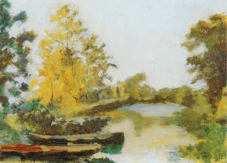
The scene opens with a gentle curve of canal that widens toward the center distance, its dull silver surface reflecting banks of yellow and green. On the left foreground, dark wooden boats nestle into reeds, their bows angled inward as if dozing. Poplars and willows rise in tufted silhouettes, the most emphatic being a luminous stand of yellow leaves that catches the eye and stabilizes the composition. The sky is a high, milk-white expanse, almost toneless at first glance, that acts like a scrim diffusing the entire view. Everything is hushed: no ripples suggest wind, no figures interrupt the stillness. What remains is the atmosphere of a late-season day and the quiet architecture of a canal that guides the gaze without fuss.
Composition As A Calm S-Curve Anchored By Boats
Matisse organizes the rectangle as a shallow stage where the canal’s S-curve is the lead actor. Beginning at the lower right, a pale wedge of water glides leftward, then turns back to the right in the middle distance, trimming the far bank before sliding off toward the horizon. This curve is flanked by two vertical screens of trees—warm yellow masses on the left and mixed green-brown shapes on the right—that operate like wings in a theater. In the lower left corner, two boats create a dark, horizontal counterweight to the canal’s pale diagonal, keeping the composition from drifting upward. The tiny ellipse of bright water at the bend functions as a visual pause, a resting pool for the eye before it resumes its motion along the banks. The design is deliberately simple; its clarity allows color and touch to do the descriptive lifting.
Color Architecture: A Low-Chroma Harmony Tuned By Temperature
The palette is remarkably quiet for Matisse and therefore revealing. Instead of saturated complements, he relies on earth pigments and low-chroma greens tempered by milky whites. The left bank’s foliage is a dominant yellow—likely ochre warmed with hints of sienna—broken by cool white flickers that suggest sky piercing the leaves. Opposite, the right bank tilts more olive and umber, a cooler counterpart that deepens the lateral dialogue. The canal itself is a pale amalgam: lead white infused with faint greens and gray blues that shift as the water receives nearby color. Because there are no dead blacks, even the darkest boats contain chromatic life; their browns incline toward green near the waterline and toward red where wood meets air. Temperature, not high chroma, drives the forms—warm where sun touches, cool where shadow and reflection gather.
Light And Weather: A Landscape As Shared Climate
Illumination in “Banks of the Canal” behaves not like a spotlight but like weather. The sky’s whiteness is neither empty nor overcast; it reads as a thin veil that scatters light evenly across the scene. As a result, shadows are gentle, transitions are broad, and the canal surface holds light as tone rather than sparkle. This atmospheric evenness is essential to the painting’s mood of repose. It also lets Matisse test how far he can push simplification without losing credibility: if light is everywhere, then modeling can be achieved through a few well-tuned temperature shifts instead of theatrical value jumps.
Brushwork And The Physics Of Place
Touch in this canvas is varied yet disciplined. The sky is scumbled thinly so the canvas weave participates, an apt analogue for airy diffusion. The trees are knitted from short, stacked strokes that refuse to count leaves but convincingly suggest clusters of foliage. On the left, the yellow poplars are built from soft daubs and dragged notes, with small cool inserts that keep the mass lively. The water is handled in longer, horizontal pulls, some slightly translucent, so that underlayers breathe through and read as depth. The boats and bank edges receive firmer, more planar strokes that grant them weight. This orchestration of speeds—quick in foliage, level in water, stout in boats—allows the eye to feel different materials without the need for detail.
Drawing Through Adjacency, Not Outline
Edges arise where zones meet rather than from lines encircling forms. The far bank exists because a cool, pale plane of water abuts a darker olive strip of land. The bow of a boat is “drawn” where a warm brown wedge presses against green water. Tree outlines dissolve into the sky as warmer yellows encounter the milk-white field. When a line does appear—say, the thin lip along a boat’s edge—it is a brief calligraphic accent, immediately absorbed by the neighboring color. This method keeps the painting unified: drawing is an effect of relationships, not a separate layer.
Space And Depth: Persuasion Without Theatrical Perspective
Depth is gently persuasive rather than calculated. The canal narrows; tones compress with distance; tree masses diminish; the small bright pool at the bend convinces because it is surrounded by progressively cooler greens. Yet the surface remains a coherent decorative field. The left mass of yellow trees presses forward like a patterned screen, and the boats, cropped and dark, anchor the lower edge as painted shapes as much as objects. This equilibrium between believable recession and frontal design anticipates Matisse’s mature aim: a picture should read instantly as a balanced arrangement on a plane even as it offers the sensation of space.
The Boats: Dark Rests And Human Imprint
Though unoccupied, the moored boats carry the painting’s human implication. Their dark, horizontal heft holds the foreground and gives the viewer a point of entry—as if you could step from bank to hull to water with your eyes. Their angles also echo the banks’ geometry, knitting people-made objects to natural form. Matisse avoids anecdote: no ropes, no carved names, no glinting hardware. The boats are distilled to planes and wedges that express function and rhythm, a quiet signature of presence without story.
Season And Mood: An Autumn Of Memory Rather Than Inventory
The golden left bank suggests late summer crossing into autumn—the moment when poplars flare before fading. Instead of cataloging botanical facts, Matisse paints the season’s feel: warmth held in the leaves, coolness gathering in water, a color key that has dropped from spring’s greens into ochre, and a sky that has thinned. The painting’s equilibrium between warmth and pallor reads as an emotional weather too, the hush of a year turning. That mood, won through spare means, is one reason the canvas lingers in memory.
Dialogues With Tradition And Peers
“Banks of the Canal” listens to several predecessors while speaking in Matisse’s emerging voice. From Corot and the Barbizon painters it borrows the dignity of subdued chords and the poetry of filtered light. From Monet and Sisley it learns to treat water and sky as fields of related tones rather than as empty backdrops. From Cézanne it absorbs the constructive patch—form built by adjacent planes—and the courage to simplify volumes into coherent masses. Yet the temperament is distinctly Matisse’s: he seeks serenity over effect, and he keeps the surface as a unified, breathing skin even when description tempts elaboration.
Materiality And Period Pigments
The restrained harmony points to a practical early-twentieth-century palette. Lead white, perhaps tempered with zinc, suffuses sky and water. Yellow ochre, raw sienna, and light cadmium yellow shape the flaring foliage. Viridian tempered with ochre and ultramarine yields the olive banks and water shadows. Raw and burnt umbers ground the boats, warmed with a touch of red lake where wood catches light. Ultramarine and cobalt whisper into the canal’s cooler passages. Ivory or bone black is used sparingly to anchor darks without killing chroma. Thin, lean scumbles alternate with fuller, buttery notes, giving the painting tactile variety appropriate to air, leaf, wood, and water.
The Ethics Of Omission
One of the canvas’s most modern traits is its confident omission. There are no counted leaves, no rippling wavelets plotted one by one, no bricks on a distant lock, no sedges traced along the bank. The sky is a great, nearly unmodulated field; the far trees are suggested by value blocks; the boats are summarized. Such omissions are not shortcuts. They are decisions that protect the whole, ensuring that nothing disrupts the chord of light and temperature that defines the scene. The viewer’s own memory of canal walks supplies specifics; the painting supplies the tuned relations that make those memories click into place.
How To Look Slowly And Profitably
Let the picture resolve first as three belts—pale sky, a band of tree masses, and the canal—organized by the S-curve of water. Then begin a circuit. Start at the dark boats in the left foreground; feel how their weight locks the corner. Follow the near bank as it rounds into the luminous pool at the bend; let your eye pause there. Cross to the opposite bank and ride the cooler greens back toward the right edge, noting how the canopy opens to expose sky. Drift up into the high white field and notice how subtly it warms near the horizon. Repeat the loop more slowly, this time attending to edges formed by adjacency: yellow against white in the tree crowns, brown against green along the boat, olive against silver in the water. Back away again until the painting holds in one breath, unified and calm. That near–far rhythm mirrors Matisse’s own method of revision by relation.
Place Within Matisse’s 1903 Arc
Seen alongside the studio interiors and rural scenes he painted the same year, “Banks of the Canal” clarifies what Matisse was after. He was training himself to reduce, to let temperature model volume, to build form with abutting planes, and to keep the surface serene even when objects tug toward description. Within two years, in Collioure and Paris, he would ignite those lessons with blazing complementary color. The later works feel inevitable because pictures like this one supplied the armature—simple, balanced designs that can carry saturated chords without breaking.
Why “Banks of the Canal” Endures
The painting endures because it turns a quiet, familiar motif into a durable harmony. Its pleasures are cumulative: the way pale water receives banks like a soft mirror; the way ochre trees glow without shouting; the way dark boats both anchor the eye and hint at human routine; the way space opens just enough to invite breath while the surface remains a single, coherent field. It shows that Matisse’s modernity did not depend on intensity alone. Even in a muted key, he could orchestrate light, color, and form so that the picture feels inevitable—an arrangement you recognize as true before you identify the parts.