Image source: wikiart.org
Introduction
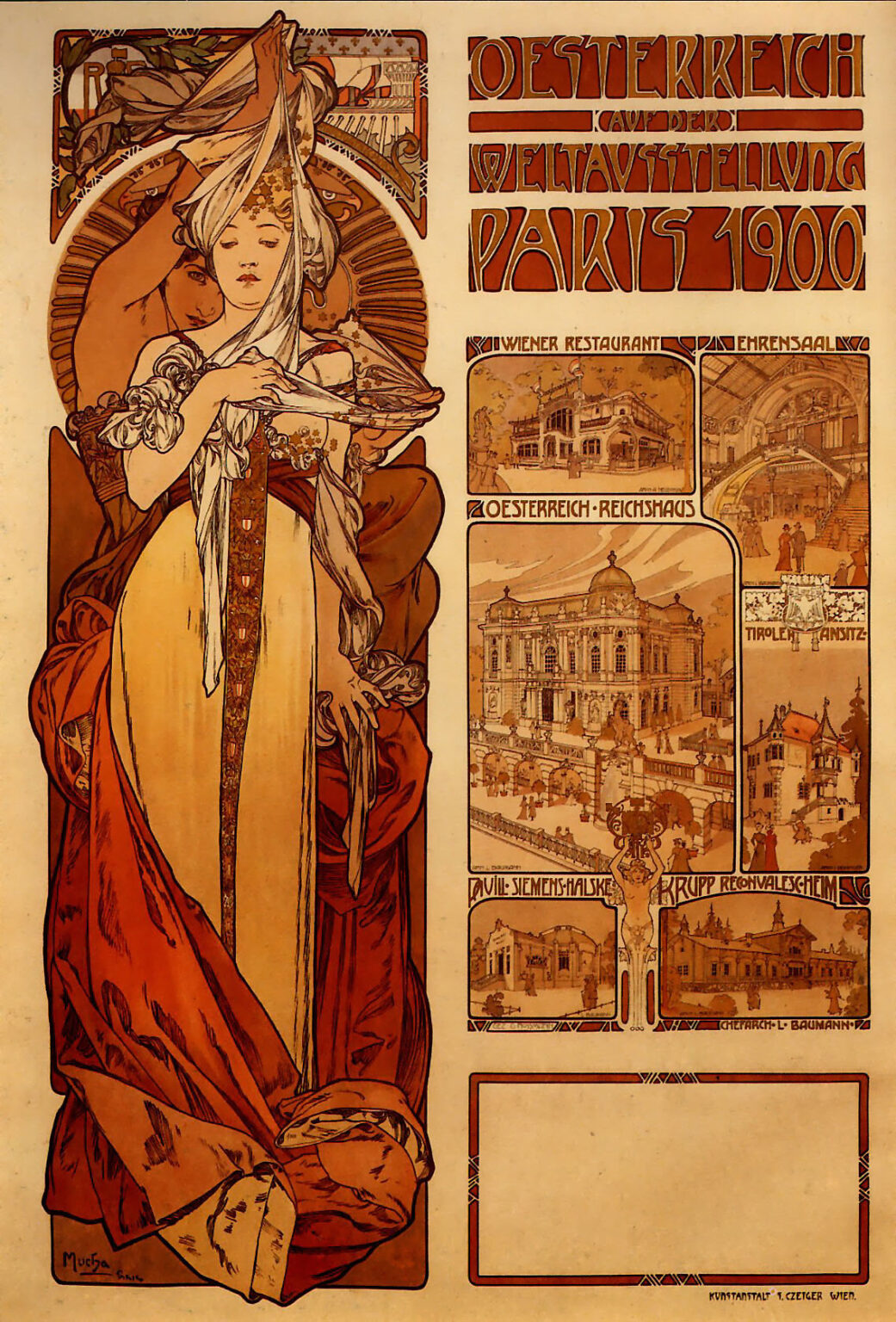
Alphonse Mucha’s “Austria” (1899) is a masterclass in how a poster can be both an announcement and an emblem. Created to promote Austria’s presence at the Exposition Universelle in Paris of 1900, the composition binds allegory, architecture, and typography into a single persuasive image. On the left, a monumental female personification rises like a column of drapery and light. On the right, a series of architectural vignettes previews the pavilions, restaurants, and gala halls that visitors would encounter. Between these halves flows a river of lettering whose sculptural forms are as carefully designed as any figure. The sheet does not merely advertise; it dramatizes a nation unveiling itself to the world.
A Poster for a World Stage
Around 1900, world’s fairs were engines of national self-presentation. Austria—within the Austro-Hungarian realm and culturally intertwined with the Vienna Secession—sought to broadcast modernity while honoring tradition. Mucha was an ideal ambassador. Already celebrated in Paris for his theater posters, he understood how to command attention from a distance without sacrificing refinement up close. “Austria” answers that challenge by giving the eye both an icon that reads instantly and a field of detail that rewards prolonged viewing. The poster’s very scale evokes architectural presence, as if it were a portable façade for the Austrian section of the fair.
The Allegory at Left: A Nation Unveiled
The tall figure lifting a translucent veil is the heart of the image. She embodies the country as a living ideal, but not a stiff heraldic device. Her movement—arms raised, fabric unfurling—suggests revelation. Austria is not announced with trumpets; she is unveiled with ceremony. The gesture is both hospitable and theatrical, a welcome to the fair and an invitation to see what lies within. Garments in cream and deep terracotta recall the warm stone of Vienna’s Ringstrasse and the richness of court costume without quoting either literally. Floral ornament tucked into her hairstyle hints at alpine flora, while the pendant panel of patterned fabric that falls down her front reads like a vertical standard, an axis that anchors the composition.
Architecture of the Whole Sheet
Mucha builds the poster on a robust armature of rectangles and arcs. The allegorical figure occupies a tall bay framed by a rounded arch. To the right, a stacked column of picture windows presents the Austrian venues. The upper title block fills the top-right quadrant with compact, architectonic lettering. A blank panel at the lower right—left open for schedules or announcements—balances the visual weight of the figure’s hem. This grid gives the design both clarity and flexibility; it could accommodate different overprints while preserving harmony. Mucha’s mastery lies in making all of this planning disappear beneath the art’s surface flow.
Orchestrated Typography
The headline—“Oesterreich auf der Weltausstellung Paris 1900”—is not merely text; it is ornament, architecture, and voice. Its stacked words are carved from the same warm palette as the rest of the poster, with letterforms that echo Viennese Secession geometry: broad verticals, rounded counters, subtle wedge serifs, and close letterspacing that turns language into masonry. The lettering becomes a cornice over the vignettes, a structural member in the poster’s building. Mucha’s integration of type and image exemplifies the era’s ideal: the designer as a total artist who composes figure, ornament, and words as one continuous work.
The Vignettes: A Guided Preview
On the right, framed scenes function as windows into Austria’s display. Halls, restaurants, and ceremonial spaces appear in a consistent sepia harmony, each labelled with compact titles. Mucha renders them with brisk, sure perspective, populating forecourts and interiors with visitors whose silhouettes add human scale. These views are not technical drawings; they are invitations to stroll. The decision to keep their palette close-knit ensures that they read as a single columnar narrative rather than a noisy collage. Through this device the poster persuades on two levels: it makes an emotional promise via the allegory and a practical promise via the architecture.
Color as National Temper
The poster’s chroma is set in terracotta, ochre, olive, and cream—colors of stone, tile, textile, and autumn light. Against them, small notes of soft blue and smoke gray keep the sheet from overheating. The limited palette unifies the complex content while projecting a mood of cultivated warmth. It is a palette that suggests a café’s wood paneling, a concert hall’s velvet, a monastery’s stone, and the golden hush of late afternoon across the Danube valley. Mucha’s colors do not shout; they glow, aligning Austria with refinement rather than spectacle.
The Whiplash Line and the Flow of Fabric
Mucha’s famous whiplash line—elastic, continuous, and musically phrased—does its finest work in the figure’s drapery. The veil snakes around her raised forearms, flows through her hands, and cascades into the gown. At the hem, fabric breaks into heavy folds that weight the figure to the ground so she can rise like a column above. The line is both drawing and direction; it tells the viewer how to move through the image. Within the vignettes the line tightens into architectural contours; in the floral cartouches it relaxes into soft leaves and blossoms. The same hand holds all these modes together.
Ornament as Structure
Every decorative element carries structural responsibility. The terracotta cartouche behind the figure’s head binds the left bay’s arch to the allegory, making a niche. The floral fields in the title block soften its geometry and tie it to the figure’s organic world. The tiny dividing motifs between vignettes act like brackets, preventing visual collapse and creating cadences in the reading. Even the vacant panel at the lower right is given a slender border and corner ornaments so that, whether printed with information or left blank, it still completes the frame’s rhythm.
The Feminine Image and National Identity
Mucha’s women are often described as muses, but here the figure is more than inspiration; she is agency embodied. She gathers and guides the veil; she administers the poster’s central action, the act of revealing. Her stance is dignified—weight settled, gaze calm—balancing grace with authority. In the politics of imagery around 1900, such figures helped nations speak in a human voice. They avoided the militarized stiffness of eagles and shields, proposing instead that cultural capital—music, design, hospitality, architecture—could be a country’s most persuasive force.
A Dialogue with the Vienna Secession
While Mucha’s style was forged in Paris, the poster resonates with the Vienna Secession’s ideals: the unity of the arts, the elevation of applied design, and the embrace of geometric clarity. The blocky headline, the disciplined panel system, and the marriage of decorative flora with strict frames all point to that influence. Yet the drawing’s suppleness and the figure’s lyrical presence remain entirely Mucha. The poster becomes a bridge between the soft sensuality of Parisian Art Nouveau and the structured modernity cultivated in Vienna.
Lithography and the Glow of Paper
Printed by a Viennese lithographic house, the sheet makes exemplary use of color lithography’s strengths. A black-brown keyline holds contours; transparent inks build depth while letting the paper’s warmth supply the highest lights. The vignettes’ delicate textures—cobblestones, masonry, figural silhouettes—are produced by crayon and tusche on stone, giving them the granular life of drawing rather than the chill of mechanical reproduction. Because the palette leans warm, the paper itself acts like a quiet light source, allowing the poster to appear luminous in a café or on a misty street.
Reading Order and Viewer’s Journey
The viewer’s path through “Austria” is carefully staged. From afar, the allegory catches the eye; her raised arms and streaming veil form a beacon. As one approaches, the gaze is drawn rightward to the monumental headline, where the subject and destination are clear at once. From there the eye descends through the column of vignettes, like a visitor descending a grand stair into the exhibition halls. Finally, attention settles on the blank lower panel, where practical details could be added. The journey replicates the experience promised: revelation, orientation, exploration, and arrival.
Allegory, Industry, and Hospitality
World’s fairs wove art and industry together, and Mucha’s poster enacts that weave. The allegorical woman represents culture; the vignettes represent engineering and architecture; the restaurants and ceremonial halls advertise hospitality. Even the smallest frame includes figures walking, conversing, dining. Austria is presented not simply as a producer of objects but as a maker of environments. That emphasis aligns perfectly with Mucha’s own philosophy: that beauty and utility should be inseparable and that good design is a public good.
The Poster as Portable Architecture
Looked at structurally, the sheet behaves like a façade. The left bay is a portal containing a statue; the right side is a row of windows; the headline is an entablature; the lower blank panel is a signboard waiting for inscriptions. This architectural metaphor allows the poster to act as a stand-in for the buildings it advertises. Even if a passerby never reached the fair, the poster could deliver a scaled experience of its character—warm, ordered, ceremonial, and welcoming.
Comparisons with Mucha’s Theater Posters
Compared with Mucha’s electric designs for Sarah Bernhardt, “Austria” is more civic, less tempestuous. The heroine here does not fling herself into melodrama; she officiates with composure. The color range is narrower, the geometric scaffolding more insistent, the typography more integrated. Yet the family resemblance remains: profuse hair and fabric captured in streamers of line, ornamental halos, floral supports, and a talent for making printed ink seem to breathe. In moving from the theater of Paris to the theater of nations, Mucha adjusted scale and tone without sacrificing signature grace.
Enduring Relevance
More than a century later, “Austria” still demonstrates how to reconcile dense information with emblematic power. Designers study it for its typographic hierarchy, its panel logic, its merger of illustration and map, and its tonal cohesion. Cultural institutions draw on its strategy of pairing a single strong allegory with a matrix of programmatic images. Cities and nations continue to seek that balance between identity and itinerary, and Mucha’s solution remains remarkably contemporary.
Conclusion
“Austria” is both invitation and portrait. It invites visitors to a world’s fair with scenes of welcoming architecture, and it portrays a nation through a figure who embodies poise and revelation. Every element—letter, line, vignette, and fold of cloth—takes part in a single gesture of unveiling. The poster’s warmth, clarity, and elegance explain why Mucha became a favorite interpreter of civic themes as well as theatrical ones. In this sheet, the country steps forward not as an emblem carved in stone but as a gracious presence ready to receive its guests.