Image source: artvee.com
Introduction
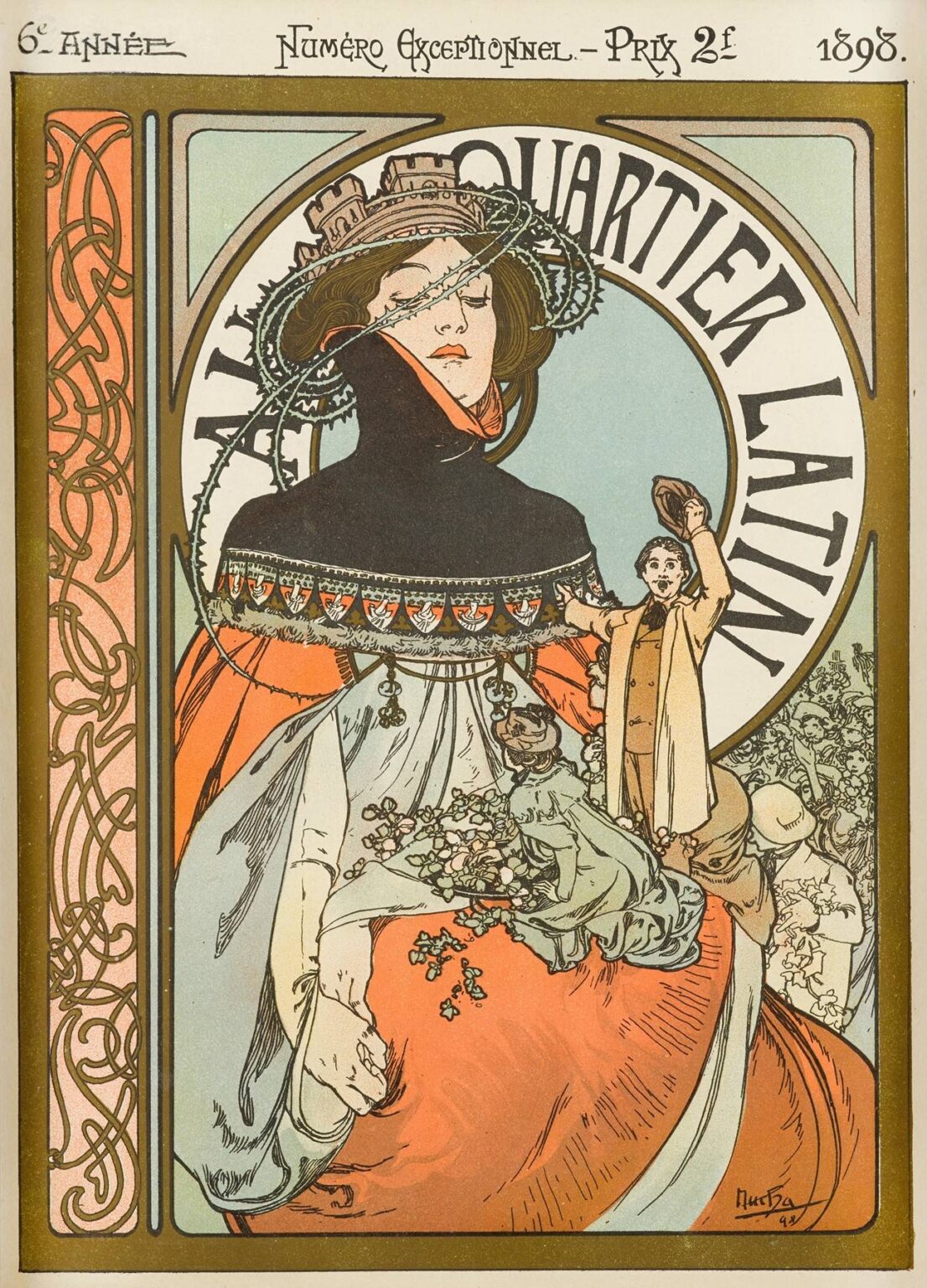
Alphonse Mucha’s Au Quartier Latin, created in 1898, stands as one of the most evocative posters of the Belle Époque, seamlessly blending allegory, graphic innovation, and the vibrant spirit of Paris’s student quarter. Commissioned as a special issue cover for a literary and artistic review celebrating the Latin Quarter’s bohemian energy, the lithograph poster transforms urban life into an Art Nouveau fantasia. Its sinuous lines, restrained yet rich palette, and symbolic interplay of figure and ornament invite viewers to explore the cultural vitality of Montagne Sainte-Geneviève and its cafés, bookstores, and theatres. Mucha’s design not only announces a publication but also offers a visual ode to intellectual ferment, social gathering, and the timeless allure of student life in the heart of Paris.
Historical and Cultural Context
At the end of the 19th century, the Quartier Latin was synonymous with academic pursuit, avant-garde art, and spirited debate. Home to the Sorbonne and numerous arts institutions, the neighborhood attracted students, writers, and artists who gathered in cafés around Boulevard Saint-Michel. In 1898, when Mucha created this poster, Paris was at the zenith of the Belle Époque: an era of optimism, technological innovation, and flourishing arts scenes. Publications devoted to literature, art criticism, and theater reviews played a crucial role in shaping public discourse. Mucha’s Au Quartier Latin poster appeared in this vibrant milieu as the visual embodiment of that dynamic cultural exchange, offering an aesthetic gateway into the intellectual heart of the city.
Commission and Publication Purpose
The poster was commissioned for a “Numéro Exceptionnel”–a special anniversary issue–of a review dedicated to arts and letters of the Latin Quarter. Priced at “2f,” the issue celebrated the sixth year of the publication, marking its emergence as an influential voice among Parisian literati. Mucha, already renowned for his theatrical posters, was invited to lend his distinctive style to capture the review’s ethos. Rather than illustrating a specific play or product, Au Quartier Latin functions as a promotional emblem, designed to adorn walls around the Sorbonne and Boulevard Saint-Germain, enticing both students and cultural pilgrims to seek out the special issue.
Composition and Layout
Mucha organizes Au Quartier Latin within a graceful vertical frame, typical of his poster work. The top header presents the date “6e Année” on the left and “1898” on the right, flanking the phrase “Numéro Exceptionnel – Prix 2f.” Below, a broad horizontal band anchors the composition and prepares the eye for the medallion-like centerpiece. At the center, a large circular panel bears the title “Au Quartier Latin,” its lettering arched to follow the circle’s curve. Within this circle, the main allegorical figure dominates: a young woman, her head crowned by a wreath of stars and cathedral spires, her collar rising like the campus cloisters. To her right, a diminutive student stands atop her swirling skirt, tipping his cap in greeting. The left border features a vertical panel of interlaced ornament, while the right side remains open, balancing the density of detail. The lower portion of the poster is largely empty, its negative space allowing the viewer’s eye to absorb the central imagery without distraction.
The Central Figure as Allegory
The feminine figure embodies the spirit of the Latin Quarter itself—an amalgam of wisdom, inspiration, and urban grandeur. Her elaborate collar, reminiscent of both clerical robes and academic mantles, suggests the weight of learning. The wreath adorning her hair weaves together stars, gothic arches, and architectural elements that evoke Notre-Dame and Sainte-Chapelle, anchoring her identity in the City of Letters. Her gaze, directed downward and to the side, conveys introspection, as though she contemplates the dialogues unfolding in café corners and lecture halls. Mucha’s idealized portrayal transforms her into an allegorical Muse of Scholarship, inviting viewers to partake in the intellectual adventures documented within the special issue.
The Student Figure and Crowds
Contrasting with the serene poise of the central Muse, the small student figure on her skirt introduces human energy and movement. Clad in a mustard-yellow overcoat and waistcoat, he stands with one foot forward, tipping his hat toward the Muse, symbolizing respect and conviviality. The miniature crowd behind him, rendered in muted outlines, suggests the throngs of students and artists who populate the Quartier Latin. Their indistinct forms reinforce the sense of collective enthusiasm without detracting from the two dominant characters. Together, the figures create a dynamic interplay: lofty ideals embodied in the Muse and the tangible excitement of youthful participation embodied in the student.
Mastery of Line and Ornament
Mucha’s signature sinuous linework is on full display in Au Quartier Latin. The folds of the Muse’s voluminous skirt trail in graceful arcs, each contour articulated with variation in thickness to suggest depth and texture. The pupil’s hat brim and tailored coat emerge from similarly confident strokes, their edges crisp and defined. Decorative filigree in the left border panel echoes the curves of drapery and swirling stellar wreath, creating rhythmic continuity throughout the poster. Mucha’s control of contour—where line weight becomes a sculptural tool—imbues the design with both graphic clarity and ornamental richness.
Color Palette and Lithographic Technique
MuchA employs a restrained palette of coral reds, pale aquamarines, soft grays, and muted olives, evoking both autumnal warmth and academic formality. The Muse’s skirt glows in terra cotta and peach, contrasted by her smoky gray bodice and the student’s golden attire. The background fields transition from warm ivory to gentle aquamarine, framing the central circle. Achieving such harmonious tones required a multi-stone lithographic process, wherein each color is applied from a separate stone. Mucha collaborated closely with the Champenois printworks to fine‐tune ink opacity, registration, and varnish effects. The result is a poster that balances flat, decorative color fields with subtle gradients and crisp line fidelity.
Typography and Text as Ornament
The lettering in Au Quartier Latin exemplifies Mucha’s belief that type should integrate with image. The header script—lettering for “6e Année,” “Numéro Exceptionnel – Prix 2f,” and “1898”—carries calligraphic flourishes reflecting the swirling ornament below. The title “Au Quartier Latin,” within the central medallion, is rendered in elongated, slightly irregular capitals whose serifs and curves echo the circular wreath at the Muse’s head. The student‐face greeting and the indistinct crowd script behind him interplay with the main lettering, suggesting both textual layers and literal crowds. Type becomes part of the decorative tapestry, uniting language and imagery into a single visual statement.
Architectural and Gothic Influences
The poster’s circular wreath draws heavily on Gothic rose windows, with repeated quatrefoils, fleur‐de‐lys, and tracery inflections that recall Notre‐Dame’s iconic façade. Mucha’s interest in medieval ecclesiastical ornament is evident in the wheel‐like medallion framing the title and Muse. This architectural referent evokes not just physical structures but the centuries‐long tradition of scholarship housed in cloisters and cathedral schools. By integrating these forms into a modern poster, Mucha bridges past and present, aligning the Latin Quarter’s intellectual legacy with the aesthetic ideals of his own era.
Symbolism of the Wreath and Collar
The Muse’s wreath combines botanical and architectural symbolism. Leaves reminiscent of laurel—a classical emblem of poetic achievement—intertwine with star motifs, suggesting both earthly scholarship and celestial inspiration. The inclusion of miniature spires and arches within the wreath reinforces the urban, historic identity of the Latin Quarter. Her collar, rising like the hollows of cloistered walkways, suggests the embrace and the discipline of learning. Combined, these ornamental elements create a visual code that communicates the poster’s theme to an audience steeped in Western architectural and academic symbolism.
The Role of Negative Space
Mucha’s judicious use of negative space enhances the poster’s graphic impact. The broad areas of unadorned green at the bottom and of pale background behind the Muse prevent the design from feeling overcrowded, directing attention to the central medallion and figures. Similarly, the empty space immediately surrounding the date and header text allows those details to read clearly from a distance. This strategic reservation of blank fields evidences Mucha’s understanding of visual hierarchy and his ability to balance ornament with breathing room.
Integration of Everyday and Idealized Elements
While the poster is highly allegorical, it also incorporates mundane details—for example, the student’s modern overcoat, the bucket of flowers at the Muse’s feet, and the hint of Parisian rooftops in the background. These touches ground the poster in contemporary reality, reminding viewers that the Latin Quarter’s spirited life is a living tradition. Mucha seamlessly blends these quotidian references with idealized iconography, creating a work that resonates both as decorative art and as a genuine reflection of urban culture.
The Art Nouveau Aesthetic in Action
Au Quartier Latin exemplifies key tenets of Art Nouveau: organic forms, flat decorative patterns, and the unity of applied and fine art. Mucha’s synthesis of medieval, classical, and contemporary sources into a coherent ornamental language captures the movement’s quest for total design. The poster’s emphasis on flowing lines and botanical motifs, its rejection of academic perspective, and its seamless integration of text and image stand as hallmarks of the era. By applying these principles to a commercial commission, Mucha demonstrated that everyday objects—even event announcements—could become works of art.
Technical Collaboration and Print Quality
The production of Au Quartier Latin involved meticulous craftsmanship at the Imprimerie Champenois workshop. Mucha provided detailed gouache color keys and full‐scale line drawings indicating registration marks. Lithographers then prepared multiple limestone plates—often seven or eight—to capture the poster’s full chromatic range. Transparent inks allowed for subtle gradient in backgrounds and skin tones, while heavy outlines preserved the clarity of decorative details. The finished prints, executed on thick wove paper, bore the hallmarks of quality and durability, ensuring that the poster could withstand outdoor display and the rigors of urban weather.
Reception and Influence
When it first appeared on Parisian walls, Au Quartier Latin captured the imagination of students, artists, and café‐goers alike. Its evocative imagery and clear message drew readers to seek out the special issue of the review, while its aesthetic appeal elevated it to collectible status. Designers and illustrators across Europe cited Mucha’s Latin Quarter poster as a benchmark in graphic communication, inspiring similar campaigns in other cultural capitals. The blending of allegory and contemporary life in the poster influenced illustrated magazine covers, theater programs, and even early cinema posters, extending Mucha’s reach beyond the printed page.
Preservation and Modern Legacy
Today, original impressions of Au Quartier Latin are prized by museums and private collectors worldwide. Conservation efforts focus on stabilizing the acidic papers and preventing ink fading through controlled lighting and archival framing. Digital archives have made high‐resolution reproductions available, ensuring that Mucha’s design continues to inspire new generations of graphic artists. The poster’s enduring appeal lies not only in its decorative beauty but also in its vibrant encapsulation of a cultural moment—Paris’s intellectual and bohemian heart at the dawn of modernity.
Conclusion
Alphonse Mucha’s Au Quartier Latin poster transcends its commercial origins to achieve the status of a masterpiece of Art Nouveau graphic art. Through its harmonious composition, fluid linework, rich symbolism, and sophisticated palette, the poster evokes the vivacious spirit of Paris’s student quarter and celebrates the life of the mind. Mucha’s ability to integrate allegory, historical reference, and contemporary reality into a cohesive design exemplifies the transformative power of decorative art. More than a mere advertisement, Au Quartier Latin endures as an icon of cultural memory and a testament to the poster’s potential as a vehicle for both beauty and meaning.