Image source: artvee.com
Historical Context: The Roaring Twenties and Art Deco
Painted in 1924, “Au Lido” emerges from the vibrant milieu of Paris during the interwar period known as the Roaring Twenties. This was an era of economic prosperity, technological innovation, and cultural experimentation. Paris became the epicenter of modernist movements in art, literature, music, and design. Art Deco, the predominant aesthetic of the decade, celebrated exuberance, luxury, and streamlined geometric forms. Fashion houses like Chanel and Patou revolutionized women’s style, while cabarets and nightclubs thrived in Montparnasse and the Champs-Élysées. Barbier’s artwork for “Au Lido” reflects this spirit: a synthesis of high fashion, theatrical glamour, and a polished graphic sensibility emblematic of Art Deco. His depiction of elegantly clad bathers on Venice’s fashionable beach captures the era’s fascination with modern leisure and the dazzling possibilities of the new century.
George Barbier: Life, Training, and Illustration Career
George Barbier was born in Nantes, France, in 1882. After early training at the École des Beaux-Arts and the Académie Julian, he initially pursued stage design before making his mark as an illustrator. His first major success came in 1911 when he contributed to the literary review “La Gazette du Bon Ton,” working alongside artists such as Paul Iribe and Georges Lepape. Barbier’s distinct style—combining crisp outlines, refined color palettes, and stylized elegance—soon attracted commissions from fashion magazines like “Vogue” and “Harper’s Bazaar.” He also illustrated luxury publications and costume designs for the Ballets Russes. By the 1920s, Barbier was in demand for commercial posters, book illustrations, and theatrical programs. “Au Lido” represents his mature vision: a poster that functions both as advertisement and as a collectible work of art, bridging the worlds of graphic design and fine illustration.
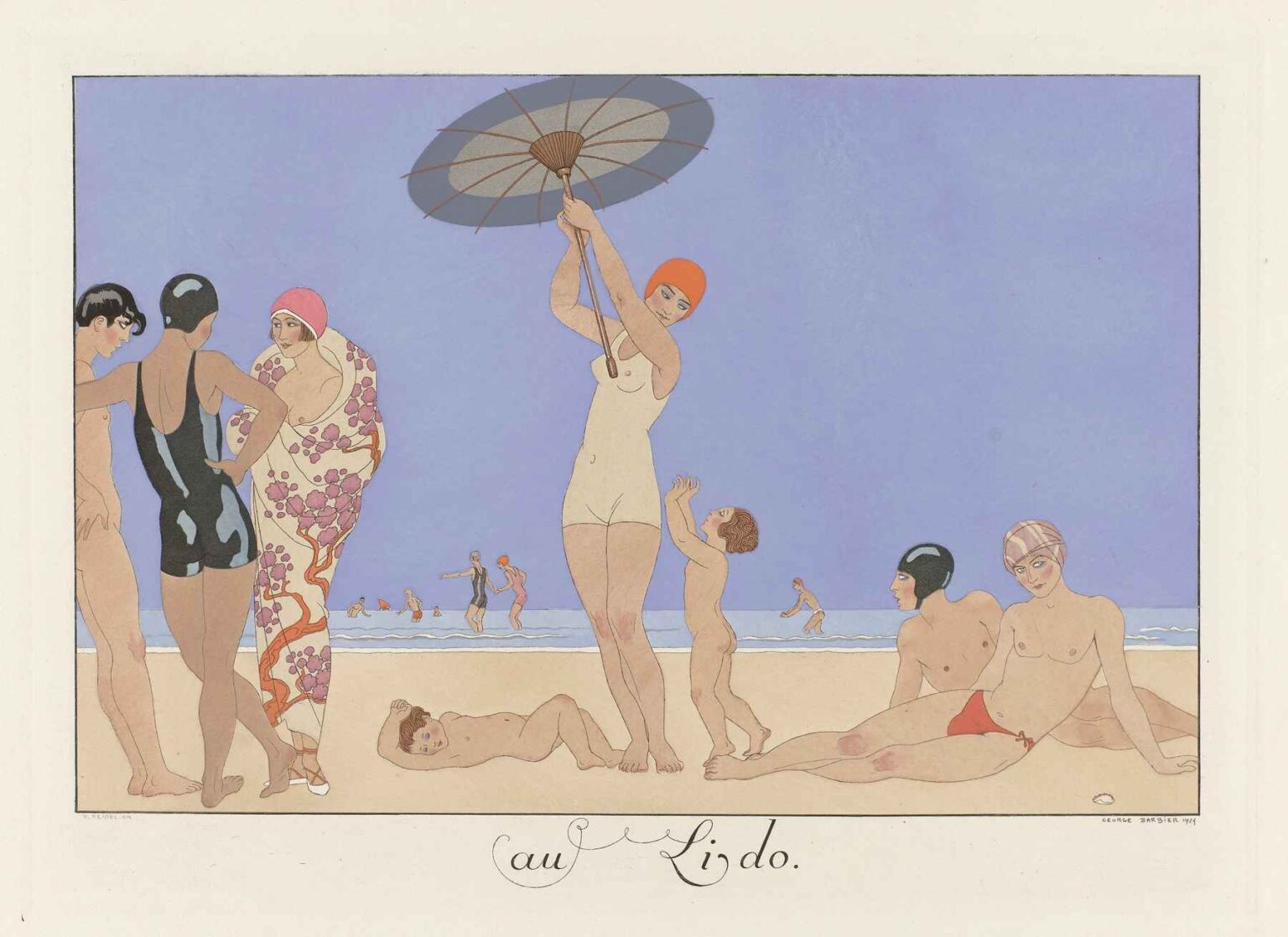
Subject Matter: Venus on the Sand
“Au Lido” transports viewers to the famed Lido di Venezia, where European aristocrats and wealthy tourists flocked for sun, sea, and society. Barbier’s scene presents a stylized panorama of bathers at the water’s edge. On the left, three figures cluster in conversation: two women in sleek, black swimsuits and bobbed hair, and a lady wrapped in a floral shawl and pink swim cap. At center, a tall figure in a cream-colored suit raises a parasol, standing beside two small children reaching upward. To the right, a reclining bather in red trunks and pastel swim cap lounges on the sand, gazing outward. In the distance, miniature figures wade in the cerulean sea. This arrangement of figures reassures viewers that the Lido was a place of elegance, leisure, and cosmopolitan style—principles at the heart of Barbier’s vision.
Composition and Spatial Harmony
Barbier structures the composition around a horizontal band of sand, sea, and sky. The foreground figures occupy the lower two-thirds of the poster, set against a broad swath of pale sand that emphasizes the diagonals and verticals of limbs, parasol, and clothing. The middleground features a thin line of breaking waves, behind which clusters of tiny bathers establish depth and scale. The upper quarter of the image is devoted to an unbroken field of flat, pastel blue sky—a modernist embrace of minimalism that allows the figures to stand out vividly. Barbier’s careful placement of each silhouette creates a rhythmic progression from left to right, guiding the viewer through a tableau of varied postures, costumes, and gestures. This elegant economy of space exemplifies Art Deco’s preference for streamlined, geometric layouts and strong visual impact.
Line Quality and Graphic Economy
One of the hallmarks of Barbier’s style is his precise use of line. Contours are rendered with assured, unbroken strokes that define each figure’s form without superfluous detail. The black swimsuits on the left are indicated by smooth, sinuous outlines, while the parasol is sketched with radial lines that converge at its handle. Facial features and hair are suggested by a few parsimonious accents—arched eyebrows, a curved line for a bob, or the curl of a child’s head. This graphic economy makes the image instantly legible from a distance, satisfying the functional demands of poster art. At the same time, the controlled line work conveys an artisanal craftsmanship, reminding viewers that each poster is a hand-crafted design rather than a mass-printed afterthought.
Color Palette and Tonal Balance
Barbier’s palette in “Au Lido” is simultaneously restrained and sumptuous. Soft pastels—powder blue sky, creamy sand, pale skin tones—dominate the background, while bright accents of red, pink, and black punctuate the scene. The swimmer’s red trunks draw the eye to the right, balanced by the pink cap and floral pattern on the lady’s shawl at left. The parasol’s warm gray-green complements the distant sea’s cooler blue, adding a refined modulation. Barbier often experimented with metallic inks and spot color in his fashion illustrations; here, he achieves a similar effect through careful contrasts rather than actual metallic pigments. The result is a harmonious unity of color that evokes sunshine and sea breeze, while also conveying high style and taste.
Costume and Fashion Sensibility
The women’s swimsuits in “Au Lido” capture the latest trends of 1924. The sleek, close-fitting one-piece suits, coupled with bobbed hairstyles and swim caps, reflect the era’s new ideals of athleticism and modern femininity. These streamlined garments also align with Art Deco’s celebration of aerodynamic forms. The floral shawl worn by the central figure hints at Japanese influences that pervaded 1920s fashion—echoes of ukiyo-e patterns and kimono drape. The child’s simple linen shorts and the parasol’s delicate structure further reinforce the image of refined leisure. Barbier’s attention to fashionable dress underscores the poster’s dual function as both beach advertisement and fashion statement, inviting viewers to emulate the sitters’ chic comportment.
Thematic Resonances: Leisure, Childhood, and Modernity
Beyond its surface charm, “Au Lido” engages with broader themes of modern life. Leisure at the seaside had become a hallmark of early 20th-century urban society, made possible by railway travel and disposable incomes. Public beaches like Lido offered opportunities to display one’s body and style in communal settings. Barbier’s inclusion of playful children introduces an element of innocence and continuity between generations: modern parents enjoying new freedoms while their offspring experience carefree joy. This juxtaposition of adult elegance and childlike spontaneity embodies a utopian vision of modernity—where social progress yields both sophistication and happiness. In this sense, “Au Lido” celebrates not only fashion but also the social transformations of postwar Europe.
Printing Techniques and Commercial Strategy
As a commercial poster, “Au Lido” would have been reproduced via lithography—a process that allowed Barbier’s bold colors and crisp lines to transfer cleanly onto paper. Parisian printers specialized in color lithographs for theater, champagne houses, and travel agencies. Posters were pasted on billboards across the city and in railway stations, reaching a wide audience. Barbier’s name, often featured prominently on his fashion plates, guaranteed a level of artistic prestige. The poster’s clean typography—“au Lido” in graceful script—integrates seamlessly with the visual elements, guiding potential visitors to the advertised destination. This synergy between art and commerce exemplifies the golden age of poster art, when graphic design served both aesthetic and promotional ends.
Reception and Influence
“Au Lido” was part of a wave of luxury travel posters that defined the look of European tourism in the 1920s and ’30s. Collectors admired Barbier’s posters as art prints, and they inspired subsequent generations of graphic designers and illustrators. The poster’s flattened perspective, strong outlines, and stylized figures anticipated mid-century modernist design and later fashion illustrations by the likes of René Gruau. Contemporary exhibitions of Art Deco graphics frequently include “Au Lido” to demonstrate the period’s glamorous vision of travel. As tourism shifted toward mass markets in the late 20th century, such works became icons of a more exclusive era, prized by collectors for their nostalgic charm and artistic finesse.
Legacy and Contemporary Resonance
Nearly a century after its creation, “Au Lido” continues to captivate audiences. Its combination of bold graphic clarity, elegant compositional balance, and evocative portrayal of leisure retains a timeless appeal. Museums and galleries showcasing 20th-century graphic arts often feature Barbier’s work as a high point of Art Deco poster design. Fashion historians cite it as evidence of the flapper era’s daring swimwear and liberated attitudes. The poster’s depiction of a cosmopolitan beach scene resonates anew with today’s globalized tourism and the ongoing interplay between art, fashion, and travel. In digital form, “Au Lido” circulates on social media as an emblem of retro sophistication and the enduring allure of seaside glamour.
Conclusion
“Au Lido” by George Barbier is more than a commercial poster; it is a masterful fusion of Art Deco aesthetics, fashion illustration, and social commentary. Through its precise composition, refined palette, and stylish depiction of modern leisure, the painting captures the spirit of the Roaring Twenties and the transformation of everyday life into a spectacle of beauty and freedom. Barbier’s technical skill and fashionable vision render the poster both visually striking and culturally significant. Over ninety years later, “Au Lido” remains an iconic testament to the power of graphic art to shape desires, celebrate progress, and etch an era’s image permanently into the collective memory.