Image source: artvee.com
Introduction
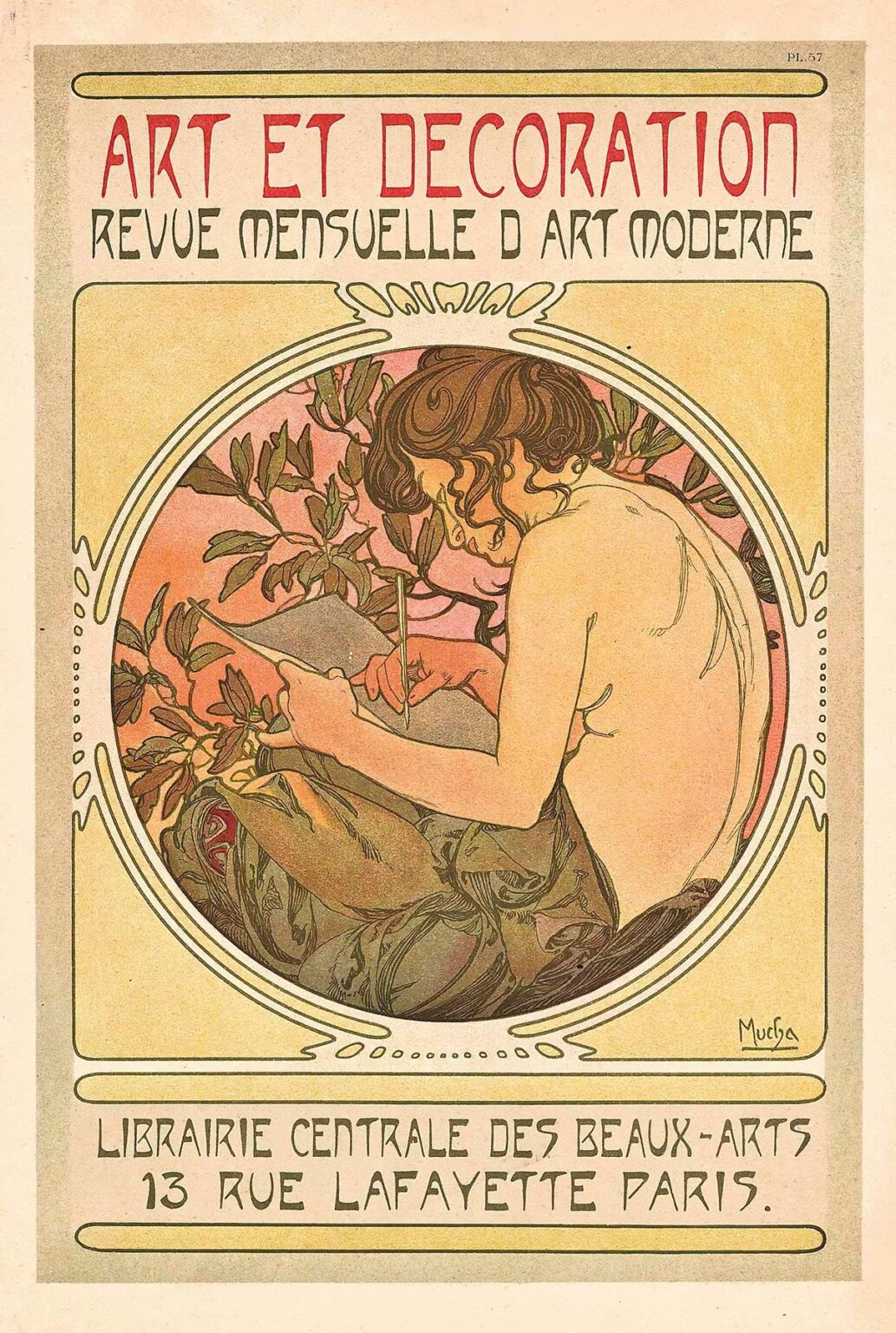
Alphonse Mucha’s poster Art et Décoration, created in 1897–1898 for the French design magazine of the same name, occupies a pivotal place in the artist’s oeuvre and in the broader narrative of the Art Nouveau movement. Far more than a commercial advertisement, this work functions as a manifesto for a new aesthetic that sought to dissolve the boundary between fine art and applied design. With its seamless integration of figure, ornament, and typography, Art et Décoration exemplifies Mucha’s belief in art’s capacity to ennoble everyday life. In this analysis, we will explore how Mucha harnesses composition, color, line, symbolism, and technical innovation to craft a poster that remains as captivating today as it was over a century ago.
Historical and Cultural Context
In the waning years of the nineteenth century, Paris stood at the epicenter of artistic experimentation. The rise of industrial printing technologies made graphic art more accessible, while the growing middle class demanded decorative objects that conferred aesthetic refinement upon ordinary living spaces. It was within this milieu that Mucha first gained renown through his 1894 poster for actress Sarah Bernhardt. Publishers soon recognized his ability to marry commercial appeal with artistic distinction, commissioning him to produce lithographic works for magazines, calendars, and decorative panels. Art et Décoration was commissioned by the eponymous monthly revue, a journal dedicated to interior design, architecture, furniture, and the applied arts. The magazine’s editorial mission—to promote modern design in harmony with everyday environments—aligned perfectly with Mucha’s vision of art as an integral element of daily life.
Composition and Spatial Organization
At first glance, Art et Décoration presents a circular vignette set within a rectangular frame, a compositional device that immediately draws the viewer’s attention to the central figure. The young woman, seated in three-quarter profile, occupies a softly illuminated niche of warm pink and cream hues. She leans forward, engrossed in sketching upon a tablet, her bare back and shoulders revealed beneath a loosely draped garment. Surrounding her is a delicate wreath of budding branches and stylized leaves, which not only frame her form but also establish a rhythmic pattern that reverberates throughout the poster. The rectangular border, lightly embellished with linear moldings, serves as a neutral stage upon which the organic curves of the central motif can shine. Above, the bold lettering of the title Art et Décoration arches gracefully, its irregular, handcrafted letterforms echoing the fluid lines of the botanical ornament.
Line Work and Ornamental Flourish
Mucha’s hallmark lies in his mastery of the line, and nowhere is this more evident than in the rendering of the figure and foliage. The edges of the woman’s body are defined by confident, sinuous contours, which taper into fine, hairline strokes that articulate the intricate pattern of her drapery and the woven texture of the wreath. Each leaf and budding petal is delineated with care, their outlines suggesting both botanical fidelity and decorative abstraction. The artist varies line weight to convey depth: thicker lines delineate the silhouette and the tablet she holds, while thinner lines capture the interior details of hair strands, fabric folds, and the network of veins on each leaf. This interplay of bold and delicate strokes creates a dynamic surface that invites close inspection and rewards prolonged viewing.
Color Palette and Tonal Harmony
The palette of Art et Décoration is characterized by warm rose, pale cream, muted olive green, and touches of gold ochre—all rendered in translucent washes typical of the lithographic medium. Mucha employs subtle gradations within each hue to model forms: the woman’s skin transitions smoothly from soft pink highlights at her shoulders to a warmer rose tone along her back. The wreath’s foliage shifts from silvery green at the tips of leaves to a deeper olive near the stems, evoking the gentle variance of sunlight filtering through early spring growth. The background field behind the figure glows with a tender apricot wash, providing a luminous counterpoint to the cooler greens and grounding the composition in a soft, harmonious light. This restrained yet evocative chromatic scheme envelops the entire image in a serene ambience, reinforcing the poster’s decorative function without sacrificing its emotive power.
Integration of Typography
One of the most innovative aspects of Art et Décoration is Mucha’s integration of typography with pictorial elements. The magazine’s title, rendered in hand-drawn letters, curves along the top of the poster, its irregular forms mimicking the undulations of the wreath below. Crucially, the lettering does not sit apart from the illustration as a separate graphic element; rather, it emerges organically from the composition, anchored by subtle stems of foliage that weave between the letters. The subtitle, “Revue Mensuelle d’Art Moderne,” appears in a more restrained, elongated typeface that echoes the vertical stems of the wreath and balances the curvature of the main title. By treating text as another decorative motif rather than a distinct overlay, Mucha achieved a unity of word and image that elevated commercial posters into works of high art.
Symbolism of the Seated Figure
The central figure, absorbed in sketching, embodies the very ethos of Art et Décoration: the fusion of artistic creation with modern design. Her pose—leaning forward, elbow resting on her knee—conveys a sense of intimacy and contemplation. The partially exposed back, modeled with gentle shading, alludes to classical nudes while the modern tablet evokes contemporary artistic practice. The wreath encircling her head and shoulders suggests a halo of inspiration, drawing on medieval and Renaissance iconography that conferred sanctity upon creative acts. Yet this halo is formed of living branches rather than gilded metal, anchoring the work firmly in nature and in the applied arts’ embrace of organic motifs. Through this allegorical figure, Mucha communicates that beauty is not merely ornamental but emerges from the artist’s engagement with both tradition and innovation.
Thematic Resonance and Allegory
Beyond its immediate purpose as a magazine cover, Art et Décoration functions as an allegory of the creative process and of design’s role in everyday life. The cycle of budding branches conjures the natural world’s continual renewal, mirroring the artist’s capacity to transform raw materials into objects of aesthetic pleasure. The act of sketching—central to painting, illustration, and design—becomes a ritual that requires focus, skill, and reverence for form. Mucha’s choice to depict a female artist counters the male-dominated narratives of fine art at the time, subtly advocating for the recognition of women’s contributions to modern design fields such as interior decoration, wallpaper and textile patterning, and graphic illustration. The poster thereby communicates a progressive vision in which art is both universal and inclusive.
Lithographic Technique and Craftsmanship
Art et Décoration was produced using chromolithography, a method that allowed for the layering of multiple color stones or plates to achieve intricate patterns and luminous washes. Mucha began with meticulous preparatory drawings, translating his pencil and watercolor sketches onto lithographic stones with greasy crayons. Each hue required its own plate, aligned precisely to maintain sharp outlines and smooth color transitions. The delicate color overlays—such as the pink wash behind the figure and the subtle greens in the wreath—testify to both Mucha’s careful planning and the technical skill of the master printers who realized his designs. Occasionally, limited hand-coloring was applied to accentuate highlights and metallic touches, lending some prints an extra dimension of depth. This synthesis of artistic vision and printmaking innovation underscores Mucha’s role in elevating commercial art to the realm of fine craftsmanship.
Influence of Japonisme and Symbolism
Mucha’s decorative vocabulary reveals the imprint of Japonisme, the late nineteenth-century European fascination with Japanese prints and design. The use of flat color planes, asymmetrical botanical motifs, and the simplification of forms in Art et Décoration echo the compositional rhythms of ukiyo-e masters like Hokusai and Hiroshige. Equally, the allegorical depth and contemplative mood align with Symbolist artists’ interest in evoking inner states and mythic narratives. By synthesizing these influences—melding Eastern flatness with Western figuration and medieval iconography—Mucha forged a style that felt both fresh and timeless. His posters, including Art et Décoration, thus became conduits through which diverse artistic traditions could mingle and evolve.
Reception and Legacy
Upon its publication, Art et Décoration attracted wide acclaim among design enthusiasts and collectors of decorative prints. Its appearance in salons, studios, and commercial interiors helped to disseminate Art Nouveau’s organic aesthetic throughout Europe and beyond. Interior designers adapted Mucha’s wreath motifs for furniture inlays and wallpaper patterns, while typographers drew inspiration from his handcrafted letterforms. Over the ensuing decades, his posters were reprinted, studied, and exhibited, securing Mucha’s reputation as a visionary who bridged fine and applied arts. Today, original impressions of Art et Décoration are prized in museum collections, and the work continues to inform contemporary graphic design, branding, and editorial layout. Its enduring appeal rests on the seamless unity of figure, ornament, and text—a testament to Mucha’s belief in art’s capacity to beautify everyday experiences.
Modern Reinterpretations and Continued Relevance
In the twenty-first century, Art et Décoration remains a touchstone for designers seeking to marry classical sensibilities with modern production methods. Digital artists reinterpret the poster’s wreath and lettering in web graphics, while fashion brands reference its palette and line work in textile prints. The motif of the artist at work resonates with contemporary calls to recognize creative labor and to celebrate design as a form of cultural production. Even as printing technologies have evolved beyond chromolithography, Mucha’s approach to color layering, compositional unity, and text-image integration offers valuable lessons for branding, user interface design, and immersive visual storytelling. The poster’s message—that art belongs in every facet of life—continues to inspire creators across disciplines.
Conclusion
Art et Décoration stands as one of Alphonse Mucha’s most compelling articulations of the Art Nouveau ideal: that beauty and functionality need not be separate realms, but can coexist harmoniously within the objects and images that shape our daily environments. Through its refined composition, fluid line work, harmonious color scheme, and innovative fusion of text and ornament, the poster transcends mere commercial purpose to become a lasting tribute to the creative spirit. As an allegory of artistic practice and a showcase for lithographic mastery, Art et Décoration invites viewers to consider the transformative power of design—and to recognize that, in Mucha’s words, “art lives in all things.”