Image source: artvee.com
Introduction to “Arabesque”
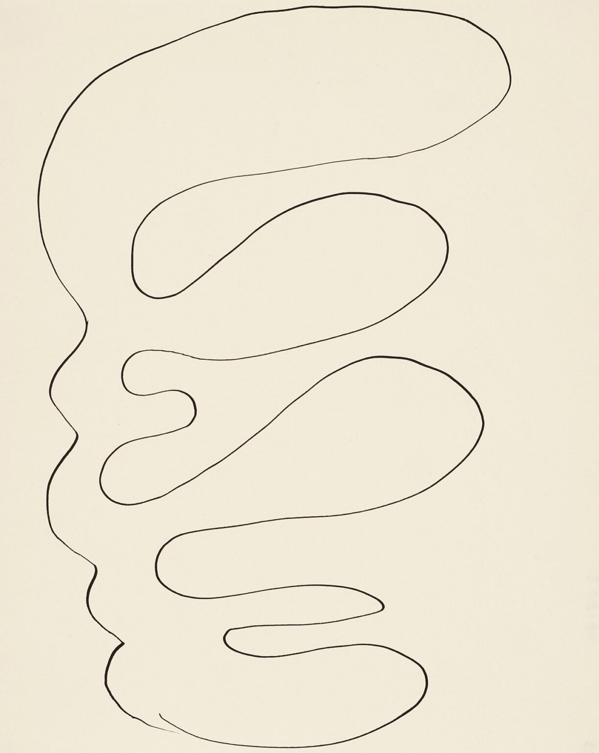
Henri Matisse’s “Arabesque” (1946) is a drawing that looks disarmingly simple: a single black line unfurls across a pale sheet, looping and tapering as it descends. Yet inside that apparently effortless gesture lies a full vocabulary—of rhythm, balance, speed, pressure, breath, and touch. The drawing belongs to the late period when Matisse, convalescing in the south of France, pursued an art stripped to essentials. Here color is absent and modeling set aside. What remains is the line itself, the “arabesque” he had championed for decades as the true architecture of a picture. With almost nothing—one continuous mark—he summons the pulse of a living form and a field of space that feels full and resonant.
What Matisse Meant by “Arabesque”
“Arabesque” in Matisse’s studio vocabulary did not mean a specific motif but a way of organizing vision through flowing, ornamental line. He admired the unbroken curves of Islamic ornament, the calligraphy of Asia, the serpentine grace of dance, and the way those traditions achieve coherence without resort to heavy modeling or strict perspective. For him the arabesque was a path the eye could follow across the surface, binding disparate parts into a single movement. In this drawing he shows the idea at its most literal: the image is an arabesque, a path without interruption, a line that holds a composition together by being the composition.
A Single Line as a Complete World
Look closely and it becomes clear that the drawing is not fragmentary. The line begins near the upper left, swells into a large, buoyant loop, then contracts, then swells again, cascading downward through five or six broad “pools” of space. These expansions and contractions give the drawing structure and pace. Where the line thickens slightly the hand pressed harder; where it narrows the hand lifted and sped on. The whole reads as a complete phrase—no crossings, no second thoughts, no corrections. The discipline of holding to a single mark forces every decision to count: turn, tempo, width, interval, and destination.
Rhythm, Tempo, and the Sense of Breath
The drawing feels breathed rather than built. Each loop is separated by a small isthmus, like the pause at the top of an inhale before air slides out again. The upper ellipses are longer and calmer; the lower ones become more compact, as if gravity or fatigue had begun to tug on the hand. This timed variation makes the image feel bodily. One can sense how long the movement took, where the wrist rolled, where the elbow carried the curve, and where the shoulder joined the arc. Matisse does not hide the human pace of the gesture; he makes it the subject.
The Role of Negative Space
Because the line is unfilled, the drawing’s “forms” are primarily the spaces it encloses. These interior pools are not identical; they alter subtly in proportion and tilt, like stones in a riverbed. The paper becomes an active participant, a bright volume pressed up against the line. The uninked areas articulate as clearly as any shaded mass in a traditional study. This inversion—space as form, paper as light—was central to Matisse’s late work. He trusted the eye to complete volume from contour and to feel weight and buoyancy in the mere thickness of white shapes.
Edges, Margins, and the Field
The arabesque never touches the sheet’s border, yet it activates every margin. Near the left edge the line runs closer, tightening the field; to the right the generous breathing room relaxes the composition. At top and bottom the drawing leaves small reservoirs of space, preventing the image from pinning itself to the edges. These margins behave like the white borders in his cut-outs and prints—areas of silence that set the key and allow the main motif to speak without strain. The picture lives not only in the line but also in the tension between line and paper.
Gesture and Control
Matisse prized spontaneity, but not accident. The line’s steadiness indicates a trained control: no jittering, no hesitant restarts, no laborious retracing. Yet the curve never stiffens into compass perfection. It retains the supple irregularity of a human mark. This balance between fluency and discipline is what gives the drawing authority. It looks inevitable, but it also looks made by a person in a moment—one who knew exactly how to let the hand roam while keeping the whole in mind.
A Drawing That Hints at Many Things
Viewers have seen many images in “Arabesque”—a river course, a vine, a profile, a reclining figure, even a coastline traced from above. Matisse encourages such readings by letting the line hover between abstract pattern and natural echo. The large upper ellipse could be a head-like mass; the descending loops could be shoulders, torso, hip, and leg; the taper at the base reads like a foot or a root. None of these identifications is necessary, but the drawing’s warmth comes from how easily it tips toward life. It is an abstraction with the memory of bodies and branches still in it.
Line as Sculpture and Air
The arabesque reads as both contour and volume. Where the curve flattens slightly, the enclosed space feels heavier; where it quickens, the space lightens. The drawing thus behaves like a low-relief sculpture in which depth is implied by pressure rather than by shading. At the same time the line works as air—a current that moves past discrete forms, tying them together in a single flow. Matisse’s achievement is to make these two functions—sculpture and breath—coexist inside a single thin mark.
Relation to the Cut-Outs and “Jazz”
In the mid-1940s Matisse was developing his cut-outs: colored shapes scissored from painted paper and pinned into large compositions. Those works are full of leaf-like ellipses and long looping paths—arabesques in color. This drawing belongs to the same project seen in another key. Where the cut-outs stack shape upon shape, “Arabesque” relies on absence. It is a cousin to the cut-out “Blue Nudes,” stripped of everything but the course of the form. The drawing also echoes the graphic economy of the book “Jazz,” with its bold silhouettes and unfussy lines. Across mediums Matisse pursued the same essential problem: how much can be removed while leaving the sensation whole?
Calligraphy, Dance, and the Eye’s Path
The line nods to calligraphic traditions. It swells and thins like a brush in ink; it turns with the ease of practiced script. Matisse had long admired writing systems where meaning emerges from pressure and curve rather than from anatomized letters. He also watched dancers carefully and learned how bodies create continuous phrases through space. The arabesque borrows from both: it is a written dance, a choreographed sentence for the eye, an inscription whose grammar is motion.
Scale and the Viewer’s Body
“Arabesque” is scaled so the loops are larger than a hand’s span and smaller than a full arm’s sweep. That in-between size invites the viewer to imagine the drawing’s making in the body—not miniature and cramped, not mural-sized and athletic, but a comfortable radius of movement. Standing before it, the viewer’s shoulder and wrist want to echo the curve. This sympathetic mirroring helps explain the drawing’s immediate charm: it fits the body’s own repertoire of rounded motions.
Economy as Expressiveness
Late Matisse is often celebrated for economy—doing more with less. “Arabesque” demonstrates how economy itself becomes expressive. The absence of color heightens attention to timing and interval. The absence of shading sharpens our sense of volume held inside contour. The absence of background leaves the line exposed and thereby more eloquent. This is not minimalism as restraint for its own sake; it is a focused search for the exact means needed to carry sensation, and nothing extra.
Drawing Time
Because the line is unbroken, it records its own duration. We can follow it from start to finish and reconstruct the sequence. The upper lobe was first, wide and confident; the second loop is slightly smaller, like a second sentence spoken more quickly; the middle squeeze is a pivot; the final turns seem to quicken toward completion. Few artworks allow the viewer to replay the making in such a clear loop. The drawing is thus both an image and a score—a set of marks that can be “heard” in the time it took to set them down.
Balance, Gravity, and Poise
Despite the asymmetry, the drawing rests easily on the page. The largest mass sits high, but the cumulative weight of the lower loops steadies the figure. The narrowest constriction lands just left of center, acting like a waist or hinge. The bottom curve flares gently, creating a base that prevents the eye from tumbling off the sheet. Matisse had an instinct for equilibrium; even when the line threatens to wander, it returns to a poised center. The composition’s grace feels inevitable because the balance is hidden inside the movement.
The Sensation of Touch at a Distance
The line never meets the viewer physically, yet it conveys touch powerfully. Slight roughnesses in the contour show where the pen or brush dragged; tiny tremors announce a change of direction; a barely perceptible flattening reveals a moment of decision. These micro-events keep the drawing intimate. One senses not only the image but the fingertip and tool that made it. In this way the most abstract of Matisse’s media—the single line—produces one of the most tactile experiences.
Conversation with Earlier Contour Drawings
Throughout his career Matisse alternated between fragrant color and severe line. His earlier contour drawings from the 1910s and 1920s already show confidence in an “all-at-once” stroke. What distinguishes the 1940s is the scale of simplification and the acceptance of blankness as a positive field. The earlier lines often serve to define faces or bodies; the arabesque does not need a subject outside itself. It carries the subject—movement—within.
Decorative Intelligence Without Ornament
Matisse championed the “decorative” not as prettiness but as structural clarity. “Arabesque” embodies that ethic. It could hang alongside textiles, tiles, or cut-outs and hold its own, because it shares with those arts a commitment to coherence across a surface. Yet it avoids fuss. There are no secondary motifs, no border, no internal filigree. The drawing is decorative because it is exact: a single line tuned to harmonize the whole sheet.
Why “Arabesque” Still Feels New
Contemporary eyes, used to logos, vector curves, and digital minimalism, find the drawing surprisingly contemporary. Its clarity reads at a glance; its touch rewards close looking. It is graphic and handmade at once. In an age that often divides design from art, “Arabesque” bridges them effortlessly: a drawing that could be a sign, a path, a pattern, or a private improvisation—and is all at once.
Conclusion: A Line That Holds a Life
“Arabesque” seems modest, but it contains a lifetime of lessons distilled. Matisse discovered that line can carry volume, that empty paper can feel full, that rhythm is a form of structure, and that a viewer’s body echoes what a hand once did. The drawing asks very little of the world—just ink and a page—and returns a great deal: a model of balance, a record of motion, and a meditation on how much feeling a single, unbroken mark can hold.