Image source: artvee.com
Historical and Religious Context
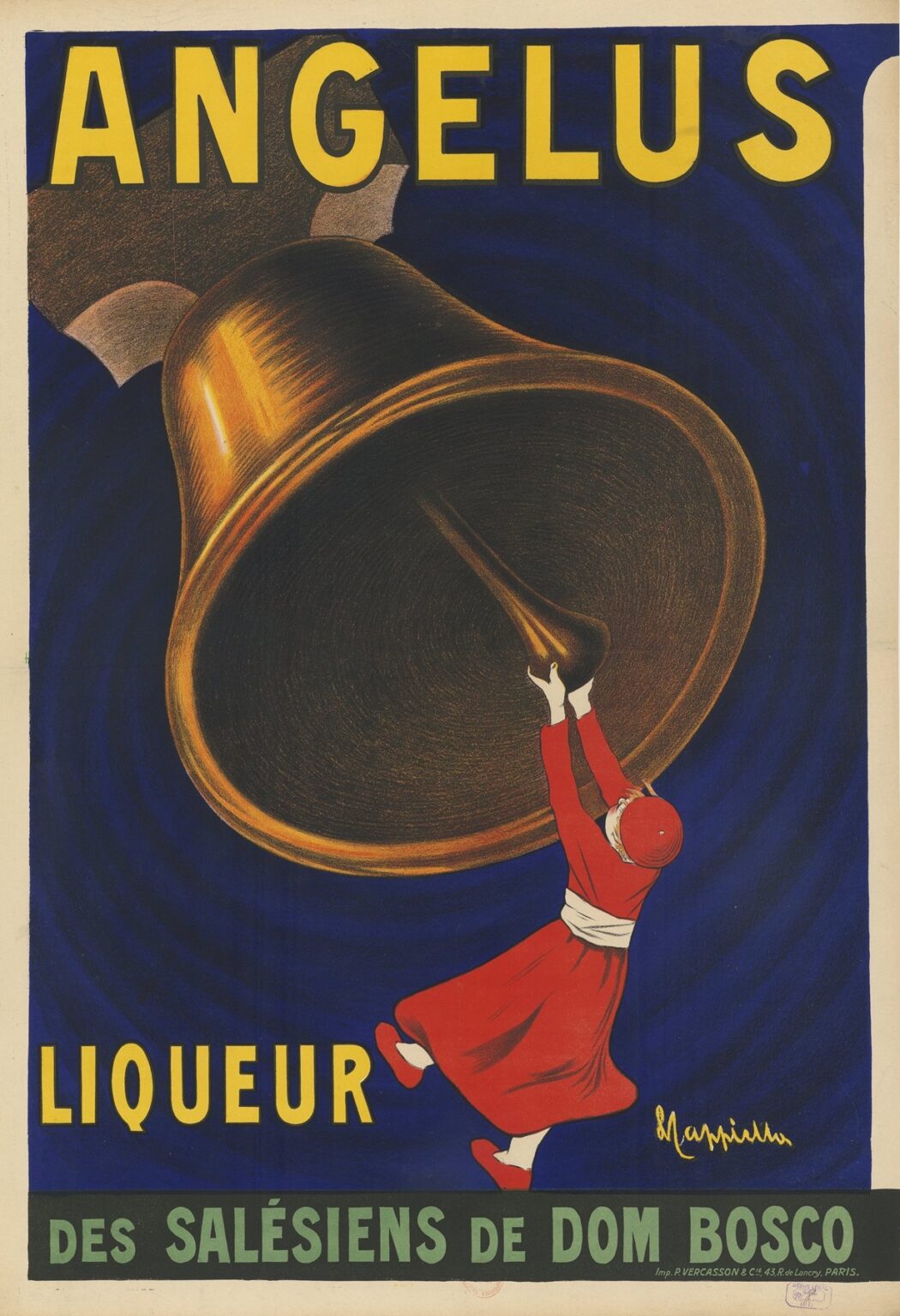
In 1911, Leonetto Cappiello created the poster “Angelus. Liqueur des Salésiens de Dom Bosco” at a moment when both graphic advertising and Catholic religious orders played prominent roles in European culture. The Angelus prayer—a devotion recited thrice daily by Catholics at dawn, noon, and dusk—centers on the ringing of church bells to call the faithful to contemplate the Incarnation. Meanwhile, the Salesians of Don Bosco, founded by Saint John Bosco in mid-19th-century Italy, dedicated themselves to educating and sheltering disadvantaged youth. By the early 20th century, the Salesian order had expanded across Europe, establishing schools, workshops, and social centers. In this milieu, Salesian communities in France began producing a mint-flavored liqueur—marketed as both a hygienic tonic and a gentle aperitif—under the name Angelus. Cappiello’s 1911 poster distilled this unique blend of religious tradition, charitable enterprise, and consumer culture into a single iconic image, one that resonated deeply with contemporary viewers.
The Salesian Order and Dom Bosco
To appreciate the poster’s deeper meaning, one must understand the Salesian mission. Saint John Bosco (1815–1888), affectionately called Don Bosco, championed education through kindness, rather than punishment. His congregations—formally known as the Salesians of Saint John Bosco—operated oratories, technical schools, and apprenticeships for poor and orphaned boys. By the turn of the century, the Salesians had also embraced integrated social enterprises—printing presses, publishing houses, and even small-scale production of hygienic tonics such as Angelus liqueur. Profits supported charitable works, sustaining schools and workshops for underprivileged youth. Cappiello’s poster thus transcends mere commercial appeal: it advertises a product whose proceeds funded a broad educational and humanitarian network, inviting consumers to partake in an act of spiritual and social solidarity.
The Product: Angelus Liqueur
The Angelus liqueur was formulated around peppermint and other aromatic herbs reputed for their digestive and antiseptic properties. Marketed as “sueur fraîche, parfum agréable, hygiène parfaite” (“fresh flavor, pleasant fragrance, perfect hygiene”), it aligned with early 20th-century concerns about cleanliness and well-being. Packaged in elegantly labeled bottles, Angelus was sold through Salesian channels—bookstores, parish fairs, and school canteens—and in select pharmacies. The liqueur’s dual identity—as a wholesome medicinal aid and a genteel aperitif—positioned it uniquely in the market. Cappiello’s challenge was to communicate both trustworthiness and sensual allure, signaling the liqueur’s religious provenance while appealing to the era’s appetite for novel taste experiences.
Leonetto Cappiello: From Caricaturist to Poster Visionary
Born in Livorno in 1875, Leonetto Cappiello honed his skills as a caricaturist for Le Rire and La Vie Parisienne before transitioning to commercial poster design around 1900. By 1911, he had already revolutionized advertising with a signature style: bold compositions featuring a single, arresting motif rendered in flat, saturated colors and minimal text. Unlike the Victorian tendency toward ornate borders and dense copy, Cappiello distilled a brand’s essence into one unforgettable image. For Angelus, he synthesized his mastery of caricature—his capacity to exaggerate form and infuse personality—with a newfound restraint that privileged clarity and emotional immediacy.
Composition and Visual Dynamics
“Angelus. Liqueur des Salésiens de Don Bosco” centers on a colossal bronze bell suspended against a deep cobalt background. Dominating the upper two-thirds of the poster, the bell’s gleaming surface is rendered with subtle gradations of yellow, burnt sienna, and black to suggest three-dimensional volume. Beneath it, a single Salesian youth—dressed in the order’s distinctive red cassock with white belt—stretches upward, his outstretched arms grasping the bell’s clapper. The boy’s figure anchors the lower right quadrant, while the brand name ANGELUS appears in large yellow block letters across the top, and liqueur des Salésiens de Dom Bosco spans a dark green band along the bottom. The diagonal thrust from boy to bell creates a dynamic tension, guiding the viewer’s eye in an ascending sweep from label to logo to title.
Symbolism of the Bell and the Angelus
The bell in Christian tradition symbolizes the call to prayer and the boundary between sacred and secular time. By choosing the bell as the poster’s focal object, Cappiello invokes the Angelus devotion directly: viewers subconsciously hear the peal and feel the summons to pause and reflect. The title ANGELUS reinforces this association, while the boy’s Salesian habit underscores the link to the order’s educational mission. This layered symbolism elevates the liqueur beyond a mere beverage—it becomes a tangible extension of faith and community. Consumers who purchased Angelus liqueur were reminded of their own spiritual rhythms and encouraged to support the Salesian cause.
Color Palette and Emotional Resonance
Cappiello’s palette in the Angelus poster is at once restrained and emotionally charged. The cobalt blue background suggests twilight or the hush before noon, evoking the hours associated with the Angelus prayer. Against this, the bell’s golden ochre gleams like a shaft of light, while the youth’s vermilion cassock introduces warmth and vitality. The clapper’s pure white gloves and the boy’s face are picked out in light gray to ensure clarity against darker hues. This triadic harmony—blue, yellow, red—creates maximum contrast, heightening both visual impact and emotional engagement. The poster’s vivid colors not only catch the eye from a distance but also convey a sense of solemn joy, aligning with the liqueur’s promise of both enjoyment and edification.
Typography and Message Clarity
Text in Cappiello’s poster is limited to the essentials: ANGELUS (the product name) and liqueur des Salésiens de Dom Bosco (the manufacturer), set in bold sans-serif typefaces. Positioned high and low, the text balances the vertical drama of the bell and the ascending youth. Its bright yellow and mint green coloring contrasts sharply with the darker fields, ensuring legibility even under dim street lighting. By minimizing copy, Cappiello allowed the powerful imagery to dominate, trusting that viewers would understand the confluence of name, image, and religious allusion. This economy of text exemplifies his broader belief that the most effective posters treat words as supporting actors rather than co-leads.
Technical Mastery: Lithography and Scale
Printed as a large-format lithograph by the renowned Vercasson & Cie in Paris, the Angelus poster demonstrates Cappiello’s commitment to production quality. Each hue—cobalt, ochre, vermilion, green, white, black—required a separate stone, precisely registered to avoid color fringing. The result is a design of razor-sharp edges and uniform ink coverage, crucial for outdoor display on kiosks and billboards. The poster’s imposing scale (often over one meter tall) magnified Cappiello’s graphic impact, transforming urban facades into dynamic galleries of modern art. His rigorous supervision of the printing process ensured that the final images exhibited both the brilliance and durability necessary for street-level advertising.
Cultural Impact and Salesian Branding
Cappiello’s Angelus poster succeeded on multiple fronts: it conveyed the liqueur’s name and religious heritage, generated curiosity, and distinguished the product in a crowded marketplace. Salesian outlets reported increased foot traffic, as the poster’s novelty and emotional resonance drew in both faithful parishioners and casual passersby. More broadly, the design contributed to a shift in public perception of charitable enterprises: rather than merely soliciting donations, religious orders like the Salesians could engage in ethically aligned commerce, using profits to underwrite their schools and workshops. Cappiello’s poster thus helped pioneer a model of “faith-based branding” that balanced evangelism, philanthropy, and consumer appeal.
Comparison with Cappiello’s Other Works
The Angelus poster shares Cappiello’s hallmark approach—central, oversized motif; flat color fields; minimal text—with other masterpieces such as “Vermouth Victor” (1925) and “Contratto” (1925). However, Angelus distinguishes itself through its religious undertones and the dynamic upward gesture of its figure. While his vermouth posters celebrate carefree hedonism, Angelus marries spiritual contemplation with consumer ritual. In both cases, though, Cappiello’s innovations advanced poster art beyond mere sales tools, establishing the medium as a vital component of modern visual culture.
Interpretive Themes: Faith, Youth, and Modernity
At the heart of Angelus. Liqueur des Salésiens de Dom Bosco lies a tension between tradition and modernity. The Angelus bell recalls medieval church practices, while the lithographic style and urban placard context place the image squarely in the modern era. The Salesian youth, reaching upward, embodies both fidelity to religious heritage and the dynamic aspirations of young people in an industrializing society. The liqueur itself—marketed as a healthful tonic—bridges sacred time and secular pleasure. Consumers who encountered this poster were invited to partake in a contemporary ritual that blended midday prayer, charitable patronage, and sophisticated taste.
Legacy and Continued Relevance
Over a century after its conception, Cappiello’s Angelus poster remains a benchmark in graphic design and faith-based branding. Original prints are prized by collectors and exhibited in institutions such as the Musée des Arts Décoratifs in Paris. Design students study its economy of form and emotional potency, while heritage liqueur producers draw inspiration from its compelling blend of imagery and ethos. The poster’s enduring appeal underscores Cappiello’s maxim that successful advertising must speak to both the heart and the mind, forging connections that transcend mere transactions.
Conclusion: A Synthesis of Devotion and Design
Leonetto Cappiello’s “Angelus. Liqueur des Salésiens de Dom Bosco” stands as a masterwork at the intersection of religious devotion, social enterprise, and modern advertising. Through a commanding bell motif, a spirited Salesian youth, and a triumvirate of saturated colors, Cappiello crafted a poster that communicated product, provenance, and purpose in an instant. Its technical excellence—rooted in advanced lithographic methods—and its pioneering graphic clarity established the template for 20th-century poster design. More than an advertisement, Angelus became a visual hymn: a call to prayer, a taste of regional alchemy, and a testament to the transformative power of artful persuasion.