Image source: artvee.com
Introduction
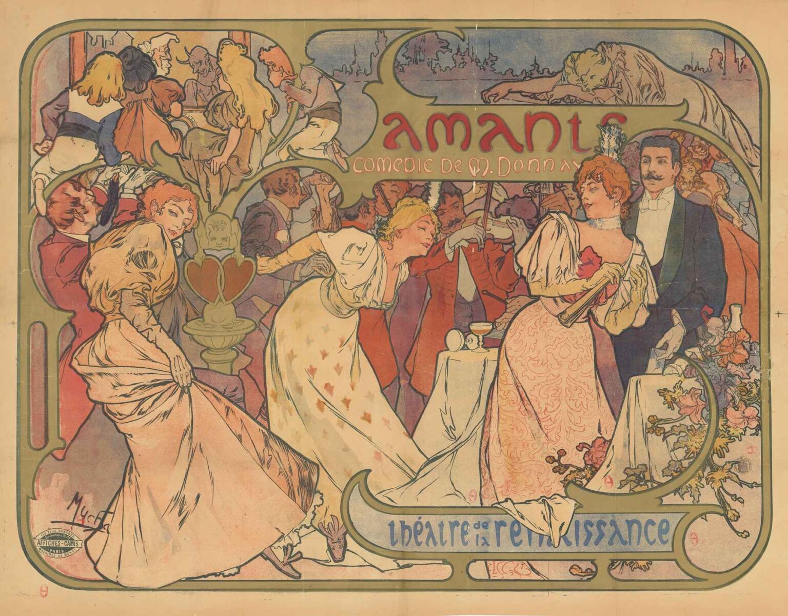
In 1895, Alphonse Mucha created one of his earliest theatrical posters with “Amants, comédie de M. Donnay. Théâtre de la Renaissance.” This lithograph, commissioned to advertise Maurice Donnay’s comedic drama “Amants” at Paris’s Théâtre de la Renaissance, marks a pivotal moment in the evolution of graphic design. Measuring roughly 60 by 80 centimeters and rendered through multi-stone lithography, the poster blends elegant figuration, ornamental flourishes, and integrated typography. Mucha’s design privileges both narrative suggestion and decorative harmony, inviting passersby to anticipate an evening of romance and wit. Across a palette of muted pastels and golden accents, he harmonizes dance, music, and theatrical spectacle into a single, cohesive image. In the following analysis, we will examine the poster’s socio-cultural origins, Mucha’s artistic development, compositional strategies, chromatic innovations, graphic integration, technical execution, and enduring legacy in visual culture.
Historical and Cultural Context
The mid-1890s in Paris embodied the Belle Époque’s exuberance—a period defined by rapid urban growth, technological advancement, and artistic experimentation. The city’s theaters flourished, attracting audiences eager for new forms of entertainment. Maurice Donnay (1859–1945), a rising playwright known for his witty dialogue and modern sensibility, premiered “Amants” (The Lovers) at Théâtre de la Renaissance in winter 1895. Parisian theaters competed for attention against cafés, salons, and the emerging cinema; bold, memorable posters became essential marketing tools. Lithography had advanced to support vibrant, large-scale prints displayed on boulevards and tram shelters. Visual artists such as Jules Chéret had already transformed posters into works of art. Yet it was Mucha, just beginning his career in commercial design, who would elevate the genre to unprecedented heights. The “Amants” poster thus emerges at the intersection of theatrical culture, technological innovation, and the nascent Art Nouveau movement.
Alphonse Mucha’s Early Career and Influences
Born in 1860 in Moravia, Alphonse Mucha trained in Munich before arriving in Paris in 1887. In his early years, he created book illustrations and decorative panels, absorbing influences from academic Realism, historicism, and Japanese woodblock prints. By 1894, Mucha had garnered attention through decorative projects and magazine commissions but had not yet defined his signature style. The “Amants” poster represents one of his first major forays into theatrical advertising, preceding his famed Sarah Bernhardt lithographs of 1895–1896. During this period, Mucha experimented with elongated female forms, swirling drapery, and plant-inspired ornament. His evolving aesthetic combined precision in draftsmanship—honed under academic training—with an emerging penchant for stylization. “Amants” allowed him to synthesize these elements within a commercial framework, setting the stage for the Art Nouveau vocabulary he would soon pioneer.
Commission and Promotional Purpose
Théâtre de la Renaissance, housed in a 19th-century former church on Boulevard Saint-Martin, sought to position itself at the vanguard of modern drama. By commissioning Mucha to design its “Amants” poster, the theater aimed to capture attention with a novel visual language. The printed sheet, affixed to station walls and street kiosks, needed to convey both the play’s romantic theme and the venue’s prestige. Mucha’s challenge lay in balancing promotional clarity with aesthetic innovation. He achieved this by portraying elegantly dressed couples in an intimate salon setting, suggesting flirtation and theatricality without revealing plot details. The integrated title and author credit—Amants. Comédie de M. Donnay. Théâtre de la Renaissance—ensured legibility at a glance. Through this design, Mucha demonstrated that advertising could engage viewers emotionally and visually, while fulfilling its primary marketing function.
Composition and Spatial Dynamics
The poster’s composition is defined by a fluid interplay of figures, architectural motifs, and decorative linework. At center stage are two elegantly attired women and a gentleman, their poses implying both movement and social ritual. The figures occupy the mid-ground, while a violinist and onlookers populate the background, rendered in softer contours to suggest depth. Mucha frames the scene within an ornate cartouche, its curved borders echoing the dancers’ swirling gowns. Negative space at the top and bottom accommodates typographic elements, while the central imagery remains unobstructed. Diagonal lines—tracing the sweep of skirts and the violinist’s bow—convey liveliness, guiding the eye across the composition. Intricate arabesques in the margins draw visual parallels to the theatrical curtain’s folds. Overall, Mucha balances activity and repose, ensuring that the viewer’s attention moves seamlessly between figure, ornament, and text.
Color Palette and Light Effects
Mucha employs a palette of muted corals, soft ochres, pale greens, and discreet blues, punctuated by richer accents of burgundy and gold. These colors evoke the warm ambiance of an intimate salon, while aligning with contemporary printing limitations. The figures’ costumes—white, rose, and cream gowns against dark tails—create clear focal points. Light appears to emanate from lanterns just out of frame, casting gentle highlights on faces and fabric folds. Mucha’s graded washes, achieved through lithographic crayon techniques, produce subtle transitions between light and shadow. Reflective touches on jewelry and polished wood of the violin further enhance the illusion of three-dimensionality. The overall tonality suggests both refinement and accessibility, embodying the spirit of an evening’s theatrical diversion. Through careful color calibration, Mucha ensures harmony between image and printing constraints, while imbuing the scene with luminous warmth.
Linework and Ornamental Flourish
Central to the poster’s appeal is Mucha’s masterful use of line. His sinuous contours define figures with minimal overlap, lending each character clarity and elegance. The decorative border features intertwining vines and stylized floral motifs characteristic of Art Nouveau’s organic approach. These vegetal forms echo the dancers’ flowing dresses, visually linking human movement with natural growth. Mucha varies line weight—thicker for figure outlines, finer for ornamental details—to orchestrate emphasis and recession. The result is a rhythmic interplay of curves and counter-curves that animate the static medium. In the background, sketch-like lines suggest architectural elements without heavy modeling, reinforcing the theatrical setting without competing with the foreground. Through disciplined yet expressive linework, Mucha transforms a functional advertisement into a decorative tableau.
Typography and Graphic Integration
Mucha’s integration of text into the overall design revolutionized poster typography. For “Amants,” he selected a custom Set of title letters—rounded, slightly elongated, and adorned with keels—that harmonize with the poster’s curved motifs. The author and theater credit appear in a simpler yet graceful serif that contrasts gently with the title. Mucha avoided rigid text boxes; instead, he allowed lettering to follow the poster’s contours, nesting type between ornamental scrolls and blank space. Kerning and leading were meticulously adjusted to maintain visual fluidity. The placement of text at the top and bottom frames the central image like a proscenium arch, reinforcing the theatrical theme. By treating typography as an integral design element, Mucha ensured that information and imagery functioned as a unified whole rather than discrete parts.
Lithographic Technique and Craftsmanship
Executed through multi-stone lithography, the “Amants” poster demanded precise registration and skilled handling of greasy crayons and tusche washes. Each color required its own limestone plate, with registration pins ensuring correct alignment across print runs. Mucha’s underdrawing guided the process, but he allowed crayon texture to remain visible in shaded areas, imparting warmth and tactility. The layering of translucent inks produced gentle gradients, while reserved whites—the untouched paper—provided crisp highlights. Paper choice was critical: a lightly textured, slightly off-white stock accentuated color richness and lent the prints an artisanal quality. Given the poster’s public display, multiple printings were needed, each requiring careful quality control to preserve sharpness and hue consistency. The technical complexity of this process underscores Mucha’s commitment to craftsmanship in commercial art.
Reception and Influence
At its debut, Mucha’s “Amants” poster earned admiration from the public and the Parisian art community. It stood apart from the busier, text-heavy posters of the time, offering instead a refined blend of narrative suggestion and decorative elegance. Theatergoers recognized the promise of a sophisticated evening, while fellow artists noted Mucha’s fresh approach to graphic composition. The poster’s success led to additional commissions from Théâtre de la Renaissance and other venues, as well as from fashion houses and publishers. It laid the groundwork for Mucha’s later triumphs with Sarah Bernhardt and cemented his reputation as Art Nouveau’s leading graphic designer. In the decades that followed, the image influenced poster artists across Europe and North America, who adopted its integrated typography, organic ornament, and figure-centered layouts.
Legacy and Contemporary Relevance
Over a century later, “Amants, comédie de M. Donnay. Théâtre de la Renaissance” retains its status as a cornerstone of graphic design history. Original prints reside in major museum collections, including the Musée d’Orsay and the Victoria and Albert Museum, where they are studied for their artistic innovation and technical mastery. The poster’s visual language continues to inspire branding, editorial design, and illustration. Contemporary artists reference its harmonious composition and decorative motifs in fashion campaigns, interior décor, and digital media. The image also serves as a reminder of the transformative power of commercial art when entrusted to a visionary creator. In an era of mass production and rapid visual turnover, Mucha’s “Amants” poster endures as a testament to the lasting value of thoughtful design married to artistic integrity.
Conclusion
Alphonse Mucha’s 1895 poster for “Amants, comédie de M. Donnay. Théâtre de la Renaissance” exemplifies the convergence of art and commerce at the dawn of Art Nouveau. Through its elegant composition, luminous palette, expressive linework, and integrated typography, the design transcends its promotional origins to become a decorative masterpiece. Mucha’s pioneering approach to lithography and graphic integration set a new standard for theatrical advertising, influencing generations of designers and elevating the poster to fine art status. As both a historical artifact and a living source of inspiration, the “Amants” poster invites us to appreciate how beauty, narrative, and craftsmanship can coalesce in a single image—an enduring celebration of Parisian creativity and the timeless allure of the theater.