Image source: artvee.com
Introduction: A Confluence of Art and Commerce in the Belle Époque
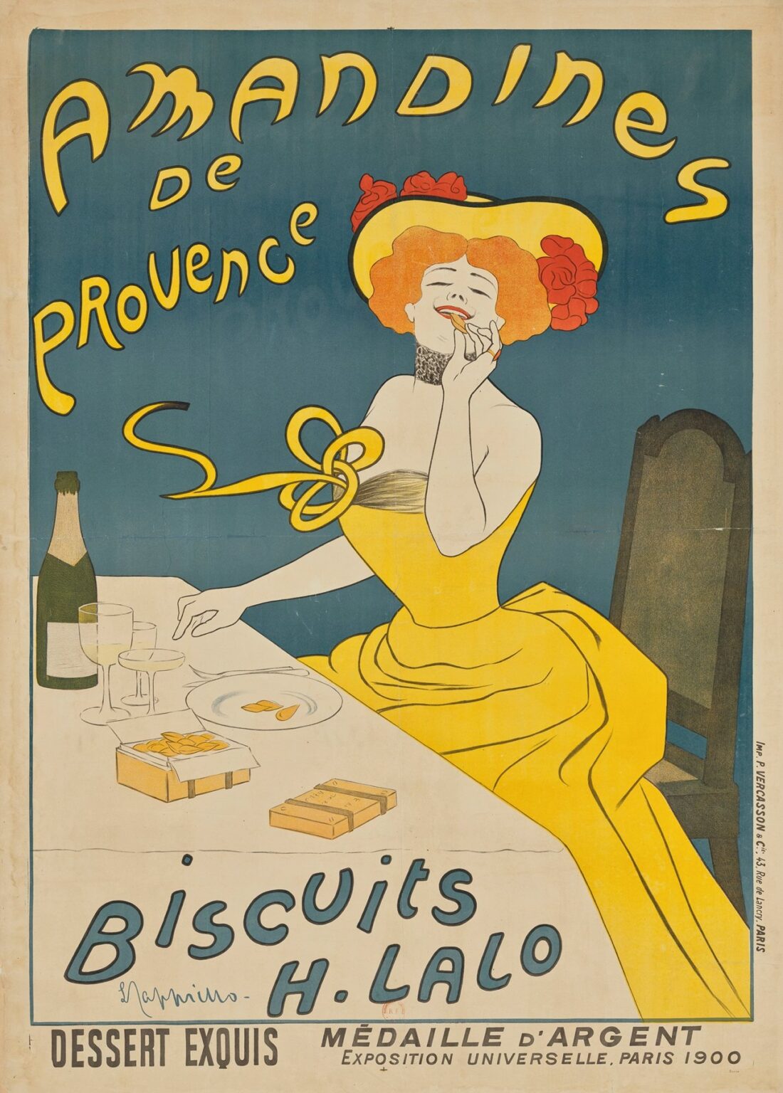
In the dawn of the 20th century, Paris embodied a vibrant blend of artistic ingenuity and commercial ambition. Amid this flourishing cultural landscape, regional producers sought innovative ways to distinguish their wares from an ever-growing array of consumer goods. In 1902, Leonetto Cappiello, an Italian expatriate turned Parisian poster artist, unveiled Amandines de Provence, a poster that seamlessly merged art and advertising. Cappiello’s creation arrived at a critical moment when urban promenades teemed with pedestrians and cafés lined with posters vying for attention. Rejecting the dense text and cluttered imagery of earlier commercial prints, Cappiello opted for a single, striking visual: a graceful woman luxuriating in the pleasure of a simple almond biscuit. Through a masterful interplay of color, form, and typography, Amandines de Provence not only boosted sales for the aristocratic biscuit maker H. Lalo but also redefined the possibilities of graphic communication. This analysis explores the poster’s genesis, its technical brilliance, and its lasting impact on both graphic design and regional branding.
Leonetto Cappiello’s Artistic Evolution
Born in Livorno in 1875 and relocating to Paris in 1891, Leonetto Cappiello began his career as a caricaturist for leading satirical journals such as Le Rire and La Vie Parisienne. His early illustrations displayed a keen eye for exaggeration and a fondness for playful distortion. By the late 1890s, he recognized a transformative potential in advertising: posters need not mimic fine art but could instead harness clarity and bold imagery to communicate instantly with urban audiences. Eschewing elaborate ornamentation, Cappiello pioneered a style characterized by flat color fields and isolated figures. Over the next decade, he collaborated with the Atelier d’Art Devambez, refining lithographic techniques that would bring his visions to life on monumental street posters. Amandines de Provence stands at the crossroads of his career, synthesizing his flair for caricature with a newfound simplicity that defined his mature output. In this work, the artist’s evolution culminates in a design that conveys both elegance and immediacy, hallmarks that would secure his title as the father of modern advertising.
The Amandines de Provence Biscuits: History and Prestige
The product at the heart of Cappiello’s poster—Amandines de Provence—was more than a modest confection. Produced by H. Lalo in the sun-drenched orchards of southeastern France, these almond biscuits had earned a silver medal at the Exposition Universelle of 1900, cementing their reputation as an exquisite dessert. The term “Amandines” itself connotes not only almonds but also a lightness of preparation and a nod to Provençal culinary tradition. As interest in regional specialties grew, H. Lalo sought a means to broadcast their biscuits’ unique flavor profile—nutty, buttery, and subtly perfumed with local honey. Cappiello’s poster, commissioned in 1902, answered this call by presenting a single evocative image that captured the biscuit’s sensorial pleasure. The poster did not dwell on ingredients or production methods; rather, it imbued the product with an aura of luxury and refinement, positioning Amandines de Provence as a must-have delicacy for discerning Parisians and international visitors alike.
Poster as Medium: Lithography Meets Mass Communication
At the turn of the century, lithography had emerged as the premiere medium for commercial posters. Unlike engraving, lithographic printing allowed for broad swaths of flat color and rapid reproduction, essential for the bustling streets of Belle Époque Paris. Cappiello collaborated with master printer Eugène Devambez, whose workshop—Atelier d’Art Devambez—ranked among the finest in the city. The printing process for Amandines de Provence would have involved preparing separate stones for each major color: the deep teal background, the golden hues of the woman’s gown, the crimson accents of her hair and roses, and the crisp ivory of the table and skin. Precise stone registration ensured that each color aligned perfectly, resulting in a poster that gleamed under gaslight and sunlight alike. By embracing lithography’s strengths—vivid pigment, large format, and high-speed output—Cappiello’s design achieved maximum visual impact, transforming public spaces into galleries of modern graphic art.
Composition: Harmony of Form and Space
The visual architecture of Amandines de Provence rests on a harmonious interplay of dynamic curves and tranquil negative space. The reclining female figure occupies the right half of the poster, her torso angled gracefully as she savors an almond biscuit. Her sweeping gown and outstretched arm form rhythmic loops that guide the viewer’s gaze across the image: from the biscuit to her smiling face, through the folds of her dress, and onward to the product crates on the table. The solid teal background provides a visual pause, allowing the figure’s pale skin and bright yellow attire to stand out without competition. Above, the poster’s title—“Amandines de Provence”—arches in a playful, undulating script that echoes the gown’s curves. Below, the brand name “Biscuits H. Lalo” and the accolade from the Paris Exposition provide a stabilizing base. Through this composition, Cappiello achieves a balance between movement and stillness, ensuring that each element complements the next in a seamless visual flow.
Color Palette: Evoking Warmth and Appetence
Color plays a central role in the poster’s evocative power. Cappiello’s palette harmonizes warm and cool tones to awaken both emotional and physical appetites. The deep teal background evokes the Mediterranean sky, imparting a sense of regional authenticity. In contrast, the golden ochre of the woman’s gown and chair resonates with the sunlit hues of ripe almonds and honey. Her striking red hair and rose wreath introduce bursts of vitality, while the candy-white of her skin and tablecloth conveys purity and refinement. Subtle touches of green—on the almond sprigs decorating her waist—reinforce the notion of fresh, natural ingredients. Accented by crisp black outlines that define contours without heavy shading, these colors remain flat yet vibrant, tapping into lithography’s strengths. The overall effect is one of comforting warmth tempered by fresh brightness—a perfect visual metaphor for the taste of an almond biscuit.
Typography: Melding Playfulness with Clarity
The textual elements in Amandines de Provence are as integral to the design as the imagery itself. Cappiello selected a custom Art Nouveau–inspired typeface for the poster’s title, characterized by flowing lines and rhythmic irregularities that mirror the woman’s dress folds. The yellow letters cast a thin black shadow, enhancing legibility against the teal field. Positioned at the top, the title immediately identifies the product and its Provençal roots. The secondary text—“Biscuits H. Lalo”—employs a more restrained script, denoting the manufacturer’s name without detracting from the central image. Below, the endorsement “Dessert Exquis • Médaille d’Argent • Exposition Universelle, Paris 1900” appears in uppercase sans serif, asserting the product’s prestigious recognition. By combining ornamental and utilitarian typography, Cappiello ensures that each line of text fulfills a distinct communicative purpose, bridging the realms of brand identity and consumer trust.
The Muse: Symbolism of the Female Form
The reclining woman in Amandines de Provence serves as the poster’s emotive nucleus. Far from a mere decorative element, she represents the quintessence of indulgence. Crowned with red roses reminiscent of Provençal flora, her closed eyes and gentle smile evoke a private moment of pleasure. The almond biscuit between her fingers becomes an object of intense focus, yet her relaxed posture suggests that true enjoyment requires neither haste nor complexity. This portrayal aligns with early 20th-century ideals of leisure as an aspirational luxury. By personifying the biscuit’s sensory delight in a classical yet modern form, Cappiello invites viewers to imagine themselves in her place, savoring a brief respite from daily routine. The model becomes an interactive conduit, transforming a static poster into a shared celebration of refined taste.
Regional Identity: Provence on the Boulevard
By explicitly referencing Provence in the poster’s title, Cappiello and H. Lalo tapped into burgeoning interest in regional specialties and terroir authenticity. Provence, celebrated for its lavender fields, olive groves, and sun-baked landscapes, possessed a strong cultural cachet among urban elites seeking escapism. Amandines de Provence leverages this association, suggesting that a taste of these almond biscuits constitutes a sensory journey to the Mediterranean coast. The poster’s color choices—teal and honey—evoke both sea and sun, while the rose wreath and almond sprigs allude to local flora. In doing so, the design resonates with consumers’ emerging desire for products rooted in specific geographical traditions, foreshadowing modern concepts of artisanal branding and protected designation of origin (PDO).
Technical Brilliance: Lithography and Visual Impact
The success of Amandines de Provence rested not only on Cappiello’s artistic vision but also on the technical mastery of early 20th-century lithography. Atelier d’Art Devambez employed multiple stones—each coated with a separate color—registered with pinpoint accuracy. The broad expanses of flat teal, yellow, and white required even ink application and precise pressing to avoid streaks or misalignment. Fine details—such as the outline of the rose petals and the text’s subtle drop shadows—demanded expert carving and registration to maintain fidelity to Cappiello’s original drawing. The final prints emerged with crisp edges and luminous color, ensuring that posters plastered on walls, kiosks, and tram stops retained their vibrancy over time. This technical excellence underpinned Cappiello’s reputation, demonstrating how artistry and printcraft could unite to produce images of lasting visual power.
Influence on Graphic Design and Advertising
Leonetto Cappiello’s Amandines de Provence stands as a touchstone in the evolution of modern advertising. His insistence on a singular, memorable image and minimal yet purposeful text set a template for 20th-century poster art. Subsequent generations of designers, from Art Deco luminaries to mid-century corporate art directors, drew inspiration from his bold use of color and streamlined composition. The poster’s influence extends beyond its immediate commercial success; it helped shift public perception of advertising from a mere informational tool to a legitimate art form capable of emotional resonance. Today, Cappiello’s work is studied in design curricula and featured in museum retrospectives worldwide, underscoring his role in forging a visual language that continues to shape branding and marketing.
Modern Resonance and Collectible Status
More than a century after its creation, Amandines de Provence remains highly sought by collectors and admired by contemporary designers. Its original lithographic prints fetch premium prices at auctions, and high-quality reproductions adorn interior spaces, cafés, and galleries. The poster’s themes of regional authenticity, sensory indulgence, and elegant simplicity resonate in today’s marketplace, where consumers value artisanal products and visual storytelling. Digital designers often emulate Cappiello’s approach—prioritizing striking imagery and concise messaging—when crafting web banners, social media ads, and packaging. The enduring appeal of Amandines de Provence attests to the poster’s ability to transcend its Belle Époque origins and speak compellingly to modern sensibilities.
Conclusion: The Enduring Power of a Single Image
Leonetto Cappiello’s Amandines de Provence exemplifies the remarkable potency of a well-conceived image in capturing imagination and driving consumer desire. Through a harmonious union of graceful composition, vibrant color, and strategic typography, the poster elevates a simple almond biscuit into an icon of refined taste and regional heritage. Its technical execution—rooted in the finest lithographic traditions—ensured that the design would sparkle in public spaces, imprinting itself on the cultural memory of 20th-century Paris. More than a commercial artifact, Amandines de Provence stands as a landmark in graphic design history, reminding us that in the realm of advertising, clarity of vision and emotional authenticity remain the keys to timeless persuasion.