Image source: artvee.com
Historical and Cultural Context
In 1924, the world was emerging from the rigors of the First World War into the effervescent “Roaring Twenties,” a decade marked by rapid social change, technological innovation, and a thirst for pleasure. Within this milieu, Leonetto Cappiello—an Italian-born artist who had made his name in Paris—revolutionized commercial art through bold, minimalist posters that spoke directly to modern sensibilities. Cappiello’s work for Alcool de Menthe de Ricqlès, first conceived in 1924, exemplifies his pioneering approach. At a time when consumers were bombarded with text-heavy, finely detailed advertisements, Cappiello stripped away extraneous information and focused on one arresting visual motif: a dancing figure embodying the spirit of the product. The poster not only prompted immediate brand recognition but also captured the zeitgeist of postwar liberation and the dawning of modern consumer culture.
Artist Biography: Leonetto Cappiello’s Evolution
Leonetto Cappiello (1875–1942) began his career as a caricaturist for satirical journals such as Le Rire and La Vie Parisienne. By the early 1900s, he had evolved into a sought-after poster designer, fusing his flair for caricature with a radical simplification of form. Cappiello’s early works foreshadowed modern branding: he championed large-scale imagery, flat color fields, and a single, dominant figure or object. His posters for products ranging from perfumes to soft drinks established a new visual language that prioritized immediate impact over detailed illustration. With Alcool de Menthe de Ricqlès, Cappiello consolidated his innovations, creating an image that remains instantly recognizable a century later.
Brand Background: Ricqlès’ Mint Spirit
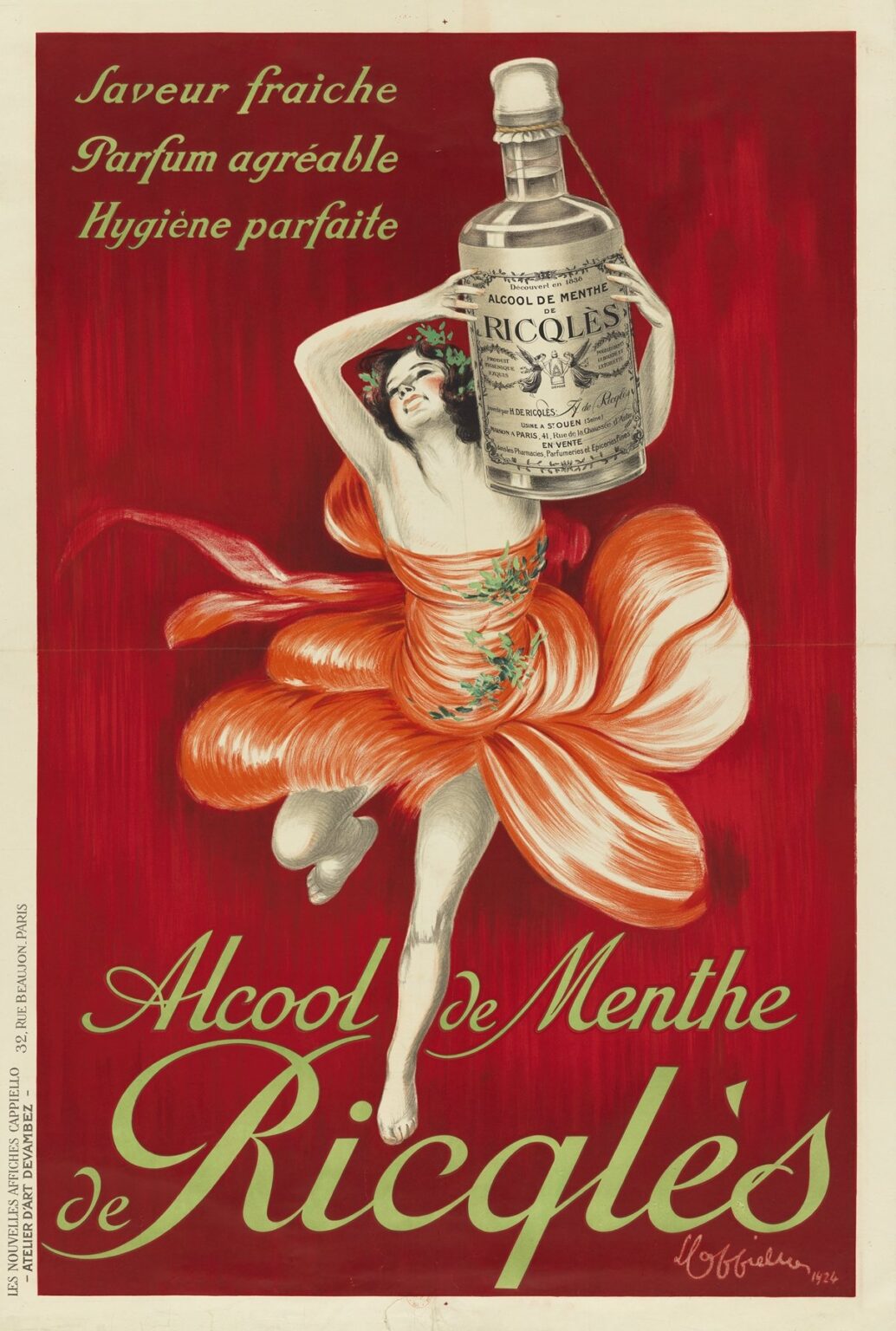
Founded in 1838 by doctor François Ricqlès, the Alcool de Menthe de Ricqlès was originally marketed as a medicinal tonic—its mint-based formulation relished for digestive relief and hygienic freshness. By the 1920s, Ricqlès had broadened its appeal from pharmacy counters to cafés and fashionable social settings, positioning its mint spirit as both a healthful and a hedonistic indulgence. Cappiello’s poster needed to reconcile these dual facets—inspired vitality and refined taste—within a single image. His solution was to personify the product’s effects through a joyful, dancing woman whose very movement suggests the cooling refreshment and effervescent energy that a sip of Ricqlès promises.
Composition and Focal Imagery
At the heart of Cappiello’s poster is a dynamic female figure caught in mid-leap, her limbs extended in a flourish of exuberance. Rendered in flowing scarlet brushstrokes, her dress billows like mint leaves in the wind. Her head, crowned with a delicate wreath of mint sprigs, tilts back in ecstasy, her eyes closed as if savoring the spirit’s cool tingle. In one graceful hand she balances a bottle of Alcool de Menthe de Ricqlès—its oversized label meticulously detailed—while her other arm is outstretched, offering a filled glass aloft. Behind her, a rich crimson field provides maximum contrast, allowing her pale skin and white highlights to pop vividly. The placement of the product at the apex of her movement ensures that viewer attention is instantly drawn to the Ricqlès brand.
Color Palette and Psychological Impact
Cappiello’s masterful use of color in Alcool de Menthe de Ricqlès is central to its persuasiveness. The background’s deep carmine red evokes warmth, passion, and appetite stimulation, while the dancing figure’s pale peach skin and white dress highlights create a sense of purity and refreshment. Accents of mint green in the wreath, text, and subtle highlights forge a direct link to the product’s flavor profile. The green-tinged lettering—“SAVEUR FRAÎCHE,” “PARFUM AGRÉABLE,” “HYGIÈNE PARFAITE”—translates to “Fresh Flavor,” “Pleasant Fragrance,” “Perfect Hygiene,” reinforcing the sensory and hygienic virtues of mint alcohol. By juxtaposing warm and cool hues, Cappiello achieves a dynamic tension that both energizes and refreshes the viewer’s eye—much like the spirit itself enlivens the palate.
Typography and Message Hierarchy
Rather than burying the poster in copy, Cappiello uses three succinct French slogans at the top left—Saveur fraîche, Parfum agréable, Hygiène parfaite—to crystallize the product’s key benefits. Set in a graceful yet easily legible serif script, these phrases occupy only a fraction of the total area, ensuring they complement rather than compete with the central figure. The large, flowing script of “Alcool de Menthe de Ricqlès” at the bottom commands immediate brand recognition. Its gentle curves mirror the dancer’s movements, reinforcing unity between text and image. By limiting textual elements to essential, benefit-driven statements and employing harmonious typography, Cappiello ensures that the brand name and its promises embed themselves seamlessly in the viewer’s memory.
Movement and Visual Rhythm
The poster’s sense of motion is nothing short of choreographed. Cappiello arranges the figure’s limbs and dress folds to create a spiral of energy that carries the eye from the bottle in her hand, down her sweeping airborne leg, through the swirl of her dress, and back to the raised glass. This cyclical flow echoes the sensations of mint’s cooling swirl in the mouth, translating gustatory pleasure into visual rhythm. The diagonal of her extended leg contrasts with the bottle’s vertical line, generating tension and release—a visual metaphor for the product’s dual effect of invigorating the senses while imparting a crisp cooling.
The Bottle as Iconic Object
Unlike earlier, text-heavy advertisements, Cappiello’s design grants the Alcool de Menthe de Ricqlès bottle an almost totemic presence. Its label—replete with ornate borders, company seal, and product information—is rendered in fine detail in black-and-white, creating a striking contrast against the vivid red background. This hyper-realistic treatment anchors the composition in reality, reminding viewers that beneath the poster’s fantastical vivacity lies a tangible, purchasable product. By elevating the bottle to equal status with the dancing figure, Cappiello bridges fantasy and reality, ensuring that the brand itself remains at the forefront of consumer consciousness.
Symbolism of Mint and Health
Mint—long prized for its medicinal and aromatic qualities—serves as a recurring motif in the poster. The wreath of mint leaves encircling the dancer’s head alludes to classical laurel crowns of victory, positioning Ricqlès as the champion of digestive comfort and hygienic well-being. Scattered sprigs of mint on her dress further reinforce this botanical theme. In the early 20th century, concerns about hygiene and health were paramount; advertisements for tonics and elixirs often emphasized purity and therapeutic efficacy. Cappiello’s synthesis of sensual enjoyment and hygienic assurance captures this era’s dual obsession with healthful living and tasteful indulgence.
Gender, Modernity, and the “New Woman”
The effervescent female protagonist in Alcool de Menthe de Ricqlès embodies the archetype of the 1920s “New Woman”—confident, liberated, and eager to partake in modern pleasures. Her daring mid-air pose suggests physical freedom and social emancipation, a far cry from the rigid corseted silhouettes of previous generations. By aligning his product with this emerging ideal, Cappiello tapped into contemporary currents of feminism and social change, positioning Ricqlès not only as a beverage but as a symbol of progressive lifestyles. The poster thus transcends mere product promotion, becoming an emblem of modern identity and autonomy.
Technical Mastery and Reproduction
Alcool de Menthe de Ricqlès was produced as a multi-color lithograph—one of the few print techniques of the time capable of delivering large fields of uniform, saturated color. Cappiello meticulously crafted separate stones for each hue: crimson red, mint green, peach flesh, and black-outline details. The precise registration of these stones was essential to maintain the clarity of the dancing figure and the intricacy of the bottle label. Working with the prestigious Atelier d’Art Devambez, he oversaw each stage of the printing process, ensuring that the final posters retained the luminosity and contrast of his original artwork. This commitment to technical excellence helped solidify his reputation and allowed his posters to shine in the bustling streets of Paris, Milan, and beyond.
Influence on Later Advertising and Design
Cappiello’s minimalist approach in Alcool de Menthe de Ricqlès set a new standard for 20th-century advertising: focus on a single compelling image, limit text to essential messaging, and employ bold, flat colors for maximum impact. Subsequent generations of designers—from mid-century modernists to postmodern graphic artists—have cited his work as a foundational influence. The poster’s emphasis on symbolic dynamism and brand personification prefigured later concepts of brand mascots and iconic logos. In an era when visual noise has only multiplied, Cappiello’s clarity of vision remains a guiding principle: in advertising, simplicity and emotional resonance often trump exhaustive detail.
Preservation and Legacy
Nearly a century after its creation, Alcool de Menthe de Ricqlès endures as a treasured artifact of graphic design history. Original lithographic prints fetch high prices at auctions, and reproductions adorn galleries of vintage posters worldwide. Museums such as the Musée des Arts Décoratifs in Paris and the Victoria & Albert Museum in London include Cappiello’s work in permanent collections that celebrate the golden age of poster art. Graphic design curricula continue to study Ricqlès as a case study in bold composition, color theory, and brand communication. Its enduring popularity underscores the poster’s dual status as both a compelling advertisement and a masterful work of art.
Conclusion: A Celebration of Sensation and Modernity
Leonetto Cappiello’s Alcool de Menthe de Ricqlès transcends its commercial origins to become a luminous portrait of 1920s modernity. Through a potent fusion of color, movement, and symbolic motifs, Cappiello transformed a simple bottle of mint spirit into an agent of joy, health, and liberation. The poster’s bold red field, its dancing mint-crowned protagonist, and the emblematic product bottle all coalesce into an unforgettable visual manifesto: life is to be savored, spirits elevated, and senses refreshed. In crafting this image, Cappiello not only propelled the Ricqlès brand to international renown but also charted a new course for advertising—one in which art and commerce intertwine seamlessly to captivate the imagination.