Image source: wikiart.org
Historical Context And Why This Paris View Matters
Henri Matisse painted “A Glimpse of Notre-Dame in the Late Afternoon” in 1902, at the moment his art was pivoting from disciplined tonal realism to a color-first language that would soon crystallize as Fauvism. Paris itself was his laboratory. From high windows along the Seine he repeatedly tested how familiar motifs—the river, its stone quays, a bridge, the island of the Île de la Cité, the silhouette of Notre-Dame—could be rebuilt not with minute detail but with tuned planes of color, purposeful omissions, and a surface that remains proudly painterly. This canvas is one of the most revealing of those experiments. It is recognizably a city view, but its real subject is how cool evening light and a limited palette can fuse air, water, and stone into a single, breathing chord.
First Look: A City Suspended In Cool Light
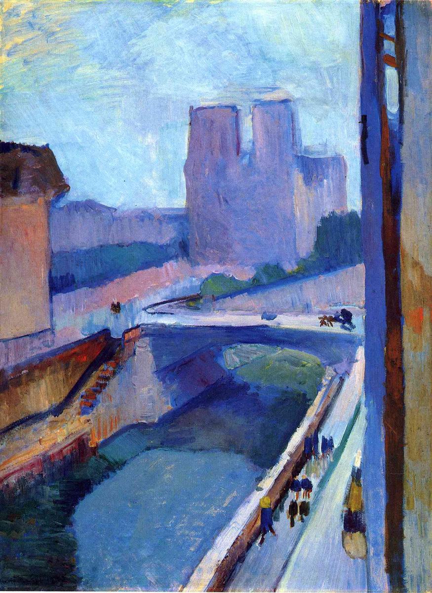
The composition is dominated by blue. Sky, cathedral, river, paving stones, even distant façades are bathed in a range of violets, cobalts, and blue-greens that announce the hour. A tall vertical at the right edge—probably the jamb of a window or the wall of the studio—frames the view and thrusts the scene outward. From the lower right, a pale promenade lifts diagonally toward the bridge at mid-distance; tiny, dark notations of pedestrians and carriages animate its length. The silhouette of Notre-Dame rises just left of center, simplified to twin towers and a blocky nave, a memory of the Gothic rather than a catalogue of carving. The first sensation is of clarity and quiet: cool light settles on the city like a veil, and the eye is invited to wander rather than to stare.
Composition As A Window, A River, And A Route
Matisse organizes the rectangle with a few decisive moves. The strong vertical at the right margin is a proscenium that establishes nearness and scale. An S-curve of quay and roadway begins at the lower right, arcs gently to the bridge, then pivots left toward the cathedral. The river occupies a deep wedge at the lower left, its darkened surface counterbalancing the pale promenade. The cathedral sits where this traffic of diagonals slows, a hinge that steadies the picture without freezing it. Cropped architecture at the far left and right tells us we are inside looking out, not perched on an ideal viewpoint. The design is economical and legible, which allows the color to carry mood and space.
Color Architecture And The Grammar Of Evening
Nearly every mixture in the painting leans blue or violet. That cool dominance is not monotony; it is orchestration. Sky blues are thinned and scumbled so the canvas breathes through them. Cathedral blues are denser and slightly warmer, lending stone a felt weight without blackness. The river blue is darkest, greened in places where depth and reflection pool. Counterpoints are rationed with care. A strip of muted ochre and raw sienna warms the framing wall at right. A faint run of pinkish beige suggests late light on the far quay. Small touches of sap green mark tree belts. Because Matisse avoids dead neutrals, the entire view reads as colored light—one of the surest signs of his developing method.
Light Without Theatrical Shadow
The hour is late afternoon drifting toward evening, but there is no single spotlight raking across the scene. Illumination is ambient and shared. The promenade glows because the sky’s cool light settles onto pale stone; the river darkens because it turns away from the light and absorbs the blues above; the cathedral’s planes differentiate by temperature rather than by harsh value jumps. The sense of time comes from this equitable distribution of light. Day is ebbing, not collapsing, and the city receives that change with calm.
Drawing Through Adjacency Rather Than Outline
Edges in the painting arise where one color field meets another. The towers of Notre-Dame are “drawn” by the kiss of blue-violet against a milky sky. The parapet of the promenade appears where a pale band touches a darker wedge of water. The bridge is authored by the encounter of two blue temperatures. When Matisse does use a line—the faint, dark accent of a window mullion at the right, or a rail along the quay—it is calligraphic and quickly absorbed into surrounding color. The painting never feels like a drawing that has been colored; it feels like a world precipitated from tuned patches.
Brushwork And The Time Of Looking
Surface handling follows material. In the sky, long, lateral strokes drag semi-transparent paint so that the grain of the canvas catches real light. Across the river, pulls are broader and denser, reading as depth. Architecture and the cathedral are pressed with shorter, tackier touches that build mass without detail. The promenade’s strokes run in the direction of travel—small, quick marks for figures; longer strokes for the paving—so movement is implicitly recorded. This modulation of touch sets a tempo for viewing: slow for air, measured for water, compact for stone, lively for human traffic.
Space Compressed Into A Decorative Plane
Depth is persuasive yet moderated. The bridge recedes; figures diminish; the river narrows; but the surface never dissolves into a tunnel. The right-hand wall insists on flatness. The sky remains an active cloth. The quay reads as a plate rather than a corridor. This compression is purposeful. It keeps the painting readable as a designed arrangement of shapes and colors at the very moment it offers a believable city. Matisse’s decorative convictions—surface first, window second—are already clear.
The Cathedral As Silhouette And Memory
Rather than carving flying buttresses and traceries, Matisse states the cathedral as a firm, blue-violet block interrupted by a few crucial turns. The twin towers and nave are placed accurately enough to trigger recognition, but detail is withheld. Notre-Dame stands here not as a Gothic specimen but as a civic and pictorial anchor. Its blue mass absorbs and redistributes the cool of the sky, the water, and the stone, making the whole city feel of a piece.
The Framing Wall And The Ethics Of Viewpoint
The slab at the right edge does more than balance the composition. It acknowledges the painter’s body and the fact of interiority. We are allowed into the room with him; we do not hover disembodied over Paris. The warm ochres and reds of that wall animate the cool chord and remind us that city views are acts of looking as much as they are landscapes. The wall is the hinge between world and picture, between experience and design.
Rhythm, Scale, And The Measure Of Life
Human notations are minimal and essential. Dark, upright dabs moving along the promenade establish scale, confirm the function of the walkway, and give the diagonal its beat. A carriage or two crosses the bridge with just a handful of strokes. These touches never compete with the architecture; they tune the tempo. Life is present not as anecdote but as measure.
Dialogues With Predecessors And Peers
The painting is in conversation with Impressionist Paris views, especially in its devotion to atmospheric unity, yet it declines Impressionist flicker for larger, calmer planes. Cézanne’s constructive method is audible in the way masses are built from abutting strokes rather than blended tonal gradients. The Nabis’ decorative clarity—flat framing elements, simplified façades—informs the design. But the temperament is distinctly Matisse’s: harmonizing rather than analytic, poised rather than agitated, modern yet serene. He is discovering how high color and economy can coexist without strain.
Materiality And Period Pigments
The palette likely rests on cobalt and ultramarine for the many blues of sky, stone, and water, nudged with viridian for certain greenish turns; lead white massed into the pale promenade and scumbled into the sky; earth ochres and raw siennas for the framing wall; madder or alizarin in small violet notes; and touches of black blended into blues to deepen them without killing chroma. Paint alternates between lean scumbles that let the canvas breathe and denser body-color that catches literal light. The physical skin of the picture thus participates in its optical light.
How To Look Slowly And Profitably
Begin by letting the big relations settle: cool sky, blue cathedral, pale diagonal promenade, dark river wedge, warm framing wall. Once those anchors hold, approach the surface and study how edges form by adjacency—the tower against the sky, the parapet against water, the bridge against roadway. Track the different speeds of brushwork and feel how they match substance. Step back again until the picture resolves into one breath of evening light. This near–far rhythm mirrors the painter’s own process of tuning patches until the whole becomes inevitable.
Place Within Matisse’s Notre-Dame Series
Compared with his other 1902 Notre-Dame views, this version is the most tonally unified in cools, the most compressed spatially, and the most explicit about the framing wall as a formal actor. Compared with the warmer, more variegated “View of Notre Dame,” it is quieter and bluer, closer to a time-of-day study. Compared with “Notre Dame with Violet Walls,” it subdues the violets into one prevailing evening key. Across the series, the same grammar persists: color carries structure; black becomes a living neighbor; space remains shallow enough to read as design; omission protects harmony.
Why “A Glimpse of Notre-Dame in the Late Afternoon” Endures
The canvas endures because it transforms a famous landmark into an experience of weather and relation. It shows how a handful of tuned blues can hold a city; how a vertical strip can declare a viewpoint; how people can be present as rhythm rather than anecdote; how depth can be suggested while the surface remains a unified, decorative field. The picture is modest in scale and generous in sensation. It is not a postcard; it is a memory of light, built to last.