Image source: wikiart.org
Introduction
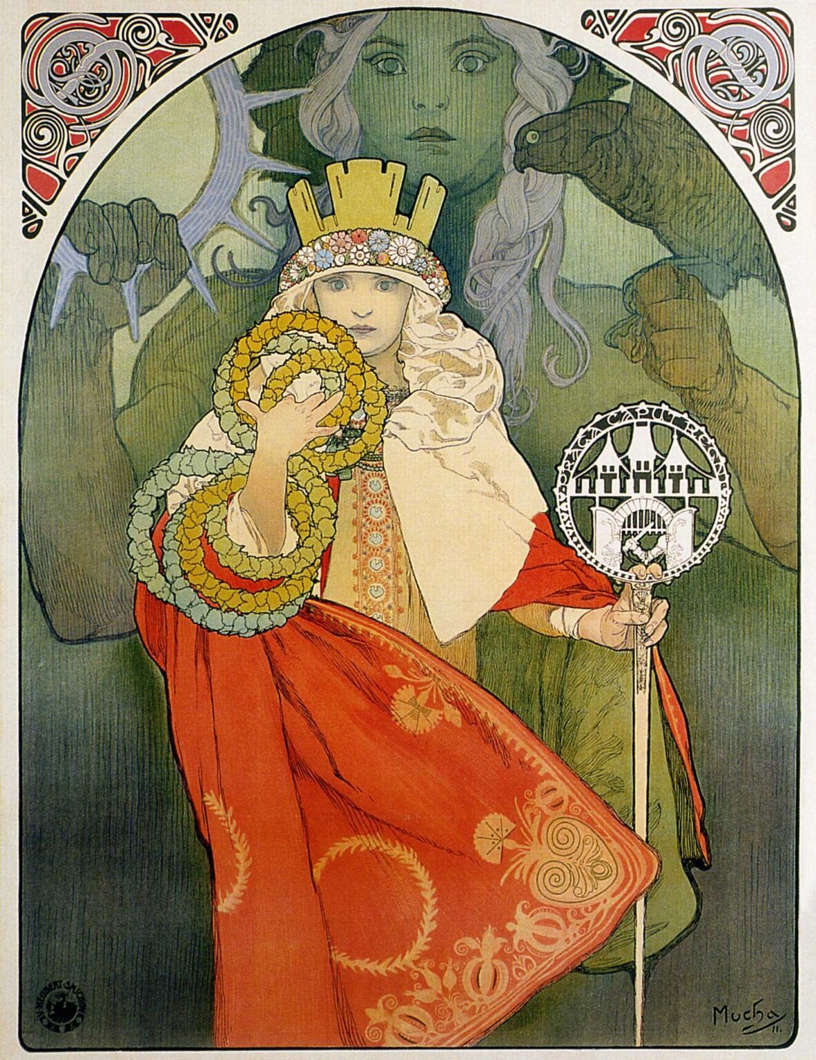
Alphonse Mucha’s “6th Sokol Festival” (1912) compresses a nation’s physical energy, moral ambition, and decorative imagination into a single, commanding image. At the center stands a crowned allegorical figure in a red mantle, one hand lifting a chain of laurel wreaths, the other gripping a staff capped with the Sokol emblem. Behind her, a monumental, green-toned guardian looms with outstretched arm and falcon, a specter of watchful strength that turns the foreground ceremony into destiny. Spiraling corner ornaments, runic-looking letters, and a shallow, stage-like space fuse the poster’s theatrical mission with a civic one: to call the public not only to a sporting spectacle but to a demonstration of shared identity. Designed for the sixth mass gathering—“slet”—of the Sokol gymnastic movement, the poster synthesizes Art Nouveau finesse with Slavic visual heritage and the rhetoric of national awakening.
Sokol and the Culture of the Slet
Sokol, Czech for “falcon,” began in the mid-nineteenth century as a gymnastics society committed to physical culture, discipline, and civic virtue. Its great gatherings were not merely competitions; they were choruses of movement in which thousands of bodies performed synchronized exercises, translating ideals of order and solidarity into kinetic spectacle. The sixth festival took place at a time when Central Europe was politically tense yet culturally vibrant. Mucha’s poster acknowledges that complexity. It does not show athletes mid-routine. Instead, it presents the values that make collective motion meaningful: honor, vigilance, continuity, and beauty. The wreaths, crown, and staff are not trophies for winners alone; they are emblems of a people rehearsing unity in public.
Composition and the Architecture of Authority
Mucha constructs the composition with three nested systems. The outer rectangle behaves like a proscenium, with decorative corner plates that act as carved capitals. Inside, a broad arch frames the action, curving down to brace the central figure like a vault. At the core, the allegory stands erect, a near-vertical axis running from crown through nose, staff, and toe. This stack of geometries—rectangle, arch, vertical—projects stability and hierarchy. The eye enters at the bright crown and wreaths, rides the cascade of red mantle, and stops at the glinting medallion of the staff where stylized letters announce the festival. Behind, the gigantic guardian anchors the scene in a secondary, softer space tinted blue-green. The overlap of planes gives depth without sacrificing the flat, poster purity that makes street images legible.
Gesture and Narrative: From Offering to Oath
The foreground figure’s gestures form a complete story. The left hand lifts linked wreaths—laurel circles of achievement—toward the viewer, transforming spectators into participants. The right hand steadies the staff, a sign not only of office but of vow; staffs and scepters imply authority accepted and carried rather than grabbed. The chin is level, the gaze unflinching. Mucha avoids melodrama. He prefers small, exact motions that let the viewer imagine the larger ceremony implied. One can almost hear the rustle of the mantle and the murmur of assembled gymnasts waiting for the signal to begin.
The Guardian and the Falcon
The translucent, monumental figure in the background is key to the poster’s emotional weather. Molded in cool greens and blues, it has the concentration and calm of a patron goddess or ancestral protector. In the left hand a ringed device or wheel suggests the cycles of time and the constancy of training; on the right arm rests a falcon whose curved beak and alert eye echo the emblem of the movement. The giant’s scale dwarfs the foreground figure without diminishing her authority; instead it deepens it. She appears as the movement’s present face, backed by powers of memory, land, and myth. The falcon—swift, precise, sovereign—becomes a living metaphor for the kind of citizenship Sokol envisioned: sharp-eyed, disciplined, and free.
Costume, Ornament, and the Grammar of Symbols
Mucha was a master of turning costume into grammar. The crown is not an aristocratic diadem; it is a crown of the people, a simple wall of upright forms girded by a floral band. The mantle is a saturated red, its border embroidered with wheat wreaths, pomegranates, and arabesques that convert agricultural plenty and renewal into decorative clauses. Under the mantle, the white cape and laced tunic keep a calm, luminous core, as if moral clarity lives at the body’s center. The linked wreaths shift in hue—golden, green, pale blue—like a chorus of voices singing the same melody in different registers. Each device can be read singly, yet they cohere: achievement (wreaths), office (staff), guardianship (crown), vitality (red mantle), and purity (white cape). The ensemble is a thesis about how a nation celebrates itself without kitsch.
Color, Tonality, and Emotional Temperature
The color scheme rests on a triad: the warm blaze of red in the mantle, the cool breath of green-blue in the background guardian, and the creamy, warming whites of cape and flesh. Gold accents on hem, wreath, and staff provide the metallic idea of honor without literal shine. Because lithography thrives on flat areas, Mucha orchestrates these tones in large, readable fields that also hold up under close scrutiny. The red is not a flat stop sign; it is veiled with variations, and its edge is softened by the gold border so it sings rather than shouts. The green of the guardian is muted to a mist so it supports rather than competes. Together the palette projects seriousness buoyed by celebration, the tonal equivalent of a trumpet call held in check by choir harmonies.
The Staff Medallion and the Drama of Letters
Near the right hand, a round medallion carries compressed lettering set into a geometric frame. The characters look part Slavic, part runic—an invented script that reads visually even before it is deciphered. Mucha knew that letters in public posters must function as shapes first and words second. Here the medallion serves two roles. It gives the viewer information about the event and it behaves as an amulet, a seal of authority. Its circularity repeats the wreaths; its black-and-white intensity cuts through the warmer hues, anchoring the lower right quadrant with a point of crispness that keeps the composition from drifting.
Line, Contour, and the Breath of Art Nouveau
The poster’s power lies not only in color blocks but in the nervous, musical life of line. Mucha thickens contours where weight collects, as along the mantle’s edge and the grip of the hand; he lets lines taper to whispers where forms turn into light, as at the cheek and sleeve. Inside the red field, he scores the cloth with subtle, parallel strokes, enough to suggest folds and embroidery without breaking the graphic calm. The guardian’s hair and the falcon’s wingtip are rendered with gentler tracery to keep them atmospheric. This calligraphic intelligence—drawing that breathes—was the secret that made Mucha’s work legible across a boulevard yet intimate in a parlor.
Decorative Corners and the Stage of the Street
Look to the top corners and you find spiraling plates of ornament, red and green, like carved capitals crowning an arch. They are not idle garnish. They reconcile the organic inward curl of the poster’s lines with the hard right angles of the urban wall on which the lithograph would be pasted. They also echo the circular movement of wreaths and medallion in miniature, pulling motifs outward to the edges so the whole sheet feels resolved. Mucha understood that a poster lives among other posters; the corners give the print a distinctive profile from across the square, a bit of heraldry that signals its identity at a glance.
The Poster as Civic Sermon
Although the Sokol slet is a sporting festival, Mucha’s image behaves like a secular sermon. The front figure addresses the public not with words but with emblems; she lifts wreaths as if offering them to all who join; she holds the staff like a shepherd’s crook for a civic flock; she wears red not as provocation but as warmth. The guardian behind supplies doctrine: discipline, vigilance, tradition. Many of Mucha’s commercial posters sell perfumes, papers, or champagne by conjuring a lifestyle. This poster sells a different good: belonging. It persuades by staging the feeling of standing shoulder to shoulder in an open field while banners lift and a single bird wheels overhead.
Women, Strength, and the Balance of Archetypes
It is significant that Mucha places a woman at the center of a festival associated with male gymnastics and martial drills. In his visual universe, women often carry abstract virtues—Seasons, Arts, the Hours. Here the female allegory does more than symbolize. She mediates power. The background guardian, vaguely masculine, brings raw force; the foreground woman civilizes it into ceremony. She humanizes the falcon’s sharpness into wreath and staff, making the movement’s strength accessible to families, children, and the broader public. Mucha’s choice aligns with his long-standing theme: culture advances when beauty and discipline are coupled.
Folk Motifs and Modern Printcraft
Mucha never confuses folklore with nostalgia. He abstracts folk motifs—the floral crown band, the embroidery rhythms, the wheat wreaths on the mantle—into a modern design vocabulary that survives the tough conditions of mass printing. The poster thus speaks to multiple audiences at once. Villagers recognize the patterns and feel honored. Urbanites see a sophisticated, international style reinforced with local flavor. Printers appreciate flat colors that register cleanly, while viewers at shop windows enjoy details refined enough to reward a long look.
Rhythm, Repetition, and the Music of Form
The poster’s visual music is written in recurring shapes. Circles proliferate: wreaths, medallion, the crown’s floral band, coils in the corner ornaments. Vertical beats steady the rhythm: staff, central axis, repeated hems. Diagonal accents—falcon beak, guardian’s wrist, mantle sweep—introduce syncopation. Mucha composes as a conductor works with a score, balancing sections so that no instrument drowns the others. The result is a picture that feels composed, not assembled, a single chord rather than a collage.
Scale, Presence, and the Viewer’s Route
A successful poster must choreograph the passerby’s attention at multiple distances. From afar, the red mantle and bright crown pull the eye. At street distance, the wreaths, medallion, and staff deliver the subject and theme. Up close, the embroidery, lace, and delicate striation of fabrics repay the viewer’s time. Mucha engineers this route with unerring instinct. He knows where to place crisp edges and where to let atmosphere blur; he knows when a bit of black is needed to steady a white; he knows how much information a morning commuter will tolerate before turning away.
Time, Continuity, and the Myth of Renewal
The sixth festival implies a history—a cycle of gatherings that rehearse the nation’s athletic and ethical muscles. Mucha builds that continuity into the picture. The guardian’s wheel-like device hints at seasons and returns. The wreaths, as evergreen circles, promise renewal even in winter. The crown’s simple battlements suggest a city that abides. The poster does not trumpet novelty; it preaches perseverance. In that sense it reads prophetically, standing on the threshold of the war that would soon refashion Europe. The image affirms that a culture able to coordinate thousands of bodies in purposeful motion can also coordinate itself toward survival.
Influence and Afterlife
The visual strategies codified here—allegorical center, symbolic staff, circular emblems, folk-modern synthesis—echo throughout Mucha’s late work and in the graphics of later civic movements. While the immediate purpose was to fill stadium seats and parade routes, the poster outlived its date because it functions as a portable national icon. Reproduced in books and classrooms, it still teaches how ornament can dignify public life and how a mass event can be pictured without resorting to spectacle alone.
Why the Image Endures
“6th Sokol Festival” endures because it compresses complexity into clarity. It carries the intimacy of hand-drawn line and the public authority of emblem. It is red without anger, green without chill, ceremonial without pomp. Viewers who know nothing of gymnastics or Czech history still feel the magnet of its balance: a human figure hugged by a mythic guardian; hard geometry softened by florals; letters that are both words and shapes. It is persuasive not because it shouts but because it composes—a poster that behaves like a hymn.