Image source: wikiart.org
Introduction
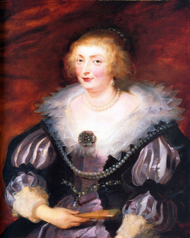
Peter Paul Rubens’s “Catherine Manners, Duchess of Buckingham” (1629) is a poised encounter between Flemish bravura and English aristocratic taste. Painted during Rubens’s diplomatic mission to London at the court of Charles I, the portrait presents Catherine in three-quarter view against a warm, animated ground. Pearls spiral around her neck, a lace ruff glows like frost at dawn, and violet satin sleeves balloon with light. The sitter’s gaze is frank and composed, her presence balanced between noble reserve and human warmth. Rubens turns costume into architecture and light into character, creating an image that is at once a record of rank and a living likeness.
Historical Context and the London Moment
In 1629 Rubens traveled to England as an envoy, negotiating a fragile peace between the Spanish Habsburgs and the Stuart court. He painted as he bargained, moving with ease among nobles hungry for continental sophistication. Catherine Manners, heiress to vast estates and widow of the assassinated George Villiers, 1st Duke of Buckingham, embodied the high drama of the Stuart elite. Commissioning or sitting for a portrait by Europe’s most celebrated painter was a statement of survival and station. Rubens responds to this environment by adjusting his palette and touch: English portraits favored rich textiles and a restrained, cool dignity; the artist supplies both while maintaining his hallmark vitality.
The Architecture of Pose and Format
Catherine turns slightly to her left while looking toward the viewer, a classical arrangement that builds a subtle spiral through the figure. The torso faces three-quarters, the head pivots, the left hand steadies a closed fan, and the right arm anchors the composition just off the lower edge. This rotation sets the portrait in motion without disturbing its courtly decorum. The bust-length format tightens our focus on head, hands, and the ornamental complexity of dress. Rubens arranges these elements like parts of a façade: ruff as pediment, bodice as central bay, sleeves as voluted side towers, jewelry as cornice. Yet the effect is not coldly architectural; the painter keeps every edge soft with breath and light.
A Face Rendered with Tact
Rubens’s handling of Catherine’s face is exceptionally discreet. The modeling is luminous rather than hard, with transitions so fine that the skin seems to carry its own inner radiance. A touch of carmine at the cheeks, a cooler half-tone near the temples, and delicate accents along the eyelid ridges build a head that breathes. The mouth is poised, not pressed; the slight asymmetry in the lips keeps the expression alive; the eyes carry small, wet highlights that suggest attention rather than challenge. Rubens avoids flattery by preserving specificities—the gentle swell of the lower eyelids, the faint shadow under the chin—while maintaining a gracious overall harmony appropriate to a duchess.
Costume as Theater and Identity
The moral of Stuart portraiture is that rank resides in fabric as much as in flesh. Catherine’s costume is a lesson in the language of material. The lace ruff is drawn with short, scintillating strokes and soft scumbles, making it glint without pedantry; the violet satin sleeves are mapped in broad, elastic planes that flip between lilac and pewter as the light rotates; the bodice is armored by black velvet adorned with jewels, belts, and a central brooch that behaves like a heraldic device. Each texture—sheen of satin, plush of velvet, airy bite of lace—receives a different brush dialect. Rubens makes these differences legible from a distance and rewarding at close range, a necessary skill for paintings destined for grand rooms.
The Orchestration of Pearls
Pearls are more than treasure; they are punctuation. A double strand at the neck, drops at the ears, and beaded edging along the bodice produce a rhythmic path for the eye. Rubens paints pearls with a tiny crescent of shadow, a milk-white body, and a pinprick highlight, never repeating the recipe mechanically. Their cool light offsets the warmth of the ground and the flushed face. Historically, pearls also encode chastity and status, an especially pointed symbol for a widowed duchess navigating public scrutiny. The painter lets them sparkle without ostentation, reinforcing dignity rather than display.
Color as Emotional Weather
The portrait breathes a restrained but sumptuous palette: burnished reds and umbers in the background, silvered violets and blacks in the costume, milk-white lace and pearls, and the soft carnation of the skin. The red-brown ground sets a warm key that flatters the face and activates the lavender tones of the dress. Rubens avoids excessive contrast; instead he modulates neighboring hues so that the whole picture glows. This harmony fits Catherine’s situation: steadiness after political tempest, composure after scandal, elegance without aggression.
Light and the Grammar of Rank
Light falls from the upper left, touching brow, nose, and cheek before sliding down the ruff and picking out the satin’s crests. The falloff is slow, preserving volume and guarding against theatrical glare. Rubens uses this light to establish hierarchy. The face receives the clearest illumination; the pearl strands and lace ruff receive secondary attention; the hands and fan are noted but subdued. This ordering reaffirms the sitter’s person above her finery, making the portrait a human encounter rather than a mere inventory of wealth.
The Hand and the Closed Fan
Catherine’s left hand holds a folded fan, its simple geometry contrasting with the bustle of lace and jewels. The gesture is important: a closed fan implies self-command and readiness rather than flirtatious display. Rubens paints the hand with confident economy—few well-placed planes, a rosy knuckle, a cooled shadow at the wrist—so that it reads at once. The fan’s warm wood and matte surface punctuate the satin’s metallic sheen, giving the composition a quiet counterpoint.
Brushwork and the Intelligence of Touch
The portrait is a concert of different touches. In the face, the paint is blended wet-in-wet to preserve translucency; in lace, it is laid with tip-of-the-brush notation; in satin, broad strokes are dragged across underlayers to catch the fabric’s directional shine; in the background, loose, smoky sweeps break into eddies around the head to keep the air alive. This distribution of labor is not random. Rubens constantly calibrates how much detail each area deserves to sustain the illusion at the intended viewing distance. The more the eye needs to linger—the face—the more the painter refines; the more the surface is read as context—the background—the more he abbreviates.
The Background as Moral Atmosphere
The warm, active ground does more than separate figure from space. It supplies moral atmosphere. A duchess whose life had been entangled in court intrigue is here surrounded by a weather of tempered fire: passion acknowledged, tamed by poise. The reddish currents echo the English taste for deep-toned textiles and hangings, and they anticipate later portrait backgrounds by Van Dyck and Lely. Rubens turns this chromatic theater into a halo of worldly honor rather than a sacred nimbus, aligning social aura with pictorial warmth.
English Taste and Flemish Bravura
Rubens adapts without surrendering. English aristocrats favored portraits that were stately, cool, and attuned to wardrobe; Flemish art prized bodily vitality and painterly vigor. Catherine’s portrait fuses these preferences. The head and hands are frank and living, the costume is magnificently present, and the whole is governed by decorum. This synthesis would soon be canonized by Rubens’s gifted pupil Anthony van Dyck, whose English portraits inherit the recipe on a grand scale. In Catherine’s likeness one can feel the turning point where an international court style is being codified.
The Psychology of Dignity
What does the portrait say about Catherine beyond her titles? Her direct gaze communicates self-possession; the slight compression of lips indicates restraint; the lean of the head toward the left shoulder softens formality with approachability. She is neither coy nor severe. Rubens resists pathos or moralizing; he lets small, humane specifics speak: the softening at the corners of the eyes, the relaxed fingers on the fan, the unforced fall of the hair. The result is a portrait of dignity as a lived habit rather than a mask.
The Social Message of Ornament
The jeweled belts that traverse the bodice and the central rosette brooch are not random luxury. They function like heraldry translated into fabric, arranging the surface into ordered ranks that echo governance and household stewardship. The painter deploys these ornaments as compositional devices—diagonals that keep the torso active and lead the eye back to the face—while acknowledging their social signal: wealth disciplined into pattern.
Technique, Layering, and the Glow of Flesh
Rubens achieves the glow of the skin by floating thin, warm glazes over a ground that already leans toward warmth. Cooler half-tones are laid on top to turn form, and sparing, opaque highlights complete the model. In lace, he reverses the strategy: opaque lights over a darker base, with tiny translucent shadows giving depth to the frills. Satin is handled with underpainted cools and dragged lights that break cleanly over ridges. The technical variety keeps the surface richly alive while unifying the whole under a single light.
The Portrait’s Function and Afterlife
Painted during a politically charged visit, the portrait likely circulated within a network where images ratified alliances and reputations. It would have hung in a great house or private cabinet, greeting visitors with a controlled splendor. Over time, as the specifics of Stuart politics faded, the painting’s appeal condensed to its artistry: the quicksilver mapping of satin, the humane head, the active air. It remains an eloquent artifact of cross-Channel culture in the 1620s, when diplomacy traveled as much by canvas as by letter.
Comparisons and Lineage
Seen alongside Rubens’s portraits of other English sitters or of his own wives Isabella Brant and later Helena Fourment, Catherine’s likeness reads as a cousin: softer than state portraits of monarchs, more ceremonious than the intimate family images. Compared to Van Dyck’s later duchesses, Rubens’s brushwork is more muscular, his color warmer, his lace less diagrammatic and more painterly. Those differences clarify his role as progenitor; Van Dyck will refine the recipe into a silvery elegance, but the essential harmony of living flesh and aristocratic theater is already complete here.
Why the Portrait Still Persuades
The painting convinces because it treats grandeur as a condition of light, not simply of things. Satin shines because it meets an air that glows; pearls gleam because they reflect a world the painter has filled with warmth; the face is vivid because blood seems to move beneath paint. This approach keeps the portrait from ossifying into costume history. The viewer meets a person across time, framed by splendor but not swallowed by it.
Conclusion
“Catherine Manners, Duchess of Buckingham” is a compact triumph of Baroque portraiture. Rubens translates a complex social identity into a clear visual harmony: poised rotation, humane face, orchestral costume, and a ground that breathes status without noise. The pearls beat gently around the neck like a measured cadence; the ruff flickers; the sleeves swell and fall; the fan rests in a capable hand. Above all, the likeness asserts composure in a world of turbulence—a fitting image for a duchess and a fitting testament to a painter-diplomat who could make art speak with the clarity of politics and the grace of music.
