Image source: wikiart.org
Introduction
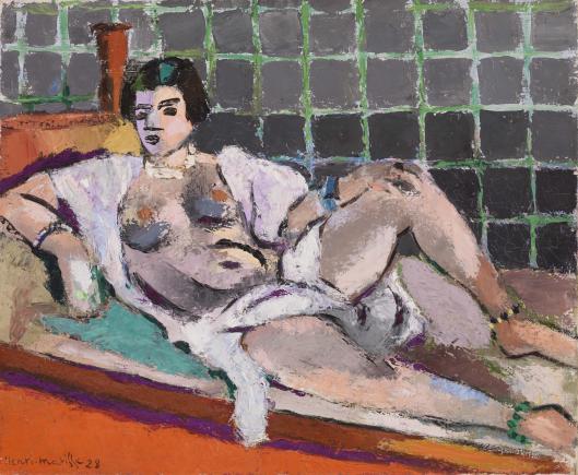
Henri Matisse’s “Reclining Odalisque” (1928) is a compact manifesto of the Nice period—an interior arranged like a stage, a model at rest, and color treated as architecture. Yet this canvas marks a turn within that phase: instead of luxuriant ornament cascading over every surface, Matisse compresses the décor into a strict tiling of squares and a set of pared-down planes. The odalisque—wrapped in a loose white robe, pearls at her throat, one leg extended and the other propped into a confident triangle—reclines across a low divan. Behind her, a grid of green and gray squares presses forward like a mosaic wall. Under her body a turquoise cushion and a lilac sheet cool the field; at the bottom edge, a burning band of orange pins the composition. Edges are rugged, strokes are chunky, and the whole surface feels hammered into place. The picture balances intimacy with graphic bluntness, sensual repose with modern geometry.
A Nice Interior Stripped To Essentials
The Nice years gave Matisse steady Mediterranean light and the privacy to build rooms from screens, textiles, and furniture he could rearrange at will. In many canvases he filled the stage with arabesques and brocades, granting pattern a central, melodic role. Here he distills that decorative impulse into the grid—an armature that flattens space and clarifies the figure’s long diagonal. The usual repertoire of brass vessels, porcelain and patterned draperies is reduced to a single cylindrical vase at left and a handful of fabrics whose colors—mint, lilac, creamy white—act less as anecdote and more as temperature regulators within the orchestration. This reduction sharpens attention on the odalisque’s pose and on the way color blocks lock together.
Composition As A Negotiation Between Diagonal And Grid
The painting is built on a strong opposition: a reclining body that reads as a flexible diagonal and a background rigidly articulated into squares. The odalisque’s head and shoulders occupy the left third, where the diagonal begins, slides through the torso and pelvis, and culminates in the straightened right leg that points toward the lower right corner. The propped left knee forms a counter-triangle that braces the diagonal and keeps the figure from becoming a soft arc. Horizontals—the edge of the cushion, the line of the sheet, the orange strip of floor—stabilize the lower register and provide a stage on which the diagonal can rest. The vase sits on the back ledge like a punctuation mark at the beginning of the sentence. Without the grid the figure’s diagonal would float; without the diagonal the grid would ossify. Their antagonism produces poise.
Color As Architecture And Temperature
Color carries structural weight. The ground chord is an assertive clash between the cool, mint-green lattice and the hot, saturated orange floor. Between those extremes Matisse stages mediation: the lilac sheet cools the lower half without killing the heat; the turquoise cushion lifts the head and shoulder like a pool of shade; the robe is a readable white that absorbs reflections rather than declaring neutrality. Flesh tones are a body of interwoven warms and cools—pearl grays, shell pinks, ochres and mauves—so the figure never feels pasted on. Because neighboring hues borrow from one another—a greenish reflection slides into the thigh, a lavender gray creeps into the shoulder, a vein of orange warms the shin—the palette breathes rather than shouting in isolated blocks. The result is a climate, not a color chart.
Grid As Ornament And Order
The tiled wall is not merely background; it is a discipline. Each square is loosely drawn, edges scuffed and vibrating, the green lattice often catching light with an icy bite while the interior of a tile shifts from slate to charcoal. This makes the grid hand-made rather than mechanical, a living pattern that asserts the surface even as it recedes as a wall. The strict repetition calms the upper half, countering the body’s asymmetry and the agitated impasto. It is Matisse’s way of keeping the picture thinking while it luxuriates—ornament that behaves like reason.
Drawing, Contour, And The Authority Of The Edge
Matisse’s line—often just a narrow seam of darker paint between shapes—grants the form its authority. The cheek, jaw, and throat are knifed in with a few decisive turns; the shoulder swings in a single elastic arc; the knee is clipped to a sharp peak; the ankle and heel are simplified to strong, almost calligraphic kinks. These edges never freeze the paint; they let it breathe. Within the contours the modeling is largely chromatic: cools gather under the breasts and along the ribcage; warms ride the planes that face the orange floor. The pearls and bracelets are placed as crisp intervals that keep the long diagonal from dispersing.
Light, Shadow, And Mediterranean Diffusion
The light is the even, reflective bath of the Riviera rather than spotlight drama. Shadows are color events, not black holes: greenish cools slip into the side of the torso where the wall’s hue bounces; mauves gather in the crook of the bent knee; olive notes settle in the fold of the robe. Highlights are small and precise—a milk-white on the shoulder, a brisk flash on the thigh, a discreet glint on the pearls—distributed to keep the value range moderate so that color relations do the heavy lifting. This diffusion explains why the orange band can blaze without overwhelming the skin and why the grid can remain assertive without turning harsh.
Surface, Touch, And The Palette-Knife Feel
Compared with the silkiness of earlier Nice interiors, the surface here feels robust, even stony. Brushwork breaks at the edges; paint sits thickly enough to create a ragged seam where one color meets another; some passages read like palette-knife pulls. This granular handling fuses the figure with the décor: the odalisque’s body is not a soft cameo placed before a velvety backdrop but part of the same painted masonry. The tactile intelligence of the surface makes the calm pose feel earned. We sense the labor of adjusting edges and temperatures until the whole locks tight.
Space, Depth, And Productive Flatness
Depth is compressed by design. The grid behaves like a screen just behind the model; the orange strip acts as a floor lip; the couch and sheets are shallow shelves. Overlaps—the thigh over the sheet, the forearm crossing the stomach, the robe trailing onto the lilac—suffice to persuade space. But the eye never swims into illusion. The productive flatness keeps attention on the painting’s task: distributing differences so they cooperate. You do not look into a room; you stand with the painting at the surface where everything happens.
Rhythm, Music, And The Time Of Looking
The grid gives a measured beat, square by square, like a metronome in slow time. Against that steady pulse the figure’s diagonal is a long melodic line; the kink of the bent knee is a syncopated accent; the orange floor is a sustaining pedal; the turquoise cushion supplies a cool refrain that returns your eye to the head. The viewer reads the score in loops: vase to face to pearls to knee to ankle to orange bar and back along the sheet to the torso again. Each circuit yields fresh consonances—green echoing on the shin, a lavender shadow matching a tile interior, a tiny black from the necklace answering the pupil of the eye. The rhythms are clear enough to be legible and complex enough to reward repetition.
The Odalisque Reimagined: Calm Agency
The traditional odalisque drifts toward languor and display; Matisse modernizes her by granting agency through structure. The bent knee and propped elbow make a stable scaffold; the gaze is level and slightly withdrawn rather than beckoning; the jewelry reads as measured beats, not seduction props. This is a person at rest in a room designed for pictorial thinking. The sensuality is real, but it comes from spacing and temperature—how warm flesh meets cool sheet, how a white robe opens to pink and gray—rather than from narrative excess.
Comparisons Within Matisse’s Oeuvre
Set beside the lavish arabesques of the 1925–1926 odalisques, this 1928 canvas is almost austere. The medallioned walls and curving lattice chairs are replaced by a strict grid and a few elemental planes. Relative to the dancer pictures from 1927, it shares the poster-like clarity—large fields meeting at exact contours—but turns that idiom toward reclining repose rather than vertical poise. It also foreshadows the logic of the late cut-outs: interlocking colored shapes pressed to the surface, the figure’s silhouette read as a pure contour against a patterned field. Across these dialogues, constants persist: a shallow stage, living contour, and color that behaves as architecture.
Materials And The Intelligence Of Differentiation
Matisse differentiates substances with minimal means. Skin is knit from creamy strokes that sit closer together; the robe is dragged more dryly so it reads as a soft, absorbent cloth; the sheet’s lilac is smoother and slightly cooler; the orange strip is more opaque and dense, like a painted board. The vase’s brown is laid in compact, upright passes that persuade by simple contrast with the choppy wall. Nothing asks for descriptive fuss because the surrounding relations tell you what each thing is.
Evidence Of Process And The Earned Harmony
Small pentimenti—shifts in the outline of the knee, a rehung edge where the robe meets the hip, a regridded square—confirm that harmony was tuned, not given. The green lattice often rides over the gray tiles, then is corrected; the orange bar is reasserted where it meets the sheet to keep the lower edge from going soft; the pearls are re-touched to keep the head’s cadence crisp. The final chord feels inevitable because alternatives were tested and set aside.
Psychological Tone And Viewer Experience
Despite the rugged paint and saturated color, the mood is serene and alert. The model’s face is calm, her pose grounded, the room generous. The grid’s discipline reassures; the orange warmth comforts; the cool cushion and sheet breathe. For the viewer the image is hospitable to long attention. You can return to the edge where thigh meets sheet, to the tiny hinge of shadow at the navel, to the seam where green lattice touches black hair, and each time a new relation appears. The painting’s meaning is not a hidden anecdote; it is the sum of these tuned meetings.
Why The Painting Endures
“Reclining Odalisque” endures because it converts oppositions into cooperation: diagonal against grid, warm against cool, soft body against rugged surface, intimacy against abstraction. Its order is not stiff; its pleasure is not careless. Everything is placed for clarity, yet nothing feels diagrammatic. The result is a room that can be inhabited by the gaze, a climate of balance to which you can return and still find it breathing.
Conclusion
In this 1928 odalisque Matisse proves that restraint can intensify sensation. A body, a grid, a few planes of high-key color, and a surface that records the painter’s hand—these are enough to build a persuasive world. Color acts as architecture, contour as breath, pattern as meter, and light as gentle atmosphere. The odalisque is no longer a decorative pretext; she is the calm axis around which a modern grammar of painting turns. The canvas stands as one of the lucid bridges between the ornamental abundance of the early Nice years and the pared, planar clarity that would culminate in Matisse’s late work.
