Image source: wikiart.org
Introduction
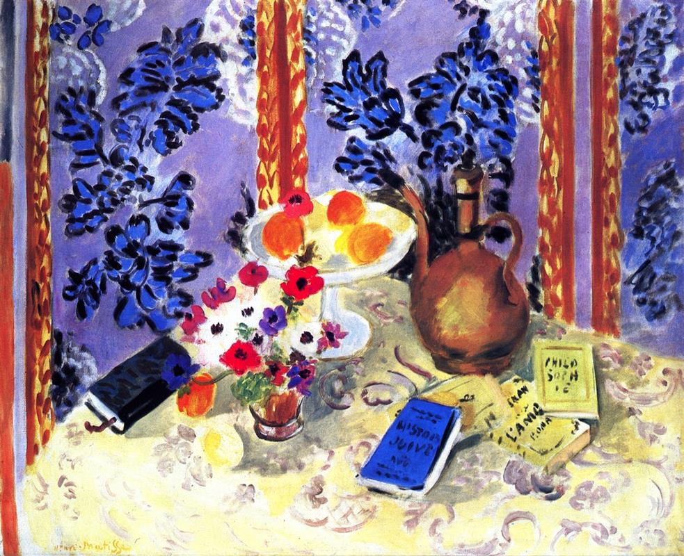
Henri Matisse’s “Still Life, ‘Histoires Juives’” (1924) is a luminous demonstration of his Nice-period language, where pattern becomes architecture, color becomes climate, and ordinary objects—flowers, fruit, books, and a homely copper ewer—are tuned into a poised harmony. A pale table, loosely scrolled with arabesques, carries a footed compote of oranges, an earthen vessel, a bunch of anemones, and a scatter of slim books, one of which bears the legible title “Histoires Juives.” Behind this stage rises a lavender wall densely printed with midnight-blue foliage and bracketed by two golden vertical bands. Nothing here asks for narrative; everything asks to be looked at. The painting’s power lies in how it teaches us to look—slowly, rhythmically—until we feel the room’s measured pulse.
Historical Context and the Nice Vocabulary
Matisse moved to Nice in 1917 and, over the next decade, forged a modern classicism quite different from the shock of Fauvism that made his name. He embraced ambient Mediterranean light, shallow layered space, and a “democracy of surfaces,” where humans, textiles, fruit, flowers, screens, and seashells share equal dignity on the plane. Interiors became his laboratories; the figure often appears, but the grammar of his art is most openly tested in still lifes. Painted in 1924, this canvas sits at the center of that practice. It unites two recurring Nice motifs: the ornamental wall (pressed forward to the picture plane) and the tabletop world (tilted toward us), each tuned to the other through repeats of shape and color.
Composition: A Tabletop Stage and a Patterned Proscenium
The composition is arranged like a small proscenium theater. Foreground and middle ground are a single plane: the table tipped toward us, so that objects present themselves without deep recession. The background is a purple-lavender wall completely covered with dark botanical stamps; two braided golden bands on left and right function as posts that hold the “curtain” open. Matisse places his protagonists along a shallow arc: at center the white compote crowned with oranges; to the right a rounded ewer whose long handle and spout curve like a calligraphic flourish; to the left a low cluster of anemones in a terracotta pot; and across the lower right a fan of small books, casually overlapped, the blue one titled “Histoires Juives.”
This choreography controls how we move. The compote’s high key and circular plate pull the eye first; the ewer’s warm bulk and sinuous handle catch next; then the bouquet’s flashes of red, white, and violet; finally the books, whose rectangles and lettered covers give the scene its crispest shapes. The diagonal of the books counters the table’s horizontal sweep, while the ewer’s vertical thrust answers the golden bands behind. Everything interlocks without fuss.
Pattern as Architecture
Pattern is not decoration here; it is the building. The lavender wall’s inky foliage pushes forward like a tapestry, flattening space and letting the objects sit in front of a living surface rather than receding into a conventional room. The table is tinted cream with broad, milky passages over which faint mauve scrolls are brushed—ornament that subtly maps the plane without stealing attention from the objects. The two golden bands, with their spotted inner texture, are the painting’s pilasters; they bracket the scene, keep the wall from drifting, and echo the warm note of the ewer and the oranges. Pattern thus sets boundaries, regulates tempo, and distributes emphasis.
Color Climate: Warm Notes in a Cool Field
The overall climate is cool—lavender, blue-violet, and creamy white—but it is peppered with warm notes that keep the surface alive. Oranges in the compote radiate cadmium heat; the ewer’s terracotta skin glows with copper and rose; the bouquet adds pulses of red and pink; the golden bands introduce a sunlit chord that frames the whole. The books carry accent colors: a saturated blue for “Histoires Juives,” lemon yellow and pale green for its neighbors, and a dark book at left that anchors the spectrum. Matisse avoids dead black; even the darkest shapes are chromatic, allowing warm and cool to converse rather than clash. The balance is exact: the cool field calms, the warm notes animate.
The Compote of Oranges: A Crowned Center
Placed just off center, the white pedestal dish is the picture’s crown. Its plate is drawn with an elastic oval; the stem is a stack of quick ellipses; light pools on the rim; shadow gathers in a cool gray under the fruit. The oranges themselves are handled as compact chords—warm body, cooler half-shadow, a singular highlight—more sensation than description. Their roundness repeats across the painting (in the ewer’s belly, the flower heads, and the arabesque curls), tying disparate materials into one family of forms. The compote’s white also serves a tonal function: it is the brightest surface in the picture, a vent that breathes light through the warm cluster.
The Ewer: Counter-Form and Rhythm
The earthen ewer to the right is the compote’s counter-form. Where the dish is high-key and crisp, the vessel is low-key and soft; where the dish is all plate and stem, the ewer is a single swelling mass; where the dish is pure white, the ewer holds rosy browns and umbers with a faint metallic sheen along its shoulders. Its handle and spout make a rhythmic S-curve that repeats the serpentine scrolls on the table and accelerates the eye toward the book cluster. It anchors the warm register in a painting otherwise tilted to cools, preventing the oranges from floating free.
The Anemones: A Miniature Orchestra
At left-center, a bouquet of anemones punctuates the table with a constellation of red, violet, and cobalt around a field of white. Their petals are dabbed in charged, single strokes—evidence of the brush’s pressure—so the bouquet reads as an event rather than a botanical record. The small terracotta pot introduces another warm vertical, echoing the ewer in miniature. Together, bouquet and compote strike the painting’s highest notes, offset by the ewer’s lower tone.
Books and the Intelligence of Rectangles
The casual fan of books in the lower right is more than incidental. Rectangles interrupt the painting’s sea of curves and arabesques, adding the clarity of straight edges and corners. The blue cover lettered “HISTOIRES JUIVES” is a crisp, readable accent that doubles as a chromatic hinge, linking the cool wall to the warm table. The yellow volumes vary the tempo and echo the golden side bands; their tilted overlaps create a welcome syncopation against the table’s broad horizontals. A dark, closed book at left anchors the bouquet and keeps the composition from listing to the right.
Words Inside a Picture of Looking
Matisse’s inclusion of legible text is deliberate. “Histoires Juives” (“Jewish Stories”) foregrounds the act of reading and, by extension, the practice of cultivated leisure—one of the Nice period’s recurring themes. The book is also a modern emblem within a classical still life: text implies narrative, yet here the scene resists story. The title sits quietly among fruit and flowers, suggesting that images and words, looking and reading, share the same table. For Matisse, this union is not didactic but humane; it models a room where attention is cared for.
Light Without Theatrics
The lighting is ambient and benevolent. There is no single spotlight carving hard shadows; rather, a clear, even illumination allows colors to carry expression. Shadows under the compote and along the ewer’s base are transparent and colored; highlights on the fruit and glass dish are milky and soft. This approach keeps the surface breathable and all shapes available to the eye. It also collapses hierarchy: no object is dramatized at the expense of others; each plays its part in the chord.
Drawing with Planes and Elastic Lines
Matisse’s drawing is laconic and exact. The compote’s ellipse is pulled once, confidently; the ewer’s silhouette swells and narrows with the brush’s pressure; the books are edged by quick, straight pulls just sufficient to lock them in space. Instead of tight modeling, he builds forms with planes—warm against cool, light against half-tone—and relies on the clarity of edges to do structural work. This economy leaves the painting fresh, its making legible in every mark.
Space by Layers, Not Illusion
Depth is constructed by overlap and temperature, not by vanishing points. Foreground: the table’s lip. Middle: compote, bouquet, ewer, and books. Background: the patterned wall, pressed forward by the gold bands so that it behaves like a hanging cloth rather than a distant surface. The short intervals between layers keep us near the objects—as if we stood at the table—and preserve the painting’s modern flatness. We experience relations more than recession.
Rhythm, Interval, and the Music of Looking
The painting is engineered like a piece of music. Big shapes—table, wall, ewer—form long notes; small shapes—the books, fruit, and flowers—create quicker beats. Repetitions ensure rhythm: round forms echo; blue leaf-motifs climb the wall in a steady pulse; gold bands repeat at left and right; letters on the covers punctuate as staccato. The viewer’s route is phrased: compote to ewer, ewer to books, books to bouquet, bouquet to dark book and back up to oranges, with detours into the deep blue foliage of the wall. Every circuit clarifies how warm and cool, curve and rectangle, figure and ground depend on one another.
Dialogues Within Matisse’s Oeuvre
Compared with the contemporaneous “Still Life with Apples on a Pink Tablecloth,” this painting works in a cooler key and relies more heavily on written objects to supply straight-edged counterpoint. It also converses with Matisse’s musical interiors of 1923–24: the golden bands and dense wallpaper recall the patterned “acoustic shells” behind pianos and violins, but here sound is replaced by reading. In relation to the earlier “Goldfish” series, the compote of oranges functions as a dry counterpart to the bowl of water: a reflective white plate rather than a refracting lens, yet serving the same purpose of centering and slowing vision.
Material Presence: The Pleasure of Touch
Even in reproduction the surface remains tactile. The blue foliage is pushed into the lavender ground with loaded strokes whose edges feather as the brush lifts; the golden bands are built from repeating dabs that catch light like woven braid; the table’s creamy plane is scumbled thinly so the weave of canvas glimmers; the books’ titles are lettered quickly, enough to be legible without losing painterly speed. This variety of pressure and thickness keeps the painting from becoming a diagram; it is felt as a made object, a record of a particular day’s looking.
Meaning Through Design
What does the painting propose? That a room tuned by color and pattern becomes a hospitable place for attention. Fruit, flowers, and books—forms of sustenance, beauty, and thought—are brought into harmony on a single plane. The title “Histoires Juives” need not carry narrative burden; its presence simply affirms that words and images can share a climate. Matisse’s ethic is not spectacle but clarity: arrange relations carefully and ordinary life begins to sing.
How to Look, Slowly
Begin at the oranges and feel their heat. Slide to the ewer—follow the handle’s curve—and pause on the book cluster. Read the blue title, then step to the yellow volumes and the little lemon edge nearby. Drift left to the anemones and count their red and violet notes. Touch the dark book anchoring the bouquet, then climb into the wall’s midnight leaves and return along a gold band to the compote. Repeat the circuit. With each pass, the interdependence of shapes and colors grows more evident; the painting shows how looking can find rest without ever stopping.
Conclusion
“Still Life, ‘Histoires Juives’” is a crystalline statement of Matisse’s Nice-period mastery. A cool, patterned wall; a warm compote, ewer, and bouquet; a scatter of books led by a legible blue title; golden bands that steady the field; ambient light that lets color think—nothing is superfluous, nothing struggles for dominance. The picture offers a model of cultivated calm: a table where thought, beauty, and simple pleasures coexist in balanced relations. Nearly a century later, it continues to teach the art of arranging a world that invites attention.
