Image source: wikiart.org
Historical Context And The Return Of A Favorite Motif
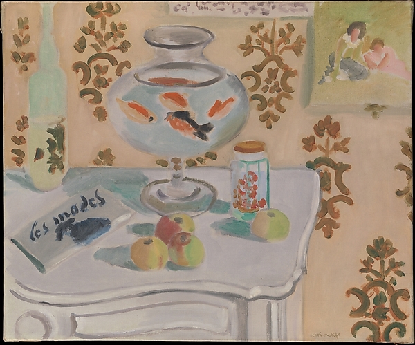
Henri Matisse painted “The Goldfish Bowl” in 1922, at the heart of his Nice period, when modest rooms, patterned wallpapers, flowers, and small domestic objects became a theater for his most refined experiments in color and form. The goldfish had been a beloved motif for a decade. In 1912 he created a celebrated sequence of aquaria balanced on tables and windowsills, turning the slow drift of fish into a meditation on seeing. A decade later the motif returns in an interior that feels gentler and more domestic. The aquarium is no longer a rigorous cylinder set among potted plants; it is a goblet-shaped bowl perched on a slender stem, integrated with fruit, a magazine, a glass bottle, and a little jar of berries. Rather than isolate the fish as a spectacle, Matisse embeds them in a lived room, showing how attention can circulate among moving life, still objects, and patterned air.
Composition As A Stage Of Circles And Planes
The composition is anchored by the large glass bowl, centered slightly left on a scalloped white tabletop. Its rounded body and narrow stem create a chalice-like silhouette that reads strongly at a glance. Around this axis, Matisse arranges secondary orbits: a stout jar with cherries or small tomatoes to the right; three apples gathered at the front edge; a pale green apple toward the right corner; and an angled magazine whose title unfurls as a loose script. These orbits echo the bowl’s curves, establishing a rhythm of circles that holds the eye near the surface before it drifts outward to the wallpaper and the small framed picture on the wall. The tabletop itself is drawn as a broad, pale plane, its perimeter swelling and contracting like a cloud. This scalloped profile, coupled with the soft shadow that traces the bowl’s foot, bathes the still life in a cloud of light—an atmosphere as vital as any object.
The Goldfish As Living Color
Inside the bowl, orange and ebony fish circle like brushstrokes in suspension. Their bodies are not anatomically exact; they are swatches of saturated color with a few dark accents for eyes and fins. In the slow water they become both creatures and abstract signs, a moving counterpoint to the room’s stillness. Matisse positions the brightest orange near the bowl’s front face where light is strongest, allowing translucency to tint the water with peach. A single darker fish creates a necessary bass note; without it, the harmony would be too treble. Because the bowl is a chalice, the fish read almost as painted ornaments on glassware, until a second look reveals their swim. This ambiguity—between pattern and life—is the motif’s charm and the philosophical heart of the picture.
Color Chords And The Temperature Of Calm
The palette is one of measured warmth and gentle cools. The wallpaper is a peachy beige accented by olive arabesques. The table is chalky white with blue-gray shadows that keep it buoyant. The fruits carry soft greens and muted reds; the jar and bottle introduce pale celadons and a thin, transparent green. Against this mild climate, the orange fish spark like embers. Matisse avoids strong blacks; even the magazine’s title is a deep blue that softens into the cloth beneath it. By letting neighbors modulate one another—peach beside olive, white beside blue-gray, celadon next to coral—he establishes a climate rather than a clash. The painting’s emotional temperature is room-warm, the perfect register for sustained looking.
Drawing Inside The Paint
As in many Nice interiors, the drawing is carried by the brush rather than the pencil. Edges swell and taper under the pressure of the loaded bristles. The bowl’s lip is described with a single elastic ellipse, the foot with a supple spiral. The fruits are rounded by patches of temperature; the jar’s label is a few clipped ovals that read persuasively as cherries. The carved face of the tabletop is suggested by a thickened contour. On the wallpaper, the olive motifs are gestural flourishes that never harden into stencil. Everywhere, Matisse’s line breathes. It is exact without rigidity, a drawing that remains a form of painting.
Pattern As Architecture Rather Than Decoration
Pattern saturates the background in the repeated olive arabesque, and yet it is not mere wallpaper. The rhythmic motifs stabilize the wall as a plane, preventing it from vanishing into emptiness and helping distinguish foreground from background. Their color is carefully tuned: dark enough to register as design, light enough to keep the wall luminous. Pattern also appears in miniature on the label of the jar, in the scatter of cherries, and in the dark script of the magazine. These smaller patterns act like ornaments on a musical theme, variations that weave the room together. Pattern becomes structural, an architecture of rhythm that holds the still life in place.
The Tabletop As A Floating Field
Matisse’s white table may be the most radical shape in the picture. Its irregular outline, thick edge, and generous highlights make it read as a luminous platform hovering in front of the wall. Rather than present a solid hunk of furniture with rigid perspective, he flattens and simplifies it into a floating field—a domestic cloud on which life can be arranged. This transformation signals his modernism: the table is a plane of color first, an object second. Because it floats, the bowl’s stem feels precarious in a pleasurable way, as if the whole still life were a balancing act controlled by color.
Light As A Continuous Veil
Light in the painting is even and quiet. It glances softly off the bowl’s lip, collects in the water, and lifts the top planes of fruit and jar. Shadows are thin, colored, and transparent, more changes in temperature than hard occlusions. The bottle at left, with its pale rectangular highlight, shows how Matisse uses thin paint to simulate translucency. The overall effect is a continuous veil of light that settles on all things equally. This calm envelope allows the small shocks of orange and red to glow, not glare.
Space Built By Overlap And Tonal Steps
Depth arises from simple overlaps and gentle tonal shifts. The jar overlaps the table’s rear edge; the bowl overlaps the wallpaper; the magazine sits on the table with a soft shadow. The right-hand corner of the table tips toward us, its shadow deepening slightly to set the plane. The little framed picture on the wall sits higher and lighter, receding just enough to confirm the wall’s distance. Matisse declines strict perspective lines; his space is negotiated by contact and value—intuitively, persuasively.
The Magazine And The Everyday
The angled magazine at left carries a scrawled title and a patch of dark ink. Its presence confirms that this still life is not a formal ceremony but an everyday arrangement. In a Nice hotel room a magazine might be left open during a pause between walks; a jar of cherries could be set aside for later; a bowl of goldfish drifts all day in the same light. Matisse dignifies the ordinary by giving it the same compositional care he grants to flowers and models elsewhere. The magazine’s diagonal introduces a dynamic, almost conversational line that breaks the roundness of the scene and invites the eye to enter and exit casually.
The Little Picture Within The Picture
On the upper right a small framed image shows two figures in a garden—just a few strokes of green, rose, and umber, but enough to conjure an embrace. This picture-within-picture extends the room’s imagination. The goldfish bowl suggests slow contemplation; the framed vignette suggests memory or daydream. Its mint-green ground echoes the jar and bottle, while its rosy figure answers the cherries and the fishes’ warmth. In a single, quiet device Matisse folds anecdote into abstraction without tipping the balance.
Rhythm, Repetition, And Visual Music
The painting’s music lies in its repetitions. Circular forms recur at every scale—the bowl, the cherries, the apple crowns, the jar’s lid, the fish themselves. Olive arabesques on the wall repeat like soft drumbeats behind the melody of the still life. The color red reappears as cherry, as fish, as blush on an apple, as a low echo in the small framed picture. Green repeats as leaf, label, bottle glass, and fruit skin, always tempered to harmonize with peach and white. These repetitions establish a rhythm the eye can live in, producing the sensation of a room that hums gently.
The Intelligence Of Omission
Matisse refuses to over-describe. The goldfish do not cast sharp reflections on the inner glass; the tabletop’s carved apron is a single expressive curve; the bottle bears no label text; the fruit lacks individual pores and stems. Such omissions are deliberate; they preserve the painting’s breath. By declining to burden surfaces with information, he keeps color and spacing as the primary carriers of meaning. The viewer completes the picture, and in doing so participates in its calm.
Relation To The 1912 Goldfish Series
Compared with the 1912 aquaria, this bowl feels less architectural and more homely. The earlier works often emphasize reflection, refraction, and the mind’s concentration. Here the bowl relaxes into domestic routine, sharing the stage with fruit and print. The palette is milder; the space is shallower; pattern replaces the bright gardens of 1912. What remains constant is the philosophical point: goldfish model a way of looking—steady, unhurried, and attentive to quiet movement. By 1922 Matisse shows that this way of looking can be practiced amid the ordinary things of a room.
Material Presence And Tactile Cues
Although the scene is airy, touch is everywhere. The bowl’s rim thickens into a palpable lip; the jar’s lid is a disc of denser color that you can almost twist; the apples carry thin, soft highlights that announce their matte skin; the magazine’s paper lies flat, with a slight curl where ink darkens the page. Even the wallpaper’s olive arabesques feel stenciled by hand, with minor variations that give the wall warmth. These tactile cues keep the still life from becoming purely decorative; it belongs to the hand as much as to the eye.
The Viewer’s Path And The Loop Of Attention
The painting choreographs a dependable path. One enters at the bright bowl, orbits the fish, slides down the stem to the shadow, crosses to the jar and apple, glances at the green fruit on the right, returns along the magazine’s diagonal, and then rises back into the bowl. Occasionally the gaze detours to the bottle at left or to the small picture at right before settling again on the fish. The loop can be repeated indefinitely, each lap uncovering new inflections—a cooler gray in the table’s shadow, a warmer peach on the wall, a dappled reflection inside the glass. Time slows into the tempo of a goldfish swim.
Emotional Weather And Lasting Resonance
The emotional key is gentle clarity. Nothing pushes or clamors; nothing is sentimental. The bowl offers slow life; the fruit and magazine offer the day’s ordinary pleasures; the patterned wall offers a steady hum. The picture endures because it models a sustainable attention: a way of looking that is generous to small things and content to live within a modest chord of color and form. In an era of noise, this domestic aquarium is a lesson in the depth that quiet can hold.
Conclusion: A Room Tuned To Living Color
“The Goldfish Bowl” distills Matisse’s mature values into a compact interior. A chalice of glass centers the stage; moving orange fish balance pale planes of table and wall; fruit, bottle, and printed page provide worldly company; and pattern acts as architecture. Light arrives as a soft veil, drawing merges with painting, and space is constructed by contact and temperature. The scene is not an inventory of objects; it is a climate for looking. Within that climate, life—goldfish circling, a page waiting to be read—goes on with calm assurance.
