Image source: wikiart.org
Introduction
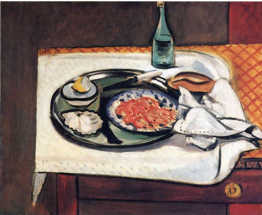
Henri Matisse’s “Pink Shrimp” is an interior still life that turns a modest meal into a clear, resonant orchestration of shapes, temperatures, and touches. A deep green platter dominates a white-draped table; at its center sits a blue-rimmed plate mounded with rose-colored shrimp. Around the platter are a lemon wedge on a saucer, a shell or meringue-like form, a small brown bread or wooden scoop, a white napkin, knives or fish forks, and, at the top, a slender green bottle that acts like a vertical exclamation point. The rear band of table is bordered by a warm, cross-hatched mustard ground; the front edge reveals the polished front of a chest or sideboard. With a few calibrated tones—greens, whites, warm yellows, rose pinks—and the elastic contour for which he is famous, Matisse composes a table that feels both immediate and enduring. The subject is simple, but the painting is not; it is a disciplined lesson in how the smallest shifts of value, edge, and placement create a world that the eye believes and the body remembers.
A Nice-Period Table Set for Poise
Painted during the early 1920s, the work belongs to Matisse’s Nice period, when he returned to the light of the Mediterranean and to the intimate theatre of interiors. After the shocks and experiments of the previous decade, he pursued an art of balance: color turned from blaze to climate; line became a conductor rather than a fence; and everyday rooms offered laboratories where harmony could be tested with fruits, flowers, crockery, and simple meals. “Pink Shrimp” embodies that ambition. The composition achieves calm not by muting sensation but by ordering it: warm and cool notes, matte and gloss, curve and straight edge, all granted places in a lucid grammar.
Composition as a Choreography of Ovals and Rectangles
The design is anchored by a set of ovals nested within rectangles. The table is a broad white rectangle with rounded corners, its cloth hanging in arcs. The platter is an oval almost as wide as the cloth’s central opening; inside it, the decorated plate holding the shrimp forms a second oval; the lemon saucer at left and the shell shape just below provide smaller echoes. Against these curving forms, Matisse sets the crisp right angles of the table’s front board, the back strip of cross-hatched pattern, and the bottle’s vertical spine. This alternation—the gentle insistence of oval against the disciplined firmness of the rectangle—creates both stability and flow. The eye travels naturally from the bottle down to the platter, across the napkin’s corner, and back to the bright shrimp at center.
The White Tablecloth as Stage and Light Source
The tablecloth is not a neutral field; it is the stage and, in a sense, the lighting system. Painted in varied whites—cooler along the top where reflected daylight pools, warmer at the drooping edges—the cloth supplies the painting’s highest values. Matisse refuses to flatten it into a single tone. He lets threads of the underlayer flicker through, pulls the contour with a dark line where the cloth turns under, and sets minute shadows at the contact points where plate and utensils rest. These small decisions keep the white from reading as blankness. The cloth behaves as air made visible, cushioning the objects, catching the bottle’s shadow, and projecting a soft glow back into the greens and pinks.
Green as the Structural Counterpart to Pink
Color does the main architectural work. The platter’s deep bottle-green is the structural counterpart to the shrimp’s vivid pink. Pink without green would be syrup; green without pink would be heavy. Together, they vibrate like complementary strings. Matisse modulates the green from nearly black at the platter’s rim to a more translucent sap in the inner fields, leaving ridges of paint where a bristle lifted, so the surface carries just enough incident to remain lively. The green reappears in the bottle—a slender, cool column—binding the top of the composition to the center and sealing the relationship between food and drink.
The Shrimp as a Warm Pulse at the Center
The shrimp are painted with brevity yet read as unmistakable. Rosy crescents and coral commas pile into a low mound, some tipped with cool white to suggest plumpness, a few deepened with umbery shadows to suggest depth. Their pink sits inside a blue-and-white plate, and that chromatic framing is important. The blue cools the warmth so the heap does not dominate; the white lifts them forward without glare. By putting the brightest warmth at the picture’s center and surrounding it with greens and whites, Matisse builds a visual hearth; everything else is compositional furniture arranged around that gentle blaze.
The Lemon Wedge and the Logic of Accents
At the platter’s left, a small saucer carries a lemon wedge. It is more than a condiment; it is the painting’s key accent. Matisse compresses the lemon to two or three values—pale butter, bright yolk, a whisper of green along the pith—and braces it with a neat dark contour where fruit meets saucer. Because the rest of the painting occupies mid-tones and measured warms, the lemon’s clean brightness pricks the eye, then sends it back across the platter. This is how accents function in his still lifes: not as decorative extras, but as navigational lights.
Bottle, Bread, and Utensils as Quiet Counterweights
The bottle, placed near the top center, steadies the painting. Its narrow vertical counters the platter’s spread; its coolness answers the cloth’s warmth; its translucency keeps the upper band from going dull. To the right of the platter sits a small brown form—bread, scoop, or shallow bowl—whose ochre tone repeats the mustard behind and the wood below, knitting plane to plane. Nearby lie utensils and the folded napkin. Matisse renders the metal with one or two reflective strokes only, careful never to outshine the shrimp or lemon. The napkin, with dotted hem and sharply flipped corner, adds a crisp triangle that cuts into the tablecloth’s soft billows, generating a flicker of rhythm at the lower right.
Pattern as Structure, Not Ornament
The cross-hatched mustard band behind the table reads first as wallpaper or fabric, but in compositional terms it is a structural brace. Its steady diagonal repeats across the width, preventing the large white field from drifting into emptiness and pushing the bottle forward into legibility. The pattern’s color—golden ochre kissed with red—also warms the upper register, balancing the cool grays in the cloth and the greens of platter and bottle. Matisse rarely lets pattern sit purely decorative; he assigns it a job. Here that job is to keep time and to supply a warm echo for the small brown object on the right.
Drawing with a Living Contour
A supple dark line runs along the edges of objects, tightening where weight is felt and relaxing where air is needed. It firms the rim of the platter, flows along the napkin’s folded edge, marks the table’s front rail, and presses lightly at the edge of the white cloth resting over the darker drawer front. The line is integral to Matisse’s voice. It is not a prison for color but a conductor, keeping the ensemble in tempo while letting tones remain open and breathable. In places, such as the top of the bottle, the contour retreats, allowing value to hold the form alone; elsewhere, as at the platter’s lip, it thickens like a reed instrument carrying melody.
Brushwork and the Evidence of Decisions
The painting is candid about how it was made. The platter’s inner fields are painted in long, loaded pulls that leave slight ridges; the tablecloth is built from broad, semi-opaque strokes through which warmer undercolor gleams; the shrimp are quick gestures that separate when you approach and cohere at a distance; the bottle’s body is a translucent scumble that traps light. This candor is central to the image’s freshness. Instead of rubbing passages into a photographic polish, Matisse edits down to the relations that make sensation legible—relative value, edge pressure, and the direction of a stroke.
Space and Depth Without Pedantry
Depth is achieved through overlap and tonal scaffolding rather than plotted perspective. The tablecloth rolls over the front board; the platter covers the cloth’s center; the bottle stands behind but reads clearly because its base touches the cloth’s higher value and its neck breaks the darker band. The slight downward view compresses the tabletop into a shallow stage; the forward edge of the drawer introduces a second plane that reminds us we are looking at a piece of furniture, not an abstract field. The total effect is convincing enough to invite reach yet modern enough to keep the surface intelligible as paint.
Sensory Translation: From Color to Taste
Matisse’s still lifes often translate taste into color and texture. The shrimp’s saturated pink suggests sweetness and brine; the lemon’s bright wedge signals acidity; the bottle’s cool green hints at mineral water or wine; the bread or scoop offers grainy ballast; the napkin promises touch and etiquette. None of this is stated literally. Instead, relational accuracy convinces the senses. The pink tastes brighter because it sits against deep green; the lemon bites because its small lightness punctures a zone of mid-tones; the bottle refreshes because its translucency cools the surrounding warms. The painting does not describe flavor; it composes it.
The Viewer’s Circuit Through the Image
The composition encourages a repeatable route for the gaze. Many viewers enter through the high-key center of shrimp, ride the oval rim left to the lemon, detour down to the shell-like form, then swing across the lower foreground to the napkin’s point and the warm knob of the drawer. From there the eye rises to the brown object and tools at right, climbs to the bottle, tests the patterned band, and returns to the platter’s rim. Each lap yields fresh incidents: a nick of light on a knife, the blue spots around the central plate, a dark accent where platter and cloth meet. The loop aligns with the act of dining: circling the table, weighing flavors, returning to the main dish.
Kinships and Differences with Sister Still Lifes
“Pink Shrimp” speaks to other Nice-period table pictures—those with striped or gridded cloths, lemons, fish, and bottles—but it has its own temperament. Compared with “Still Life with Lemon,” the present painting is brighter and more sociable; the white cloth expands the available light, and the pink mass beckons as a ready meal rather than raw ingredients. Compared with the patterned intensity of later odalisque interiors, the setting is pared down; pattern appears in a single back strip and a dotted hem rather than a riot of textiles. Across all these works, the grammar remains consistent: a few saturated notes set among tuned neutrals, one or two strong shapes that carry weight, and a living line that holds the conversation.
The Ethics of Order
Beneath the pleasures of color and form lies a gentle ethic. Matisse dignifies the domestic meal by arranging it with the same care he would give to a figure or landscape. Nothing is tossed; everything is placed, not to aggrandize luxury but to celebrate sufficiency. The white napkin is pressed, the lemon ready, the bottle poised. The painting suggests a life where hospitality is a daily art and harmony is constructed from ordinary means. In a century obsessed with rupture, this commitment to order can feel radical: calm, here, is not complacency; it is attention.
Modern Classicism at the Table
The painting achieves a modern classicism—clarity without chill, structure without stiffness. The platter’s oval could be lifted from a Roman mosaic; the white cloth’s geometry would not embarrass a Dutch master; yet the frank surface, compressed space, and color logic are unmistakably twentieth century. Matisse’s contribution is to reconcile these impulses so seamlessly that the viewer feels only completeness. The table does not try to astonish; it tries to sustain, and in that steadiness lies its power.
Why the Image Endures
“Pink Shrimp” lingers in memory because it solves several problems at once and makes the solutions look inevitable. It unites warm and cool, light and dark, flatness and depth, appetite and elegance. It gives the eye a dependable home base—the rosy mound—then sends it exploring along crisp edges and breathable whites. It refuses the trivia of detail and the vagueness of blur, choosing instead a middle path of decisive, economical description. The result is a scene that feels familiar on first sight and inexhaustible on the tenth.
Conclusion
Matisse’s still life takes a few tabletop elements and aligns them with rare precision. The white cloth supplies light and breath; the deep green platter supplies structure; the pink shrimp supply warmth and focus; the lemon and bottle supply accent and counterweight; the napkin and tools articulate human presence. Every object plays more than one role, and every color is tuned to the chord. The image invites tasting and seeing at once, turning a meal into a durable music of forms. It is not a demonstration of virtuosity; it is a demonstration of enoughness—the recognition that when relationships are right, simple things shine.
