Image source: wikiart.org
A Room Open to the Sea
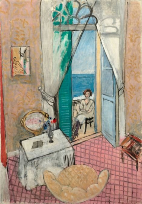
Henri Matisse’s “Interior at Nice” (1920) is one of the clearest statements of his postwar vision: a domestic space organized by pattern and color, opened by a high window to the blue expanse of the Mediterranean, and steadied by the calm presence of a seated woman on a balcony. Painted during his early Nice years, the canvas shows how Matisse fused interior order with outdoor air, trading prewar turbulence for a language of poise. The picture is not merely a view; it is a precise arrangement of planes and intervals that allows the room to breathe while keeping every element in conversation.
The Nice Period and a New Classicism
After the First World War, Matisse moved repeatedly to hotel rooms and apartments in Nice, finding there a climate and architecture that suited his search for clarity. The light was even and generous, shadows softened, and rooms offered tall windows and patterned surfaces that could be tuned like instruments. “Interior at Nice” distills that pursuit. It presents a lived space—table, chair, rug, curtain—staged not as still-life props but as a coherent grammar. What modernity means here is not shock; it is proportion, balance, and a feeling that color has been set in the right key.
Composition as a Theater of Thresholds
The entire painting is organized around a deep balcony doorway at the center, flanked by tall shutters and sheer curtains drawn aside. This vertical aperture functions as a hinge that joins two worlds. The foreground is a patterned, sheltered interior; the background is a bright horizon of sea and sky. Matisse builds a clear circulation for the eye: from the scalloped armchair at the bottom edge to the draped opening, out to the seated figure against the turquoise band of water, then back across the pink-tiled floor and up the patterned walls. The composition holds because the doorway acts like a keystone arch in a vault—remove it and the surrounding planes would collapse into separate pictures.
A High Viewpoint that Flattens and Invites
Matisse chooses a slightly elevated vantage, tilting the floor forward so the grid of pink tiles climbs toward the viewer like a textile. This subtle flattening acknowledges the painting’s surface while preserving a sense of recession. The result is distinctly modern: you read the tiled floor both as a near plane and as a patterned field. That duality keeps the interior lucid and makes the balcony’s deep space feel earned rather than theatrical. You are simultaneously in the room and looking at a carefully constructed page.
The Figure as Anchor and Measure
The woman seated on the balcony is not a dramatic protagonist; she is a measure and a mood. Rendered with abbreviated modeling—soft grays for blouse and skirt, a simple oval for face, and a demure turn of the head—she locates the human scale of the picture. Her chair rests at the exact point where interior gives way to exterior. Because we instinctively know the size of a person, every other dimension takes its cue: the door height, the table’s breadth, the span of shutters, the width of sea. Her stillness makes the entire image feel held, like the pause between inhale and exhale.
Color Intervals that Join Inside and Outside
The palette is tuned for hospitality. Warm ochres and creams pattern the walls, the tiled floor hums with rose and muted red, and the furniture holds deeper ochres and browns. Against these warm registers Matisse paints an exterior chord of blues and turquoise, with a pale band of horizon that cuts the sea from the sky. The shutters introduce a cool mint that mediates between room and air. This meeting of warms and cools is less a contrast than a handshake: interior heat meets maritime breeze without either dominating. The painting’s calm arises from the exactness of these intervals.
Pattern as Architecture, Not Decoration
Every surface carries some kind of repeat, yet none of it feels busy. The walls are covered with a fluid vegetal motif, the floor is a measured grid, the curtain edge is a lace-like border, and the armchair cushion carries a punctuated scallop. Matisse uses these patterns as structural devices. They stabilize large fields of color and establish rhythm the way musical meter steadies melody. Because the repeats are varied—some strict, some loose—the room avoids monotony, and the different meters keep the picture breathing.
The Balcony Door as Painting Within the Painting
Seen through the doorway is a crisp, pared seascape: a short vertical of balustrade, the cool blue band of sea, and a higher, lighter band of sky. The shutter’s mint and the curtain’s white veil the edges like a frame. Matisse deliberately keeps this view spare, even abstract, so that it reads swiftly as open air. It functions as a painting inside the painting—an insert of limitless space that refreshes the surrounding ornament. The limited exterior detail is a strategic kindness: it gives the interior room to speak.
Brushwork and the Life of Surfaces
Each zone receives a touch that suits its matter. The floor tiles are brushed in long, even strokes with thin lines for grout, conveying a smooth, slightly worn surface. The walls are scumbled in warm, transparent layers so the pattern feels embedded, not pasted on. The tablecloth is painted with dry, soft strokes that mimic fabric grain. The shutters and doorframe receive more decisive, linear handling, their edges stated with confidence to anchor the eye. Outdoors, the sea is laid in broad, horizontal pulls; the sky is feathered, almost breathed onto the surface. This allocation of touch turns paint into a map of sensations.
Drawing Reduced to Essential Signs
In the Nice period Matisse often treats drawing as a set of decisive outlines and sparing interior modeling. “Interior at Nice” exemplifies that ethic. A few lines fix the curve of the curtain, the arc of the armchair, the upper tracery of the doorway, the posture of the figure. The restraint frees color to carry volume and prevents the room from becoming heavy with description. Nothing is fussed; everything is said.
Space Kept Honest to the Canvas
Although the picture describes depth, it never abandons the truth of being a flat surface. The tiled floor, read as grid, insists on the plane; the wall pattern affirms it again; the curtains’ broad white shapes flatten the doorway even as they frame it. The outside view is planar too, a banded abstraction. This balance—a believable room that remains a painting—creates the particular calm of Matisse’s classicism. You are never asked to forget that you are looking at color on canvas, and yet the world depicted feels inhabitable.
Furniture as Companions, Not Props
Matisse’s rooms give furniture the dignity of character. The scalloped armchair at the bottom is like a patient companion, its warm cushion opening toward the center as if inviting a sitter. The small table at left, draped in a cloth, hosts a jug of brushes—Matisse’s gentle signature inside the scene—and a dark tablet or book that steadies the tabletop. Near the right edge, a folding stand or music rack tilts into view. None of these elements cry for attention; they behave. Their colors echo the wall and floor, so the room coheres as a family of tones.
The Door’s Tracery and the Pleasure of Ornament
At the top of the doorway, Matisse includes a delicate iron or wood tracery—an airy pattern of small arches and leaves. This detail carries more than decorative charm. It softly lifts the composition’s top edge, preventing the tall opening from feeling heavy. It also rhymes with the repeating floral on the wallpaper, stitching architecture and ornament together. Such small, exact decisions are how Matisse maintains grace without sweetness.
Light Without Theatrical Shadow
The painting is awash with light, yet there are almost no cast shadows. Illumination is evoked by value steps and by the way colors are pitched—cooler outside, warmer inside, pale at the curtain, glowing at the floor. This approach suits a Mediterranean noon when light is everywhere and nowhere in particular. The result is an image that keeps its forms clear while bathing them in an even climate, sparing the eye from harsh glare.
The Mood of Rest and Readiness
Though the figure is seated and the room composed, “Interior at Nice” does not feel static. The open door suggests movement—the next breath might be taken outdoors. The brush-filled jug implies recent work. The tablecloth’s soft wrinkles and the curtain’s tiebacks hint at touch. Matisse captures that particular domestic tempo in which rest and readiness coexist, a humane rhythm that makes the painting feel perpetually inhabitable.
Dialogue with Windows in Art History
Open windows are a classic motif, from Dutch interiors to Impressionist balconies. Matisse’s treatment is distinctive because he does not use the window to demonstrate perspectival prowess or to stage a narrative. His window is a compositional instrument: a cool chord placed inside a warm one. In composing interiors this way, he offers an alternative to both the anecdotal interior and the purely abstract plane—an art of living with color.
Relation to the Odalisque Series
Within a year of this painting, Matisse would move toward more ornate odalisque scenes, where patterned screens, textiles, and reclining figures take center stage. “Interior at Nice” is a leaner, earlier sibling to those works. The seed is here: pattern as structure, furniture as character, a threshold to outdoor air. What distinguishes this canvas is its restraint; by leaving the room relatively uncluttered, Matisse grants maximum clarity to the door’s invitation and to the measured relation between warm room and cool horizon.
Psychological Space Without Drama
Matisse’s interiors avoid melodrama. The figure’s presence is calm, the room hospitable, the sea unthreatening. Yet the painting has psychological depth. The open door doubles as a metaphor for attention turned outward and inward. The woman sits at the boundary between self and world, sheltered and exposed. The viewer can choose to linger with the patterned comfort of the interior or to follow the blue band out to distance. The painting offers both experiences without hierarchizing them.
Material Presence and the Joy of Making
Up close, “Interior at Nice” reveals its making. Lines are allowed to remain exploratory; pentimenti whisper where edges were adjusted; thin washes let the ground warm the walls; thicker strokes in the chair and shutters catch actual light. The evidence of work is not hidden. It enriches the room, reminding the viewer that this serenity is crafted, not accidental.
Lessons for Color and Spatial Design
The canvas serves as a concise lesson for artists and designers. Begin with a dominant warm field and stabilize it with repeat. Introduce a cool, banded exterior as counter-field. Place a single human-scale figure at the hinge to calibrate distances. Keep furniture colors in the room’s chord so nothing jars. Assign each surface a distinct touch. Let light be a climate rather than a spotlight. These principles make the interior legible from across a room and generous at close range.
Why the Painting Still Feels New
A century later, the image remains fresh because it solves permanent problems—how to join intimacy and openness, how to let ornament hold structure, how to keep paint alive while securing space. Its clarity allows multiple readings—formal, sensory, domestic—without strain. And its color relations are so exact that even reproductions carry a hint of the original’s air. The painting proposes a way of living with things that feels both civilized and free.
Conclusion: A Civilization of Placement
“Interior at Nice” embodies Matisse’s belief that the right placement of color and form can make a room humane. The tiled floor offers footing, the patterned walls keep cadence, the furniture extends welcome, and the open door offers release. The figure’s quiet presence measures it all. Nothing is excess; everything is tuned. The viewer leaves the painting with lungs a little fuller, as if stepping from shade into sea breeze. That sensation—clear, breathable, poised—is the work’s lasting gift.
