Image source: wikiart.org
First Impressions: A Balcony, a Curve of Blue, and the Breath of Mediterranean Air
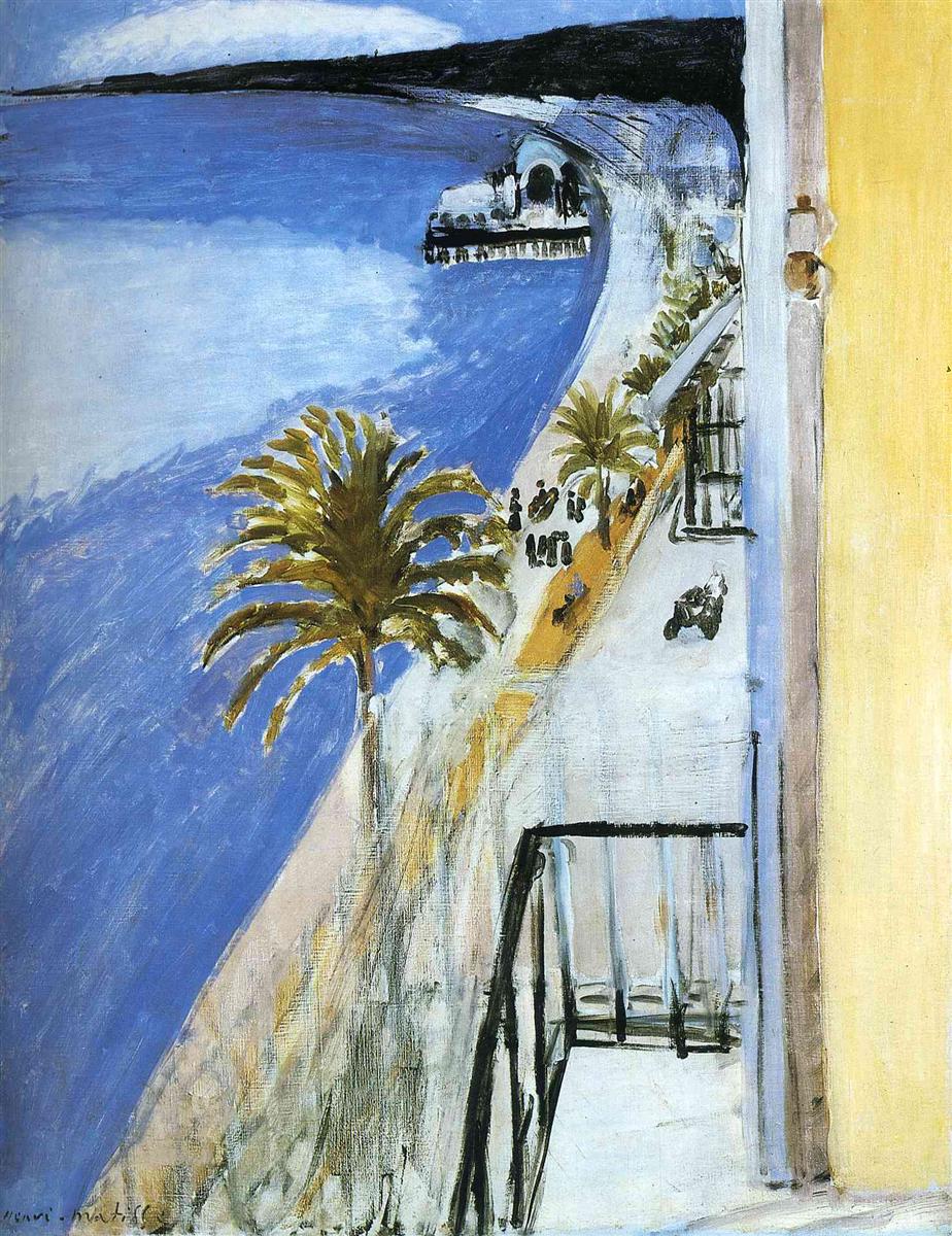
Viewed from a high balcony, “The Bay of Nice” sweeps the eye in a long, unbroken curve from the near railing down along the Promenade and out across the bay. A palm crowns the foreground, the rail cuts a crisp black angle, and the shoreline arcs like a drawn bow toward a small pier and pavilion. The left three quarters of the canvas are sea and sky fused into expansive blue; the right edge is a yellow wall and the dark geometry of ironwork. The scene is at once intimate and panoramic, domestic and civic. Matisse does not stand on the beach; he paints from a private threshold and turns the outside world into a room of light.
1918 and the Poetics of the Nice Period
The year 1918 signals the opening pages of Matisse’s Nice period, when he exchanged the carved, high-contrast energies of the mid-1910s for a tuned, atmospheric language. Light becomes climate rather than spotlight; black becomes a positive color that structures pale chords; pattern and architecture are means to pace the eye rather than ornament for its own sake. “The Bay of Nice” condenses that program. From a single vantage, it joins spacious color with quick, decisive drawing, making the Mediterranean not a spectacle but a daily condition one can inhabit.
Composition as a Chain of Hinges
The composition is a sequence of hinges that keep the viewer’s gaze in motion without confusion. The nearest hinge is the balcony’s black railing, which forms a right angle open to the sea. It connects to the pale terrace space, guiding the eye downward and outward. The second hinge is the sinuous shoreline, a continuous sweep pivoting the composition from foreground to distance. The third hinge is the small pier and pavilion, a compact form that locks sea to shore and provides a fixed measure within the great curve. These hinges prevent the vast left field of blue from diluting the image; they articulate the view like joints in a limb so that the picture moves and rests in turns.
The Balcony as Stage and Measure
The balcony framing is essential. The iron rail is drawn in elastic black, confident but never heavy. It is not mere furniture; it is a measure that calibrates scale. Because we feel the rail’s proximity, the glittering distance of water can expand without losing contact. The yellow wall at the far right works like a proscenium, a vertical band that contains the panorama and warms the palette. With these architectural notes, Matisse turns the outdoors into a staged interior, a favorite move of the Nice years. The viewer occupies a private box seat above a public promenade.
Palette: Blue in Many Tempers, Earth Warmths, and Living Blacks
The picture’s chord is economical yet expressive. The sea is a broad, cool blue brushed in long, slanted passes that darken as they near the viewer and lighten toward the horizon. Sky is an even paler blue, faintly milky, so sea and sky meet as cousins rather than opposites. Shoreline notes are sandy ochres and warm grays, with intermittent dashes of dark to suggest stones and shadows. The palm offers olive and yellow-green, a middle temperature between water and masonry. Black is a full participant: in railings, window bars, the palm’s trunk, and the dotted figures on the promenade. Because black is treated as pigment rather than outline, it tunes the neighbors without deadening them. The color is Mediterranean in spirit—clear, airy, and luminous—but governed by Matisse’s sense of restraint.
Light as Climate, Not Event
Nothing in the painting suggests a theatrical sunbeam or a sudden meteorological drama. Illumination is everywhere at once, a soft, saturating climate that dissolves hard cast shadows and bathes surfaces evenly. The balcony floor is pale without glare; the sea accepts light in a gradated field rather than in sharp reflections; the palm crown is lit in steps, not splashes. This “climate light” is what allows Matisse to build space with temperature shifts—cooler near the water’s depth, warmer at the stucco wall—rather than with heavy contrast. The experience is less of a snapshot and more of a held breath.
Drawing with Color, Drawing in Color
Lines in this canvas are not a separate layer; they belong to the color. The railing’s black reads as drawing, yes, but also as a tonal note within the palette. The shoreline is a painted contour, a quick-edged seam of ochre and gray laid against water; the palm fronds are flicks of green laid into air like calligraphy. Even small figures on the promenade—little strings of dark ovals and dashes—are marks of color that deliver both drawing and tempo. Matisse’s famous synthesis is at work: drawing is done with the brush, inside color; color carries the structure.
Space Kept Close to the Plane
Depth is expansive yet close to the picture plane. There is no vanishing hallway of orthogonals, no deep perspective scaffolding. Overlap and value do the work. The balcony and palm anchor the near; the promenade slides beneath them; the pier nests into the curve; the far headland seals the bay like a raised lip. By keeping depth near the plane, Matisse secures two advantages: color remains strong because it is not drained by atmospheric recession, and the design reads instantly while leaving room for slow looking.
The Curve: A Motif of Movement and Calm
The Bay of Nice presents a natural curve; Matisse makes it the picture’s melody. It carries the viewer’s eye around like a slow, generous bow stroke, countered by the sharp right angle of the balcony. This balance—curve against corner—delivers the painting’s calm. The curve promises continuity and softness; the corner promises measure and rest. One feels both promenade and pause in the same glance, a rhythmic experience that matches the lived pleasure of walking by the water and returning to a chair.
The Palm as Pictorial Compass
The palm is less a botanical specimen than a compass rose. Its trunk posts a strong vertical; its fronds radiate like arrows that point to shore, sea, and sky. The greens are mixed with yellows and grays so they sit easy in the light. Matisse skews the palm slightly, giving it a breeze and preventing it from stiffening the composition. Its placement just left of center stabilizes the great left field of water while keeping the balcony’s black geometry visible. It is the bridge between human architecture and maritime expanse.
The Pier and the Parade: Punctuation of Human Scale
Down the promenade, a compact pier with a domed structure anchors the middle distance. It is drawn with a few economical darks and cool whites, sufficient to register mass and entrance without fuss. On the walkway, strings of small dark notes stand for people strolling, a rite of the Promenade des Anglais. The choice to keep these figures schematic is deliberate; they mark time and scale without introducing anecdote. The viewer understands the grandeur of the bay precisely because the human notes are so small.
Brushwork: The Visible Pace of Looking
The surface keeps the tempo of painting audible. The sea is laid in with long, slightly angled pulls that recall wind on water. The sky is smoother, thinly brushed to let the ground breathe. Stucco walls are scrubbed and slightly warm, suggesting rough plaster. Ironwork is made in quick, loaded strokes that crest and thin like a single breath. The palm is a cluster of flicks and hooks. These varied touches never compete; they harmonize into a single pictorial climate in which speed and stillness are held together.
Edges and Joins: Where Forms Share Air
Edges in the picture are tailored to keep forms in common air. The railing’s black meets the pale balcony with a crisp seam; the seam then softens at the far post, allowing light to describe distance without linear perspective. The shoreline is an adjusted edge that tightens where a wall or curb would be and relaxes where sand softens into water. The palm fronds nibble into the sky so that foliage and air share a boundary rather than fight. These adjustments prevent the image from reading as a collage of cutouts and maintain a breathable continuity.
The Balcony Pictures as a Suite
Matisse painted a number of balcony views in Nice, each a negotiation between private room and public vista. “The Bay of Nice” is among the most distilled. In related works the balustrade can become a band of shadow stripes across the floor; here the rail is an angle and a gate, simpler and more declarative. In others, furnishings intrude or curtains billow; here the interior shrinks to a yellow wall and a sliver of frame, the better to hold the curve of the bay. One senses the artist refining a sentence until only necessary words remain.
The Ethics of Distance
There is intimacy in this painting but no trespass. The viewer does not stand among the café tables or follow a particular figure; the eye honors the public distance of the promenade. At the same time, the scene is not detached reportage. The balcony implicates the viewer in the act of looking—from a chair, after breakfast, perhaps between pages of a book. Matisse’s Nice-period poetics are built on this ethics: presence without intrusion, attention without appetite.
Weather, Time of Day, and the Color of Air
Although Matisse’s art avoids literal storytelling, the picture carries a sense of hour. The blues are tempered and gentle rather than biting; shadows are minimal; the yellow wall is warm but not hot. The cues suggest late morning or midafternoon, a time when the promenade fills but the light has not yet leaned into orange. Sea and sky share a coolness that is more spring than summer. The harmony gives the viewer permission to breathe with the painting, not to chase an event within it.
A Modern Landscape without the Pastoral Crutch
Landscape painting traditionally relies on pastoral figures or dramatic weather to animate the scene. Matisse declines both. The animation comes from composition and color. The waterfront is modern and built; the promenade is urban; the angle of the balcony and the line of the rail are metropolitan strokes. Yet the experience is not hard. The sea is generous and the palm is patient. The modern grows humane because it is tuned by simple, durable relations.
Guided Close Looking: A Circuit through the Picture
Begin at the lower right corner where the yellow wall rises. Let your eye slide across the black rail as it pivots into space. Step onto the pale terrace and over the edge to the palm’s crown, noticing how each frond is a single, confident gesture. Follow the shoreline leftward; note the ochre seam that keeps water and walkway distinct. Pause at the pier; its small dome and dark slats hold the eye for a beat. Continue to the far headland, a dark bar that caps the curve and returns your gaze along the open water. The long, feathered strokes in the sea draw you back diagonally toward the balcony, where the rail steadies you again. After a few circuits, the picture’s rhythm becomes bodily—walk, look, rest, return.
Material Evidence and the Courage to Stop
Small pentimenti remain. A darker earlier line haunts the edge of the wall; the palm’s fronds show first thoughts corrected by quick overpasses; the shoreline wears slight restatements where the curve needed softening. Matisse stops when the relations feel inevitable, not when surfaces are glossy. The viewer senses this inevitability as calm.
Lessons Embedded in the Canvas
The painting offers durable lessons. Use black as a living color to organize pale chords. Keep depth near the plane so color can do structural work. Trade description for proportion: a handful of exact forms—the balcony, the curve, the palm, the pier—carry more truth than catalogs of detail. Let light be climate; model by temperature rather than by heavy shadow. Above all, design the viewer’s path through the image as carefully as any contour; a good painting is a choreography of attention.
Why “The Bay of Nice” Still Feels Fresh
A century later, the canvas reads as contemporary because it trusts essentials. Big shapes make a legible first read on any scale; tuned hues reward long looking; process shows itself without apology. The image delivers both the expanse of a map and the nearness of a room. It is quietly radical, refusing spectacle in favor of poise. In a world full of noise, the painting’s offer remains generous: a balcony of one’s own above an open curve of blue.
Conclusion: A Balcony Grammar for a World of Light
“The Bay of Nice” is a grammar for seeing. A right angle opens to water; a curve returns the gaze; a palm steadies the air; a few dark notes calibrate the whole. With these elements Matisse composes a humane landscape—neither souvenir nor sermon, but a space to inhabit with one’s eyes. The Mediterranean becomes an interior of color; the balcony becomes an instrument for clarity. The result is a picture that you do not merely admire; you join its breathing.
