Image source: wikiart.org
A Harbor Composed from Light, Shapes, and Memory
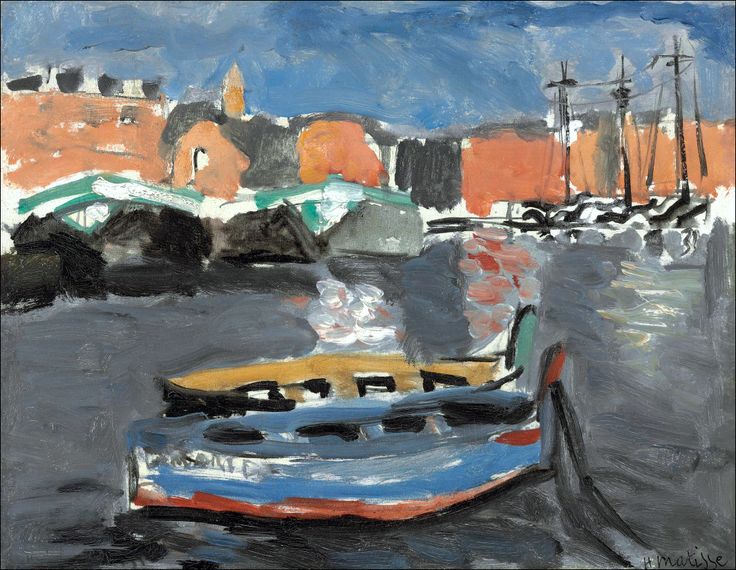
Henri Matisse’s “Port de Marseille” (1917) turns a working harbor into a modern design of bands, blocks, and reflections. A low boat noses into the foreground like a stage set; across the middle distance a row of darker shapes marks quays, sheds, and bridges; beyond them rise ocher and brick-red buildings compressed into simple planes under a light-pulsing sky. The water, dragged with smoky grays and interrupted by bursts of white and pink, carries the whole composition like a moving floor. Matisse does not inventory the port; he extracts its grammar—vessel, wharf, skyline, and sky—and orders them so that the painting is both a literal place and a proposition about how painting can hold space, weather, and work without fuss.
First Encounter: A Boat in Our Space
What strikes first is the proximity of the foreground boat. Its blue hull edged with red and white, its ocher deck punched by rectangular hatches, it sits almost at the viewer’s feet, tethered at right by a dark mooring line. This object is more than motif; it is the device that brings the harbor into contact with our world. Because the boat is cropped and presented frontally, it reads as an object we could touch. Its simple geometry—two long arcs enclosing a shallow wedge—becomes an anchor for the picture, a solid from which the rest of the port can be measured. The boat’s presence also establishes the painting’s tone: practical, unsentimental, and intimate with labor.
Composition as a System of Bands and Knots
Matisse organizes the scene into horizontal strata knit together by a few verticals and diagonals. From bottom to top: the darkened water of the foreground; the colored body of the boat; the midwater strip of reflections, smoke, and wakes; the low dark belt of harbor structures; the sunstruck blocks of city facades; and finally the broad sky. This layered order is interrupted—and therefore energized—by the boat’s diagonal prow, the mooring line, the masts and rigging at the right, and triangular rooflines that cut into the light. The eye does not drift aimlessly; it walks the bands, then leaps from knot to knot where lines cross and shapes hinge.
Color as Weather and Industry
The palette is disciplined. Sky and water are held in related cools—steel gray and chalky blue—that vary with pressure and direction of the brush. Land is organized by warm blocks: red-orange for the city walls and roofs, touched by buff and saffron where light catches; cooled slate and green-gray for the sheds and bridges that sit nearer the waterline. The boat concentrates several of these colors—blue, white, red, ocher—so that it functions as a small index of the painting’s total harmony. Because Matisse refuses unnecessary hues, each relationship carries information: the warmth of masonry against cool sky implies sunlight; the dark belt of wharf against vibrating water defines a horizon; the colored hull against gray water asserts nearness and weight.
Black Contour as Structure
A hallmark of Matisse’s 1916–1917 language is the unapologetic use of black as a constructive color. In “Port de Marseille” black defines the boat’s gunwale and hatches, stitches shapes within the sheds, strengthens rooflines, and erects the masts and rigging at the right. These strokes are not decorative outlines; they are beams and cables in a composed architecture. Their thickness varies with pressure so that edges feel alive, not diagrammatic. Crucially, black also creates intervals—the little negative spaces between rigging lines or under arches—that let air through the composition and keep heavy color from congealing.
Water Rendered as a Plane of Thought
The harbor is not a dictionary of ripples. Matisse rejects glitter and instead treats water as a reflective plane that collects and reorders the rest of the picture. He drags grays in slanted sweeps to register movement, then inserts quick flares of white and pink to mark sun-struck reflections and smoke dissolving on the surface. The result is more than description: water becomes an active participant in the composition, a field that replays the sky, the boat, and the wharf as abstracted signs. Because this plane is so legible, the viewer believes in depth without a single literal wave.
Brushwork You Can Feel
One pleasure of the painting is how frankly it records the hand. Sky strokes run in broad, slightly diagonal bands that echo sea wind. The city blocks are laid with thicker, more opaque passes, giving masonry an appropriate mass. On the boat the paint is tamped and dragged to sharpen edges and emphasize the man-made crispness of planking. In the water, strokes are shorter, mixed wet-into-wet, so their edges bleed and simulate movement. Everywhere, the brush is a narrator: broad for sky, dense for buildings, elastic for rigging and reflections. The harbor feels built by touch.
Space by Overlap and Compression
There is perspective here, but it’s formed by a handful of convincing overlaps and compressions rather than by measured vanishing points. The boat overlaps the reflective band and thus sits in our space; the dark belt of the wharf overlies the water and underlies the city blocks; masts rise in front of buildings; bridges cross the water as low triangles that shorten convincingly with distance. Buildings are compressed into planar facades that climb only slightly toward the horizon, so the city reads as a continuous wall of habitat rather than a scatter of scenic monuments. The space is shallow, navigable, and modern.
Boats as Protagonists, Not Ornaments
The foreground craft is an actor; so too are the rigged ships at right and the low working vessels tucked under the arched bridge. Matisse avoids fetishizing the romance of sail; he does not lace the painting with rigging details or figure anecdote. Yet the boats control the picture’s tempo. The foreground hull advances, the mid-distance craft hang under the bridge like commas, and the tall masts pin the skyline with solemn verticals. Together they remind us that a port is not scenery but a choreography of moving tonnage and time.
The City as Compressed Memory
Matisse paints Marseille not as a topographer but as someone who has walked its quays. The city appears as a reddish rampart of lived buildings, animated by a few telling accents: a triangular church tower, two or three roof steps, black windows that suggest depth rather than count units. No single facade demands attention; the whole wall of the city carries mood—sun-warmed, salty, a little soot-streaked. The harbor sheds crouch lower, cool and utilitarian, with green roofs that assert function over show. The painting convinces not through cataloged detail but through a memory made accurate by structure.
1917 and the Measure of Restraint
Placed in its year, “Port de Marseille” speaks with the measured voice Matisse found during World War I. The blazing primaries of Fauvism have been tuned to a restricted scale in which black and gray carry as much responsibility as blue and red. The design is architectural; the color is purposeful; the brushwork is direct. Yet the painting is not austere. Light plays in the reflections; the boat’s blue and red strike cheerful notes; the sky breathes. It is the restraint of a painter who trusts a few right relationships to do more than a hundred dazzling facts.
Conversations with Tradition Without Mimicry
The subject invites comparisons to Impressionist harbors, to Cézanne’s constructive facades, and to the School of Paris’ love of working quays. Matisse borrows none of their manners wholesale. He declines the Impressionist shimmer in favor of broader planes; he accepts Cézanne’s lesson about building with color-bound shapes but keeps his surfaces more openly brushed; he honors the modernist belief that simplification clarifies truth but refuses to flatten the world into pattern. “Port de Marseille” reads like a conversation in which Matisse replies in his own accented, economical syntax.
Sound, Smell, and Movement Without Anecdote
No smoke stacks belch, no dockworkers bend, no gulls wheel. And yet the painting conjures maritime life. You can almost hear the slap of water against planking in the foreground, the clank of rigging on the tall masts, the muffled thud of cargo beyond the bridge. The smell of tar and salt seems to rise from the gray band of water. How does this happen without literal storytelling? Because the design embeds cues—ropes under tension, wakes that smear into reflections, arches shadowed like mouths—that trigger sensory memory while keeping the picture’s dignity.
The Eye’s Path Through the Harbor
Matisse choreographs a satisfying itinerary. Most eyes enter at the colored prow, slide along the gunwale to the mooring post, skip across the midwater reflections to the arched bridge, then climb the warm wall of buildings to the triangular tower. From there the gaze slips right to the masts, descends the rigging into the water’s silvery band, and returns along the dark wharf to the boat. Each turn is reinforced by a clean value contrast—light on dark or warm on cool—so the circuit repeats without fatigue, revealing fresh particulars: a smudge of white water, a change of pressure in the sky stroke, a reinforcement along a hatch edge.
Negative Space and the Discipline of Edges
What the painting leaves blank matters as much as what it fills. Between masts and rigging, sky slots cut like bright air; under the bridge, arched voids determine the geometry of the passage; between the boat’s ribs, dark ellipses imply depth without digging. Edges tighten or soften according to the kind of space they border: the boat’s rim is crisp; the skyline’s top edges are felt rather than ruled; the water’s edges are perpetually in negotiation. This disciplined management of negative space gives the harbor its balance of solidity and breath.
Material Facts and Studio Decisions
Look long and the picture starts telling you how it was made. A gray dragging through blue at the top left suggests an adjusted cloud. A warm underpaint peeks at the base of the tower, warming the facade. A black line along the boat’s stern doubles back, corrected for angle. The reflections’ whites show two viscosities—thin for glare, thicker for foam. These are not mistakes; they are the human trace that keeps a harbor of shapes from becoming a diagram. You are invited not only to look at Marseille but also to watch Matisse build a Marseille that convinces in paint.
Symbolic Readings That Remain Optional
A port is an easy symbol: threshold, trade, contact, departure. Matisse neither courts nor forbids such readings. The moored boat near the viewer can be read as readiness or pause; the arches may figure passage; the masts may stand for endurance. But the painting’s power does not depend on allegory. Its main work is pictorial: the rightness of relations that turn oil and pigment into a navigable day.
Why “Port de Marseille” Endures
The canvas endures because it finds the point where description and design lock. From across a room you grasp a harbor immediately: blue sky, red city, dark wharf, gray water, a boat close enough to touch. Up close you witness a conversation among strokes that is as candid as any plein-air sketch and as composed as any studio picture. The painting honors work—the work of boats, bridges, warehouses—and mirrors it with the work of painting: measured, decisive, and built to last.
A Closing Reflection on Work and Light
Stand before this picture and you feel a harbor at a moment between surges—daylight laid like a sheet over water, craft waiting, buildings holding warm heat, a breeze combing the sky. Matisse declines drama and gives us order: the order of bands, the order of color chords, the order of a boat moored and a city continuing its business. In that modest clarity lies the painting’s gift. It lets you carry Marseille’s light with you—the light of a place that works and the light of a painter who turned work into seeing.
