Image source: wikiart.org
Introduction
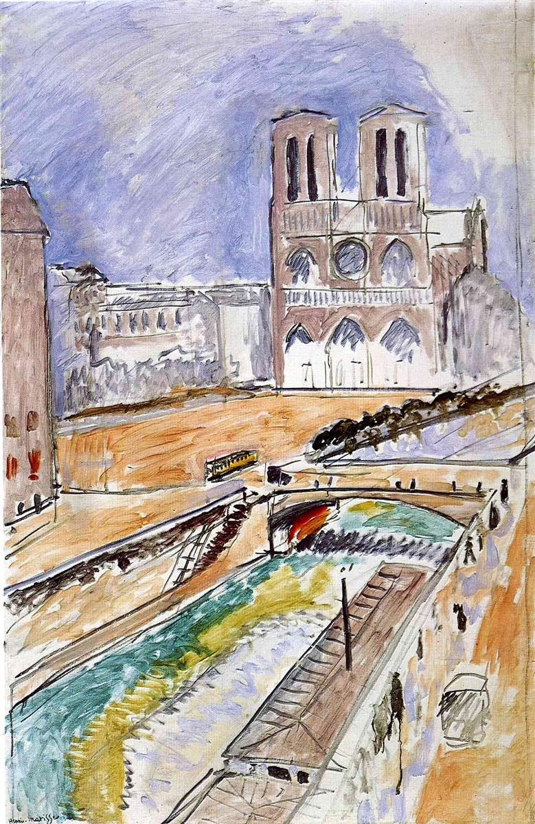
Henri Matisse’s “Notre Dame” (1914) is a city portrait that feels both immediate and constructed, a swift notation of Paris seen from a high vantage and a careful orchestration of color, line, and interval. The twin towers of the cathedral rise at the upper right like a reddish-brown façade pressed into a violet sky. The Seine swings diagonally across the foreground, glinting green and pale gold as it passes under a small bridge whose shadow adds a sudden burst of warmth. Quays, steps, embankments, and scattered pedestrians are abbreviated to strokes and patches that read at once as observation and design. Painted in the same year as Matisse’s radically pared “French Window at Collioure,” this view of Notre-Dame demonstrates a complementary path: not the near-monochrome reduction of interior panels, but the quick clarity of an outdoor scene built from a handful of decisive relations.
Historical Context
The year 1914 was a pivot for Matisse. After the blazing chroma of Fauvism and the luminous geometries of his Moroccan period, he set himself the task of rebuilding his pictorial language with fewer elements and greater structural discipline. “Notre Dame” belongs to this phase of experiment just before the outbreak of the First World War. The painting revisits a long-standing motif for Matisse—the window and the city beyond—but here the “window” is implied rather than shown. Instead of framing bars and interior edges, the composition relies on a steep vantage that tilts the city toward us. The palette is restrained but not austere; the drawing is spontaneous but never careless. Matisse compresses the living movement of Paris into a schema that can be read instantly from across a room.
First Impressions and Visual Walkthrough
At first glance the painting organizes itself around three movements: the cathedral’s vertical mass, the sweeping diagonal of the river, and the broad, warm plane of the place in front of Notre-Dame. The towers are simplified to reddish-brown blocks with slate apertures; arcades and rose windows are barely indicated, yet the identity is unmistakable. The river cuts from lower left to mid-right, its surface articulated by interleaving bands of green, ochre, and lavender, as if catching different zones of light. A small bridge spans the water just where the diagonals would otherwise race off the canvas, and beneath it Matisse drops a surprising flame of red reflecting in shadow. At lower right a carriage or cab is delivered in a few strokes; figures along the quays are flicks of dark paint that still register as walkers. The whole scene feels as if sketched in one concentrated session, but the relations are tuned with the care of a composer.
The Notre-Dame Motif and Paris Topography
Matisse’s Paris is not the grand, axial city of boulevards and domes. It is a knot of lived routes: steps down to the quay, a sudden bend in the river, a bridge that compresses traffic, a square that opens like a pause. Notre-Dame appears not as an isolated monument but as part of a choreography connecting banks, streets, and water. By positioning the cathedral off-center and allowing the river to dominate the foreground, Matisse places the viewer in motion. We feel the descent from parapet to quay, the push across the bridge, the circulation around the parvis. The painting thus honors the building’s iconic form while insisting that the city’s true subject is movement through space.
Composition and Structure
The composition is a cruciform of forces. The cathedral’s verticals counter the river’s diagonal, and the warm parvis acts as a stabilizing horizontal plane across the middle distance. Triangles proliferate: the prow-like island of the quay at lower right, the wedge of shadow under the bridge, the pitched roof beside the towers. Matisse draws long sightlines—quay rails, steps, embankment edges—that guide the eye while declaring the flatness of the painted surface. The off-balance placement of major masses produces a lively asymmetry: weight gathers high right and low left, but the bridge and the warm square knit the halves. The result is a city held together not by detail but by spannable intervals.
Color Architecture and Light
Color here is disciplined and atmospheric rather than celebratory. A cool violet dominates the sky, veined by quick, slanted strokes that give it air. The cathedral’s brick-red and umber planes glow against that cool field, and their dark slits for windows register both depth and calm. The parvis is a layered ochre that modulates from pale apron to deeper bands, suggesting the scuffed surface of a public square. The Seine carries the painting’s most complicated chord: green shifting to olive, then to straw and pale lavender, all streaked by white that reads as gloss and motion. The small red flare under the bridge is an economical masterstroke. It provides a warm counterweight to the cool river and violet sky, and it marks the hinge where water passes from light into tunnelled shade. The palette’s restraint keeps the image legible while allowing isolated warm notes to pulse.
Drawing and the Authority of Contour
Matisse’s line is quick, searching, and decisive. Cathedral apertures are established with vertical slashes; the rose window is a ring with a crossbar, more sign than depiction. Quay edges are single strokes that widen and narrow with pressure, registering both line and mass. Steps and railing are sketched as a ladder of short, parallel marks that march down the embankment in shorthand. Figures are calligraphic specks, but their proportion and placement supply scale. This drawing is never timid outline; it is the skeleton on which the color planes can hang. Because the color itself is often thin and translucent, the line reads through, keeping the whole surface articulate.
Space, Perspective, and Rhythm
Matisse rejects polished perspective in favor of an elastic, observed geometry. The river’s diagonal makes the space breathe; the bridge interrupts and unites the banks; buildings retreat by successive simplifications rather than by a single vanishing point. The cathedral is slightly frontal, the river strongly oblique—two spatial systems in amicable tension. Rhythm emerges where these systems meet: the repeated arches along the façade echo in the bridge; the cadence of the steps down to the quay reappears in the cadence of strokes across the water; the alternation of cool and warm bands orchestrates movement through the scene. The overall effect is of a city that can be surveyed and inhabited at once.
Brushwork and Materiality
The paint handling is open and breathable. Sky and parvis are laid in with thin, slanted strokes that allow the white ground to flicker, granting luminosity without heavy impasto. Along the river, brushwork changes direction to mimic current and chop; whites are dragged wet-in-wet to give the water’s surface a skin. On the cathedral, thicker touches articulate the edges where bright sky meets dark interior, suggesting the building’s mass with minimal ingredients. Scumbled passages at the peripheries prevent the image from closing too tightly, and pentimenti—faint ghosts of earlier lines—reveal that Matisse adjusted the architecture until the proportions clicked. The surface keeps the history of its making visible.
The Bridge as Pictorial Hinge
The small bridge near mid-ground is the painting’s keystone. Without it, the river’s diagonal would carry the eye too quickly out of the frame; with it, the diagonal becomes a path that rounds back. The bridge also compresses the palette’s entire range into a single compact event: warm red under-arch, cool green water, violet sky glimpsed through, ochre parapets above. Its curve rhymes with the arches of the cathedral while its scale roots the composition in everyday Paris, crowded and navigable. In a canvas dominated by large planes, this one measured arc holds the narrative and the design together.
The Sky and the Weather of the Painting
The sky is not a neutral backdrop but a zone of activity. Matisse’s slanting, semi-diagonal strokes create a sense of breeze and shifting high clouds, a pale weather that silvers the edges of buildings and river. The violet hue leans warm here and cool there, allowing the cathedral to breathe forward without hard outlining. The same slant reappears in the parvis and in some quayside passages, giving the painting a consistent grain. The weather, in other words, is structural: it ties sky, ground, and water into a single climate.
Comparison with “View of Notre-Dame” and the 1914 Suite
Matisse painted another Notre-Dame in 1914, the famously severe “View of Notre-Dame,” where vertical bars and cool slabs reduce the vista to nearly abstract relations. The present “Notre Dame” keeps more of the city’s lived detail while preserving that same commitment to economy. Both works share the violet atmosphere, the use of dark linear scaffolding, and the refusal of academic modeling. But where the “View” asserts interior framing as subject, this canvas trusts the city’s own diagonals and masses to carry the design. Together they show Matisse testing the motif from opposite extremes—pure structure and lived scene—and discovering that both can yield modern clarity.
The Ethics of Omission
Matisse’s choices are as notable for what they omit as for what they include. There is little texture on the cathedral stone, no crowding of figures on the square, no detailed facades along the far bank. Shadows are abbreviated; surfaces are kept flat. These omissions direct attention to relation rather than inventory: how river meets bridge, how warm ground meets cool sky, how the cathedral anchors a field of moving parts. The painting’s honesty lies in that restraint. Instead of promising a postcard likeness, it offers a way to see the city’s essentials swiftly and accurately.
How to Look
This image rewards a rhythm of scanning and dwelling. Begin with the big diagonal of the river and let it carry you to the bridge; pause at the red glow under the arch and feel how it pulls warmth into the center. Climb from there to the cathedral’s twin towers and register how little information Matisse needs to make them ring true. Drift back to the parvis and watch the micro-events—a tram, a cluster of shadow—assert scale without noise. Drop to the quay at lower right and notice the quick ladder of steps, then the tiny carriage, all placed so the eye measures distance. Finally, stand back and let the whole surface read as a single chord of violet, ochre, and green, secured by brisk black drawing.
Legacy and Relevance
“Notre Dame” exemplifies a modern approach to the cityscape that many later artists would adopt: simplify the palette, privilege structure, let a few directional strokes generate space. It shows that a recognizable place can be presented without photographic exactitude and still deliver the sensation of being there—perhaps more so, because the painting preserves the eye’s path and the body’s route rather than a neutral view. In urban design and contemporary image-making alike, its lessons endure: balance diagonals with vertical anchors, rely on temperature contrasts to order depth, and allow omissions to keep the whole breathing.
Conclusion
Henri Matisse’s “Notre Dame” distills the metropolitan experience into a set of lucid relations. The cathedral stands, not as an isolated icon, but as an actor in a composition of river, bridge, square, and sky. Color is measured, line is authoritative, space is shallow yet convincing, and the brushwork remains open enough to let the white ground act as light. In a year when Matisse pushed painting toward radical reduction, this view of Paris demonstrates the other half of his project: how to keep a subject alive while paring it to essentials. The canvas still feels contemporary because it makes clarity gripping, turning a familiar landmark into an active field where seeing and movement coincide.
