Image source: wikiart.org
Introduction
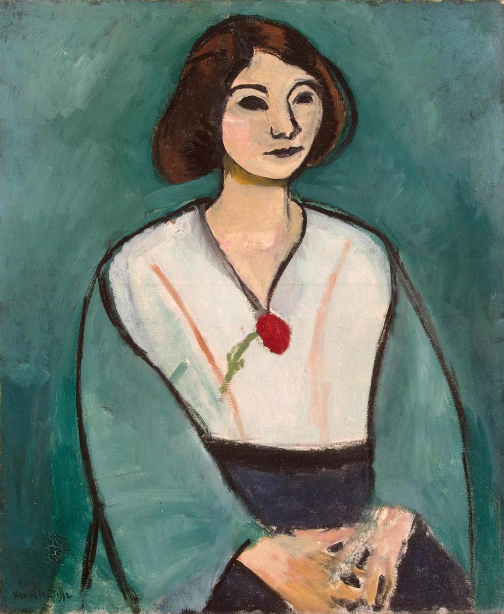
Henri Matisse’s “Woman in Green” (1909) presents a poised half-length figure distilled to essentials: a teal ground, a mantle of green that frames the torso, a pale tunic falling to a dark waistband, and a single red accent rising at the chest like a living punctuation mark. The sitter’s features are pared back to firm arcs and planes—the almond eyes simplified to dark ovals, the mouth a concentrated note of plum, the hair a lucid brown mass that holds the head like a small architectural cap. Nothing in the painting seeks anecdote. Instead, Matisse builds the portrait from intervals of color and decisive contour, showing how a few carefully chosen relations can carry presence and character with astonishing economy.
A 1909 Language of Clarity
By 1909 Matisse had tempered the incendiary contrasts of early Fauvism into a calmer, more architectonic order. The year yields works that rely on broad, legible planes, high but harmonized color, and drawing performed by the brush itself. “Woman in Green” belongs to this shift. It is neither a salon likeness nor a decorative caprice; it is a study in how color can structure a figure and how simplified features can yield a specific, modern poise. The palette narrows to greens, whites, blacks, fleshes, and a single flare of red. With so little, Matisse composes a portrait that reads instantly from a distance and keeps rewarding the eye up close.
Composition and Framing
The composition is built on a stable pyramid. The sitter’s shoulders and draped sleeves form the wide base; the head, slightly turned, completes the apex. The green mantle acts like two sloping buttresses that guide the eye toward the face. A dark waistband cinches the pyramid’s middle, locking the geometry and preventing the broad pale tunic from dispersing. Matisse sets the figure just off center so the right shoulder breathes a fraction more, an asymmetry that keeps the calm composition alive. The background remains a single breathing field, so that the silhouette of the figure—the true architecture of the painting—reads with crystalline clarity.
Color Architecture and the Meaning of Green
Green is not merely a costume note; it is the painting’s governing climate. The teal ground establishes a cool atmosphere against which flesh warms and the white tunic glows. The mantle repeats this green in deeper, more opaque notes, creating a frame within the frame. The eye experiences the greens as both space and garment, an ambiguity that strengthens the portrait’s unity. Against this cool order, Matisse deploys three counterweights: the warm lights of the face and hands, the black contour that tightens every edge, and the small, saturated red motif at the chest. That red, poised where breath gathers, calibrates the entire chord. It makes the greens purer, the whites cleaner, and the skin tones more alive, even though its physical size is tiny.
Contour as Conductor
Matisse draws with the brush in firm, unhesitating lines that behave like the lead cames in stained glass. A single stroke defines the shoulder’s sweep, another secures the jaw, and two assertive arcs lock the eyes. These contours do not chase detail; they establish structure. Around the mantle, the line thickens and thins to acknowledge the weight of cloth; around the face, it lightens, allowing the features to sit softly in the plane. The authority of contour lets the larger color fields remain unmodeled without losing presence. You feel the pressure of the painter’s hand—the place where a stroke slows, where bristles splay, where a corner is turned with a quick, elastic flick.
The Face as a System of Planes
The head is reduced but not generic. The brow and nose fuse into a continuous profile; the eyelids are simplified to dark leaves; a few pink and ochre notes turn the cheek and chin. Rather than build volume through graded shadows, Matisse places adjacent planes so cleanly that the mind completes the turn of the face. This economy opens room for expression at the level of posture and interval: the slight tilt of the head, the quiet alignment of mouth and collarbone, the measured distance from chin to collar. The sitter’s intelligence registers not through tiny mimetic cues but through composure.
Hands, Gesture, and the Anchor of Stillness
The hands, resting at the lower right, are rendered with frank strokes that suggest bone and tendon without fussy anatomy. They interlock lightly, neither tense nor limp, completing the triangle of torso and lap. In Matisse’s portraits, hands often carry character; here they supply the anchor of stillness. Their pale warmth counters the cool ground and mantle, while the dark skirt beneath them provides a bass note of gravity. The gesture is modest, inward, and consistent with the restrained drama of the face.
Garment, Ornament, and the Red Motif
The tunic is an expanse of off-white touched by faint rose lines, as if echoes of the sitter’s warmth were moving through the fabric. Its V-neck invites a slender black tie or seam that rises to the throat, where the red motif blooms. Whether read as a flower, brooch, or embroidered emblem, that red is functional more than descriptive. It punctuates the center axis, draws the eye upward toward the head, and counters the cool breadth of the garment. The mantle’s green repeats and encloses the background’s green, tightening the portrait’s decorative order without letting the costume overwhelm the person.
Background as Active Field
The background is not neutral; it is a field of teal built from layered, visible strokes. Warmer and cooler greens drift across it, preventing the plane from going inert. Slight halos appear along certain contours where the ground was pushed up or pulled back to adjust intervals—a record of decisions left in place. By keeping the background a continuous color environment, Matisse avoids shallow theatrical space and allows figure and field to participate in the same decorative logic.
Light Without Chiaroscuro
The painting achieves luminosity without theatrical light. Instead of casting shadows, Matisse lets adjacency perform the work. Flesh reads as luminous because it sits against cool green; the tunic glows because its off-white is bounded by black and teal; the red accent seems bright because it is the lone warm saturated note in a cool system. Small strokes—peach on the cheek, ochre under the chin, a gray at the bridge of the nose—are placed with restraint, just enough to suggest turning without breaking the calm of the planes.
Surface, Brushwork, and the Presence of Time
Up close, the surface testifies to a painter working quickly but reflectively. You can trace dry-brush scumbles across the mantle, denser deposits at the edges of the tunic, and thinner, more absorbent paint in the face to preserve clarity. Pentimenti around the sleeve and neckline show minor corrections that Matisse allowed to remain, letting the painting keep its history visible. Fine craquelure in some passages whispers that the materials have aged without undermining the design. The surface feels candid, neither polished to anonymity nor left rough for effect.
Space, Depth, and the Shallow Stage
Depth is shallow by design. The figure sits close to the surface and the background refuses perspectival cues, so the portrait reads as a living relief. That shallow stage is crucial to the work’s mood. It eliminates anecdotal distractions and gives the viewer a direct relation to the sitter. The result is intimacy without intrusion: the person is present, dignified, and protected by the painting’s clarity.
Psychological Poise and Modern Identity
The sitter’s calm, slightly averted gaze and composed mouth generate a psychological tone of thoughtful reserve. Nothing here performs; nothing pleads. The simplified features resist caricature and sentimentality. Instead, they propose a modern identity rooted in restraint and self-possession. The portrait’s dignity arises from exactness—of proportion, of intervals, of color relations—rather than from props or narrative. In this sense, “Woman in Green” offers the ethics that underwrite Matisse’s best portraits: clarity as respect.
Dialogues with Sister Works
Seen alongside portraits from 1908–1909, the painting articulates a consistent vocabulary. The firm contour and planar color recall the serene control of “Greta Moll.” The cool field organized by a single warm accent relates to the chromatic discipline in “Geranium.” Compared to the more incendiary shock of “Woman with a Hat,” the present canvas is quieter yet more conclusive. It shows a painter who has learned to concentrate expressive power within fewer notes, trusting rhythm and structure rather than exaggeration.
The Decorative Order and Its Discipline
Matisse claimed the decorative as a positive principle: a way to distribute interest evenly across the surface and bind parts into a harmonious whole. “Woman in Green” exemplifies that order. The background breathes but does not compete; the garment’s large planes act as calm fields; the mantle echoes the ground; the red accent measures the center. Everything participates in a web of relations that allows the face to remain sovereign. The decorative becomes a means of clarity, not an overlay of pattern.
Material Choices and Scale
The choice of a relatively intimate scale suits the portrait’s conversational tone. At this size, the brush can speak plainly—big enough to declare, small enough to nuance. Paint is used sparingly; there is no thick bravura for its own sake. Where the black contour passes over a seam or meets a hand, you sense the exact pressure of bristles, the moment a decision is sealed. The few visible adjustments—narrowing a sleeve, nudging a neckline—signal a painter aiming for inevitability rather than flourish.
Why the Painting Feels Fresh
A century later, the portrait’s freshness lies in its confidence that less can be more. It rejects the false choices between likeness and design, between emotion and structure. With five or six tones and a handful of lines, Matisse delivers presence, mood, and order. The picture teaches that character can emerge from posture, proportion, and the calibrated meeting of colors, and that a single red stroke, placed exactly, can animate an entire world of green.
Conclusion
“Woman in Green” distills portraiture to a lucid grammar: a cool field of teal, a mantle that frames, a pale tunic that catches light, a black contour that conducts, a red note that lifts the chord, and a face whose simplification protects and clarifies presence. Painted in 1909, it embodies Matisse’s turn toward enduring clarity after the blaze of Fauvism. The sitter is modern not because of fashion, but because of poise; the painting is modern because it trusts structure and color to do the essential work. It remains a compact manifesto for humane portraiture—art that honors a person by arranging the world around them with exact, generous care.
