Image source: wikiart.org
First Impressions: Breezes Painted as Color
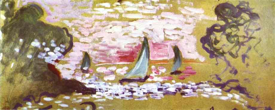
“Sailboats” (1906) is a compact panorama where wind, light, and water are translated into a few fearless chords of color. A band of shimmering strokes marks the sea; three small sails tilt into the breeze; dark, loosely drawn masses—more sensations than botanical facts—frame the scene at left and right. Above, a mauve-rose sky spreads like a veil over an ochre ground, so that the entire image reads as a low, luminous horizon suspended inside a golden atmosphere. The painting is not a topographical record; it is an experience of air and light compressed into an elegant, horizontal motif.
The 1906 Moment: From Fauvist Shock to Balanced Clarity
Painted the year after Matisse’s breakthrough canvases of 1905, “Sailboats” belongs to a period when he refined the Fauvist language into poised statements. Color still drives everything, but its use here is controlled and musical rather than explosive. The format—an unusually wide horizontal—encourages a frieze-like calm and suggests a deliberate engagement with decorative possibilities. Instead of cataloging masts and waves, Matisse reduces the motif to essentials: a luminous sky band, a sparkling water band, three triangular sails, and two framing masses. This economy of means is typical of 1906, when he searched for a grammar that could be both radical and serene.
Composition: A Theater in Three Bands
The compositional skeleton is simple and strong. Across the center runs the “action” band of water, stippled with white-lilac marks that read as glittering chop. Above it lies the sky band, a cushion of pinks and violets; below and around it, a field of ochre sets the overall warmth. The boats sit perfectly within the middle register, their triangular sails interrupting the horizontal flow with clear, vertical accents. On both sides, dark vegetal swirls serve as proscenium curtains, keeping the eye inside the stage. The proportion of sail to sea to sky is no accident: the boats are small enough to make the world feel vast, yet large enough to anchor the surface rhythm.
Color as Structure: The Chords That Hold the Picture
Matisse organizes the painting with three interlocking color chords. First is the golden-ochre ground that suffuses the whole with Mediterranean heat. Second is the cool, watery sequence of lavenders and pale violets that flicker through the sea and clouds. Third is the suite of deep viridians used for the sails and the dark framing shapes. These chords are not descriptive so much as structural—devices that tell the viewer how to read distance, brightness, and air. When the green sails cut across rose and ochre, they acquire immediate authority; when white flickers sit on violet, the sea dazzles without a single “realistic” wave.
Drawing With Touch, Not Outline
A hallmark of “Sailboats” is the way drawing emerges from touch. There is almost no continuous contour; the boats are defined by wedges of green and the intervals they open in the surrounding color. The trees are agglomerations of rounded passages, dragged and scumbled, whose edges oscillate between crisp and dissolving. Even the shoreline is more a seam—where light strokes bump into darker ones—than a line. This method keeps the image mobile. Things are not pinned down by boundary; they cohere because the pressures of one color encounter the counterpressures of another.
Light Without Chiaroscuro
The light in “Sailboats” arrives not as theatrical modeling but as relational brightness. White dashes superimposed on lavender make the water blaze; pale rose in the sky is warmed by the surrounding ochre and cooled by plum shadows within the cloud band. Nowhere does Matisse add brown to “darken” a passage. He deepens by hue, adjusting temperature to find depth while letting every region retain a fresh, breathing quality. The result is an even, generous illumination that feels like afternoon light but never becomes anecdotal.
The Role of the Horizontal Format
The extreme horizontal amplifies the sensation of gentle travel. The eye glides from left to right with the breeze, passing the three sails like milestones in a slow procession. This format also brings the painting close to a decorative frieze, encouraging the viewer to perceive it not as a window onto a distant harbor but as a rhythmic object on the wall. That double identity—scene and ornament—is central to Matisse’s project at the time.
Rhythm: Repetition, Variation, and Rest
Matisse distributes repeated units—sails, white flecks, cloud patches—so that the painting has a musical pulse. The three sails are similar shapes, but each tilts differently, implying wind without literal rigging. The water’s white notes cluster more densely under the central boat, thinning toward the sides; the clouds break apart where the sky warms to rose near the horizon. These variations keep the rhythm alive. Areas of rest—the open ochre fields and unbusy upper sky—give the eye places to pause so that the bright middle register can shimmer without fatigue.
The Framing Masses: Trees or Curtains?
The two dark forms that flank the boats are readable as shore trees, yet they also perform as abstract brackets. On the left, rounded strokes coalesce into a looser, leafy cluster punctuated by white scatter, suggestive of sun on blossom or foam caught in branches. On the right, wiry arabesques sketch a more linear tangle, almost calligraphic. Together they create a gateway that both contains the center and hints at the motif’s origin in a real cove. By refusing to specify species or texture, Matisse lets these masses operate at two registers at once—land and ornament.
Economy and Suggestion: How Little Is Enough
“Sailboats” is a lesson in minimum means. The masts are implied rather than drawn; the hulls are mere shadows; the horizon is a soft register change, not a line. And yet the scene is unmistakable. This economy accomplishes more than speed. It invites the viewer’s eye to complete what is hinted, making the experience participatory. The joy of the image lies in recognizing how the mind snaps the world into place when given a few decisive signals.
The Sensation of Wind
How does a flat image convey breeze? Here it’s done through leaning forms and the directional slant of strokes. The sails pitch slightly, their angles echoing in the diagonal dashes that ripple across the water. Above, the pink clouds appear to drift leftward as their shapes repeat with small offsets. Even the right-hand arabesques carry a lateral pull, like foliage combed by air. The painting never resorts to literal flags or spray; it trusts rhythm to communicate motion.
Material Surface: The Pleasure of Paint
The brushwork ranges from thin, washy passages to denser, buttery flecks. The ochre ground is relatively lean, allowing the weave of the support to whisper through and giving the surface a warm, sandy tooth. On top of this, Matisse lays his cooler notes more thickly so that the sea and sky physically catch more light. This interplay between lean and loaded paint turns the picture from merely seen to palpably present; it glows not only because of color choice but because of how much paint sits where.
Space as a Shallow, Breathing Stage
Depth is felt rather than measured. The boats overlap nobody but sit distinctly in front of the glittering band because their green is darker and purer; the cloud band floats above because it is cooler and slightly higher; the framing trees clearly occupy the closest plane because their marks are larger, darker, and more textured. Perspective lines are unnecessary. Overlap, scale, and value/temperature contrast provide spaciousness while keeping the image close to the surface—perfect for a decorative yet convincing seascape.
Human Presence Without Figures
There are no people depicted, but their presence is implied. Scale tells us the boats are small craft close to shore; the neighboring vegetation suggests a sheltered inlet; the time feels like late afternoon when leisure boats often return. By keeping figures absent, Matisse turns attention away from anecdote and toward perception itself—the human act here is seeing, not acting.
Comparisons Within Matisse’s Coastal Work
“Sailboats” resonates with the seaside canvases painted around Collioure, particularly those that treat the Mediterranean as a sheet of color rather than as a perspectival stage. Compared with the iconic “Open Window,” this picture is more abstracted and pared down. Where “Open Window” uses architectural elements to layer space, “Sailboats” relies on color bands and framing masses. Both, however, convert an everyday view into a decorative order where sensation and structure fuse.
The Decorative Ideal: Painting as a Harmonious Object
Matisse often spoke of his desire for an art of balance and serenity. In “Sailboats,” that ideal arrives not through quiet colors but through disciplined distribution. Warmth is concentrated in the ground and horizon; cools gather in sea and sky; darks are few but crucial, fastening the flanks and the small boat shadows. These distributions make the painting restful even while it sparkles. It functions as an image and as a balanced object whose parts hold one another in place.
Edges That Breathe
Edges constantly shift character—hard under the boats where clarity is needed, soft at the horizon where air thickens, broken along the tree masses to keep the flanks alive. This breathing edge keeps the picture from feeling cut out and pasted; it gives the sense that forms belong to their surrounding atmosphere, which is essential to any convincing seascape.
What the Palette Says About Place
The ochre field and the lipstick-pink sky may seem far from naturalistic, yet they are faithful to the sensation of southern light: intense, warm, reflective. The choice to bathe everything in gold communicates heat as effectively as a thermometer; the cool violets and lavenders recall the way the Mediterranean sea can flash mauve where sun glances off chop. Fauvist color, in other words, is truthful at the level of experience rather than optics.
Small Darks, Big Payoff
The painting’s few dark passages—boat shadows, streaks in the framing masses—perform outsize work. They provide the necessary gravity to counter the expansive warmth of ochre and the buoyant pinks. Without them the scene would risk floating away; with them, the boats feel moored to water and the trees feel anchored to shore. In a high-key palette, such selective depth is everything.
Meaning Without Allegory
“Sailboats” carries no narrative emblem. Its meaning arises from how it orders sensation: a breeze, a spill of light, the calm regularity of moving craft. This is a vision of leisure stripped of anecdote, a coastal afternoon distilled to its essentials. The painting invites the viewer not to decode a story but to inhabit a mood—clarity, brightness, and the gentle cadence of passage.
The Work’s Lasting Lesson
The power of “Sailboats” lies in how much it achieves with how little: three sails, two brackets, two color bands, and a handful of well-placed lights. It shows that modern painting can be expansive without being grand, decorative without being trivial, and bold without being noisy. By substituting color relations for detail and rhythm for description, Matisse found a language that remains fresh more than a century later.
Conclusion: A Breeze Made Visible
In this small, wide canvas, Matisse converts the elements—air, water, sun—into a lucid arrangement of color and touch. The composition’s bands hold firm; the boats punctuate the surface with quiet confidence; the flanking masses keep the eye within the frame while suggesting the lived coast beyond it. Everything is necessary, nothing is labored. “Sailboats” is less a view than a distilled sensation, a reminder that painting’s deepest resource is its ability to make weather from pigment and stillness from motion, then join the two in lasting harmony.
