Image source: wikiart.org
First Impressions: A Coastline Held in a Single Breath
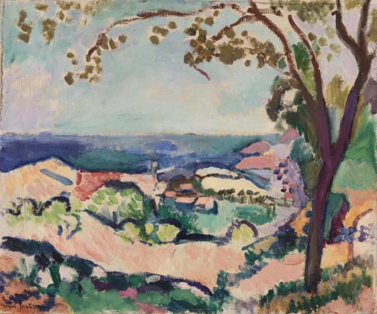
“The Sea Seen from Collioure” offers the sensation of stepping from shade into brilliance. Matisse places us beneath a tree whose branching silhouette arcs across the upper edge like a proscenium. Through this natural frame the view opens to Collioure’s terraced hills, clustered roofs, and finally the band of the Mediterranean that seals the horizon. The surface shimmers with clear, unblended color: mint and turquoise for cool air, rose and apricot for sun-struck earth, ultramarine for the sea’s weight, and firm, dark contours that gently lock forms in place. Rather than a meticulous topographical study, the painting is a lucid orchestration of temperature, interval, and rhythm that turns a familiar view into a living harmony.
1906 in Collioure: After the Fauvist Shock, a Language Matures
The date matters. In 1905, Matisse and his circle detonated color at the Salon d’Automne; critics dubbed them “les Fauves,” the wild beasts. By 1906, Matisse was consolidating those breakthroughs in Collioure, the small Roussillon port whose light had taught him that hue could shoulder the work of modeling and depth. This canvas belongs to that phase of refinement. The palette remains saturated, but it is modulated—sky tints are milky, earth notes are warm yet breathable, and the sea’s ultramarine is tempered by softer coastal violets. The goal is no longer to shock; it is to prove that pure color, spare drawing, and visible brushwork can build a stable, generous world.
Composition: A Framed Vista with a Measured Pulse
The composition is deceptively simple. A tree trunk rises at the right margin, branches swing leftward and scatter small leaf-forms along the top, and a low horizon runs across the middle third, where the deep blue sea meets the pale sky. The land rises in scalloped terraces whose edges are reinforced by dark, elastic lines. These contours act less as outlines than as connectors, tying rosy slopes, green clumps, and white roofs into continuous routes for the eye. The tree’s vertical stabilizes the field and keeps the view from sliding out to sea; the canopy’s arc gently herds our attention back into the center. The result is a view that breathes: expansive enough to convey distance, yet intimate enough to feel like a momentary pause under shade.
Color Architecture: Warm Ground, Cool Air, and the Sea as Bass Line
Matisse builds the vista through complementary chords rather than tonal shading. Warm pinks and apricots define sunlit hills; soft greens and minty notes map groves and gardens; the sea supplies a saturated ultramarine that reads as a structural bass line; the sky is a high, light register of pale blue with hints of lavender. Where warm touches cool, form turns. A rose plane beside a teal shadow delivers volume without traditional chiaroscuro. A mint stroke adjacent to a cream roof becomes the edge the eye needs. Because the pigments are kept clean and the transitions are local, the surface retains a crystalline freshness that mirrors the maritime air.
The Role of Contour: Drawing With Color, Not Over It
Dark seams wander through the landscape, most visible along terrace edges, shrub masses, and the trunk’s silhouette. These are not stiff boundaries; they are supple elastic lines that consolidate the color fields without imprisoning them. In places the contour dissolves or shifts hue—blue-black deepens to violet, brown warms toward claret—so drawing and color remain the same actor in different keys. The approach clarifies forms while protecting the painting’s buoyancy; it is drawing as relation, not as rule.
Brushwork and Facture: A Map of Touches
The painting is legible at the level of the stroke. Sky passages are laid in smooth, lateral sweeps that calm the upper field. The sea is denser, with richer, slightly shorter strokes that give it weight. Hills are broken into mosaic-like dabs—rose pressed against green, violet toggling with cream—that convey the terraced texture without descriptive detail. The trunk is built from thicker, curving applications, the pressure of the brush acknowledging bark’s heft. This varied facture becomes a tactile code: air flows, water sits, earth tessellates, wood resists.
Light and Atmosphere Without Heavy Shadow
Fauvism replaces brown shadow with chromatic counterpoint. Here, midday light compresses values and turns shadow into cool temperature rather than darkness. The mid-ground greens cool toward blue as they recede; roofs and walls brighten into creamy notes that never drop into grey; the tree’s interior spaces are not filled with black but with chill greens and violets that allow the canopy to feel airy. The sky’s paleness is not empty; it is tuned across thin layers so that the view seems to vibrate with heat and breeze.
Space by Adjacency: A Shallow, Believable Depth
Depth arrives without a perspectival grid. Overlaps are crystal clear—tree in front of sky, terraces in front of sea—while temperature shifts and saturation steps sort the planes. Foreground greens are richer, background greens cooler and lighter. The sea flattens to a calm bar that locks the horizon, a vital pause between the agitation of land and the quiet of sky. The space remains shallow enough to preserve the decorative unity of the surface, yet open enough to suggest the long exhale of coastal distance.
The Motif of the Tree: Shelter, Measure, and Music
The framing tree is more than a compositional convenience. It delivers shelter, setting the viewer’s body in shade and lending the landscape an inhabited feel. It also acts as a measuring stick for scale—its trunk’s thickness and leaves’ smallness tell us how far away the village lies. Finally, it contributes music: the branch arcs and peppered leaves supply a dotted rhythm that counterbalances the broad horizontal of sea and horizon. The painting is a duet between arch and band, between sway and calm.
Rhythm and the Eye’s Path Through the Picture
The canvas choreographs looking. Most viewers begin under the boughs at upper right, slide along the canopy to the left, drop into the lightest area of hillside, cross the green terraces toward the white cluster of buildings near center, and then ride the dark, undulating contour out toward the bluer promontories. The sea’s horizontal line catches the gaze and quiets it before the eye returns to the trunk and begins another loop. Each region hands you to the next through shared direction, neighboring color, or value contrast. The motion is gentle and repeatable—exactly the sensation of surveying a view at leisure.
The Decorative Intelligence: Unity Across the Surface
Even as it describes a place, the canvas behaves like a carefully balanced textile. Repeating units—leaf-dots, terrace scallops, roof shapes—create visual motifs that stitch the surface into a whole. Crucially, none of this patterning becomes literal ornament. It is structural decoration: the means by which unity and variety coexist. That decorative intelligence is not a sideline in Matisse; it is the core principle that will later blossom in “Harmony in Red,” “The Red Studio,” and the cut-outs, where color-shape and rhythm are everything.
Collioure as Teacher: Color, Air, and the Ethics of Clarity
Collioure taught Matisse an ethic as much as a technique. The place insists that clarity and pleasure can be the same pursuit. In “The Sea Seen from Collioure,” clarity arises from relations that are easy to follow: warm earth to cool sea, saturated foreground to paler distance, elastic contour to breathing field. Pleasure arises because those relations are tuned rather than forced. There is no melodrama, no storm or sunset; the painting honors a common hour and finds in it a durable harmony. That restraint is why the picture still feels modern—its confidence lies in organization, not in effect.
Comparisons Within Matisse’s Coastal Works
Set beside his 1905 Collioure canvases, this painting feels steadier. The earlier views often pit crimson against emerald in audacious clashes; here the chords soften into apricot and mint, ultramarine and lavender. Compared to the 1906 seascapes where waves batter dark rocks, this work privileges breadth and air over impact. Compared to “Open Window, Collioure” of 1905, which frames the sea with a riot of interior color, “The Sea Seen from Collioure” frames it with nature and offers more repose than jubilation. Across all of them, the method persists: color builds structure; visible touch enlivens matter; a few darks provide the architectural bass.
How to Look So the Picture Opens Further
Choose one leaf-dot at the top edge and notice how it is not green alone but often tinged with ocher or grey to keep it from floating. Follow the nearest branch and feel the brush’s pressure lighten as it thins, a physical analogue for tapering wood. Move to the white roof cluster and see how tiny violet shadows, not black, supply form; step back and watch them lock the buildings into the hillside. Rest your eyes on the sea and register that a very small value shift along the top of the band suggests distant haze. Finally, let your gaze slip to the rose slope in the foreground and observe how two or three cool strokes instantly make it a turning plane. With each pass, the view grows clearer without ever losing mystery.
Materials Speaking as Materials
Because Matisse lets paint remain paint, the picture carries the sensation of matter. Scumbles in the sky admit the weave of the ground, and that texture reads as glare. The thicker touches in the trunk catch real light, echoing bark’s relief. The land’s broken dab-work behaves like vegetation seen through heat. The result is a landscape you feel in your body: a shade-cooled forehead, a salt breath from the water, a bright field pressing behind the eyes.
Meaning Beyond Topography
The painting’s “what” is a view over Collioure to the sea; its “why” is gentler and more ambitious. It proposes that ease and intelligence can coincide in art, that the world’s complexity can be held in a simple, legible arrangement of colors and intervals. The framing tree is not merely a tree; it is hospitality extended to the viewer. The sea’s band is not merely water; it is a horizon of calm that gives every other event permission to happen without strain. This is Matisse’s ethics in visual form.
Legacy: A Step Toward the Great Harmonies
What is rehearsed here—chromatic modeling, decorative unity, shallow breathable space—feeds directly into later masterworks. The Nice interiors will transpose Collioure’s coastal air into room light. Monochrome orchestrations like “Harmony in Red” will push the idea that a single color field can organize a world. Decades later, the cut-outs will literalize the notion that color and contour are one material. Seen from that arc, “The Sea Seen from Collioure” is both a serene landscape and a pivotal proof that a view, a mood, and a method can be the same thing.
Conclusion: A Calm Held Firm by Color
“The Sea Seen from Collioure” endures because it distills a complex sensation into a lucid structure. Shade meets glare, land meets water, and near meets far in a set of color relations so clear that they seem inevitable. The tree’s dark lyric anchors the field; the terraces pulse with warm-cool exchanges; the sea rests; the sky breathes. Matisse does not narrate the landscape—he composes it—so that the viewer can stand beneath those branches and experience the world as balance.
