Image source: wikiart.org
First Look: A Living Architecture of Color
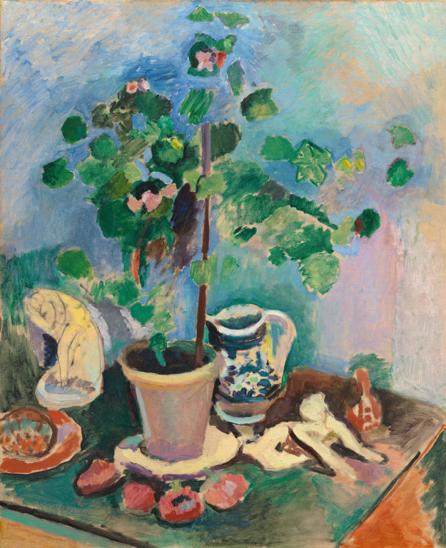
At first glance, “The Geranium” feels like a small indoor climate where everything breathes the same cool air. A potted plant stands at the picture’s center like a slender tree. Around it Matisse arranges household objects—a blue-and-white jug, a small sculpture, a plate with fruit, a red bottle, a draped white cloth—on a green tabletop pushed close to the corner of the canvas. The wall behind shimmers from turquoise to lilac, brushed so openly that you can almost see the room’s light circulating. No part of the still life is treated as mere accessory. The plant, ceramics, sculpted form, and cloth contribute equally to a delicate structure in which color, not line, carries the weight of form.
Between the Heat of 1905 and the Poise of 1906
Painted the year after the blazing Fauvist summer in Collioure, this work shows Matisse consolidating his discoveries. In 1905 he shocked Paris with saturated oranges and magentas braced by black seams. By 1906 he often moderated the heat, thinning paint, leaving passages of ground, and relying on temperature contrasts rather than outlines. “The Geranium” preserves Fauvism’s high key yet swaps its trumpet blast for a chamber-music clarity. The canvas reads like a studio experiment in which indoor light, humble objects, and a living plant demonstrate that pure color can organize space as convincingly as any academic modeling.
Composition: A Vertical Stem and a Table as Stage
Structurally the painting is very simple and very deft. The geranium’s straight stem rises from the pot to bisect the composition, the way a tree might anchor a landscape. Its leaves spiral outward in irregular clusters that counter the stem’s strictness with arabesque motion. Everything else locks to that axis. The jug nestles behind the pot; the sculpture—curved like a shell—balances on the left; a red bottle and a brown form counterweight the right; pink fruits dot the front edge while the white cloth spreads like a soft peninsula between objects. The table is cropped so that its corner points toward the viewer. That diagonal thrust gives the arrangement depth without relying on strict perspective lines. The plant’s vertical relates to the table’s diagonal like a mast to a deck; together they make a clear armature that holds the scene.
Color Architecture: Warm–Cool Chords Doing the Drawing
The picture’s grammar is color. Warm notes—the terracotta pot, the rose fruits, the tiny blushes in the flowers—concentrate along the lower half, while cool notes—the blue jug, the teal and lavender wall, the emerald leaves—surge upward and outward. Red and green, classic complements, animate the entire scene: warm rose punctuates cool foliage; green casts deepen the shadows of the pink fruit; the tabletop’s green plane steadies the pot’s orange. A few strategic darks (in the pot’s inner rim, the jug’s pattern, and the cast shadows under the leaves) act like the lead in stained glass, bracing the bright panes so they won’t drift. Edges form where temperatures meet—pink petal against blue wall, green leaf against lilac haze—so drawing happens as a seam of hue rather than a pencil line.
The Background as Air, Not Wall
Matisse refuses to treat the background as neutral filler. Thinly brushed transitions shift from sky blue to aqua to mauve, and all of them are applied in strokes that keep their edges alive. The wall reads as air lit by a window outside the frame. It is this breathing background that allows the foliage to feel buoyant: green leaves don’t sit on a flat plane; they float in a gentle gradient that gives them depth without shadows. You sense the time of day not through a clock but through color climate—a bright, even illumination that makes whites bloom and blues recede.
The Geranium: A Domestic Tree
Geraniums are workhorses of Mediterranean windowsills and Parisian studios, valued as much for their hardy stems and scalloped leaves as for their vivid blossoms. Matisse paints this plant as a house-sized organism reduced to table scale. The leaves arrive as solid, confident shapes built from greens that tilt warm or cool depending on what surrounds them; a few are nibbled by light so that the ground peeks through. The tiny pink blooms rest like color accents more than botanical descriptions, keeping the green field lively without becoming fussy. The stalk is a brownish pole, a sober note that steadies the lushness above. The plant becomes a study in how nature’s volume can be expressed purely through temperature and placement.
The Pot, the Plate, and the Jug as Lessons in Construction
Look at the pot and jug to see Matisse’s method at its most economical. The pot is a cylinder constructed from bands of warm rose and clay, with a quick violet curve along the lip to turn the form. No brown shadows, no glazing—just a few values within the same warm family. The jug is assembled from adjacent planes: pale body, deep cobalt pattern, a cool shadow on the far side, and a white highlight pulled not as a dot of pure white but as a lighter version of the surrounding hue. These objects are convincing because the relations are right, not because details are enumerated. The plate under the pot and the saucer-like rings around it do similar work: elliptical strokes stabilize the arrangement and echo the table’s angled corner, organizing our movement through the scene.
Sculpture and the Dialogue with Other Arts
On the left sits a small carved form—winged, shell-like, almost abstract. Matisse admired sculpture’s ability to simplify mass into essential curves; placing a sculpture inside a still life lets him paraphrase that idea in paint. He does not copy its details; he translates its volume into milky whites and pale yellows shaped with a few decisive arcs. The object acts as a silent partner that reinforces the painting’s core argument: forms should be understood as rhythmic silhouettes filled with living color.
Pattern and the Decorative Intelligence of the Tabletop
Matisse loved textiles and the decorative arts, where design organizes space and guides the eye. That sensibility pulses across the tabletop. The white cloth snakes between objects, its edges italicized by lavender and ocher to imply folds without literal stitchwork. The alternating red fruits across the front lip function like a border motif, balancing the heavier objects. Even the tabletop’s green is not a monotonous field; it modulates from deep viridian to thin, minty scrubs that acknowledge reflected light. The whole surface behaves like an orchestrated pattern—never repetitive, always measured.
Brushwork, Impasto, and the Evidence of Decision
The paint handling keeps the record of making visible. The wall is laid in broad, open strokes that leave traces of the ground; leaves are built with thicker, more opaque placements; fruits are dabbed with rounded strokes that match their forms. The variety is not stylistic decoration; it’s descriptive. Thick strokes feel near and substantial (leaf and pot), while thin scrubs feel airy and far (wall and distant table areas). Matisse’s confidence shows in what he omits. He refuses to “finish” the plane with uniform polish because those open joins between strokes are where light lives.
Light Without Chiaroscuro
There are almost no cast shadows and no traditional chiaroscuro modeling, yet light saturates the picture. It arrives as temperature: cool air pooling behind the plant, warmer reflections bouncing off clay and fruit. Whites are rarely pure; they lean slightly blue or slightly yellow depending on their neighbors, which makes them luminous rather than chalky. This chromatic conception of light—light as a relation among hues—atoms the old hierarchy of foreground detail and background murk. Every part of the painting can be clear because clarity no longer belongs exclusively to highlights.
Space Built by Overlap and Temperature
Depth in “The Geranium” arises from simple tactics. Objects overlap: the pot stands before the jug; the cloth slips under both; the fruits sit on the cloth’s edge. Temperatures stack: warm objects advance, cool backgrounds recede. The corner of the table thrusts diagonally toward us, while the background’s airy brushwork keeps us from falling into a deep fictive room. The painting stays agreeably shallow—enough space to place things, but not enough to become theatrical. That shallowness is a deliberate choice that allows color to remain the protagonist.
Rhythm and the Viewer’s Path Through the Scene
The composition choreographs a clear circuit for the eye. Begin at the pot’s rim and step upward along the stem. Pause among the leaves where small pinks flicker. Slip rightward to the blue-and-white jug whose pattern echoes the foliage’s rhythms. Slide down to the white cloth, then cross to the row of fruits along the table’s edge and return to the left where the small sculpture waits like a punctuation mark. Each stop borrows a color or curve from the last so the loop repeats easily. Looking becomes an unhurried walk through a room where everything has been placed for the pleasure of circulation.
The Psychology of Ease
Although there’s no human figure, the painting conveys temperament. The palette is high-key but calm, the arrangement measured, the touch frank but never aggressive. This atmosphere mirrors Matisse’s oft-stated goal for painting to offer repose—a “good armchair” for the spirit—without losing vitality. The geranium embodies that ideal: simple, resilient, quietly radiant. The still life’s message isn’t luxury; it’s sufficiency and order, a domestic world made hospitable by clear relations of color and shape.
Kinships Within Matisse’s Work
“The Geranium” speaks to earlier and later milestones. From the 1905 Collioure canvases it inherits the courage to let color lead. It looks forward to “Harmony in Red” and “The Red Studio,” where hue becomes architecture itself—walls, floors, atmosphere. The object vocabulary anticipates the Nice interiors, with their plants, pitchers, patterned fabrics, and open windows. And the way edges are formed by color seams rather than drawn lines foreshadows the paper cut-outs, where color and contour become the same material. Seen this way, the painting is not a side note but a hinge in his evolution from blazing experiments to serene mastery.
The Table Corner: A Subtle Masterstroke
It’s easy to overlook the orange triangle at the lower right margin, but it does heavy compositional lifting. That small wedge marks the table’s far edge and tilts the whole stage toward us. Its warm color echoes the pot and fruits, preventing the right side from drowning in the cool blues of wall and jug. Its diagonal repeats the invisible diagonal from pot to sculpture, creating an X-like structure that tightens the picture. A modest accent becomes a structural keystone.
Material Presence and the Sense of Scale
Matisse’s paint never forgets that it is material. On the pot, thicker pigment builds a believable weight; on the wall, thin scumbles let the weave show through, simulating glare; in the fruits, swipes leave ridges that catch real light in the gallery. Those physical differences make the tabletop feel tactile and the objects varied in substance—clay, leaf, glazed ceramic, carved stone, woven basket—without descriptive fuss. The studio becomes a place you can occupy with your eyes and, almost, with your hands.
How to Look So the Picture Opens
Stand close to the pot and track the short violet mark that firms the lip; step back and watch the cylinder turn. Shift to a single leaf and note how one side warms toward yellow while the other leans bluish—then feel volume emerge with no shadow added. Slide across the jug’s dark motifs and see how they act like braces against the wall’s airy field. Rest on the white cloth and let its cool and warm halftones suggest folds. Finally, return to the red fruits at the edge and notice how their spacing paces the foreground like beats in a measure. After a few circuits, the scene ceases to be a collection of items and becomes a single organism of color.
Why “The Geranium” Still Feels Contemporary
Many images today are built from flat planes of digital color; Matisse anticipated that clarity while preserving the pleasures of paint. The still life feels modern because it locates truth not in minute depiction but in stable relations—complements set in balance, warm against cool, mass against air. It also trusts you. It leaves joins visible, admits the ground, and lets your eye finish what a literalist hand might overwork. That generosity gives the painting a timeless friendliness: it remains open to being looked at slowly, and it gets better the longer you stay.
Conclusion: A Studio Where Color Does the Thinking
“The Geranium” shows Matisse fully confident that color can hold the world together. A simple plant, a handful of objects, a tabletop, and a wall become a complete environment arranged by temperature and rhythm. The painting demonstrates a principle that would guide him for decades: when hue and interval are right, the need for heavy shading or intricate detail disappears. What remains is clarity—luminous, breathable, hospitable. In that clarity, an ordinary houseplant achieves the dignity of architecture and the room around it becomes music.
