Image source: wikiart.org
First Impressions: A World Arriving in Color Before Form
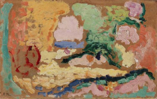
“Sketch for Le Bonheur de Vivre” feels like a landscape only just coming into focus, as if you have stepped into a studio at the precise moment when vision turns into paint. The surface is a mosaic of creamy pinks, lemony ochres, mint greens, cobalt and ultramarine blues, punctuated by decisive strokes of deep green and small, urgent reds. Shapes hover between abstraction and recognition: a pale clearing in the center suggests sunlit ground; a cool band reads as distant sea; a branching green arabesque implies a tree; a darker sweep along the lower edge acts like a stream or path. The brown support remains visible around the edges and between strokes, warming everything with a low, earthy hum. Even without precise figures, the painting already contains the climate of Matisse’s monumental “Le Bonheur de Vivre (The Joy of Life)”—a pastoral space where bodies, trees, and light are woven together by color.
Context: Preparing a Manifesto of Pleasure
The finished “Le Bonheur de Vivre” of 1905–1906 is a landmark of Fauvism, a theatrical clearing populated by reclining nudes, musicians, and a far ring of dancers. This sketch belongs to the crucial thinking that led there. Matisse was testing how to coordinate an entire world through a handful of chords rather than detailed drawing, how to let color shoulder the structural work of composition. The study’s roughness is not a prelude to careful finish; it is a map of relations—temperatures, intervals, and rhythms—that the large canvas would obey. In this sense the sketch is not secondary at all. It preserves the first, most candid statement of the idea: delight as an environment built from color.
Composition: Clearing, Horizon, and the Binding Arabesque
The painting organizes itself around a bright, almost oval clearing set slightly below center. Surrounding this field, warm ochres and oranges form a protective ring that reads as sunlit earth and foliage. Along the upper third a slim band of cool blue introduces a horizon or inlet that instantly deepens the space without resorting to drawn perspective. The left margin’s warm block and the right margin’s cooler masses act like framing trees. Cutting across the middle, a branching, almost calligraphic green line—the embryo of Matisse’s famous “arabesque”—binds sky to ground and sets the tempo for everything else. The lowest edge is anchored by a dark blue-green ribbon whose broken notches supply weight and keep the airy center from floating away. Even at this stage, the composition already enacts Matisse’s law of balance: a calm central field clasped by lively borders and stitched together by a rhythmic curve.
Color Architecture: Warm–Cool Chords Doing the Drawing
The sketch replaces tonal modeling with temperature contrasts. Warm zones—apricot, rose, buttery yellow—occupy the clearing and left background; cools—mint, blue-green, violet, cobalt—gather at the borders and horizon. Where warm planes meet cool planes, edges appear automatically. A rosy shape turns into a boulder, a figure, or a cloud the moment a seam of green or blue presses against it. The small darts of crimson near the left and lower center are not literal “things”; they are catalytic accents that activate the surrounding greens and pinks and keep the chords vibrant. Because the pigments remain clean and largely unmixed, the surface retains a luminous inner light instead of going chalky. Matisse, trained by Cézanne’s lessons in constructing with color and emboldened by the Fauvist high key of Collioure, composes here like a musician—blocks of notes first, melody later.
Surface, Touch, and the Role of the Support
The paint sits in short, blunt swipes laid wet against wet, with some passages dragged thin to let the reddish-brown ground breathe through. That exposed ground is crucial: it acts as a shared middle value that knits disparate hues, and it supplies the warmth of sun-baked earth without the need to cover every inch. Thick creams of pink and lemon stack in the central field like stacked tiles of light; leafier greens are applied with more pressure, leaving ridges that catch actual light the way a twig catches sun. The blackish-blue at the bottom has been scrubbed and then restated, leaving a record of revision that feels like the testing of a base line in music. Nothing is polished; nothing is smoothed into anonymity. The surface is a diary of choices that remain legible and alive.
From Abstraction Toward Motif: Where Figures May Be Hiding
Look long enough and potential figures begin to declare themselves. At center, a salmon and cream form reclines within the clearing, and a violet notch near its upper edge reads as the curve of a back or shoulder. To the right, a cluster of pale pinks wrapped by spring greens becomes, in the mind’s eye, a seated pair or the crowns of flowering shrubs that the final painting would translate into nude bodies nested in foliage. The small red oval at left could be a lute or a figure in profile; the dark green branch crossing the upper middle anticipates the tree that, in the finished work, shelters the gathering. Matisse understood that the mind needs only a few cues to summon subject. The sketch therefore withholds description in order to test what combination of color, placement, and curve is sufficient to conjure Arcadia.
The Arabesque: Line as Music and Structure
Matisse’s theory of the arabesque—a continuous, flowing line that organises the whole—arrives here in nascent form. The dark green stroke that bends over the clearing is not a mere contour. It positions weight, marks the hinge between land and sky, and sets a tempo that the eye follows again and again. This line later becomes literal branches and implied limb-lines of reclining figures, then decades later the cut paper curves of the Jazz series. In the sketch, freed of description, it can be seen doing its most important job: unifying the picture as a single breath.
Space Without Perspective
Depth is achieved with almost shocking economy. The blue band across the upper third implies distant water; the ochres and greens thicken toward the lower edge to imply nearness. Overlaps are minimal yet decisive: a pale pink cloud of paint interrupts the horizon and so must be nearer; the green arabesque crosses the pink mass and pulls it forward. Values are limited; shadows are nearly absent; still, the scene opens convincingly. This is the boldness of Fauvism at its most distilled—space delivered by color relations rather than drafted grids.
The Pastoral Idea: Pleasure as Order
If the finished “Le Bonheur de Vivre” makes its theme explicit with nudes, musicians, and dancers, the theme is already audible here. The palette is orchard-bright, the rhythm unhurried, the intervals spacious. There is no strain in the composition; nothing is crowded or dramatic. The clearing invites rest, the horizontal blue suggests soothing distance, and the curves of green propose shelter rather than threat. Matisse’s often-quoted wish to create an art like “a good armchair” is not a retreat from seriousness but a decision about what kind of order painting can model. The sketch makes that order visible at the foundational level of color and interval.
Relation to the 1905–1906 Breakthrough
Seen beside the Collioure canvases of 1905, this study looks less saturated and more abbreviated. The change is intentional. In 1905 Matisse learned how far pure color could go; in 1906 he learns how little is needed to hold the world together once the relations are right. The sketch is a laboratory for that reduction. It also shows how the energy of Neo-Impressionist division can be kept without its diagram: instead of even dots, Matisse uses variable strokes that carry direction and pressure, giving the surface a human tempo.
How to Look So the Picture Opens
Begin with the dark blue-green ribbon at the bottom and feel how it braces the whole, then climb into the creamy yellows of the clearing and notice how their edges are left open so the ground can sparkle through like glare. Shift your eyes to the small red touches; see how each one snaps the surrounding greens and pinks into sharper focus. Follow the green arabesque as it arcs over the middle and sense how it binds left to right. Finally, rest on the cool blue horizon and experience the sudden quiet it imposes. Repeat the loop and watch potential figures emerge then dissolve again, as if the world were forming and reforming under your gaze.
Material Presence and Matisse’s Process
Because the paint is unforced, you can infer process step by step. Light zones were blocked in first to claim territory; cools were introduced to counterweigh them; a few deep notes of green and blue were added to test the skeleton. There are moments where the brush seems to have been wiped on the support to clean it, leaving a scumble that nonetheless becomes part of the scene. The signature “HM” in the lower left crouches like a small weight, a final dark to stop the eye from skating off the edge. The whole feels less like a rehearsal for a later performance than like the performance of seeing itself.
The Importance of Reserve, Accident, and Revision
One of the sketch’s modern pleasures is how openly it welcomes chance. Where the brush drags and leaves ridges, those ridges read as the corrugations of sunlit ground; where a stroke slips and leaves a tail, the tail becomes breeze moving through branch or hair. The brown support is alternately covered and exposed, participating as a third player between warm and cool. Revision is not hidden: a dark sweep at the bottom turns then stops; a green dash is abandoned mid-course; a patch of pink is repainted without fully erasing what lies beneath. All of these artifacts testify to a confidence that painting is not a picture of certainty but a record of arriving at it.
Why This Small Study Still Feels Large
The sketch feels bigger than its scale because it contains the logic of an entire world. You can test its relationships and they hold: remove the blue band in your mind and the clearing loses air; erase the dark base and the composition floats away; dull the small reds and the greens recede into blandness. What you are seeing is not a fragment but a system—color as structure, curve as continuity, reserve as light—ready to accept more detail without requiring it. The later, finished canvas supplies narrative and figure, but the system is already intact here.
Legacy: From Joy of Life to the Cut-Outs
The procedures rehearsed in this sketch echo across Matisse’s future. The reliance on a few large color chords returns in “Harmony in Red” and “The Red Studio,” where hue becomes nearly architectural. The unifying arabesque becomes the guiding line of Nice interiors and later the very edge of his paper cut-outs, where color and contour are literally the same material. The courage to let the ground play an active role, to trust space to temperature rather than perspective, and to prize rhythm over description—all are present here in concentrated form.
Conclusion: The Moment Pleasure Becomes Structure
“Sketch for Le Bonheur de Vivre” captures the flicker when a pastoral dream crystallizes into a usable order. With a handful of strokes and a limited set of clean, luminous notes, Matisse builds a clearing, a shore, sheltering trees, and the promise of figures at ease. He shows that joy in painting is not a subject added after the fact; it is the structure of relations—warm to cool, curve to field, weight to air—that makes a world hospitable. The study’s beauty lies in its candor. It lets us see the painting think.
