Image source: wikiart.org
A First Look: A Sunstruck Port Composed in Color
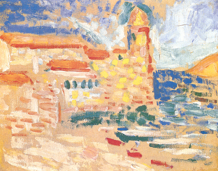
“View of Collioure (The Tower)” captures the small Mediterranean town where Henri Matisse forged the language of Fauvism in the summer of 1905. The motif is Collioure’s waterfront centered on its famous tower—part lighthouse, part church bell-tower—seen against sea and sky. Instead of building the scene with careful outlines and shaded modeling, Matisse constructs it from quick blocks of high-key color: biscuit ochres for walls and quays, terra-cotta for rooflines, lemon for sunlit windows, viridian and ultramarine for water and awnings, and pale violets and blues for the sky. Large zones of primed canvas remain visible, so light feels as if it rises from within the painting. The result is less a literal postcard and more a bright, breathing organism of hue.
Collioure 1905: The Crucible of Fauvism
This canvas belongs to Matisse’s pivotal Collioure cycle, created while working shoulder to shoulder with André Derain. In those weeks Matisse moved decisively beyond Neo-Impressionism’s optical method toward a freer, declarative use of pure pigment. The painting preserves the idea of separate, legible strokes, but it loosens the system: marks vary in size and direction, and their spacing is governed by sensation rather than theory. “View of Collioure (The Tower)” reads as a field experiment conducted in full sun, testing how little information is required for architecture and space to cohere when color is allowed to lead.
Composition as a Stage for Light
The composition presents Collioure’s harbor front as a shallow stage. At right, the dark-blue band of sea and a strip of foaming surf press against a bright quay. At the center-right rises the tower, a vertical anchor capped by a small dome. Rooflines and parapets march from left to right, their terra-cotta bands forming a gentle zigzag that guides the eye toward the tower and out toward the water. Foreground boats and shadows are reduced to flat red and green notes that skim across sunlit ground. The horizon sits high; the foreground expands; the picture plane remains active. Everything is arranged to choreograph the viewer’s path—across the warm quayside, up the tower, and out to the blue.
Color as Structure, Not Ornament
Matisse builds the whole from temperature contrasts. Warm zones—ochre walls, rose roofs, yellow window squares—advance and hold the architecture together. Cool zones—ultramarine sea, green patches of foliage or awnings, bluish shadows—recede and open space. The tower itself is a column of warm stone stabilized by a cool, greenish cap that binds it to the sky. Edges rarely rely on drawn lines; they exist where warm and cool meet. This warm–cool grid performs the work that perspective once did, creating depth while keeping the surface alive.
The Tower as Emblem and Pictorial Pivot
Collioure’s tower is both local landmark and pictorial device. It places the town unmistakably, but it also gives the painting a necessary vertical against the horizontal spread of beaches and roofs. Matisse situates it slightly off-center so it functions neither as a stiff axis nor as mere background. Its vertical weight keeps the high key from dissolving into dazzle, and its small dome—rendered in a cool, green-gold chord—locks sky and town together like a keystone.
Brushwork: From Dots to Tiles
The painter lays color in short, rectangular touches—closer to small tiles than pointillist dots. In the open sky these strokes are thin and widely spaced, allowing the ground to flash between them like glare. Along the buildings they bunch into denser tessellations that resolve as masonry and shuttered windows. On the water, broader, horizontal dabs of blue and teal suggest moving surface without literal wave drawing. The change in mark size and density directs attention and clarifies form: air breathes, walls solidify, water flows.
The Productive Use of Reserve
One of the work’s great strengths is its calculated use of unpainted canvas. Matisse leaves large areas of ground visible—especially in the sky and the foreground quay—so that these pale intervals act as active light. Reserve prevents overmixing, keeps the palette clean, and replicates Mediterranean glare more convincingly than a blanket of thick pigment ever could. In several passages the contrast is striking: a few lemon strokes adjacent to untouched canvas become sunlit windows; a sweep of raw ground next to a band of blue reads instantly as blinding shore.
Light and the Hour of the Day
Everything points to steep, early-afternoon light. Shadows are abbreviated and chromatic rather than gray. The tops of roofs blaze in terra-cotta; vertical walls are warmer than horizontal stone because they catch reflected light; the sky is a scrubbed tapestry of pale blues and off-whites rather than a single saturated field. Matisse translates, rather than copies, the physics of noon: forms flatten under the sun, color intensifies, and the scene resolves into bands and squares.
Space Without Linear Perspective
Although the view is convincing, there is little reliance on vanishing points. Space is sensed through overlaps, relative scale, and temperature. Warm façades overlap cooler water; the tower overlaps the sky; small boats overlap the quay. Warmth makes planes advance; coolness makes them recede. The viewer never forgets the painting’s surface, yet still feels the invitation to walk from foreground to water’s edge.
Urban Modernity in Fauvist Terms
Unlike Matisse’s contemporaneous olive-grove scenes, this subject is emphatically civic. The harbor, tower, shutters, and moored boats are modern, everyday facts. But the treatment refuses anecdote. There are no individualized figures and no descriptive signage. Instead, Matisse translates the town’s buzz into color rhythm. The harbor becomes a decorative field whose pattern is alive with civic activity, a reminder that Fauvism could dignify urban experience as surely as it did landscape.
Drawing Through Color Edges
Where traditional drawing would tighten forms with contour, Matisse draws by juxtaposition. A roofline is a band of orange running along a pale ground; a window is a square of yellow flanked by cool marks that act as shade; a quay curve forms where warm ochre kisses a pool of blue-green. This method allows both drawing and painting to happen at once and keeps forms soft enough to shimmer in the heat.
Material Facts: Pigment, Pressure, and Speed
The paint is generally thin to medium, with occasional thicker flecks in the blues and oranges. Strokes are laid quickly, with enough pressure to leave the tooth of the canvas visible. That roughness is not careless; it’s a record of decision. The way pigment grabs at the weave deepens the sensation of limestone, stucco, salt water, and sun. Material behavior and motif align: rough paint for a sun-gritted town.
Rhythm, Movement, and the Eye’s Walk
The viewer’s gaze travels in a loop: along the warm foreground plane with its red and green boat notes, up the cluster of lemon windows, over to the tower, out across the dark band of sea, and finally into the open sky before returning. The loop feels effortless because the painting distributes accents—green awnings, red roof bars, yellow panes—like stepping stones. Looking becomes an embodied promenade through light.
Decorative Heritage and Architectural Clarity
Matisse admired Islamic tiles, Persian rugs, and Japanese prints; here he lets that decorative clarity inflect a built environment. The town’s tessellated façade reads almost like a patterned textile stretched over masonry. Yet the painting never slips into mere décor: the tower and the sea keep the motif anchored in real place, and the warm–cool organization makes the architecture legible.
Kinship Within the Collioure Series
Compared with Matisse’s seascapes from the same summer—where cliffs confront a heavy belt of ultramarine—this canvas is lighter and more porous. Compared with the grove pictures—dense with dabs and arabesques—it is more geometric, befitting architecture. “View of Collioure (The Tower)” sits between those poles, using divisionist memory for air and Fauvist daring for heat, which makes it an ideal summary of the 1905 breakthrough.
The Psychology of Temperature
Color here carries mood. The ochres and oranges communicate heat and hospitality; the lemon squares of “windows” feel like lively interiors; the ultramarine harbor gives calm weight; the greens supply cool relief. As the eye moves among these temperatures, it experiences the town not as a topographical inventory but as a sequence of sensations—warm stone, cool shadow, salt air—folded into a single chord.
Why the Painting Still Feels New
A century on, the canvas remains fresh because it identifies accuracy with effect. The tower is not meticulously described, yet the town is instantly believable. Light is not painted as white highlights alone; it is baked into every interval of reserve. Perspective is nonchalant, yet space breathes. The painting demonstrates that when color relationships are right, everything else becomes secondary.
How to Look so the Picture Opens
Begin at the bright, lemon-flecked façade near center. Let the eye step from yellow square to yellow square, then climb the tower’s vertical to the small green cap where sky and stone meet. Drift right across the blue-green harbor, noticing how the darker bands steady the surface. Return along the line of terra-cotta roofs, and finally rest in the pale sky where reserve and thin scrubs create glare. After a few circuits the town resolves as a place both seen and felt.
Anticipations of Later Matisse
Several seeds planted here will flower across Matisse’s career. The reliance on color to build space leads to the radical interiors of 1908–1911 and culminates in “The Red Studio,” where hue becomes architecture itself. The taste for leaving ground exposed returns in Nice interiors and finally in the cut-outs, where white is literal paper light. The habit of drawing by color edge rather than contour becomes a signature of his late style. “View of Collioure (The Tower)” is thus both a local view and a blueprint for the future.
Conclusion: A Tower Held Together by Light
“View of Collioure (The Tower)” distills the summer of 1905 into a lucid harbor of color. Architecture is a mosaic of warms and cools; the sea is a band of rhythm; the sky is light held by reserve. The tower centers the town and the picture, but the true protagonist is Mediterranean sun—translated into ochre, lemon, viridian, and blue, and allowed to breathe through the canvas itself. With an economy of marks and a courage of palette, Matisse turns a familiar landmark into a demonstration of how color can carry form, space, and mood all at once.
