Image source: wikiart.org
Introduction
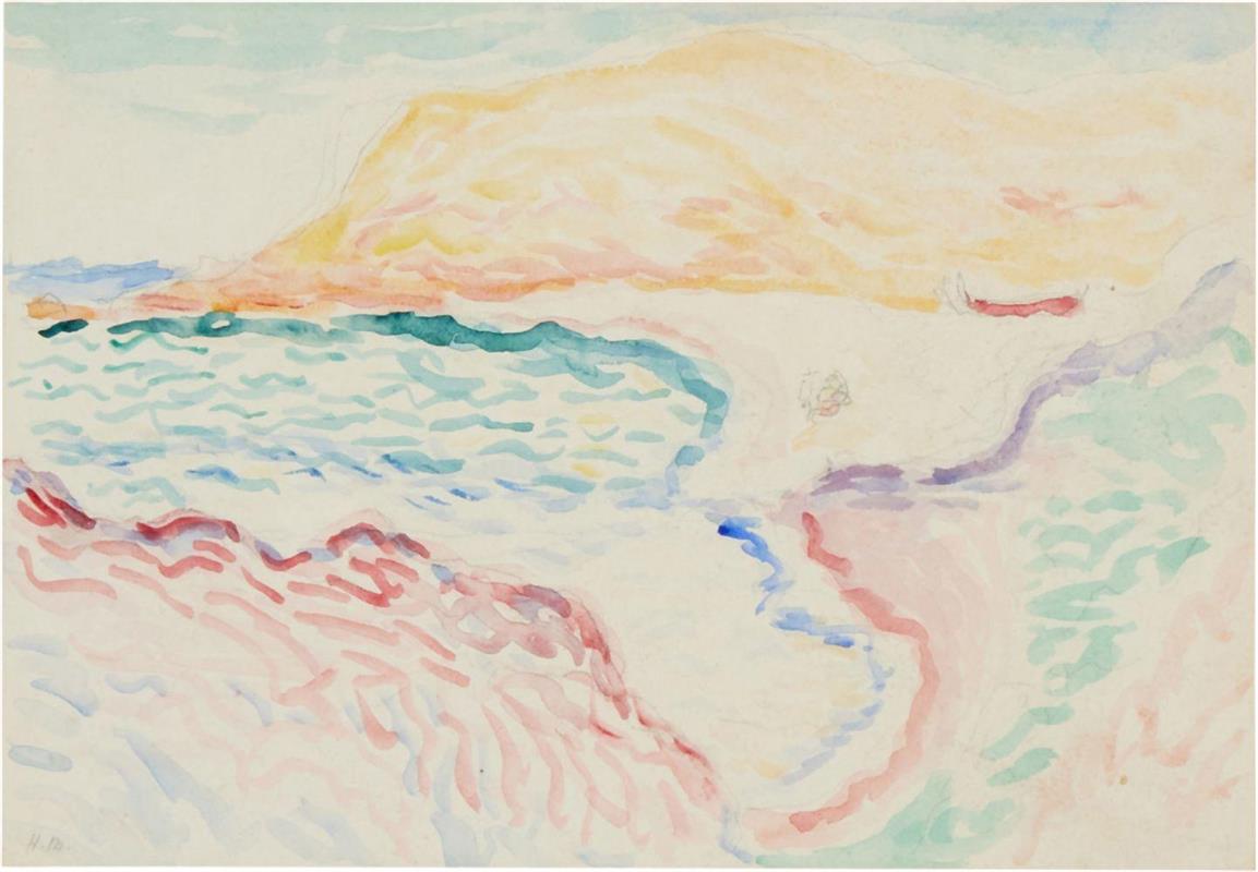
“Coastal Landscape, Collioure” from 1905 is a small work with large consequences. In a few buoyant strokes and translucent washes, Henri Matisse translates the Catalan coast into an orchestration of color, rhythm, and air. At first glance the sheet appears disarmingly simple: a saffron headland, a turquoise bay, pink and lavender shorelines, and a lacework of rippling marks that drift like sea breeze across the page. Yet this simplicity is the distillate of searching. During the fateful summer of 1905 in Collioure, Matisse broke decisively with academic modeling and the measured pointillism of Neo-Impressionism, discovering that color could be used not only to embellish nature but to construct it. The watercolor-like handling of this sheet, its reliance on the white of the paper as light itself, and its refusal of heavy contour all stage that breakthrough with clarity and grace.
Collioure in 1905
Collioure, a fishing town near the Spanish border, offered Matisse a visual grammar ready-made for experiment. Sun-drilled air, white stone, bleached quays, and the surrounding Pyrenean foothills simplified the world into luminous planes. The harbor’s coves create natural arabesques where sea and land interleave; low houses and a prominent headland become readable silhouettes in any light. In this landscape Matisse seizes those givens and pares them down even further. The far hill, bathed in apricot and straw, is more temperature than geology. The bay is a bright bowl, rendered not by gradual shading but by a sequence of curving strokes that cool from teal to aquamarine. He does not aim to catalog topographical particulars; he aims to capture the sensation of arriving at the shore and feeling the world dissolve into sun and color.
Medium, Scale, and Speed
The work reads as watercolor, possibly with touches of gouache, brushed directly on white paper. Water media impose a tempo. They permit little revision, they reward decisiveness, and they make the painter’s hand visible in the most literal way. Matisse exploits that tempo. Many strokes begin loaded and end as dry wisps, recording the very moment the brush lifts. The effect is not of labor but of thinking in real time. Where oil might have tempted him to build up, scrape back, or blend, this sheet insists on the courage of first decisions. Its scale helps. A small support encourages the sort of notational boldness one uses in a travel diary; it also invites the viewer to read the surface intimately, as if following a musical score for color and touch.
Composition and the Dance of Lines
The composition unfolds as a broad arc. From the lower left, rose waves climb the shallows and sweep diagonally along the shore; from the right, a lavender path or tidal vein counters the arc and feeds the bay; from the top left, the shoreline pushes toward a central meeting point before breaking into the open sea. The far headland is a great cushion of warm tone whose contour softens into the sky. Nothing is rigidly outlined. Edges happen where warm and cool meet, and where the density of marks increases or thins. The white paper between these arcs is not empty. It is the glare of the midday beach and the shine on water. Negative space becomes positive light.
Color as Structure
Matisse’s palette here is Mediterranean and spare: citron and peach for sunstruck land, cerulean and cobalt for water and sky, coral and rose for the nearer beach, violet for shaded contours, and a single ruby dash for a boat or roofline that anchors the right margin. There is almost no black or earth brown. Form is generated by the meeting of temperatures rather than by modeling. A cool band beneath a warm bank creates both the idea of shadow and the sensation of depth. The bay reads as bowl-shaped not because of receding perspective lines, but because its interior shifts from deeper blue-green near the headland to paler aquamarine as it nears the sand. The eye registers these differences as space.
The Role of White and Reserve
The most radical color in the picture is the one Matisse mostly leaves unpainted. The unworked paper is deployed as daylight itself. Where the beach blazes, he simply declines to lay down pigment. Where surf flashes, he spares narrow veins of white between strokes. This strategy does more than lighten the image; it collapses the distinction between representation and surface. Light in the scene is literal light bouncing off the page. The white also lets the surrounding hues breathe. Because the color patches do not butt up in a continuous skin of paint, each retains its clarity and vibration, just as planes in a bright landscape seem edged with light rather than with a drawn line.
Gesture, Calligraphy, and Musicality
Across the sheet Matisse adopts a calligraphic stroke that carries two meanings at once. Each serpentine mark is both a record of water’s motion and a piece of writing in its own right, a script that spells out rhythm. The sea’s commas curl in a consistent direction, implying drift and wind. On the beach, broader, slower strokes suggest the drag of foam or the pattern left by receding waves. The lavender path undulates with an internal meter, as if tracing the lazy gait of a walker. This is painting that thinks through the body. The viewer does not decode a diagram; the viewer feels the gesture that made it and, by extension, feels the place.
Light, Weather, and Time of Day
Although the sheet does not indulge in atmospheric description, every choice points to a particular light. The large reserves of white imply a hard, clear sun high enough to wash color toward the cool ends of the spectrum. The headland’s warmth tells of rock heated for hours. The bay’s gradient hints at depth and transparency, with the turquoise deepening under the bluff and bleaching toward the shoal. The absence of cast shadows on the beach suggests either hazy midday or an angle of sun that hides shadows behind forms. The sky, washed thin and held toward the top, avoids drama; its job is not to narrate weather but to press light down onto the land and water below.
From Divisionism to Fauvism
The painting’s delicacy should not distract from its conceptual boldness. Just a year earlier, in “Luxe, Calme et Volupté,” Matisse built forms from ordered points of complementaries, applying Neo-Impressionist logic to an Arcadian subject. Here, he keeps the principle of separating colors but abandons the grid of disciplined dots. Strokes are freer, larger, and keyed to the body’s movement rather than to a scientific schema. This is precisely the transition that propelled the explosive canvases of the 1905 Salon d’Automne, where a critic coined the term “Fauves.” In the Collioure sheet, you can feel the hinge turning: color becomes sovereign, and drawing is folded into color’s motion.
Japanese Prints and Decorative Sources
Another source ripples quietly through the work. The reliance on unpainted ground and the elastic contour that appears by adjacency recall the lessons of Japanese ukiyo-e prints, which Matisse avidly studied. In those prints, a pale paper sky can stand in for atmosphere with far more radiance than layers of opaque pigment. Decorative traditions also leave their trace. The repeated water marks operate like a textile pattern, a motif that unifies the surface even as it describes nature. This decorative logic would eventually bloom in Matisse’s studio interiors and, decades later, in the paper cut-outs, but its seed is already here.
Drawing Without Contour
Traditional academic practice begins with an enclosing line and then turns to tone. Matisse reverses the order. He draws with color and lets contour be the residue of one hue pressing against another. The right-hand shoreline, for example, is not a line at all; it is a slender interval where rose stops and white begins, nipped here and there by lavender. The far flank of the headland is no more than a breath of cooler wash sliding under warm ocher. Because the contours are not locked, the image feels as open as seaside air. It is as if the forms could drift slightly and the picture would still hold.
Space, Depth, and the Elastic Picture Plane
Even with so little modeling, the sheet convinces as space. Scale does a portion of the work: a tiny red stroke for a boat or rooftop establishes distance and human measure. Color temperature does another portion, with warm advancing and cool receding. Yet Matisse refuses to surrender the surface to illusion. The repeated marks pull like a net across near and far, preventing the eye from falling into a single vanishing trough. The result is an elastic plane, inviting you to oscillate between reading the page as an abstract arrangement and reading it as a view. That oscillation is central to the pleasure of the piece.
The Psychology of Simplicity
There is a psychological clarity to the image that belies its economy. By discarding descriptive clutter, Matisse allows the viewer’s own stored impressions of shorelines to complete the scene. The mind recognizes the universal grammar of coast—warm land, cool sea, curving inlet—and fills in specifics. This makes the experience intimate. You are not pinned to a named spot but released to remember your own. The sheet’s spare means generate an unusually open empathy, which is one reason such small notes can feel larger than many elaborated canvases.
Materiality and Conservation
Because the work depends on transparency and reserve, the physical state of the paper matters. The slight tooth visible under thin washes translates as sparkle, particularly in the sky and the sunlit beach. Where the artist pressed more firmly, pigment gathers at the end of a stroke, leaving a tidemark that gives the form a buoyant edge. Such material facts are not incidental. They belong to the visual meaning of the piece. A varnished oil can mimic glare; bare paper actually returns light to your eye. That immediacy is part of the landscape’s freshness and explains why works on paper from this period often feel like unfiltered thought.
Relations to Companion Works
“Coastal Landscape, Collioure” converses intimately with other works from the same summer. “Open Window, Collioure” captures the harbor through a frame and floods the interior with outdoor color; “Boats at Collioure” and “View of Collioure” experiment with analogous palettes and the tension between decorative pattern and deep space; the more densely worked “Gulf of Saint-Tropez” extends the chromatic architecture into oil. This particular sheet sits toward the minimal end of that spectrum and demonstrates how little is required for place to appear. It is a manifesto whispered rather than shouted.
The Figure Absent and Implied
Unlike some Collioure scenes populated with bathers or café-goers, this work seems unpeopled, with the possible exception of the small vermilion note that might indicate a boat, a roof, or a distant passerby. Yet the human scale permeates it. The brushstrokes are arm-length; the curves fit the arc of a wrist. The path reads as something one could walk, the shallows as a place to wade. Matisse’s oft-quoted wish for painting to be “like a good armchair” is not an escape from the world but a commitment to bodily ease and lived rhythm. This landscape is hospitable, not because it tells a story about people, but because it moves the way a person moves when the air is warm and the horizon is open.
A Method for Viewing
The image repays a particular way of looking. First, step back until the separate strokes fuse and the headland grows weighty; notice how the white fields flare as beaches and sky. Then approach until the paper’s grain and the ragged tails of strokes come into view; watch how each mark begins and fails, and how those failings create liveliness. Move back again and feel the two readings combine. The sheet trains the eye to alternate between sensation and analysis, which is another way of saying that it teaches you how to see.
Influence and Legacy
The lessons condensed here traveled widely. Matisse would soon push this economy and chromatic clarity into his large interiors, where patterned cloths, plants, and windows merge into radiant fields. Younger painters learned from his insistence that color could bear structure without the crutch of heavy drawing. Designers, too, found in his reserves and repetitions a template for balancing pattern with breathing room. The work also helped establish a modern contract with viewers: rather than reproducing the world in full, the artist offers a charged fragment and trusts the viewer to complete it.
The Ethics of Joy
It can feel almost scandalous, in any era, to make an unapologetically pleasurable image. Matisse’s joy is not naïveté. It is an ethical stance that values clarity over spectacle and attention over anecdote. In “Coastal Landscape, Collioure,” that stance becomes visible as a practice. He refuses melancholic browns and instead builds the scene from light-struck complements. He rejects heaviness and allows the paper to shine. He declines busy narrative and invites the eye to wander, to rest, to breathe. The result is not decorative distraction; it is concentration at ease.
Conclusion
“Coastal Landscape, Collioure” captures the instant when Matisse learned to let color think. With a limited palette, sparing touch, and courageous reserves, he allows a Mediterranean shore to crystallize out of air and water. The drawing happens in the meeting of temperatures; the light is the whiteness of the page; the space is an agreement between rhythm and scale. Everything extraneous falls away. What remains is a quiet manifesto, proof that an artist’s most decisive revolutions can arrive not as thunderclaps but as a few lucid gestures that leave the world looking newly simple and newly bright. Long after the paper has mellowed and the pigments have settled, the scene keeps doing what it did on the day it was made: it lets sunlight in.
