Image source: wikiart.org
A Street in Arcueil and the Moment Color Becomes Architecture
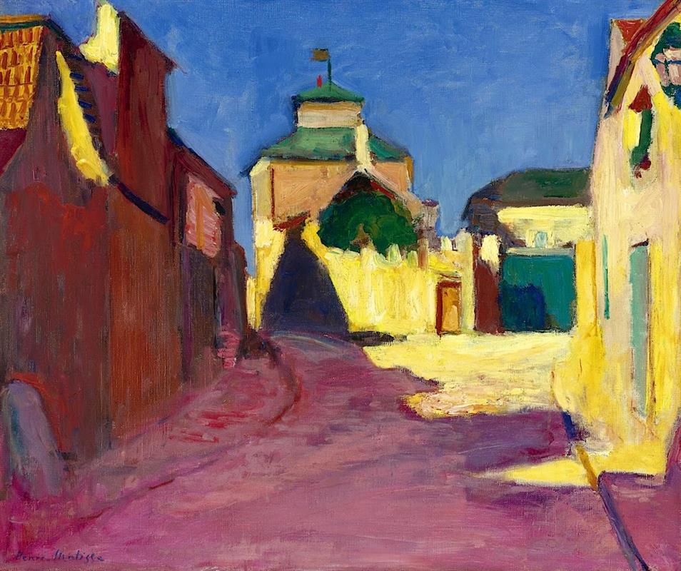
Henri Matisse painted “A Street in Arcueil” in 1904, at a hinge in his development when Paris’s outskirts and the Mediterranean alike became laboratories for color. Arcueil, a modest commune just south of Paris, offered neither grand monuments nor theatrical vistas; it offered, instead, light striking ordinary walls. Matisse answers that light with a palette that reorganizes the entire street: cobalt sky, crimson and russet façades, lemon-white glare on plaster, viridian doors, and a mauve-rose road that winds into the distance. The scene is simple, but its orchestration is radical. Rather than describe buildings and then tint them, Matisse lets color do the building. Planes of pigment behave like architectural blocks; shadows become shapes as decisive as doors; and atmosphere is constructed, not merely recorded.
The Subject: A Modest Street, A Monumental Light
The painting depicts a narrow street that curves gently toward a central gatehouse or turreted structure capped with green. Flanked by high walls, the lane funnels vision to a luminous courtyard where the sun detonates against pale masonry. There are no figures. The day’s primary actor is the light itself, which strikes the right-hand wall at full force, glances off the left-hand buildings, and pools in a bright trapezoid at center. In a town better known for an aqueduct, Matisse chooses not to paint the famous span but an ordinary corner where light makes its own kind of monument. By withholding anecdote, he recasts everyday urban fabric as a stage for chromatic drama.
Composition: A Street as a Conductor’s Baton
The geometry is disciplined and musical. The road forms a curving diagonal from lower left to center, a path that acts like a conductor’s baton leading the eye. The left-hand block of dark red-brown buildings counters the right-hand band of sunlit yellow, creating a powerful polarity across the canvas. At the center, the gatehouse stands where these forces meet, a vertical anchor that holds the composition in balance. The sky occupies nearly half the height, a flat blue field whose calm emphasizes the pulsing shapes beneath it. Every big move feels deliberate: a broad value contrast between light and shade, opposing color temperatures, and strategic cropping of façades at the edges so the viewer stands within the street, not outside it.
Color as Structure: When Hue Does the Heavy Lifting
“A Street in Arcueil” is built from large, unblended swathes of color that read as slabs of space. Local color—what a wall or street “really” looks like—yields to expressive necessity. The road is a violet-pink that would surprise a surveyor but not a painter who has watched afternoon shadows warm with dust; the sky is an intense, nearly uniform blue that compresses atmospheric depth into a decorative plane; the sunlit walls are not white but a spectrum of yellows, creams, and chartreuses that convey the scorch and bounce of light. These choices do not merely describe; they carry weight and dimension. Color becomes architecture.
Light and Shadow: The Triangles that Make Noon
The light is high, probably early afternoon, and Matisse records it with geometry. The wedge-shaped shadow that projects from the gatehouse into the court acts like a dark keystone, locking the composition. Along the right wall, smaller triangular bites of shadow articulate protrusions and recesses without resorting to line. Shadows on the left compound into a broad, reddish mass that warns of cool shade even as it glows with reflected heat. Notably, the brightest zone sits not at the horizon but mid-frame, so the street’s turn feels like a threshold—step forward and you’d be blinded for a moment. The painting thus stages light as a bodily event.
Brushwork and Surface: An Orchestra of Strokes
Matisse’s handling is confident but varied. The sky is laid in with long, level strokes that read as a single plane; the road receives broader, more oblique sweeps that follow its curve; walls are patched with shorter, blocky touches that catch on edges like the sparkle of lime dust. In places, you sense underpainting peeking through—warm notes beneath cooler passages—lending the surface a vibratory depth. Paint is neither fussed nor thin; it is placed. Instead of chasing small textures of stone or stucco, Matisse builds a texture of vision itself, the sensation of looking in bright weather when details fall away and relationships of color dominate.
Space Without Illusionism: Depth by Temperature
Traditional perspective recedes through converging lines and diminishing scale. Matisse honors those cues just enough to keep space intelligible, yet he relies more on temperature. Warm, dark reds on the left surge forward; cool, bright yellows on the right recede into the glare; the far architecture cools to blue-greens; the sky, the coolest plane of all, lies behind everything but also presses forward as an upper boundary. This dance of warm and cool produces a living space, elastic but coherent. The eye advances along the mauve road, rests in the blaze of the courtyard, and then slides upward to the blue ceiling of sky.
Silence and Heat: The Psychology of an Empty Street
The emptiness of the street is a choice. In the absence of figures, color and light carry the burden of narrative. The quiet hums with heat; the violet road feels sun-softened; the yellow walls shiver with brightness. Doorways become invitations or refusals depending on their tone: a deep green rectangle suggests a shaded interior; a pale aperture hints at light beyond light. The mood is neither lonely nor bustling. It is attentive, like a pause in which a town holds its breath. The painting’s hospitality lies in its openness to the passerby—you.
Dialogue with Post-Impressionism: Lessons Owned, Rules Abandoned
Matisse has studied Seurat’s optical science and Signac’s Divisionism; he has absorbed Gauguin’s cloisonné fields and Cézanne’s planar construction. “A Street in Arcueil” is the proof that he can take from each without becoming a disciple of any. Divisionism’s small, even dots are replaced by responsive, differently scaled strokes. Gauguin’s bold outlines dissolve; it is the seam of two colors that creates an edge. Cézanne’s architecture of planes persists, but here it is rendered in saturated complements that seek immediacy rather than slow, analytic modulation. The result is a personal synthesis: structure serves sensation.
Pre-Fauvism in Full View
Although Matisse will be labeled a Fauve the year after this canvas, the grounds for that name are here already. He treats color as independent; he refuses descriptive browns and grays except where they serve a larger harmony; he prizes clarity of major shapes over anecdotal detail. At the same time, the painting stops short of the extreme chromatic liberation of 1905. Its blues and yellows, however intense, still acknowledge the real sky and sunlit stucco. This balance—between credible light and daring hue—explains the painting’s enduring freshness. It opens the door to Fauvism without closing it on perception.
Edges, Crops, and the Modern Glance
One of the work’s modernities lies in its framing. The street is cropped so that both flanking walls exit the picture; the rooflines at left and right shear off without apology; the gatehouse is centered but not fully symmetrized, granting the scene a lived, un-staged quality. These decisions echo photographic seeing but remain painterly in their priorities. The crop is not merely up-to-date style—it tightens the choreography of light and compresses the experience into a single, decisive turn.
The Palette and Its Harmonies
Consider how systematically the palette is organized. The sky’s cobalt or ultramarine sets the cool keynote; the road’s mixtures of alizarin and cobalt produce a mauve that answers that blue while resonating with the red-browns of the left façade. Across from that mass, the right-hand wall glows with cadmium yellows tempered by hints of ochre and white, pushing warm light into the composition. Matisse inserts passages of viridian or deep teal in doors and roof tiles as cooling counterpoints. The entire canvas operates like a chord, with color intervals carefully spaced to create clarity and resonance rather than noise.
Architecture Simplified to Essentials
Matisse streamlines the architecture into a few volumes: a tall rectangle at left, a receding wedge at right, a central block with a small cupola, and a strip of lower buildings along the horizon. Windows and doors are simplified to colored rectangles; moldings and quoins vanish. These omissions are not neglect; they are acts of translation. The crucial information is how planes face or refuse the sun, how one color abuts another, how a shadow falls across a surface. The painting delivers that information with maximum legibility.
Movement and Stillness
Although no figure strolls the lane, the painting is full of motion. The road’s curve beckons; the shadow wedge seems to creep with the sun; even the brushstrokes suggest a breeze, especially where strokes angle across the sky and rake along the glowing wall. Against that animation, the gatehouse stands firm and vertical. These countervailing energies—pull and hold—generate the painting’s calm intensity. You feel both the vitality of late-day light and the architecture’s enduring mass.
Looking Strategy: Near and Far
Viewed from a distance, the painting reads as a clear arrangement of three color zones—blue sky, yellow light, red-violet shade—braced by the central structure. Up close, more subtleties emerge: the faint green in the courtyard’s shadow, the cool bristle-marks that model a door, the quick nick of white where light slices along a roof edge, the surprising runs of pink that keep the road’s violet alive. The painting invites this oscillation between structural reading and sensual savoring. It rewards both kinds of attention.
Placing the Work in Matisse’s 1904
This canvas sits beside Matisse’s southern experiments of the same year. In Saint-Tropez he loosens the mark further and floods the coast with broken color; in Arcueil he applies similar daring to a northern light and a built environment. The consistency is not subject but method: organize the world through large harmonic relationships, then quicken it with responsive brushwork. Seen against the more granular Neo-Impressionists, Matisse’s approach feels freer; placed near his 1905 works, it reads as the crucial step that made those freedoms possible.
The Ethics of Pleasure in an Urban Key
Matisse once described his aim as an art of balance, purity, and serenity. “A Street in Arcueil” delivers that aim without sentimentality. The pleasure it offers is the pleasure of clarity: a few big shapes, a handful of luminous colors, and the sensation of a warm afternoon distilled into a lucid pattern. It is not escapism; it is attentiveness rewarded. The painting dignifies a humble street by showing how completely light can transform it, and how the eye, if it attends, can be transformed in turn.
Enduring Relevance: Lessons for Seeing Today
The canvas continues to teach. It shows that color can sustain structure; that simplification, when precise, opens space for feeling; that fidelity to sensation may require betraying local color; that balance emerges from strong oppositions reconciled with care. In a visual culture crowded with photographic description, Matisse’s street remains arresting because it presents not a report but an experience—one arranged, in his words and practice, to give repose without dullness.
A Quiet Finale
Step back once more and the painting resolves into a radiant triangle of light held between two guiding walls, a wedge of noon engineered from paint. The eye travels into the courtyard and rests. The sense of heat lingers. The street is empty, but it seems made ready for arrival—yours. Matisse’s art has already done the necessary work: he has turned a corner of Arcueil into an instrument that plays pure color against pure light, inviting you to listen with your eyes.
