Image source: wikiart.org
Historical Context And Why This Still Life Matters
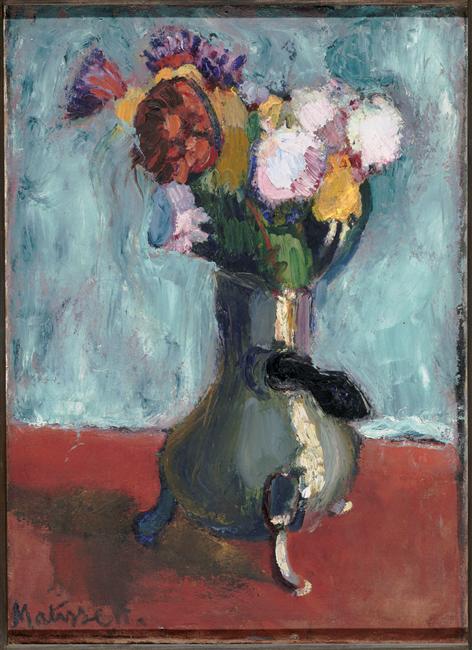
Henri Matisse painted “Bouquet of flowers in chocolate” in 1902, at the exact moment his art was pivoting from careful tonal description to a boldly chromatic language that would soon be called Fauvism. Still life was his testing ground. A tabletop offers a controllable stage; flowers and vessels tolerate abstraction; and every decision about color, edge, and plane is nakedly visible. In this painting he replaces convention with wit and invention, using a chocolatière—a domestic chocolate pot with tripod feet and a lateral handle—as a vase. That single choice signals the spirit of experimentation in his Paris studio: the ordinary is reimagined; function becomes form; and color relations, not literal description, carry the entire picture.
First Look: A Comedic Vessel And A Flaring Bouquet
The scene is immediate and frontal. A sturdy chocolate pot anchors the center, its dark, olive-metal body swelling like a small cauldron on three curved feet. Out of it erupts a compact bouquet: carnation-like pinks, a rust-red bloom, high-key yellows, and small bursts of violet and green. The tabletop is a deep, brick-rose plane that surges to the picture’s lower edge; the wall is a cool, chalky blue, scumbled thinly so the ground shines through. Nothing distracts from this triad of forces—vessel, bloom, and air—and the first sensation is of buoyant color tied down by a humorous, weighty form.
Composition As A Strong Vertical With Live Borders
Matisse engineers the rectangle as a stable vertical column against two horizontal fields. The pot sits dead center but the bouquet leans leftward, softening symmetry and sending color into the picture’s corners. The handle protrudes to the right as a black, comma-like accent that counterbalances the flowers’ lean. The feet anchor the vessel to the ground with three small arcs, and a sliver of cast shadow tucks it into the table plane. The tabletop rises as a broad band, limiting depth and insisting on the surface of the canvas; the blue wall is kept tall and airy, forming a halo that lets the flower heads flare without crowding. The frame is close but breathable, so the arrangement feels intimate rather than monumental.
Color Architecture And The Prelude To Fauvism
Color rules the structure. Matisse sets a complementary conversation between the cool, milky blue wall and the warm, brick-rose tabletop. The chocolate pot is not brown in any pedestrian sense; it holds greens, violets, and muted blues that turn with the light, proving how far chromatic darks can do the work of value. The bouquet is a stack of saturated notes—sulfur yellows, cherry reds, lilac-pinks, touches of cobalt and viridian—that sit in crisp relation to the grounds. Because there are almost no neutrals, every mixture leans warm or cool. Temperature, not heavy chiaroscuro, builds volume and gives the canvas its steady glow.
Light, Value, And Temperature Instead Of Shadow
The illumination feels like open studio daylight. You will not find theatrical cast shadows or a single, dominant beam. Instead, the pot swells by temperature shifts: cool on one flank, warmer on the other; a pale vertical highlight runs down its belly like a seam of light, and a bluish reflection lifts the near edge of the foot. The flowers model just as economically. The red bloom warms in its sunlit petals and cools toward violet in its pockets; the whites of the pink heads are never truly white but a lively mix of cool and warm notes that flash in the scumbled blue air. The table carries small value adjustments—deeper rose at the front edge, warmer under the pot—but remains a largely even band, keeping the decorative integrity of the surface.
Brushwork And The Feel Of Materials
The paint handling is candid and various. The wall is scumbled in broad, lateral strokes that leave the weave visible, admitting real light and transforming the blue into an active atmosphere. The tabletop is laid with denser, horizontal pulls, registering as a solid plane rather than an illusionistic depth. The pot is pushed with short, tacky strokes that make metal feel weighty and slightly matte; the tiny feet and the dark handle are resolved with two or three decisive gestures. In the bouquet Matisse thickens the paint into creamy touches, especially in the pinks and yellows, so petals catch literal highlights and bloom optically. The entire surface moves at different speeds—slow in the wall, steady on the table, quick and juicy in the flowers—so the painting breathes.
Drawing Through Adjacency Rather Than Outline
Edges arise where color meets color. The pot’s contour is authored by the collision of its olive-violet body with the blue wall and red table; the rim appears as a pale band laid against darker tones; the handle is a single black curve pressed against greenish metal. In the bouquet, the serrations of petals are not traced; they precipitate from alternating flares of warm and cool paint. Where linear accents occur—a seam on the pot, the pointer of a petal—they are calligraphic and quickly absorbed into surrounding color. The whole image feels constructed from living relations, not from a drawing that has been colored in.
The Chocolate Pot As Vessel And Idea
Choosing a chocolatière in place of a vase is not a gimmick. It shows Matisse’s openness to the domestic world as a source of form and his delight in the strangeness of familiar things. The pot’s squat stance, hinged lid, and lateral handle create asymmetries a vase would not, giving him a playful counterweight to the floral plume. The metal body offers chromatic darks that frame the bouquet without killing its light, and the little feet lift the whole silhouette so it reads like an animated character. The painting’s humor is gentle and modern: utility is repurposed as grace, and the object’s personality matters as much as the flowers’.
Space Compressed Into A Decorative Field
Depth is intentionally modest. The tabletop does not recede with perspectival lines; it operates as a single, rising plane that meets the wall at a shallow seam. The wall itself is a breathing color field, not a mapped room. The bouquet and pot sit at the front of this stage, believable yet pressed to the surface. This compression serves Matisse’s early decorative ideal: a painting must first be a harmonious arrangement on a flat plane and only second a window. That discipline allows him to push color harder without losing calm.
Rhythm, Balance, And The Viewer’s Path
The canvas teaches a legible route. Many viewers enter at the bright pink cluster on the right, slide into the central yellows, pivot at the dense red bloom, and then descend along the cool greens of the stems into the pot. From there the black handle flicks the eye outward and the round foot pulls it back to the base, where a dark pool grounds the weight. The cycle repeats, and on each pass small correspondences reveal themselves: a cool blue echoing from petal into pot, a warm streak in the wall answering the table’s red, a pale highlight that rhymes across metal and blossom. The picture’s pleasure is this circulation held in equilibrium.
Materiality And Period Pigments
The harmony likely rests on a familiar 1902 palette. Lead white is massed into the impastoed petals and scumbled into the wall’s blue. Cobalt and ultramarine cool the background and mix into flowers and shadows. Cadmium and chrome yellows form the bouquet’s sunny notes; alizarin and madder supply the reds and violets; viridian and emerald moderate the greens of leaves and the pot’s surface; earth ochres and umbers warm the table. Matisse alternates lean passages—thin enough for the ground to glow through—with thicker, buttery strokes that reflect literal light, imitating the different sheens of plaster, metal, and petal.
Relations To Matisse’s 1901–1902 Still Lifes
Seen beside the 1902 “Bouquet of Flowers in a Crystal Vase,” this work is cheekier and more sculptural, trading glass’s transparency for metal’s mass. Compared with the 1902 “Fruit Dish,” it keeps the same grammar—color as structure, black as a living neighbor, edges by adjacency—while condensing the motif into one central column. The humor of the chocolatière anticipates later decades when Matisse will routinely elevate everyday objects into emblems and fuse the decorative with the domestic.
How To Look Slowly And Profitably
Stand back first and let the main chord settle: red ground, blue wall, green-black pot, and a flaring bouquet. Then move closer to watch how edges form by contact rather than by drawn line, and how the paint’s thickness changes from wall to flower to metal. Look for the small temperature flips that model the pot without deep shadow and the reflected blues that sneak into the whites of the petals. Step back again until the whole reads in one breath—an upright column of color balanced between warm earth and cool air. That near–far oscillation replicates Matisse’s own method of tuning relations until the painting feels inevitable.
Why “Bouquet of flowers in chocolate” Endures
This small still life endures because it declares, with clarity and wit, the priorities that would shape Matisse’s mature art. Color is structural, not decorative. Darks live and help other hues burn brighter. Space is compressed so that the surface can sing as a designed pattern. Omission is a virtue; a handful of tuned strokes can conjure metal, bloom, and room. And the everyday—here, a chocolate pot—can be transformed into a bearer of elegance and humor. Long after the flowers that inspired it would have faded, the painting continues to glow, its column of color standing calmly between the warmth of the table and the cool breath of the wall.
