Image source: wikiart.org
Historical Context And Why This Still Life Matters
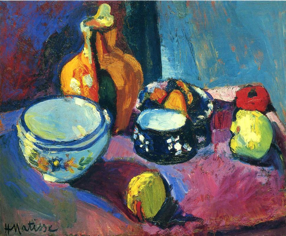
Henri Matisse painted “Dishes and Fruit on a Red and Black Carpet” in 1901, the same year he was turning decisively from academic finish to an architecture of color, plane, and touch. Still life was his most reliable laboratory. Arranged on a table and subject to studio light, dishes and fruit could be positioned, re-lit, and reconsidered while he tested how far hue and texture could replace tight drawing and tonal modeling. This canvas shows that pivot in high relief. It preserves the recognizability of bowls, pitcher, fruit, and tabletop, yet it treats them as instruments inside a chromatic orchestra where blue, orange, magenta, black, and lemon yellow hold the composition together. The result is a picture that feels both intimate and radical, domestic and modern.
First Look: A Tabletop That Radiates
The first impression is saturation. A red-violet surface sweeps from edge to edge, its field broken by darker passages that read as the “black” of the carpet. On that plane Matisse stages a set of strong forms: a large pale blue bowl at the lower left, a warm ocher pitcher standing behind it, a black bowl with white decoration brimming with sliced fruit at the center-right, and three pieces of fruit—a lemon near the front, a red apple and a green-yellow pear to the right. The background tilts upward as a cool blue wall, cooler at right, deeper and more purplish at left, so that the entire color climate oscillates between warm carpet and cold air. You sense the table before you have named a single object because the color fields announce their roles immediately.
Composition As A System Of Anchors And Accents
The rectangle is engineered with a few decisive anchors. The pale blue bowl at lower left acts as a ballast that prevents the warm carpet from floating away. Opposite it, the dark decorative bowl carries the center and shifts the eye toward the right where the bright apple and pear punctuate the field. A lemon placed near the front edge is a visual doorstop that keeps the plane from sliding out of the picture. Behind the left bowl the tall, ocher pitcher pushes the composition upward, countering the tabletop’s tilt. Negative space is carefully metered: a wedge of cool blue wall opens behind the right bowl so that the black-and-white pattern can breathe; darker maroon at far left densifies the corner to hold the pale bowl. The whole design reads as an interlock of ovals and cylinders that never quite touch, leaving little rivers of carpet between them. Those intervals are as important as the objects themselves, because they allow the red-black ground to act like the stage that it is.
The Carpet As Constructive Plane
The title foregrounds the “red and black carpet,” and for good reason. Matisse turns a patterned textile into the structural plane of the entire painting. Instead of cataloging the carpet’s motif, he translates it into an atmospheric grid: magenta, pomegranate, and crimson stroked together, with darker passages that are not empty shadow but a velvety black acting as a live color. That living black binds the palette, intensifies nearby reds, and makes the lemon and the pale blue dish feel luminous by contrast. The carpet tilts slightly toward the viewer, denying strict perspectival depth and asserting the painting’s identity as a decorated surface. It is both tabletop and color field, both object and idea.
Color Architecture And The Prelude To Fauvism
The palette is a clear, tuned chord. On the cool side are pale and slate blues in the large bowl and wall, with blue-green tints slipping into shadows. On the warm side are the ocher and amber of the pitcher, the magenta-crimson of the carpet, and the citrus yellows of fruit and highlights. Matisse sets complements into productive friction: blue bowl against orange pitcher; red carpet against green-leaning pears; black decorative bowl ringed with white so that the fruit’s oranges and lemons ignite. There is almost no neutral gray. Even “neutral” passages lean one way or the other, preserving a taut dialogue between temperatures. This is the grammar that will become central to his Fauvist work: color carrying structure, mood, and light simultaneously.
The Blue Bowl: A Cool Anchor
At lower left, the blue bowl is the painting’s cool anchor. Its pale interior is ringed by denser cobalt, and its shadow is not brown or gray but a cooler blue-violet that locks into the carpet’s maroons. Small touches of greenish reflection along the rim tie it back to the pear and to a cooler wall. The bowl’s floral decals are not meticulously described; they are quick yellow-green flares placed where the bowl needs local emphasis to remain legible at a glance. It reads not because of contour but because Matisse tuned the surrounding relations to let it sit, heavy and calm, on the warm plane.
The Ocher Pitcher: Warm Column And Counterweight
Behind the blue bowl rises an ocher pitcher, almost sculptural in its mass. Its form is built not by shaded brown but by a sequence of warm oranges, rusty reds, and near-whites. Small cool breaks at the handle and throat prevent the object from dissolving into chocolate and keep it harmonized with the blue bowl. As a shape, the pitcher is a vertical column that resists the table’s tilt and binds left and center. As a color, it is the warm counterweight that allows the cold bowl to feel true.
The Black Decorative Bowl: Chromatic Hub
Central to the composition is the dark bowl with a ring of white pattern and a mound of fruit. The “black” is never a dead hole; it is a dense color that gathers energy. White flecks act as rhythmic beats that separate the black from the red ground and make the bowl readable from across the room. The fruit—orange wedges, dark plums, perhaps berries—are abbreviated with saturated strokes, enough to say “fruit” without losing the abstract power of the color masses. The bowl also wears a cool white highlight like a plate, a deliberate flare that becomes a small light source in the painting. Everything converses at that rim: blue from the wall, warm oranges, black as concentration, white as brightness.
Fruit As Accents And Scale
The three single fruits are placed to calibrate space and pace the eye. The lemon at front catches heavy yellow and a flick of red, with a deep shadow that secures the foreground and echoes the bowl’s cool. The red apple sits near the right edge as a saturated punctuation mark, its dark core set like a small target. The pear becomes a light, greenish lantern that mediates between apple, bowl, and wall. Their shadows are not photographic; they are chosen for harmony—a blue-violet under the lemon, warmer grays beneath the pear and apple—so the objects belong to the carpet’s climate.
Light Without Spotlight
Illumination here is ambient and distributive. The carpet glows; bowls and fruit throw short shadows; the wall is breathed upon by uneven daylight. You will not find theatrical highlights; instead you find temperature shifts that imply curvature and position. The blue bowl cools where it turns from the imagined window, warms at its shoulder where carpet light flickers back. The pitcher flares not where a bulb strikes but where the color chord needs brightness. This method gives the painting a steady, inhabitable light rather than a staged effect.
Brushwork And The Register Of Materials
The surface is a ledger of different speeds. The carpet is laid in with broad, generous strokes whose visible bristles produce a nap like fabric. The blue bowl receives long, smoothing strokes that mimic glazed ceramic; the decorative bowl is built with shorter, tackier touches that thicken into pattern; fruit is struck quickly with compact dabs that leave a little impasto. The wall is scumbled thin so earlier layers whisper through, creating the feeling of air more than plaster. Matisse never hides facture; he uses it to declare what things feel like and to record the tempo of his looking.
Drawing Through Abutment Rather Than Outline
Contour lines are scarce. Edges emerge where one zone of color meets another. The blue bowl’s profile is authored by the collision of its cool body with the warm carpet; the pitcher’s neck appears where near-white rests against the dark wall; the black bowl’s rim is drawn by white pattern and a pale flare, not by inked outline. Where a line does occur—the thin stroke along the pear’s edge, a darker seam under the pitcher—it is broken and absorbed into surrounding paint. This approach keeps the surface unified and lets color do double duty as shape and light.
Space Compressed Into A Decorative Field
The table tilts toward us; the wall leans away. Depth is suggested by overlap and scale, but there is no insistence on one-point perspective. Instead the picture reads as a designed fabric where objects and ground share the same sovereignty. The red-black carpet does not recede like a tunnel; it acts like a field that supports things. That compression is intentional: it permits Matisse to orchestrate balance first and reality second, and yet the result remains perfectly believable as a tabletop.
Rhythm, Repetition, And The Route Of The Eye
The painting teaches the viewer a loop. Many begin with the lemon at front, cross the carpet to the cool blue bowl, climb the warm column of the pitcher, slide to the central black bowl and its bright white note, skip to the red apple, cool down at the pear, and then drift back across the magenta ground toward the starting point. The circuit repeats more slowly, and each pass reveals another rhyme: blue bowl to blue wall, yellow lemon to yellow pattern on the ceramic, black bowl to black shadows under fruit, white highlight to white slips on the pitcher. The tableau becomes a melody of returning notes.
The Decorative Ideal Emerging From Observation
From ordinary dishes and fruit Matisse extracts a decorative order. Each zone of the canvas takes a role in a stable chord: carpet as warm bass, blue bowl as cool anchor, pitcher as warm mid-tone, black bowl as concentrated rhythm, fruit as bright accents, wall as cool lid. None of these roles overpowers the others. The painting achieves a calm poise even at high saturation. This is the ethic he will carry into later interiors: select, simplify, tune, balance.
Dialogues With Tradition And With The Avant-Garde
The picture speaks to Chardin and to Dutch still life through its respect for domestic objects and the quiet authority of a table. It borrows from Cézanne the tilted plane and the principle of constructing form by adjacent patches. Gauguin and the Nabis are audible in the decorative flattening and the courage to let non-local color carry truth. There is even a whisper of Van Gogh in the urgent carpet strokes. Yet the temperament is distinctly Matisse’s—harmonizing rather than turbulent, structural rather than symbolic, relational rather than rhetorical.
Materiality, Pigments, And The Skin Of The Paint
Turn-of-the-century pigments make the chord possible: cobalt and ultramarine for the bowl and wall, cadmium and earth oranges for the pitcher, alizarin or madder and lake reds for the carpet, viridian touches for the pear, lead white thickened into the brightest passages. Matisse alternates thin scumbles that let the ground breathe with fatter, loaded strokes that catch physical light. The weave of the canvas participates, especially where the wall is thin, contributing a grain that enlivens large fields. The painting’s honesty about its materials—oil dragged by a bristle brush over fabric—adds to its authority.
Human Presence Without Anecdote
No hands appear, but the arrangement carries the trace of use. A bowl with cut fruit, a lemon at the front as if rolled from a pile, a pitcher set back from the edge, a carpet used as cloth—all signal human proximity without telling a story. That refusal of anecdote keeps the picture contemporary. It honors the facts of a room while insisting that the primary drama is pictorial: how color, shape, and surface can produce a lucid, breathable order.
How To Look Slowly And Profitably
Stand back first and receive the big chord: red-black carpet; cool blue wall; blue bowl; ocher pitcher; dark patterned bowl; three fruits. Then move in to watch edges happen without outline and to feel the different “speeds” of brushwork on carpet, ceramic, and fruit. Notice how black behaves as an active color rather than a hole, how white is placed sparingly to turn and crown forms, how the carpet’s magenta holds everything in suspension. Step back again until the whole locks into a single balance. That near/far oscillation repeats Matisse’s own process of testing relationships until the painting breathes.
Why This Painting Endures
“Dishes and Fruit on a Red and Black Carpet” endures because it translates a humble arrangement into a compact demonstration of modern pictorial thinking. It proves that a room can be built from tuned hues, that edges can be achieved by abutment rather than line, that black can intensify rather than extinguish, and that omission can clarify rather than impoverish. The objects are convincing, but what convinces most is the harmony behind them—the sense that each color is necessary to the others and that together they produce the calm satisfaction of a well-made chord. In this tabletop, Matisse finds the language that will underwrite his most daring works.
