Image source: wikiart.org
Historical Context And Matisse’s Paris Years At The Turn Of The Century
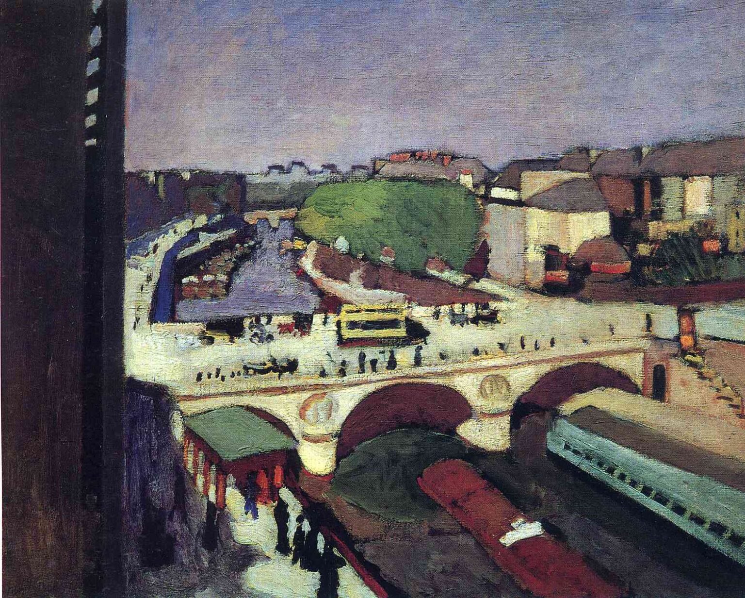
Henri Matisse painted “The Pont Saint-Michel” in 1900, during a formative period when he was living and working near the Seine and looking restlessly for a modern language adequate to the modern city. He had absorbed academic training at the École des Beaux-Arts, but by 1900 he was studying how Cézanne built form with planes of color and how the Nabis flattened interiors into decorative fields. Paris itself—the quickened traffic of bridges, quays, and boulevards—offered a living laboratory. This painting captures that moment of transition. It keeps just enough topographical precision to identify place, while compressing the scene into stacked, legible zones of color that anticipate the structural color of his Fauvist breakthrough a few years later.
A Vantage From Above: Looking Down On The Bridge And The City’s Flows
The view plunges diagonally from a high perch, almost certainly a window or balcony, a signature Matisse angle from his rooms along the quai. A dark vertical slab at the far left reads as a window frame, bluntly admitting the painter’s interior position. From this height the Pont Saint-Michel unfolds as a bright deck crossing the river; people become small strokes, vehicles tighten into simple blocks, and the water splits into working lanes for barges. The city appears as a choreography of circulation—pedestrians streaming along the parapet, a tram or omnibus moving across the bridge, boats sliding beneath the arches, and train carriages idling along the lower right. The composition is less a postcard and more a map of forces seen in motion.
Composition As An Interlock Of Bands, Arches, And Fields
The rectangle is engineered with clarity. An elevated bridge spans the middle ground in a broad light band, punctuated by three sturdy arches whose warm reddish under-tones anchor the center. Below, the river darkens into a deep, sluggish ribbon, broken by the long rectangles of barges and the flank of a train. Above, a second, paler band runs back along the quay, leading the eye toward a bend of water and a cluster of rounded trees that mass like a single green cloud. The left edge plunges in shadow, sharpening the contrast with the sunlit bridge and preventing the composition from drifting rightward. Everything is simplified to essential geometry: arch, band, block, and curve, each set to scale the others.
Color Architecture And The Early Grammar Of Structure
Matisse builds the entire scene from a restrained chord of mauve sky, chalky creams, olive greens, and wine-dark maroons, keyed by small black accents. Local color yields to relational color. The bridge deck is not gray stone but a pale, sun-struck cream that reads as light rather than as mineral. The arches carry a subdued red-brown that warms the center and echoes the maroon of the barge. Along the far bank, houses consolidate into soft tan and umber planes whose roofs are muted rose, while the large copse compresses into a cool, even green. Black and near-black are never voids; they are active colors that compact energy in the train, in the river’s trough, and under the arches. The palette is calm, but its relationships are decisive, holding the city together like masonry.
Light, Atmosphere, And Time Of Day
Illumination is even and pale, as if on a clear late morning when the sun has lifted haze without sharpening cast shadows. The bridge reads as a bright reservoir of light, its surface almost bleached in places, while the sky hovers as a thin mauve wash that cools the far distance. Instead of theatrical contrast, Matisse relies on value steps and temperature: warm planes in the buildings and arches counter the cools of water and sky; the tree mass sits between, slightly cooler than the façades but warmer than the river. The effect is a breathable atmosphere rather than spotlight drama—appropriate for a painting about the regular pulse of urban life.
Brushwork, Notation, And The Speed Of Seeing
The surface murmurs with short, firm strokes. Figures on the bridge are rendered as quick dashes; carriages or trams simplify into small, stacked rectangles; train cars become long bars of greenish gray. Water is knitted by horizontal pulls, whereas foliage is massed with stippled touches that merge at a distance. Matisse works the paint thinly in the sky, letting the ground breathe through, and thickens it slightly around the bridge parapet and barges, where edges need authority. The variety of touch gives each material a tempo—slow for masonry, brisk for crowds, steady for water—and conveys the experience of looking from a window where everything moves at once.
Space Compressed Into A Readable Field
Depth is present but measured. The bridge sits high in the picture plane, a shelf on which the city is stacked; the far bank steps upward in frugal tiers; the sky is a shallow cap rather than an infinite dome. Linear perspective exists in the receding quays and narrowing waterway, yet Matisse disciplines recession so that the surface remains a designed pattern. The viewer oscillates between entering the space and reading the painting as a fabric of colored zones. That oscillation—between urban view and painted pattern—becomes one of Matisse’s central modern moves.
Rhythm, Movement, And The Urban Score
What animates the picture is rhythm. Repeating verticals along the parapet, the dotted procession of walkers, and the steady horizontal of the river compose a score the eye can follow. The three arches beat a slow time in the center, while the tram’s block of yellowish cream provides a syncopated accent. The big, soft mass of trees acts like a sustained chord that holds the upper half together. The viewer’s gaze loops: down the left shadow, across the sunlit bridge, into the cool bend of water, around the green canopy, then back to the arches—a circuit as habitual as the daily commutes it depicts.
Paris As Modern Motif: Bridges, Transit, And Everyday Grandeur
Choosing Pont Saint-Michel matters. The bridge is both utilitarian and symbolic, joining the Left Bank to the Île de la Cité and threading daily commerce across the Seine. By painting it not as a monument isolated in beauty but as a working platform for trams, strollers, and shop errands, Matisse places modern life at the center of his aesthetic. Technology is present without spectacle—rails, cars, and barges are ordinary equipment of a functioning city. The grandeur here is not theatrical; it is the dignity of smooth circulation and shared spaces.
The Left-Edge Slab And The Assertion Of The Painter’s Place
The dark slab along the left edge does important work. It reads as a window jamb or building facade encountered from very near, as if the painter were pressed against the opening. That intrusion declares the picture as a view from a specific, embodied place rather than a neutral survey. It also compresses the field, forming a high-contrast foil for the bright bridge and preventing the eye from sliding out of the picture. This kind of framing device appears often in Matisse’s Paris views and is a quiet confession of method: the city is taken in from a lived vantage, not idealized.
Abbreviation And The Courage To Omit Detail
Nearly everything is simplified. Roof tiles, window panes, faces, carriage wheels—all are omitted. What remains is what carries structure and rhythm: the arches, the long bars of traffic, the tree mass, the bands of quay and water. This discipline signals the shift from description to construction. Omission keeps the image light and legible, allowing the painting to be read instantly at the scale of a glance, as city views are in life.
Dialogues With Impressionism And Post-Impressionism
Matisse inherits from Impressionism the commitment to present-tense sensation and outdoor light, yet he departs from its broken sparkle. The color is cleaner and the shapes more tectonic, nearer to Cézanne’s constructive planes than to Monet’s atmospheric shimmer. Pissarro’s city scenes at bridge level supply a precedent for modern urban subject matter, but Matisse’s high viewpoint and firm simplifications push the image toward decorative design. Gauguin and the Nabis whisper in the flattened, banded background. The painting sits at a crossroads of these influences while already sounding Matisse’s steadier, harmonizing temperament.
Materials, Pigments, And The Skin Of The Surface
The palette suggests industrial pigments of the period: cobalt and ultramarine in the sky; iron-oxide and madder variants in the bridges and roofs; viridian and chromium greens moderated for trees; earths and lead white for the light deck. Paint is largely handled in lean layers, with scumbles that allow under-tones to breathe in the sky and distance, and slightly denser applications along the parapets and barges where edges need to assert. The result is a surface that remains matte and unified, appropriate to a scene of clear, diffused daylight.
Human Presence Without Portraiture
The painting contains hundreds of people and yet zero individual portraits. Passersby are dots and dashes, but their presence is felt in aggregate—as social rhythm rather than anecdote. This choice frees the painting from story and strengthens its decorative coherence. The city appears as a humane machine whose parts are alive, moving, and mutually aware, rather than as a stage for incidents.
The Decorative Ideal Emerging From Observation
Even before Matisse makes rooms explode with arabesques and saturated scarlets, he is working toward a decorative ideal: a surface in which every zone holds its appointed role in a balance. Here, the mauve sky is a calm lid; the green canopy is a single weighted mass; the cream bridge is a bright plank; the maroon arches and barges are ballast; the left shadow is a stabilizing pillar. The painting remains faithful to place while already functioning like a woven fabric whose threads interlock.
How To Look Slowly And Profitably
First, take in the large divisions: the left shadow, the bright bridge, the cool river, the tiered distance, and the mauve sky. Let your eye follow the bridge from left to right, noting the way small strokes stand for walkers and the way a few rectangles imply vehicles. Drop to the river and feel the depth of its tone under the arches; then drift back along the far quay into the bend, allowing the green canopy to hold your gaze before you return to the fore. Step closer to register the difference between thinly swept sky and thicker, worked edges on the parapets and barges. Step back until the city compresses again into a single, harmonious pattern. That alternation between near and far mirrors the painter’s own process of tuning the whole.
Relationship To Matisse’s Other Paris Views
Placed alongside “Notre Dame” and other Seine pictures from 1899–1901, “The Pont Saint-Michel” shows a consistent project: to test how far simplification and relational color can structure a complex urban subject. Each view uses an elevated vantage, a broad band of water, and an anchoring architectural motif—towers, bridge, or island—and each treats crowds and vehicles as rhythmic notations. This canvas is among the most architectonic of the group, its arches and bands organizing the field with quiet authority.
Why This Painting Matters
“The Pont Saint-Michel” matters because it demonstrates Matisse’s mature priorities in embryonic form: color as structure, omission as clarity, and a surface that is at once descriptive and decorative. It proves that a modern cityscape can honor the felt order of daily life—the circulation of bodies and vehicles—without drowning in detail. It also shows how a fixed vantage, revisited, can become a workshop for invention. Within five years Matisse will intensify chroma and flatten space even further; nevertheless, the grammar that sustains those audacities is already in place here, on a calm day by the bridge where Paris moves.
