Image source: wikiart.org
Historical Context And Why This Still Life Matters
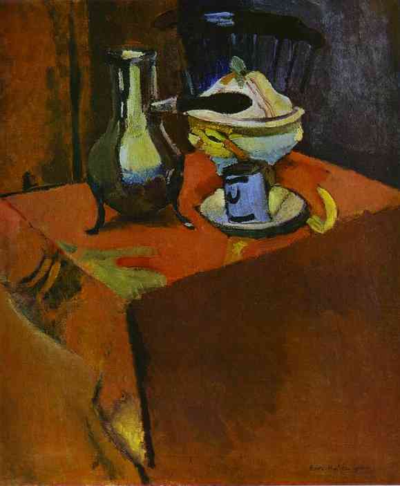
“Dishes on a Table” from 1900 sits at a hinge point in Henri Matisse’s development. He had left the École des Beaux-Arts with a solid academic foundation, absorbed the broken color of Impressionism, and was studying how Cézanne used color to build form. In still life—more than in portraiture or landscape—Matisse could test radical ideas in a contained set of relationships. This canvas captures that moment of testing. It is intimate in scale and domestic in subject, yet it advances a major modernist question: can color itself be the architecture of a painting, with drawing and modeling relegated to supporting roles? The answer here is already yes. The picture shows a painter moving away from descriptive detail and toward orchestrated planes of hue and value that would culminate, a few years later, in Fauvism and then in the great decorative interiors.
What We See: A Tabletop Theater Of Forms
At first glance we meet a corner of a table dressed in a saturated, red-orange cloth. Resting near the far edge is a small still-life troupe: a metal ewer with a swelling belly and slender neck, a lidded bowl or compote where pale fruit glows under a cream lid, and an enamel cup set on a saucer. A peel or ribbon of fruit arcs around the base of the cup like a yellow crescent. Behind them, a dark chair back rises as a silhouetted fan of spindles. The tabletop is cropped boldly; a large, simplified plane occupies the lower right, pushing the objects into a compact stage at the left. Walls and shadows flow around the scene in earthy browns and dusky purples, allowing the warm table to blaze at the center.
Composition As A System Of Interlocking Planes
The composition relies on a few decisive shapes. The red table forms a skewed trapezoid that tilts upward, inviting our eye onto the surface. A diagonal crease or hem of the cloth runs from the front edge toward the cluster of objects, acting like a sightline. The ewer, compote, and cup form a triangular constellation whose points are staggered in height, establishing a rhythm from low to high and back again. The chair’s curved crest interrupts the verticals and prevents the background from becoming a flat wall; it also frames the glinting lid of the bowl. Just as important are the negative shapes: the dark wedge beneath the pitcher’s handle, the mauve pocket between bowl and cup, and the large, almost abstract block of table at the right. These emptier forms allow the few objects to carry weight without clutter.
Color Architecture And The Early Language Of Fauvism
Color does more than decorate; it builds the picture. The overall field is a deep, warm red that functions as both cloth and atmosphere. Against it, the ewer’s metallic body holds cool blue-green reflections, creating a complementary tension that energizes the left side. The cup’s enamel shows a patch of cobalt, which locks into the ewer’s coolness and keeps the composition from overheating. Lemon yellows touch the peel, the bowl’s rim, and flashes of the cloth where light strikes, creating a chain of accents that ties the group together. The background is not a neutral gray but a set of browned violets and near-blacks that make the chroma resonate. Nothing strives for “local color.” The palette is chosen for relationships: warm against cool, saturated against dulled, light against dark. In this way, color provides the structure that drawing once provided in academic art.
Light And The Replacement Of Modeling By Temperature
Matisse does not sculpt the ewer with classical shading; he toggles temperature. Cool notes carve the metal’s volume; warm notes lift the red cloth where it turns into the light. A few high-value strokes on the bowl’s lid and on the pitcher’s shoulder give sparkle without meticulous highlights. Shadows are not transparent pools but colored zones—violet-brown under the cup, inky blue along the pitcher’s base—that exert compositional pressure. The viewer senses light from the left, yet the drama of illumination is gentler than the drama of chromatic contrast. The picture glows from within rather than from a single exterior source.
The Brush As A Maker Of Edges And Time
Brushwork is varied and purposeful. On the cloth Matisse drags pigment in broad planes, allowing subtle shifts of red, orange, and umber to suggest folds without drawing every crease. Around the objects edges alternately sharpen and dissolve; the pitcher’s left contour is firm, while the right contour melts into a reflected haze, a “lost and found” edge that implies a mirrorlike surface. The bowl’s lid is struck in concise, curving strokes that tell us as much about the speed of the painter’s hand as about porcelain. Passage by passage the surface records the time of making—quick, economical, and confident, with revision peeking through where red overlaps brown or blue slips under yellow.
Space, Perspective, And The Tilted Table Tradition
The table pitches upward in the Cézannian manner, compressing depth into the surface. We do not look through a window; we look at a field of adjacent planes. The near corner in the lower right becomes a massive block of color that refuses to recede neatly, and the far edge of the table seems to coincide with the back wall rather than locate clearly in space. Matisse uses these ambiguities to keep attention at the surface, where color and shape can do their work. The cup and saucer are drawn with an intentional awkwardness—the ellipse is slightly pinched—so that the form reads but never becomes diagrammatic perspective. The result is a poised oscillation between the tabletop’s “reality” and the canvas’s flatness.
Drawing Through Color And The Minimization Of Outline
There is very little linear drawing. Where outlines do appear, they are fragments—a dark notch under the ewer, a charcoal-like arc defining the handle, a thin line marking the saucer’s rim. More often Matisse lets colors meet to create edges: red table against the greenish metal, violet shadow against yellow peel. He draws by abutment. This method allows each shape to hold its autonomy while still participating in the larger harmony. It also breaks with academic habit by refusing to subordinate color to contour.
The Tablecloth As A Decorative Field
Seen at a distance, the red cloth reads as a unified plane; up close it becomes a subtle patchwork of modulated reds, oranges, and wine tones, with occasional dull greens where reflected light creeps in. The cloth functions like a carpet in an interior, an anchoring decorative field that organizes everything placed upon it. This is an early manifestation of the decorative ideal that would dominate Matisse’s later interiors. The painting edges toward pattern without becoming literal ornament: the play of warm and cool within the red plane gives it movement, while the objects ride atop it like motifs in a textile.
Objects As Actors: Metal, Porcelain, Enamel, And Fruit
Each object has a different material voice, and Matisse differentiates them without fuss. The metal ewer is elastic and reflective; its belly gathers environment, so he steeps it in cools and near-neutrals. The porcelain bowl reads as dense and opaque; he gives it creamy half-tones and a single decisive highlight. The enamel cup is simple and utilitarian; its blue note is almost graphic, a slab of color edged by darkness. The peel, neither fully fruit nor abstract ribbon, introduces a springy rhythm and a note of humor. Choosing humble, modern tableware rather than ornate vessels matches the painter’s ambition to make color and shape, not preciousness, the source of beauty.
Black As A Color And The Role Of The Chair
The chair back might at first seem merely background, but it plays a critical optical role. Its near-black silhouette is not an absence; it is an active color that intensifies the adjacent hues, especially the pale lid and the blue of the cup. Matisse often insisted that black was a color among colors, capable of creating the strongest harmonies. Here black anchors the composition, acting as a counterweight to the furnace-like cloth and keeping the overall chord from becoming garish. The spindles’ rhythm also echoes the verticals of the ewer and handle, knitting the group to the backdrop.
Negative Space, Cropping, And Modern Pictorial Tension
The painting’s modern energy partly comes from what is not depicted. The right half is dominated by a nearly uninflected plane, the top edge crops the chair, and the lower left slips into shadow. These decisions deny the completeness prized in academic still lifes, where every lemon and knife claims equal attention. By cropping and by granting large areas to “empty” color, Matisse creates tension that activates the few depicted objects. The viewer’s imagination fills the room beyond the frame, making the small scene feel expansive.
Rhythm And The Viewer’s Path Through The Picture
The eye enters along the bright table edge, slides toward the ewer’s reflective belly, loops around the bowl’s lid, dwells on the enamel blue of the cup, and exits along the peel’s flourish. That path is not accidental. Diagonals and arcs compose a visual sentence whose cadence alternates stress and release. The red field is the sustained note; the metallic highlights are the syncopations; the banana-colored curve is the final treble lilt. Read this way, the painting is as much choreography as depiction.
Comparisons And Lineage: From Chardin To Cézanne
Matisse converses with predecessors while quietly undoing them. From Chardin he takes the respect for everyday utensils and the intimacy of the tabletop. From the Spanish bodegón tradition he borrows the dark stage against which lighted objects stand. From Manet he inherits the courage to juxtapose large, flat planes. Above all, from Cézanne he learns to replace linear perspective with the building of forms through modulated patches of color. Yet he differs from Cézanne in temperament. Where Cézanne seeks a stony, tectonic stability, Matisse seeks equilibrium within a more lyrical, decorative key. “Dishes on a Table” is an early, persuasive statement of that difference.
Materiality, Pigments, And The Evidence Of The Hand
Turn-of-the-century industrial pigments allowed Matisse to deploy intense reds and durable blues. The red cloth likely involves cadmium or vermilion moderated by earth colors; the blues may include cobalt; the greens in the pitcher come from cool mixtures rather than literal green objects. He varies medium and thickness: thin scumbles in the shadows let underlayers breathe, while the objects carry a slightly richer body that catches the light. The surface never pretends to be anything other than paint. That candor is central to modernism, and it is already present in this early still life.
Decorative Harmony And The Ideal Of Balance
Years later Matisse would articulate his desire for an art of balance and serenity. Although this canvas is darker and more compact than his famous interiors, the ideal is present. Each area has a task: the red field unifies, the cool accents temper, the darks stabilize, the little chain of yellows animates. Nothing feels extraneous. The objects bear meaning less as symbols than as notes in a chord, placed to achieve a satisfying consonance. This commitment to harmony anticipates works such as “Harmony in Red,” where the tablecloth enlarges to become nearly the whole world.
Time, Domesticity, And The Psychology Of The Scene
Still life often stages quiet moments between actions. Here the feeling is evening or late afternoon in a private room. The cool cup implies recent use; the ewer’s reflective belly hints at a lamplight or window beyond our view. The peel suggests recent handling and touches the scene with transience. Rather than dramatizing opulence or moralizing about vanitas, the painting honors domestic time—the interlude when objects rest, glowing, before they return to work. This psychological tone is gentle but firm, a pledge that ordinary life can bear intense color without losing its calm.
How To Look: A Short Method For Entering The Picture
Stand back first and register the big division into red and dark. Let the warmth and coolness establish the painting’s climate. Move closer and trace the triangular arrangement of pitcher, bowl, and cup; feel the rhythm from left to right. Then attend to edges, noticing where they sharpen and where they blur, and how those decisions cue material differences. Finally, come close enough to see the brush. The painting becomes a ledger of touches—some brisk, some tender—that tell the story of its making. In this slow looking the work reveals its double allegiance to the world of things and to the world of painting.
Legacy Within Matisse’s Oeuvre
“Dishes on a Table” may not be as famous as the later scarlet rooms or the coastal landscapes, but it is foundational. It demonstrates that a restrained still life could carry the weight of innovation. The tilted plane, the authority of color, the decorative integration of background and object, and the refusal of dutiful detail all reappear in the breakthroughs of 1904–1908 and echo through the decades that follow. This canvas shows Matisse discovering that harmony can be bold, that simplicity can be intense, and that the ordinary can serve as a stage for painting’s most adventurous ideas.
