Image source: wikiart.org
Introduction
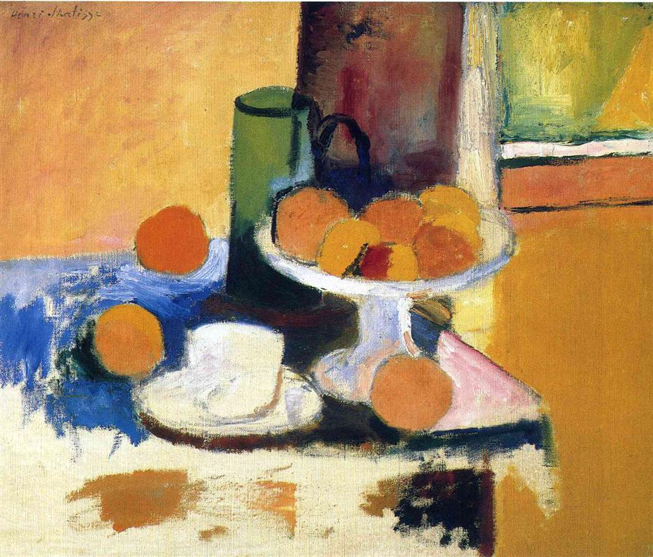
“Still Life with Oranges II” is one of those transitional paintings that feel both exploratory and inevitable. The subject—as traditional as European painting gets—becomes a laboratory in which Matisse tests a radical premise: color can carry structure. He reduces the number of elements, enlarges their silhouettes, and lets complementary chords do the descriptive work usually assigned to drawing and modeling. Behind the objects, large planes of yellow, salmon, and olive organize the room into a shallow, legible stage. On the table, a field of cool ultramarine pushes against warm fruit and pale crockery, generating light through contrast alone. The canvas reads instantly, yet it rewards close looking with dozens of calibrated decisions about edge, temperature, and touch.
Motif and Setup
The arrangement is simple: a cylindrical green jug stands left of center; a white compote piled with oranges occupies the middle ground and tilts toward the viewer; a small white cup and saucer nestle at lower left; separate oranges punctuate the cloth. A triangular pink napkin wedges under the compote’s foot. The background splits into big, flat zones—peach at left, a vertical brownish pillar near the center, and stacked yellow-greens to the right that suggest a window or framed panel. The tabletop is not a carefully described piece of furniture; it is a light field of paint, scraped thin in places and blazing blue where a cloth spreads across it. Each object keeps its identity with minimal cues: the jug’s ellipses, the pedestal’s stem, the round fruit, the lip of the cup.
Composition and Armature
The composition pivots on two intersecting diagonals. One runs from the lower left (cup and saucer) through the green jug to the upper right (yellow panel), a slow rise that stabilizes the left half of the picture. The counter-diagonal begins at the lower right orange, passes through the tilted compote, and climbs toward the central vertical. These vectors cross at the fruit bowl, turning it into the visual fulcrum. Large rectangles—peach left wall, right yellow panel, blue table cloth—lock like inlaid pieces, so small circular forms (oranges, jug mouth, cup rim) beat against a steady grid. Because the armature is so clear, Matisse can afford to leave areas thin or open; the eye fills them in without anxiety.
Color Architecture
Color relationships do nearly everything here. Matisse establishes a complementary duel of orange and blue, then orchestrates supporting pairs: yellow against violet shadows; green jug against salmon wall; white crockery tinged with lilac against warm grounds. The blue cloth is the chromatic engine. Its saturation cools the left side of the picture and slingshots the oranges forward, making them appear sunlit without a single “photographic” highlight. The jug is not a single green; along its left edge runs a transparent blue-green that cools into bottle green at the core and warms toward olive where it meets the peach wall. The compote is “white,” but only by convention: it is actually a balance of creamy yellows, pale blues, and faint violets that register reflected color from fruit and cloth. Because the palette is organized by families rather than isolated spots, the whole scene breathes one climate of light.
Light Without Chiaroscuro
The painting’s illumination is broad and ambient, closer to daylight reflected off walls than to a spotlight. Instead of building form with brown shadows, Matisse allows neighboring temperatures to imply turning. Where the oranges face the blue, their edges deepen into red-orange; where they confront yellow or peach, they pale toward light gold. The green jug reads as cylindrical because the cool side lies against the warm wall, not because of cast shadow. Even the cup and saucer, with barely any interior modeling, feel three-dimensional simply by the way cool lilac touches nestle inside warmer cream.
Drawing by Abutment
Contours are rare. Forms are “drawn” where one color abuts another. The jug’s outline arrives where green meets peach or blue; the compote’s rim is a sliver of blue-white set against deeper tones—no inked oval required. This practice weakens the tyranny of line and strengthens the unity of atmosphere. It also allows Matisse to tune shapes with the smallest chromatic nudge: widen the green by half a brushstroke, cool the rim with a touch of blue, and volume convinces itself.
Space and Depth in Shallow Relief
Depth is shallow, more relief than tunnel. Overlap does most of the work—the jug occludes part of the fruit pile; the compote interrupts the right yellow field; the cup slides beneath an orange. Value steps finish the job: the darkest note gathers under the compote and behind the jug; the lightest notes sit on the front plane of the table and within the right panel. There’s no vanishing point and no polished perspective on the saucer ellipses; yet the space is inhabitable because the planes are so clearly registered.
Surface, Touch, and Reserve
Look at the paint film. Some passages are dense and buttery—the blue cloth, the thick oranges—while others are brushed thin enough to let the weave show, especially in the lower left where warm beige ground breathes through. This alternation keeps the surface alive and lets physical light interact with the painting: we see not just an illusion of air but the actual canvas catching and reflecting. Matisse’s reserve of unpainted or lightly scumbled ground near the table edge is a strategic risk that pays off. It prevents the composition from becoming heavy and directs attention to the saturated fruit and cloth.
The Role of the Blue Cloth
The blue cloth is the protagonist’s partner. Without it, the green jug would blend too easily into the yellow-peach world; with it, relationships become electric. The cloth’s edge is ragged, not hemmed, and its color is laid in broader strokes than any other element, as if Matisse wanted to declare, “This is a plane, not a pattern.” Yet the blue also behaves like reflected light: its cooler temperatures infiltrate the compote’s stem and cup’s interior, cooling the whites so that the oranges feel genuinely warm rather than simply painted orange.
Geometry Versus Ornament
What could have become a decorative riot is held in check by geometry. Rectangles and verticals—the wall, panel, and jug—anchor the picture. Circles and alternating arcs—the fruits and cup—play against them. The triangular napkin under the compote’s foot is a hinge: one sharp wedge that locks bowl to table, and a wedge of pink that mediates between orange and blue. Matisse had been looking hard at the Nabis, but he refuses their all-over patterned screens; instead he lets a few simple shapes—and the tactile seam where colors meet—carry ornament’s pleasure without dissolving structure.
Dialogues with Influence
Cézanne’s constructive color is here in the way volumes turn by adjacent planes rather than blended tone. Gauguin’s lesson about the independence of color patches shows in the flat, saturated grounds and the bravery of the yellow panel at right. From Bonnard and Vuillard comes the confidence to treat the domestic scene as a decorative field—yet Matisse is more architectural, less enveloped in pattern. Divisionism hovers in the optical buzz between complements, but the touch is not pointillist; strokes vary with substance and are always subordinated to the object’s form.
The Oranges as Color Logic
Matisse chooses oranges because they are both object and reason: their hue tests the surrounding blues and greens, and their shape tests the tabletop geometry. Notice how no two oranges are the same note. Some lean toward tangerine or cadmium, others toward deeper red-orange; some edges sink into shadow against the blue, others flare toward lemon where they kiss the yellow panel. He implies the fruit’s bloom and weight with changes in chroma, not with glossy highlights. This variety keeps the pile from becoming decorative polka dots and turns it into a living cluster under a single light.
The Cup and Saucer as Visual Rest
The small cup and saucer, brushed with the thinnest paint on the table, act as a resting place for the eye. Their cool whites temper the heat of the fruit and keep the left side from becoming a mere blue-orange duel. The saucer’s elliptical contour is barely stated; what persuades us is the measured transition from warm ground to blue half-shadow within the bowl. The cup’s handle is omitted, a typical Matisse edit that privileges rhythm and mass over literal inventory.
Edges, Seams, and Transitions
Nearly every important edge is ambiguous on purpose. The blue cloth frays into the ground, the jug’s base melts into shadow, the compote’s foot is half-absorbed by the pink wedge. These transitions are not carelessness; they bind objects into the same air. Where Matisse wants a firm lock, he gives one—the dark notch where the jug overlaps the fruit or the crisp line on the right panel. Control is never surrendered; it is redistributed from outline to temperature.
Light as Color Temperature
The painting is a lesson in how light can be “colored” without resort to white. The right side’s yellow panel suffuses nearby surfaces; the left peach wall warms the jug; the blue cloth cools nearby whites and flattens the left foreground. These zones of influence make the picture read as one continuous environment. We intuit the time of day—something like late morning or afternoon—because the entire system of color tilts warm, with coolness introduced only to prevent stasis.
Materiality and Scale
Though intimate in size, the canvas behaves monumentally because of its big blocks of paint and refusal of petty detail. The green jug is rendered with only a few descriptive cues—base ellipse, neck rim, interior dark—and yet it carries real weight. The compote’s stem is a single sweep; the lip’s curve is a single pale band. This edited materiality anticipates Matisse’s later practice: choose the sign that means the most and let it stand alone.
How to Look Slowly
Start at the lower right orange where warm pigment meets a cool shadow. Track the pink wedge up to the compote’s foot and feel how the white stem collects both pink and blue. Climb through the fruit pile and notice how a deep red segment sits like a pulse among yellower neighbors. Slide left along the compote’s rim into the jug’s silhouette, where dense green meets peach in a boundary that flickers between edge and merger. Drop down to the cup; see how three notes—cream, lilac, and a breath of blue—are enough to convince the eye of porcelain. Finally, step back and let the rectangles reassert themselves, holding this chorus of circles inside a clear, stable frame.
Emotional Register
There is no narrative drama here; the painting’s feeling is one of clarity and appetite. The oranges are tangible, the jug useful, the cup waiting. Yet the scene’s austerity—stripped edges, bare ground, unblended planes—gives it a modern poise rather than cozy nostalgia. It is domestic life understood as relations of color, not anecdote. That quiet intensity is part of Matisse’s gift: to make ordinary objects hum with order and attention.
Place Within Matisse’s Oeuvre
Set beside the darker still lifes of 1896–1898 and the lush interiors of the early 1900s, “Still Life with Oranges II” looks like a hinge. The tonal gravity of the 1890s has lifted; the decorative plenitude of later rooms is not yet in bloom. What we see instead is the blueprint for Fauvism: color masses given autonomy, whites understood as colored light, edges negotiated by temperature, and pattern reduced to essential geometry. The picture’s discipline—few shapes, clear armature—will make possible the explosions of 1905 without chaos.
Conservation and Viewing Notes
The painting’s power depends on the legibility of its surfaces. The blue cloth carries thicker impasto; the peach wall and lower ground are thin, with the canvas weave visible. Restorations that gloss these differences risk flattening the effect. When viewed in person, slight shifts in vantage point make the compote and jug breathe, because light catches on the raised strokes and the whites cool or warm depending on where you stand. Reproductions compress this responsiveness; the original rewards proximity.
Conclusion
“Still Life with Oranges II” demonstrates how a young Matisse, at the close of the nineteenth century, could remake an old genre with a few decisive moves. He builds a firm geometry of rectangles and circles, refuses to hide the canvas under fussy modeling, and lets complementary colors do the heavy lifting of light and space. The blue cloth and the oranges answer one another across the table; the green jug mediates between cool and warm worlds; the cup offers a calm pause; and broad planes of yellow and peach knit the scene into one, clear air. What results is not a display of fruit so much as a demonstration of painting’s ability to think in color. The canvas is frank, economical, and full of appetite—an early statement of the principles that will carry Matisse into the audacity of the new century.
